
✨🚀
Smart Design for Evolving Brands.
Strategic Brand Refreshes That Build Clarity, Credibility, and Long-Term Trust.
Explore The Work
↓

✨🚀
Brand Identity Work
Explore how GBaby Studios brings brands forward through strategic refreshes, cohesive identity systems, and purposeful design that strengthens recognition and trust.
-

Horizon at Cityview
Logo / Branding / Web Development
Horizon Central, a Horizon Indianapolis local church, recently relocated to the downtown YMCA Irsay. They refreshed their brand identity to reflect this exciting move and better connect with new people in the surrounding area. The new look brings clarity, excitment, and approachability.
-

DarkButter Bakeland
Brand Identity Design
Dark Butter is a premium cookie brand born from nostalgia and bold flavor. I crafted a distinct brand identity and packaging system that amplified its indulgent personality—fusing comfort with edge. The result is a crave-worthy brand that feels rich, bold, and handcrafted.
-

Pathway to Literacy
Logo / Branding
Pathway to Literacy empowers international students by teaching essential reading and writing skills, fostering independence, and equipping them to succeed in their lives and careers through clear identity, messaging, and visual cohesion. The brand identity now reflects its mission and vision.
-
Rymax Rewards
Brand Identity & UI Design
Rymax, a leader in loyalty rewards solutions, needed a refreshed brand identity and streamlined checkout experience. The redesign modernized their visual system and improved usability for a more trusted, polished user experience.
-
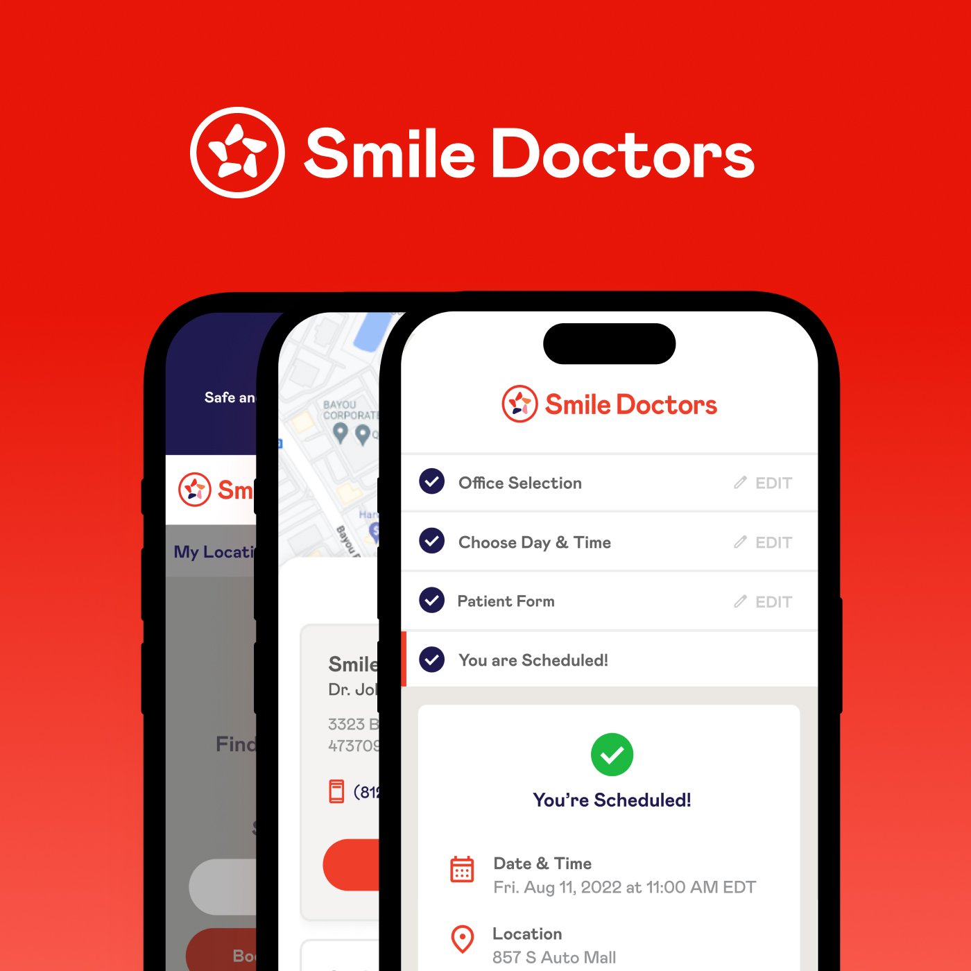
Smile Doctors
UI & UX Design
Smile Doctors, a national orthodontics brand, needed a seamless way to book new patient appointments. We extended their existing brand identity into a clean, user-friendly scheduling app—streamlining UX while reinforcing trust and approachability.
-
Jireh Vision
Logo / Branding / Web Development
Jireh Vision helps corporations strategize by identifying assets, building cross-functional teams, and optimizing financial resources and human capital for greater efficiency and productivity. By aligning internal strengths with business goals.
-

Promina AI Assistant
Logo Design / UI Design
Pathbuilders, a women’s leadership mentorship firm, needed a smarter way to use 15+ years of program data. We built an MVP with a chatbot assistant that made their data more accessible—supporting content, marketing, and mentorship resources while laying the groundwork for future matching features.
-
AK Restoration
Brand Identity Enhancements
AK Restoration provides complete home transformations—inside and out. From kitchens and bathrooms to exteriors, roofing, and outdoor living spaces, we bring quality craftsmanship to every project.
-

Archonsec Cyber Security
Brand Identity Design
A modern, authoritative identity for a leading cybersecurity partner. Built to convey precision, vigilance, and trust — adaptable across every platform where security matters.
-

WPS
Modernized digital experiences for a government health administrator—improving clarity, usability, and trust for providers and beneficiaries.
-
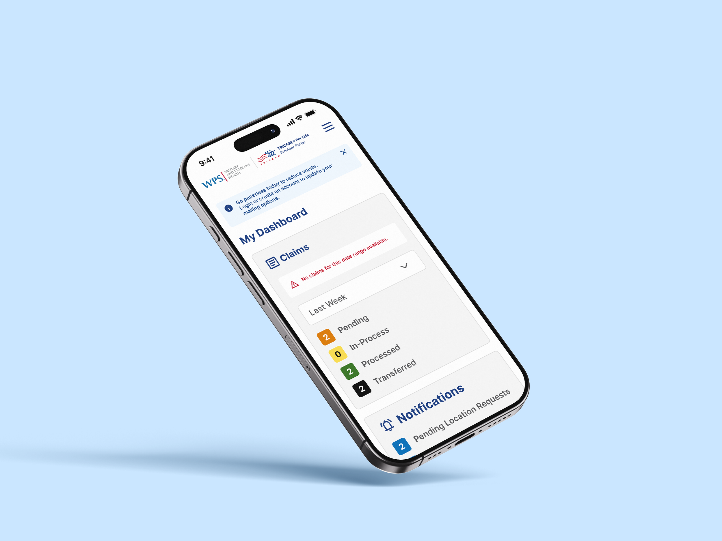
Tricare for Life
UX and interface improvements focused on clarity, compliance, and ease of use for government healthcare systems.

