
AK Restoration
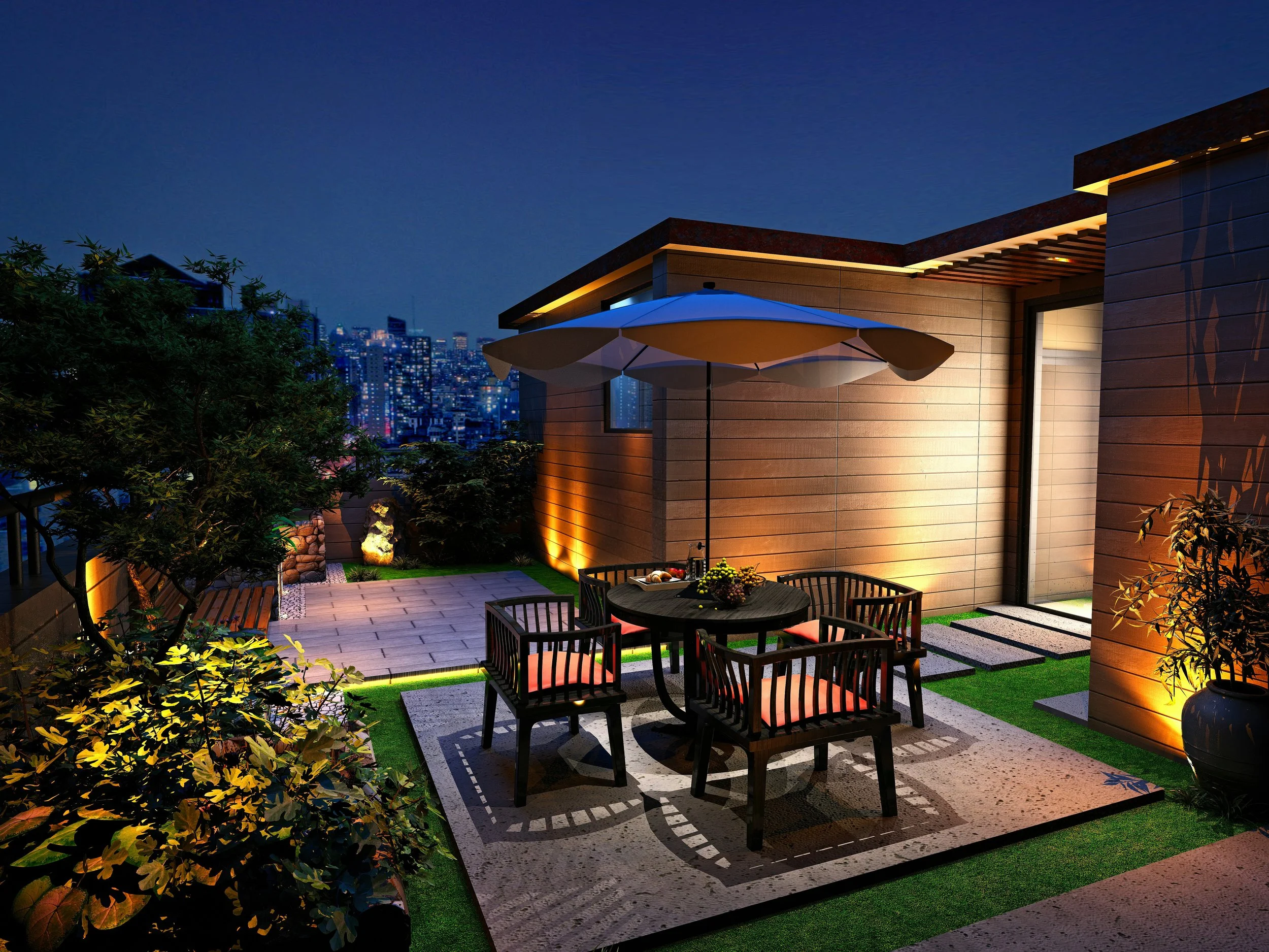
AK Restoration Indy delivers trusted home remodeling and restoration services. The updated brand identity was designed to better reflect their professionalism, reliability, and modern approach. By refining the logo, we created a more balanced and polished mark that communicates trust and quality—helping them stand out in a crowded market.
Deliverables
▸ Elevated Brand Identity System
▸ User Interface Design (UI)
▸ Visual System
▸ Design Direction
Built for Trust.
A Modernized Identity for a Trusted Remodeling Brand
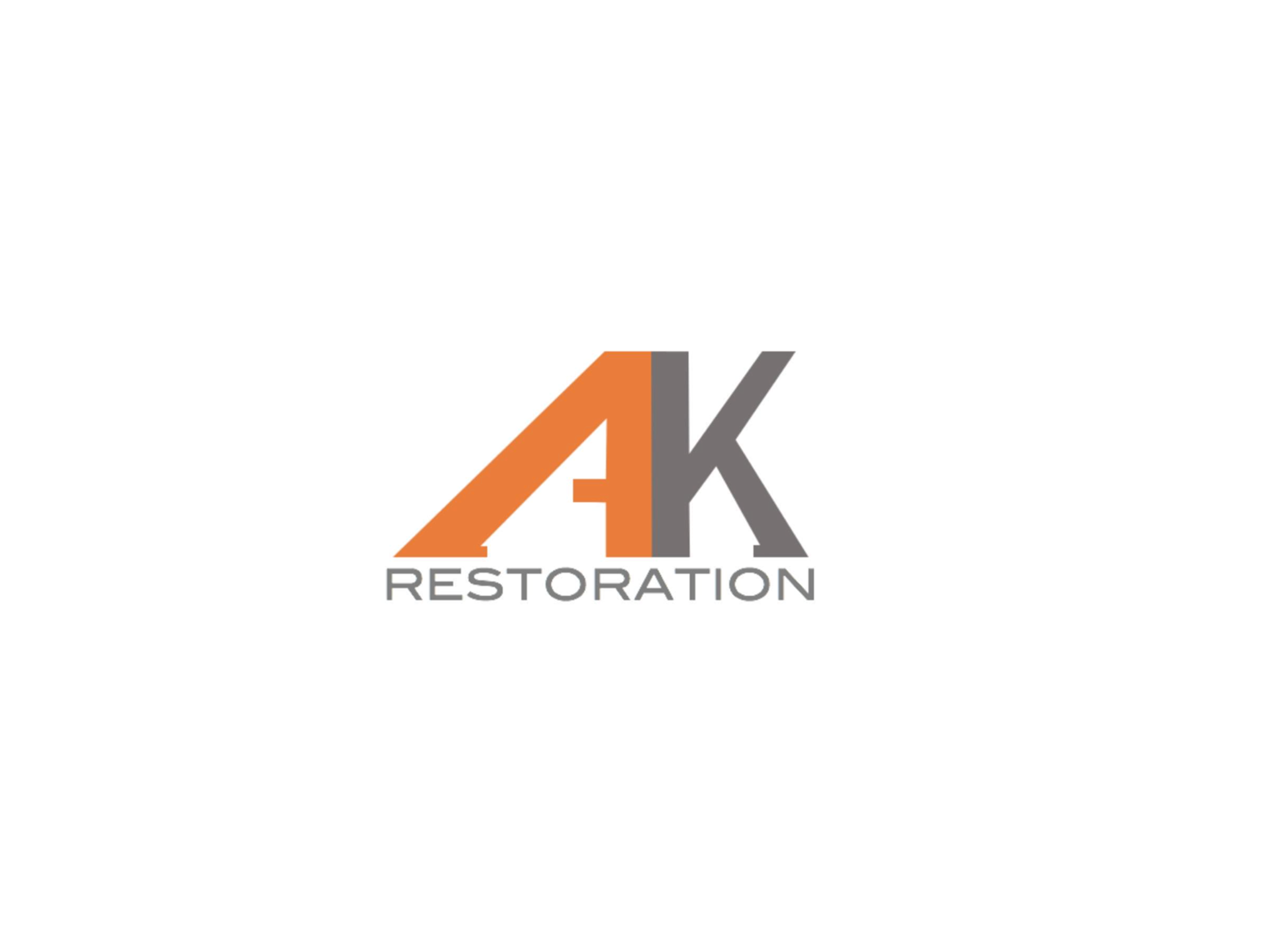
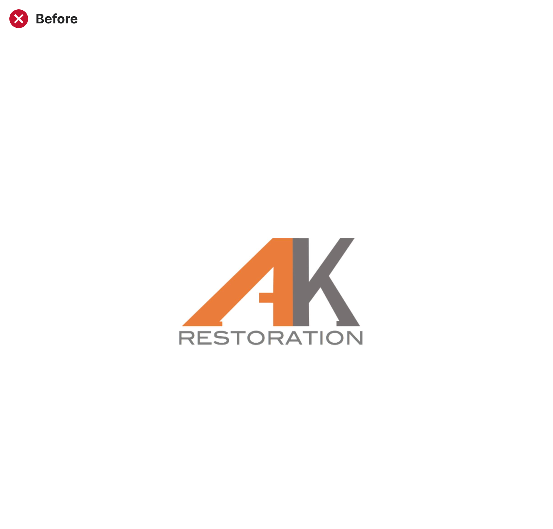
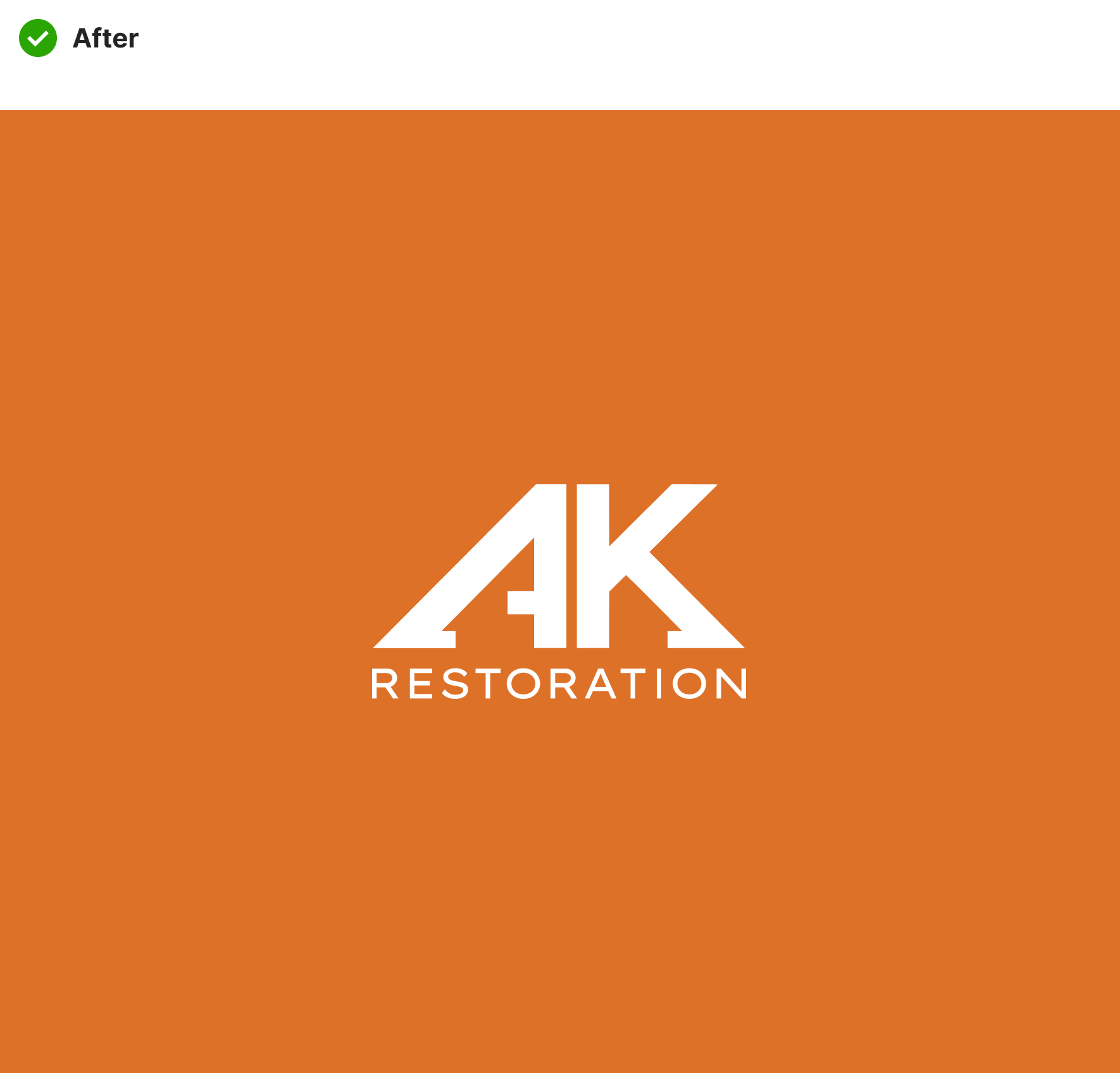
AK Restoration’s longtime logo was updated with cleaner lines, modern proportions, and improved color harmony—creating a contemporary, dependable identity. The refreshed design enhances versatility across platforms and strengthens trust with homeowners.

Old Identity
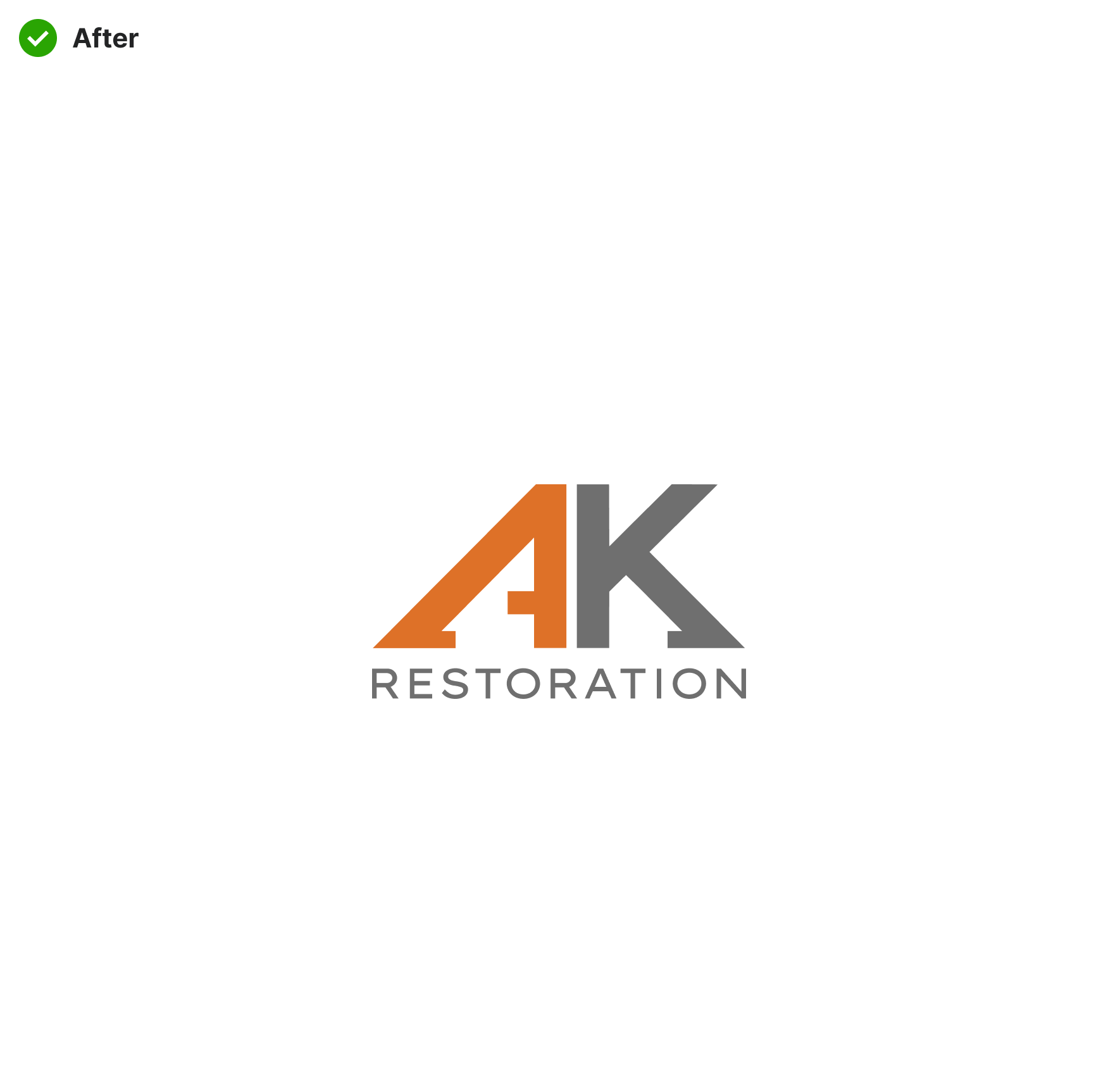
Elevated Identity

01 — Laying the Groundwork
Identifying the Gaps
The original logo had served the company for years, but its dated design and uneven proportions created real-world limitations. The mark lacked visual balance, making it difficult to reproduce clearly at different sizes and across formats—especially on vehicle wraps, signage, and digital platforms. Inconsistencies in line weight and letter spacing also made the logo feel less refined, which risked undermining the company’s professional image. To stay competitive in a crowded remodeling market, the brand needed an identity that could communicate trust, expertise, and modern craftsmanship—while performing flawlessly everywhere it appeared.
02 — Building Foundation
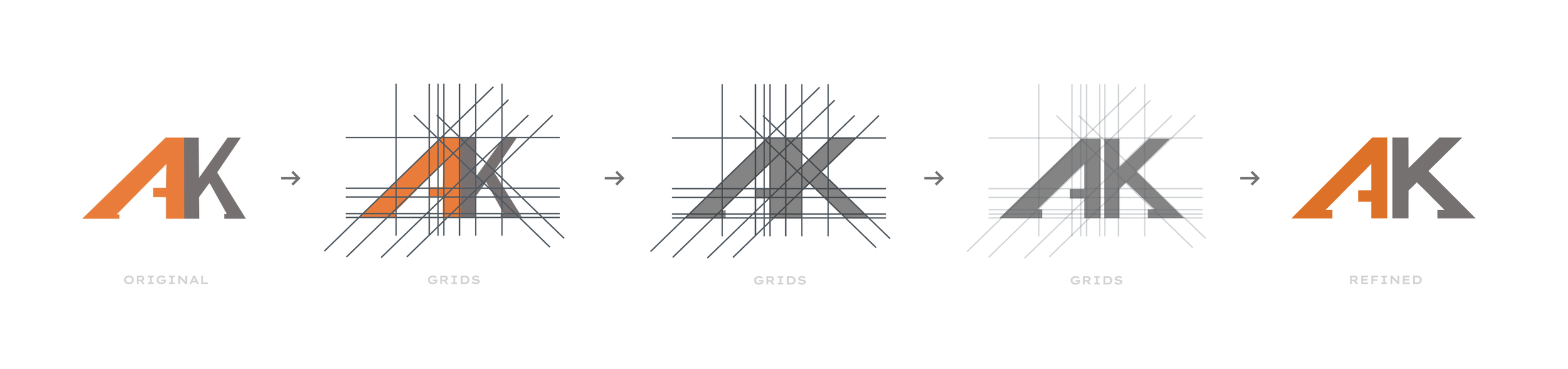
Strategic Redesign
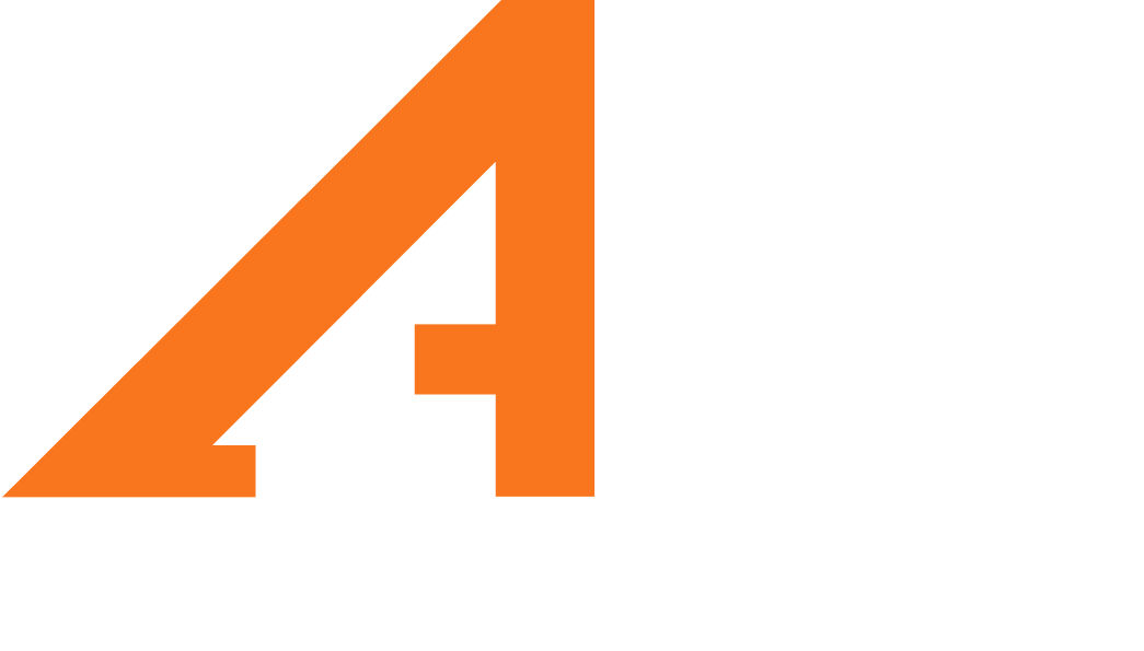
Using a precise grid system, we refined AK Restoration’s logo for cleaner proportions, balanced spacing, and stronger symmetry. The process also revealed and emphasized the house-shaped forms hidden in the negative space of each letter—creating a modern, recognizable mark that connects directly to the brand’s home restoration focus.
03 — Mark + Wordmark
Unifying Icon + Identity
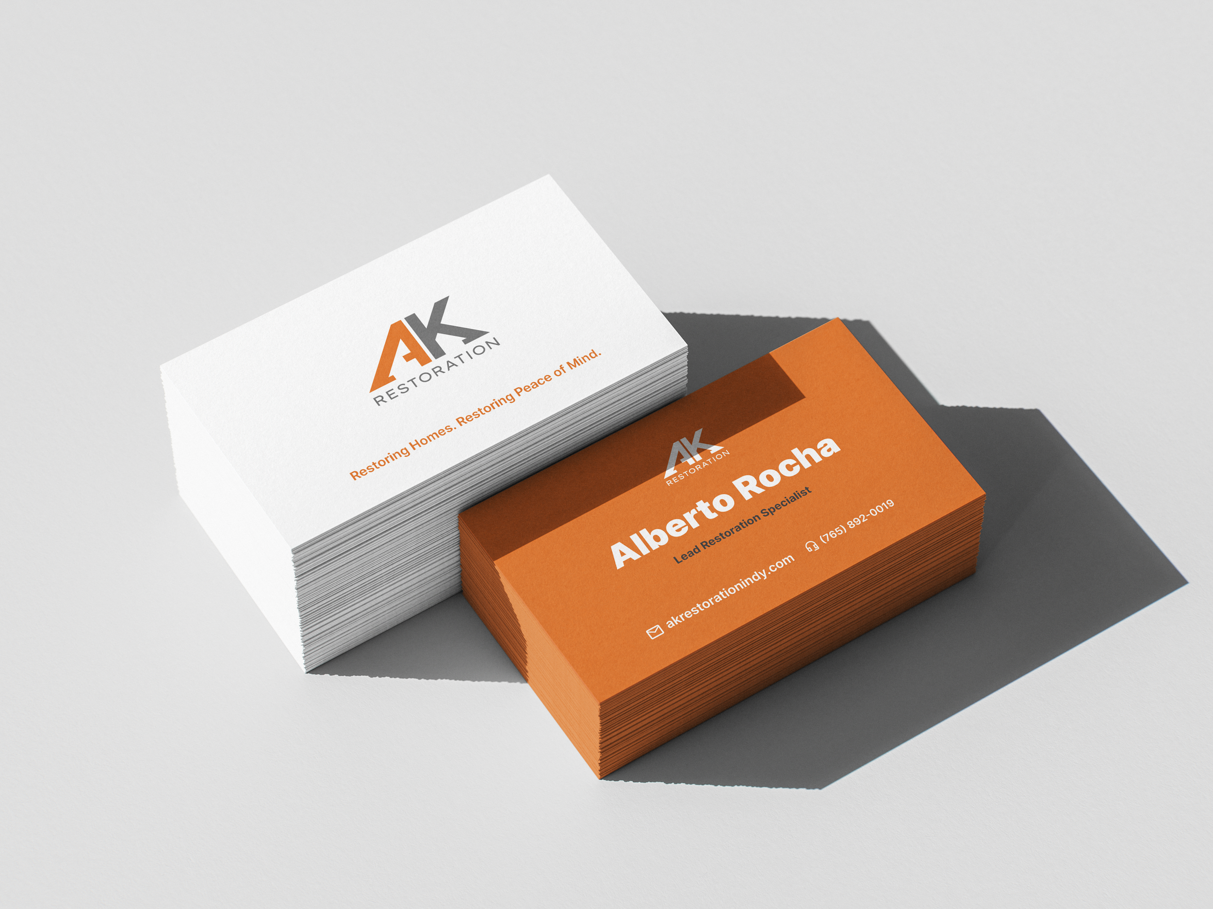
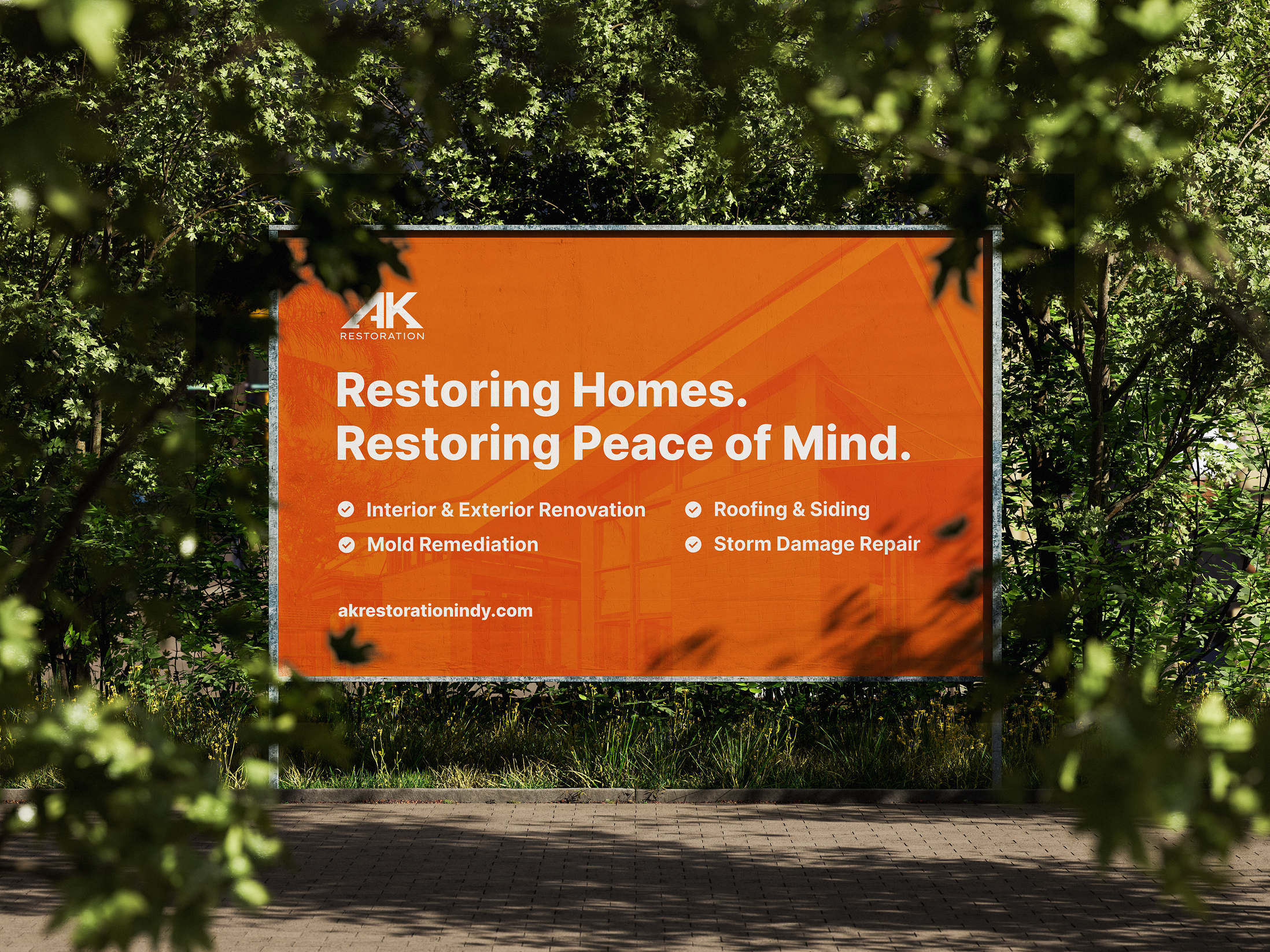
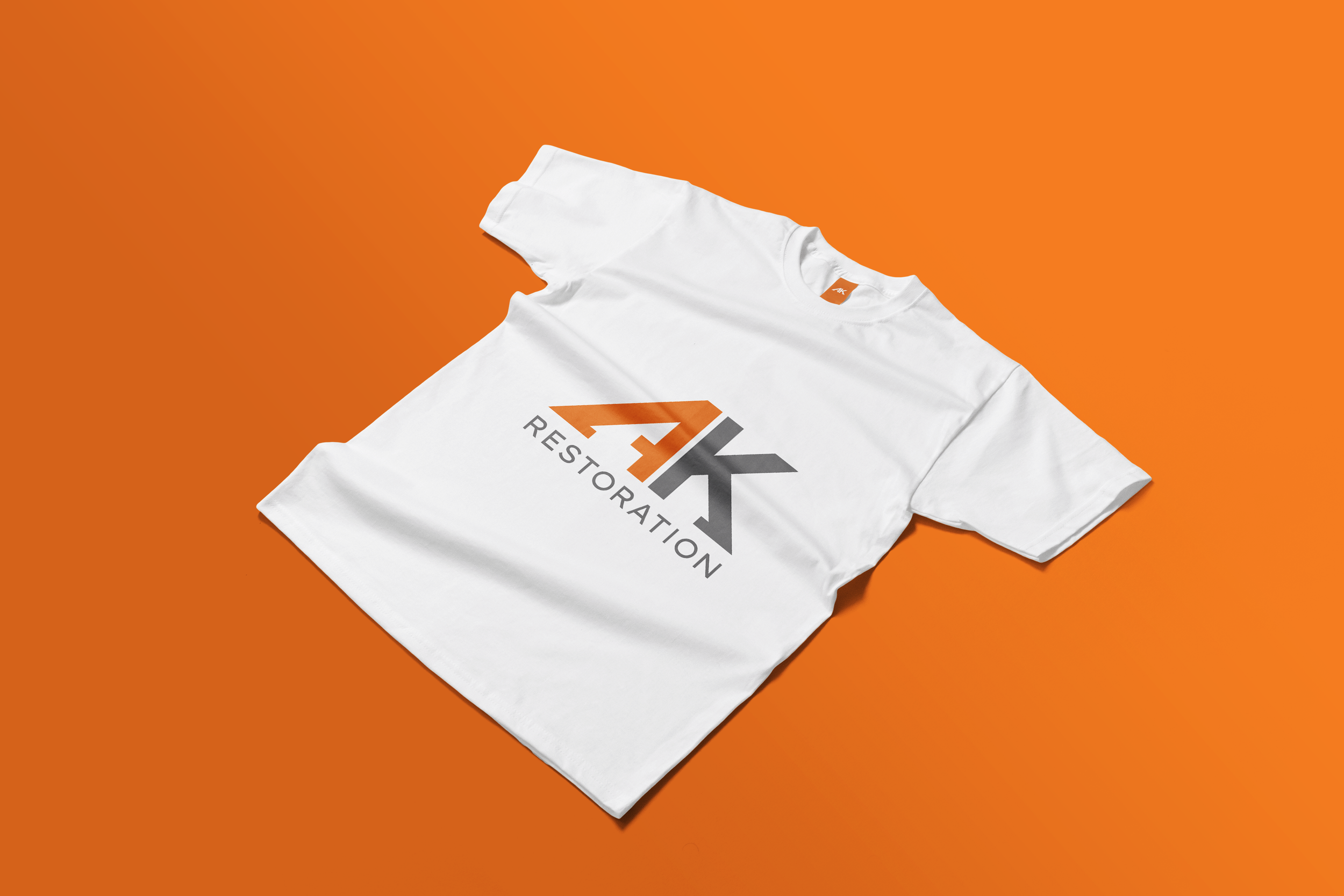
Pairing the refined “AK” mark with the word “Restoration” created a more cohesive and professional brand lockup. Careful adjustments to spacing, alignment, and typography ensure the wordmark complements the geometric precision of the icon—resulting in a layout that reads clearly across signage, print, digital platforms, and vehicle wraps. The clean sans-serif typeface reinforces trust and modernity, while the proportional relationship between the mark and the text improves recognition and visual impact at any scale.
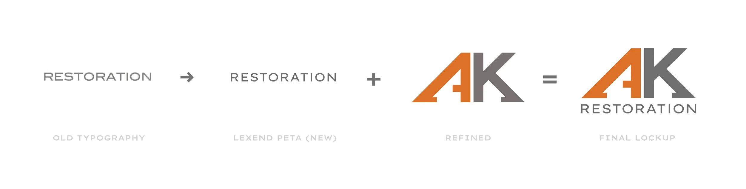
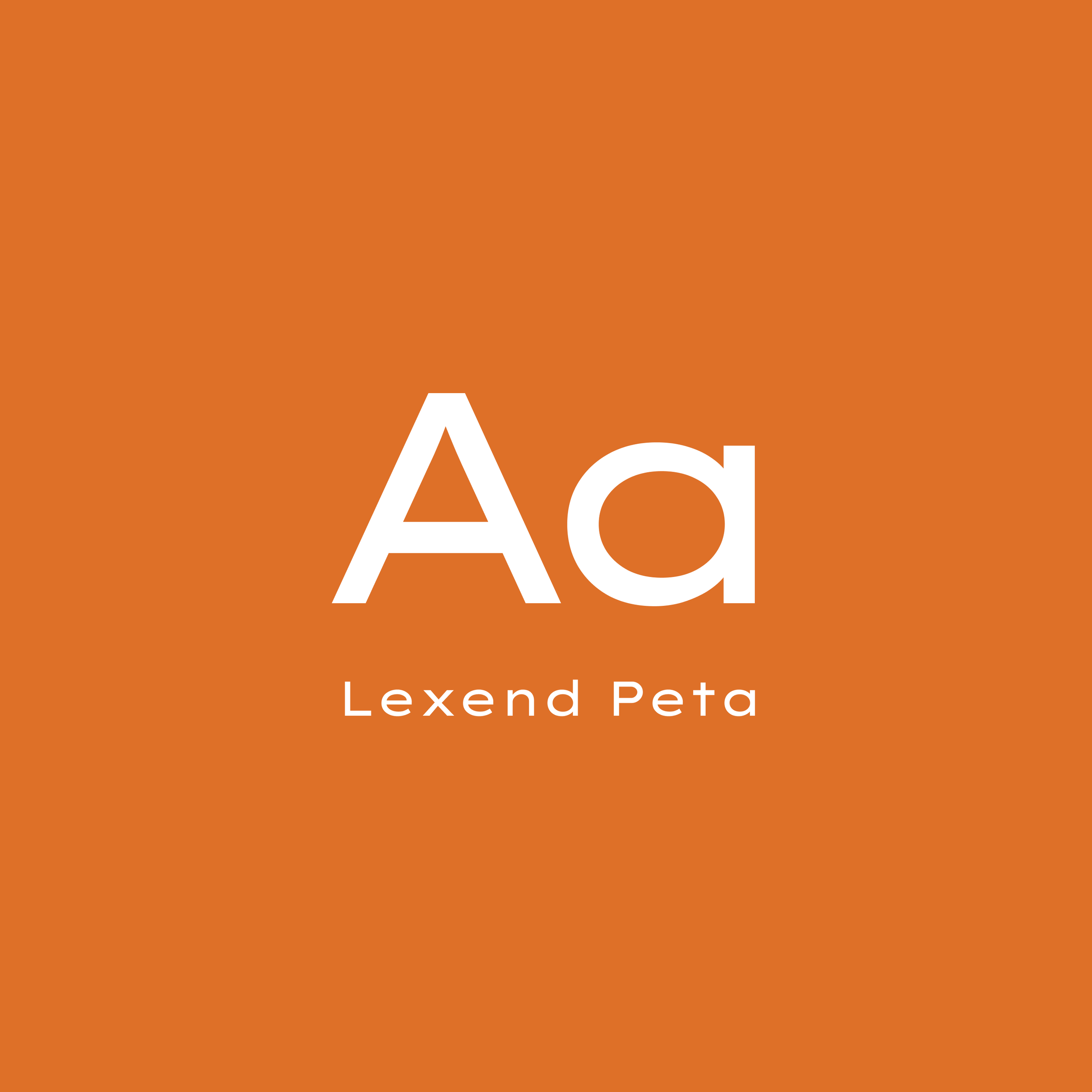
Typography
Lexend Peta was chosen for its clean geometry, legibility, and versatility. Bold weights project strength in large applications, while lighter styles keep body copy clear—ensuring the brand communicates with authority, warmth, and consistency.
Color Palette
AK Restoration’s palette balances energy and reliability, creating a modern, cohesive look that strengthens recognition and consistency across all brand touchpoints.
04 — Identity Comparison
Why Change Matters
An outdated mark was streamlined into a sharper, modern system built for clarity and versatility.
Original Logo
- Uneven Letterforms – Off-balance, dated
- Poor Scalability – Blurs at small sizes.
- Inconsistent Color – Weak cohesion.
Redesign
- Balanced – Clean, modern proportions.
- Improved Scalability – Sharp at any size.
- Consistent Color – Strong, unified identity.


CEO & Founder
Marlon Alecio
"He Provided full cycle expertise for a successful launch from logo design and revision to a functional website. Recommended!"