
Pathway to Literacy
Pathway to Literacy is a program designed to teach reading and writing, helping individuals gain independence for life.
The Goal: To create a recognizable visual identity for the Pathway to Literacy program, developed by a team of educators in Indianapolis and guided by the Immigrant Welcome Center. The identity embodies the program’s essence—a foundational stepping stone that empowers adult English learners to progress and thrive.
Services: Visual Identity Design
Industry: Adult Education
Year: 2023
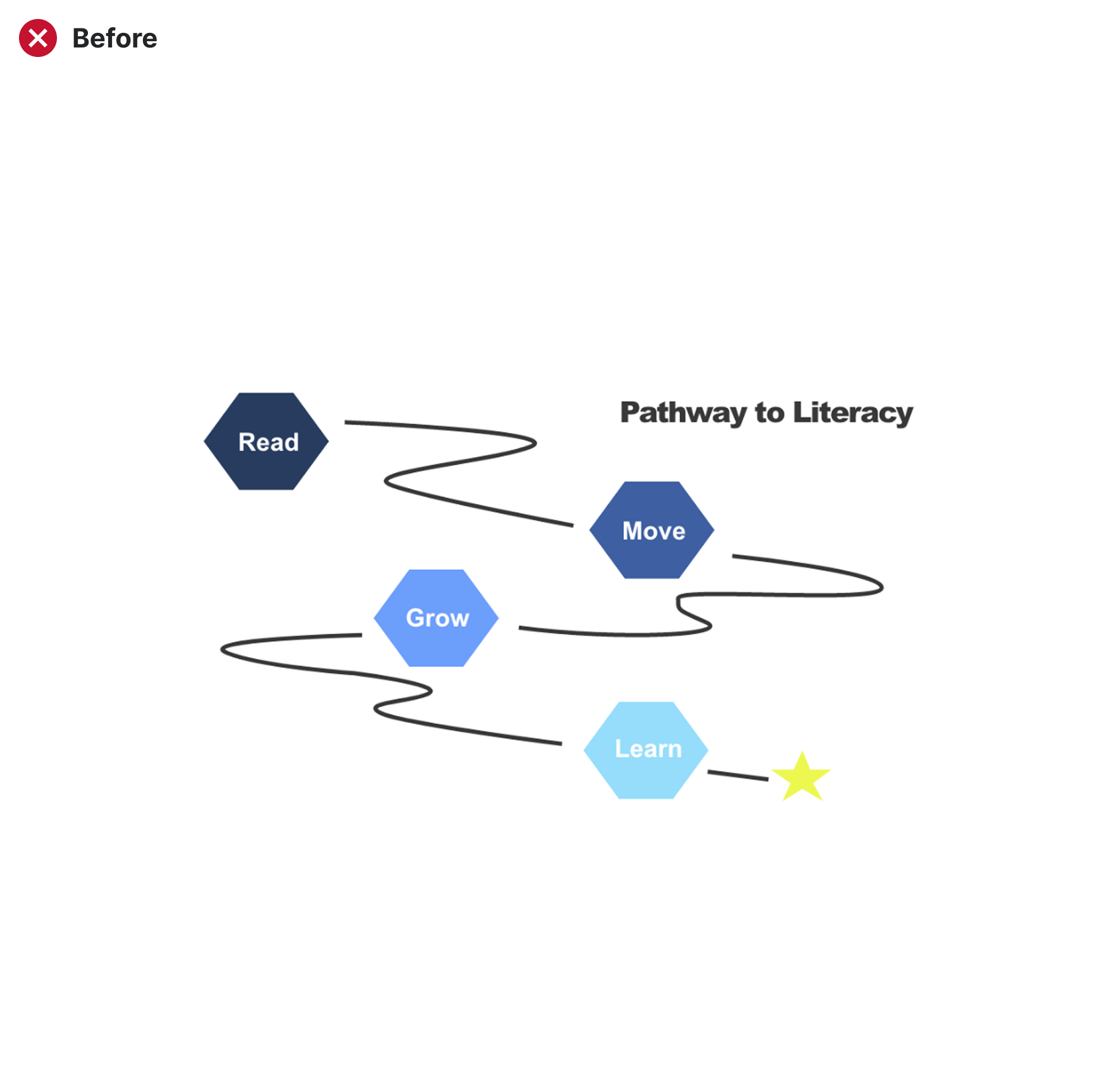
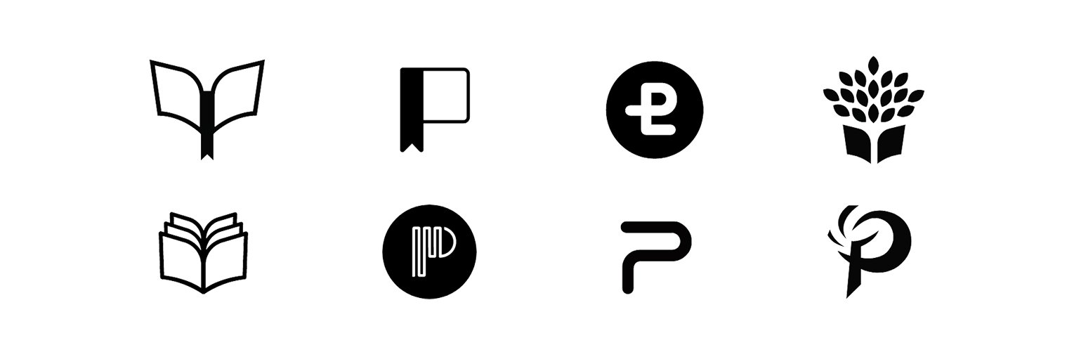
The original Pathway graphic hinted at progress, but it lacked cohesion, clarity, and balance.
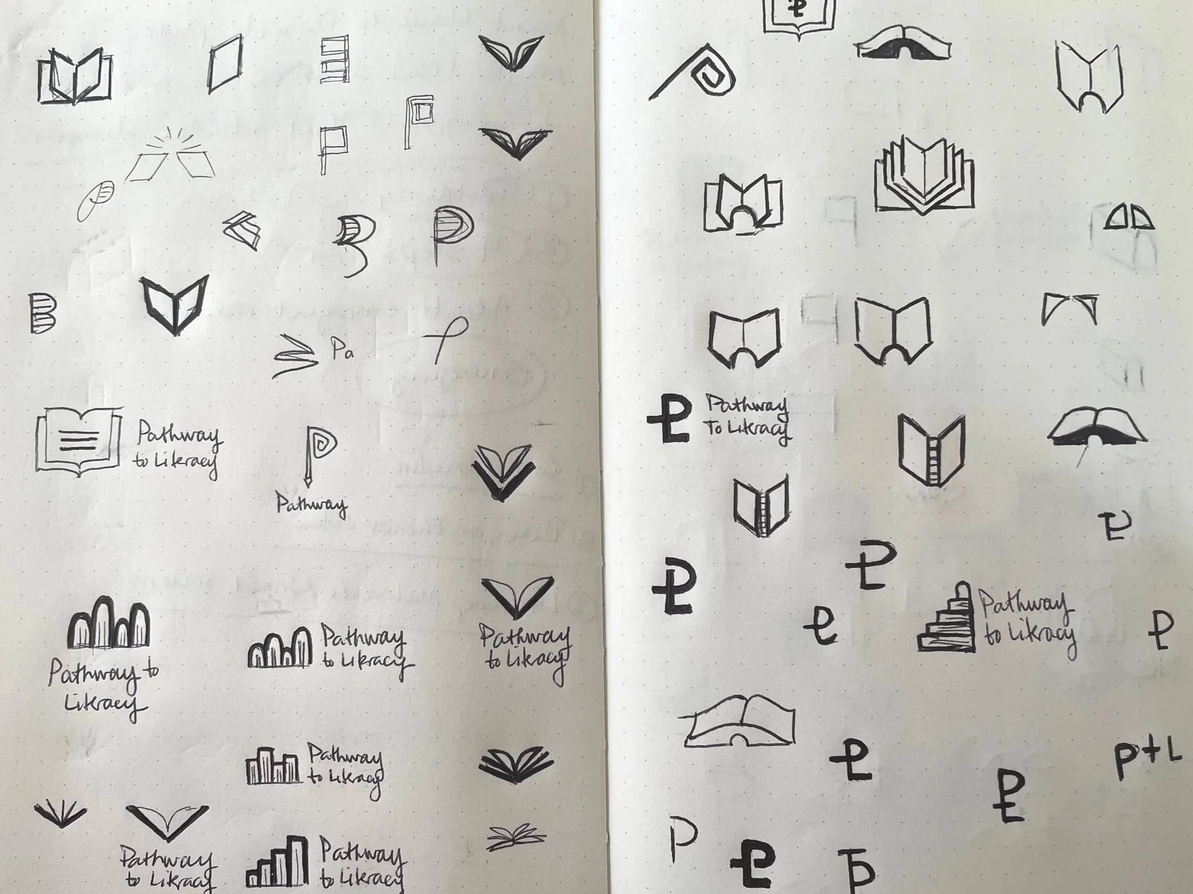
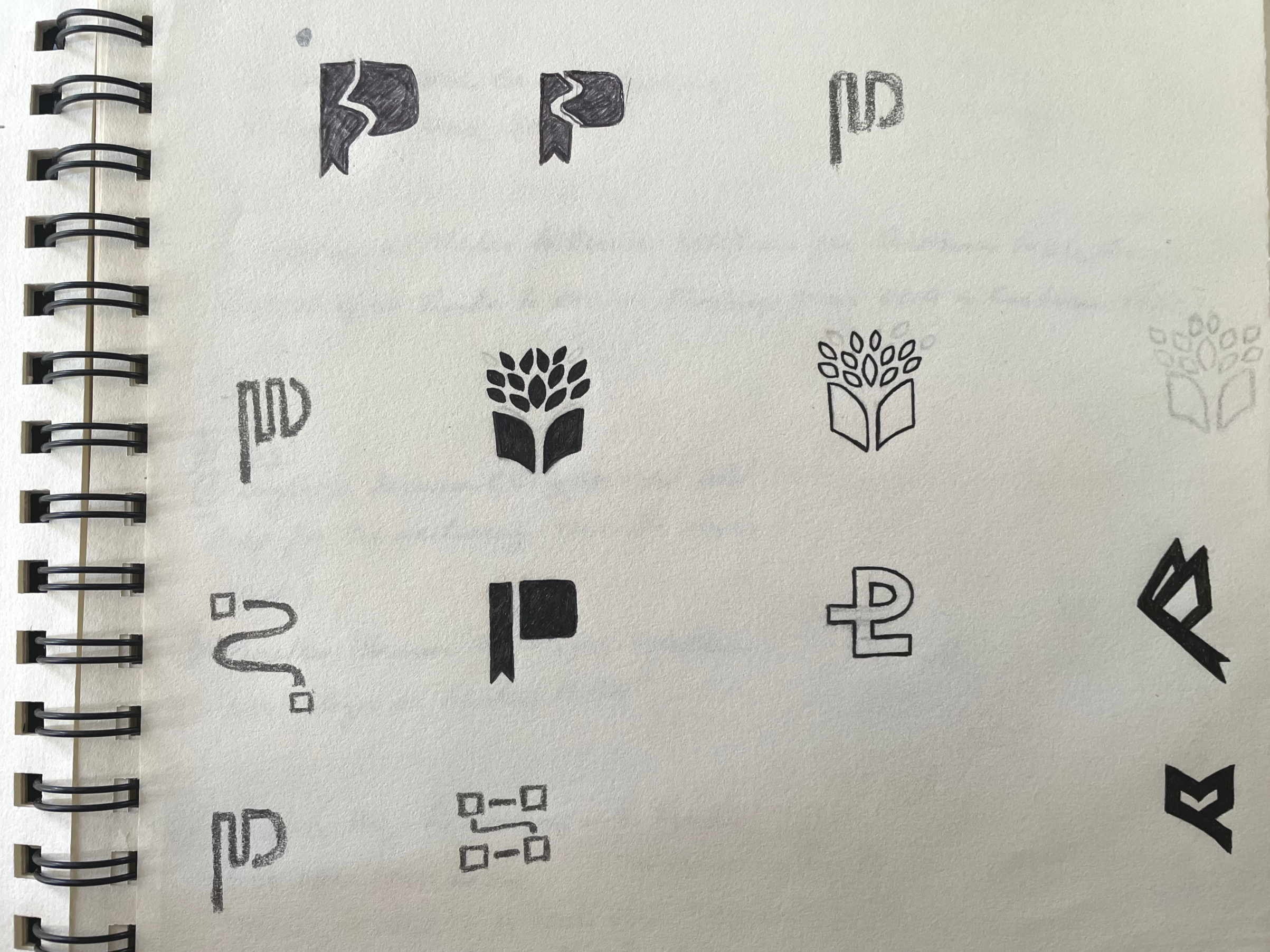
Every good mark starts with a deeper understanding. We began by unpacking the existing logo—its intent, its limitations, and how well it was working (or not) for the people it represented.
From there, we dug into the heart of the brand—its mission, values, and personality. The goal was to create something that felt friendly, dynamic, and welcoming.
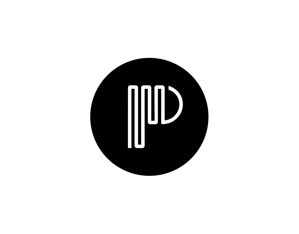
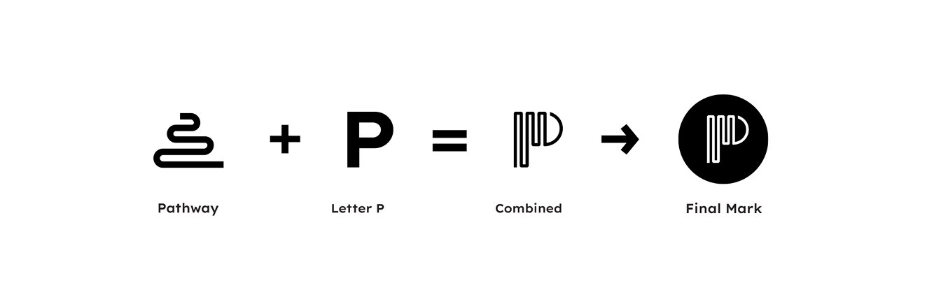
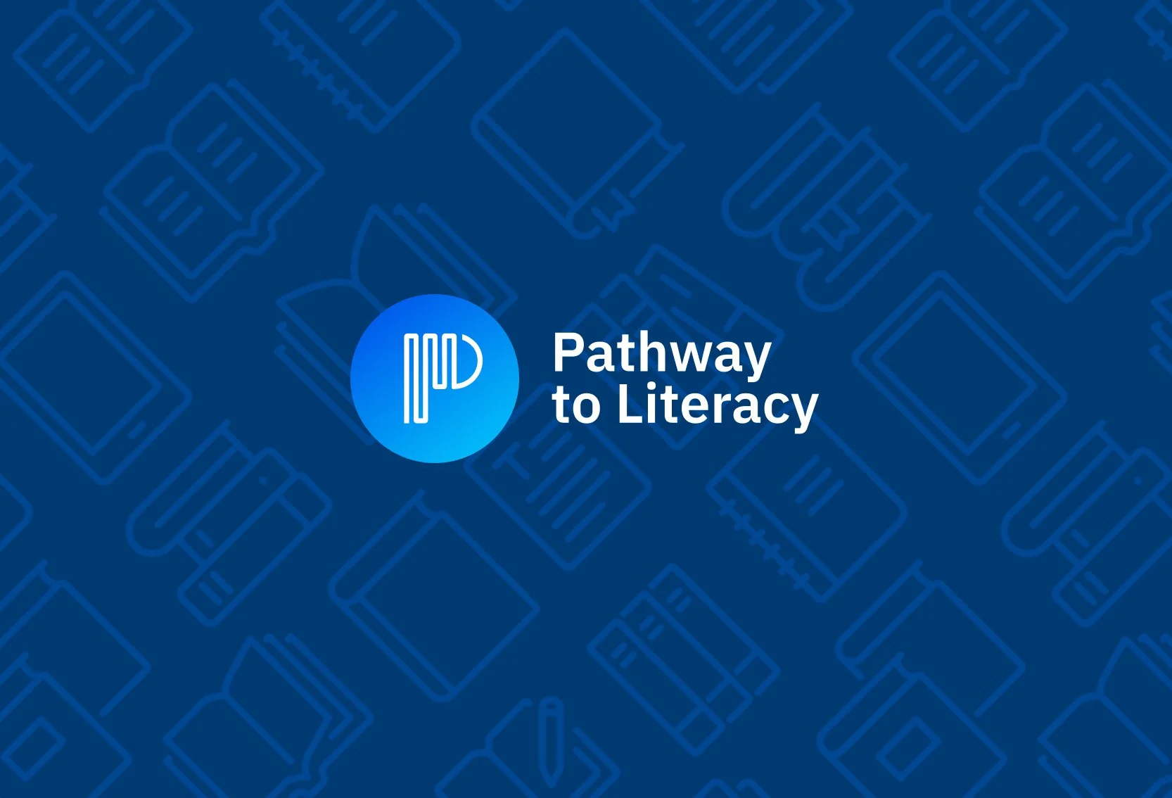
At the core were two elements: a pathway, representing progress and movement forward, and the letter “P,” grounding the mark in the brand’s name. The final step was placing the mark inside a circle, giving it a clear boundary and stronger presence. This brought everything together into a single, recognizable symbol that feels stable, approachable, and easy to use across different contexts. What started as an abstract idea became a simple, confident mark that communicates direction, learning, and growth at a glance.
The final mark was built by stripping the idea down to its most essential parts and rebuilding it with intention.
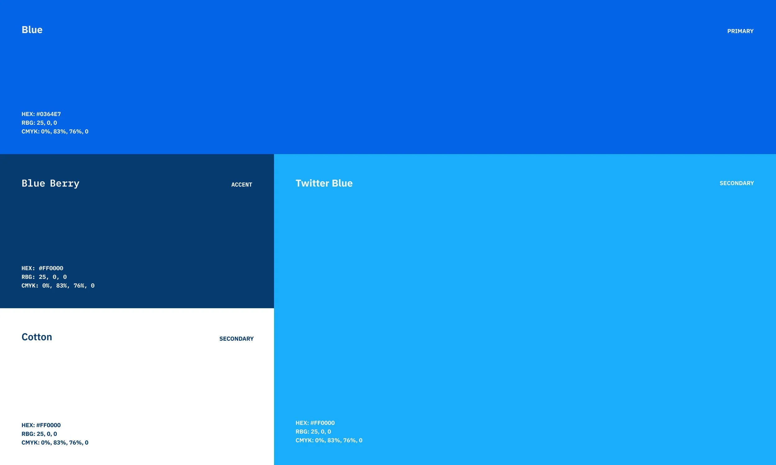
We created a visual system that’s clear, vibrant, and approachable—built to inspire confidence and progress.
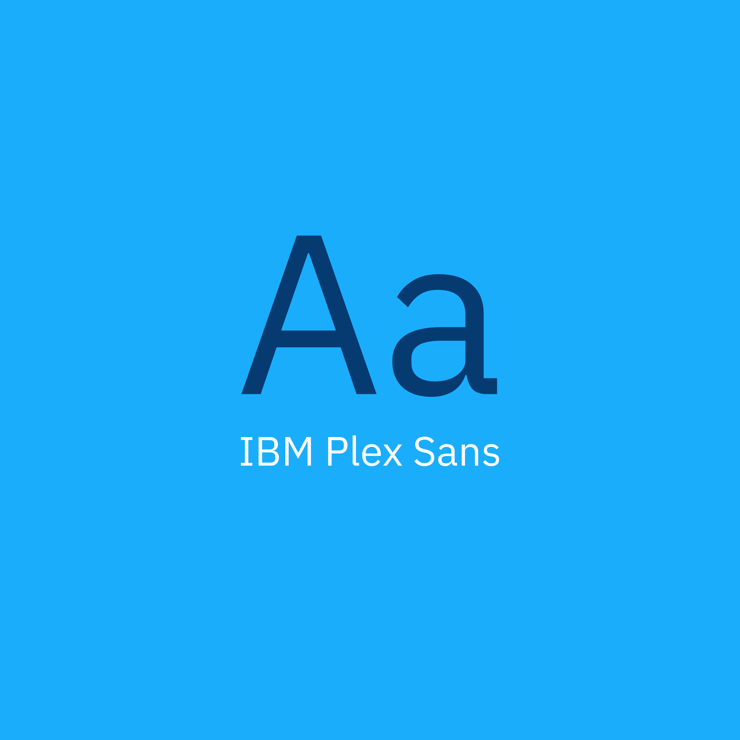
Balanced colors and structured typography keep it modern and accessible, while bright accents add energy and momentum, ensuring the identity supports forward movement.
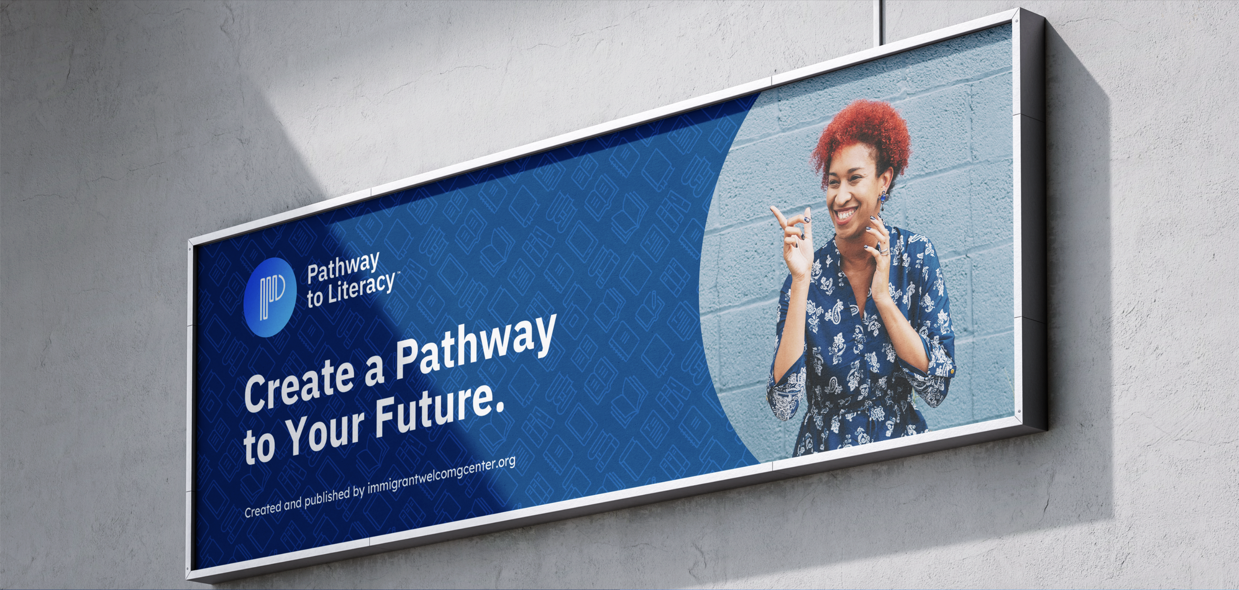
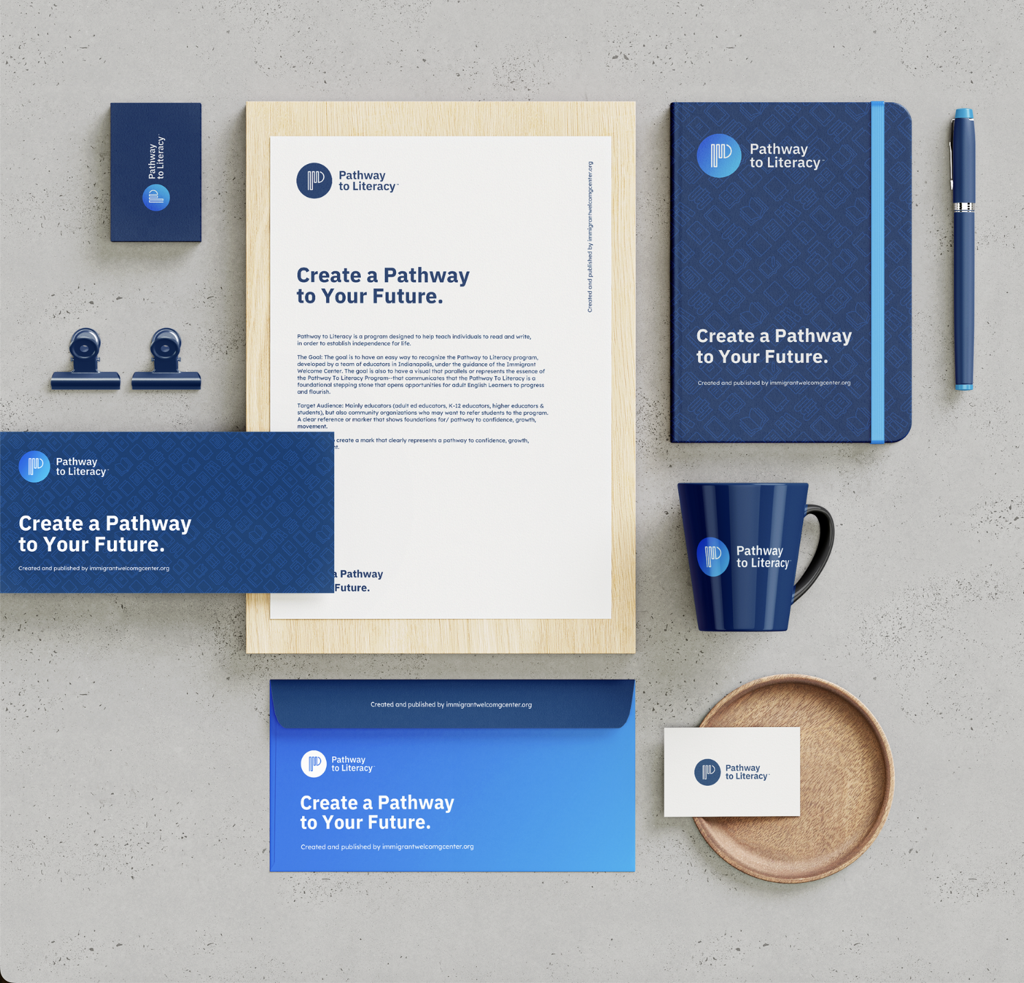
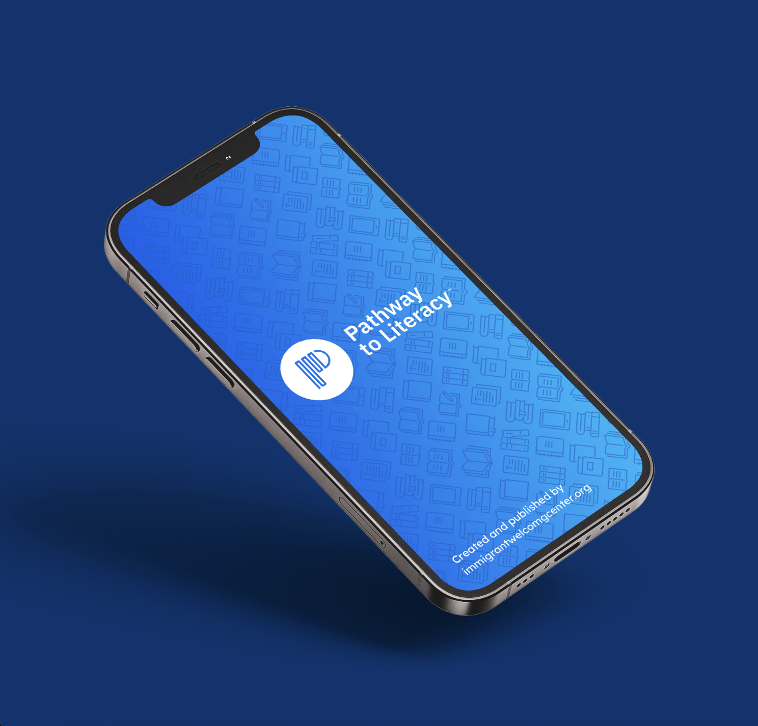
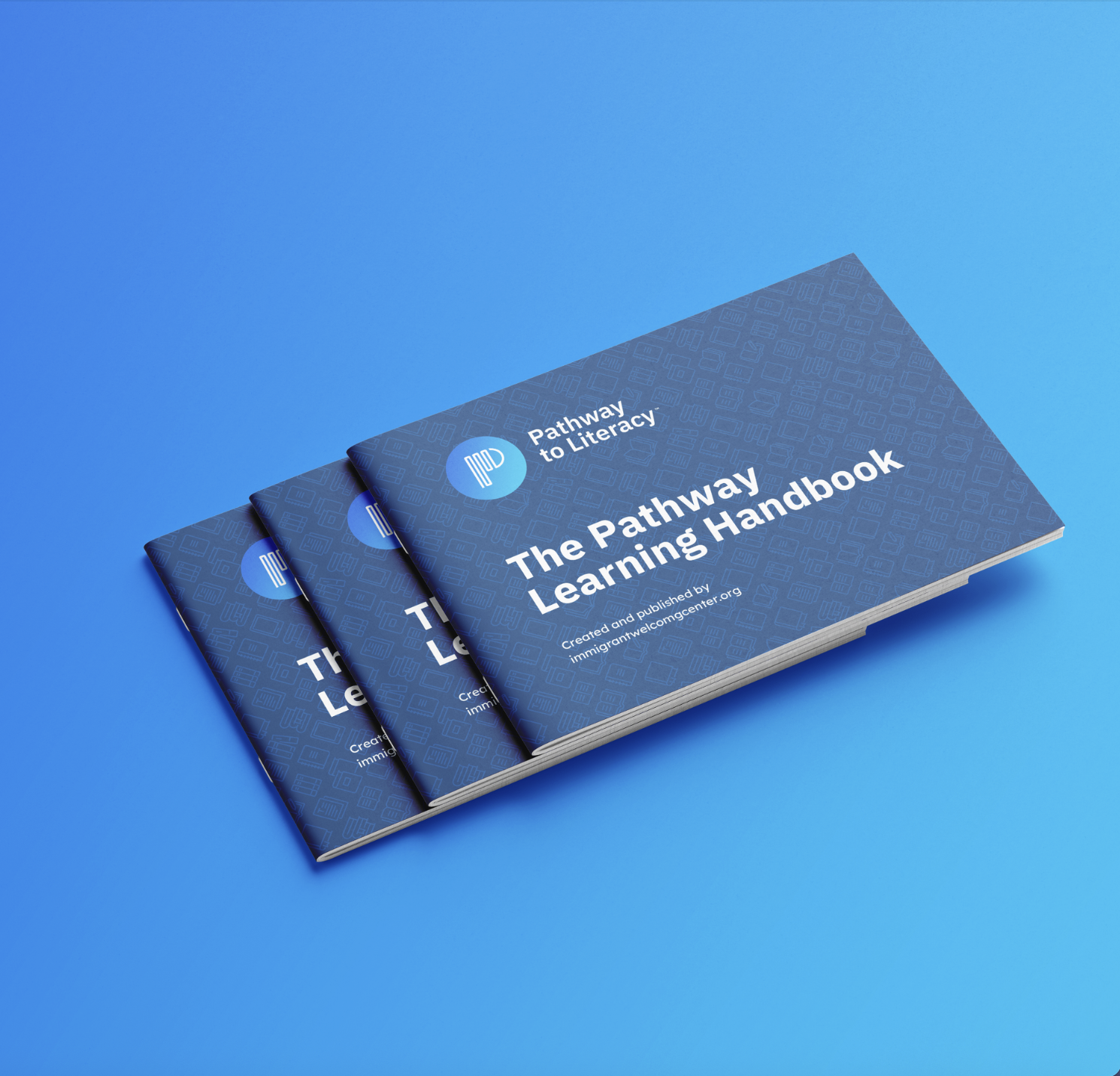
The system was built to show up clearly wherever people encounter it. Whether it’s on a billboard, a handbook, printed materials, or a mobile screen, the identity stays consistent and easy to recognize. Bold color fields help key messages stand out, while simple layouts keep the focus on people and progress—not decoration. Photography brings the work to life by showing real moments of learning and connection, grounding the brand in human experience. Together, these pieces create a visual language that feels confident, welcoming, and active—supporting the mission across physical spaces, digital platforms, and everyday touchpoints.