
Tricare for Life
TRICARE For Life’s legacy portal was dense and confusing, making it hard for aging military users to access vital healthcare info. We redesigned the experience for clarity, accessibility, and ease—improving usability across devices and reinforcing trust, care, and professionalism.
Deliverables
▸ Discovery
▸ User Flows & Wireframes
▸ UI/UX Redesign
▸ Design Systems

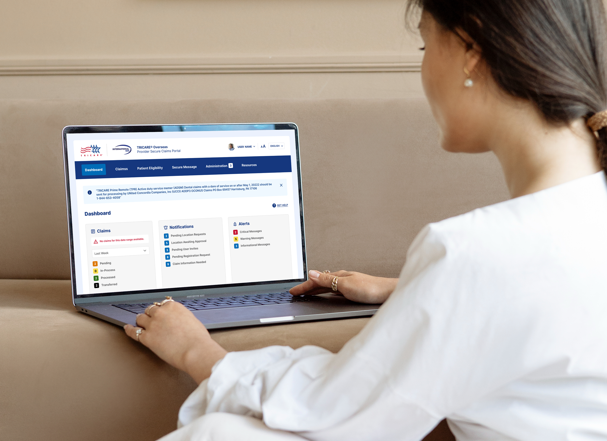
Enhancing Healthcare Access for Military Families
Streamlining the Experience to Better Serve Those Who’ve Served.
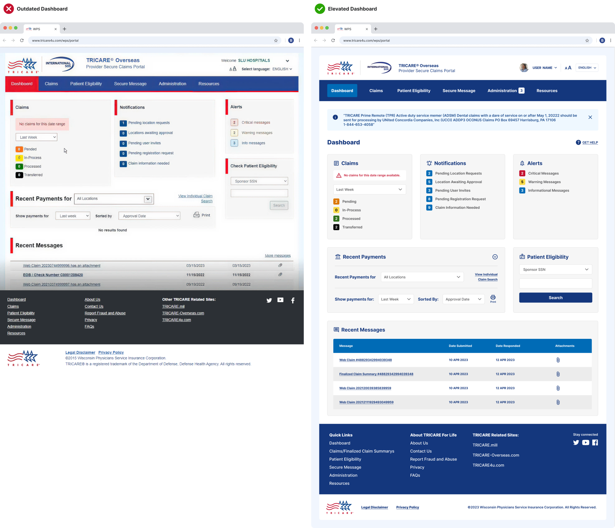
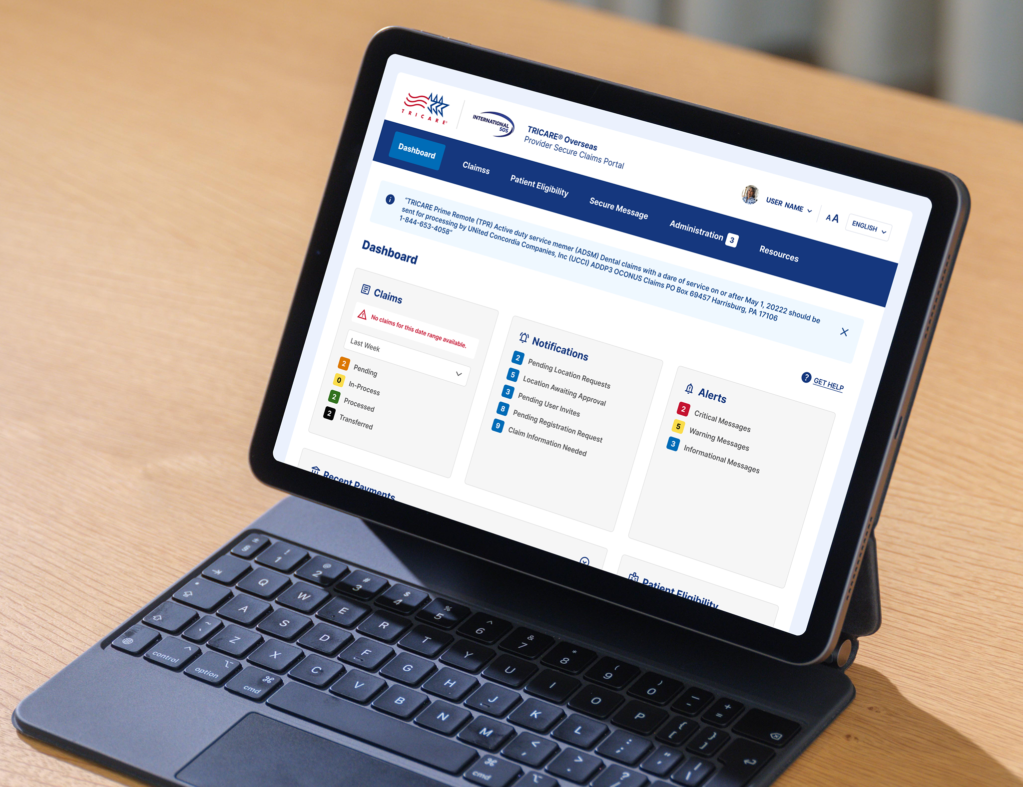
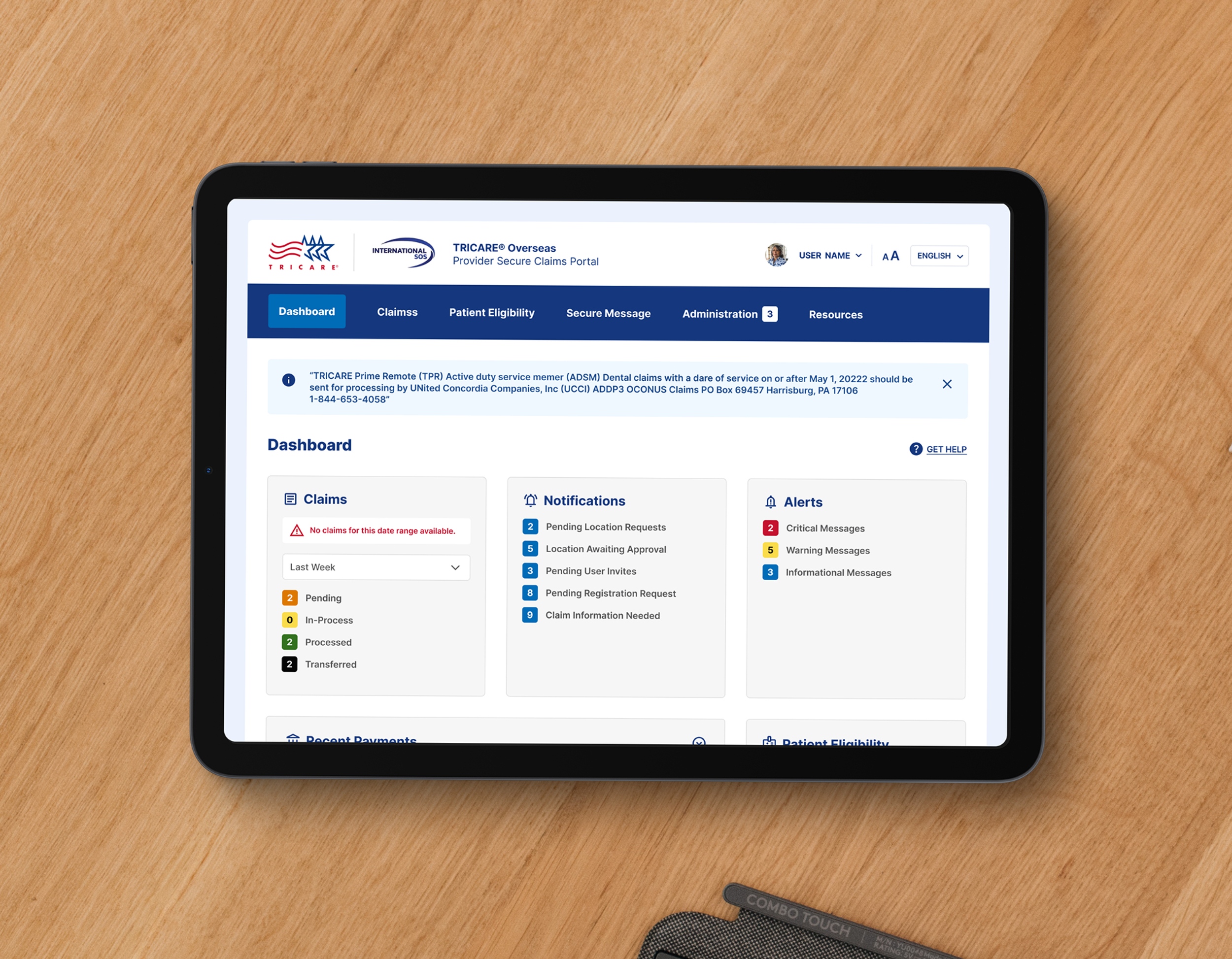
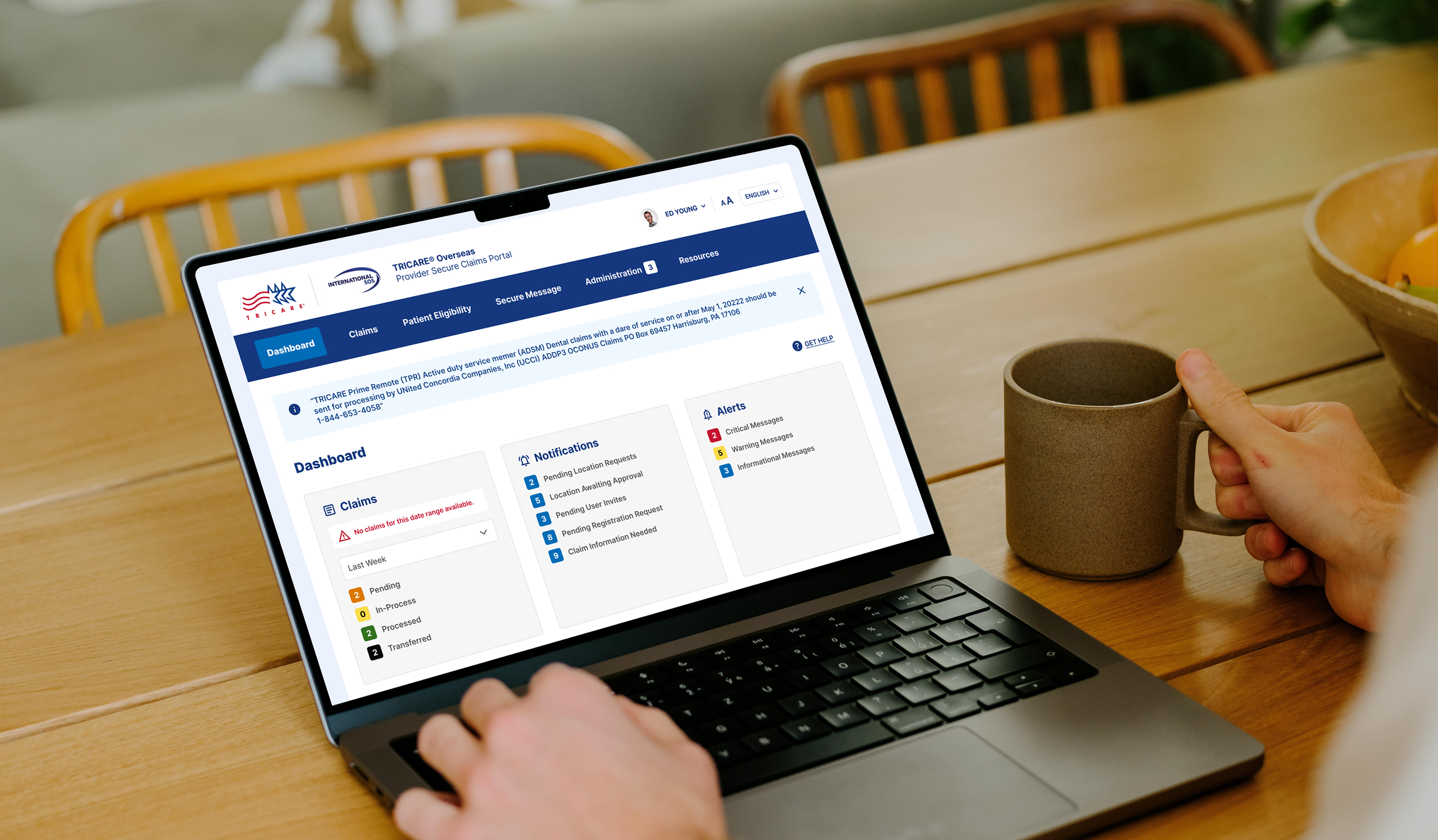
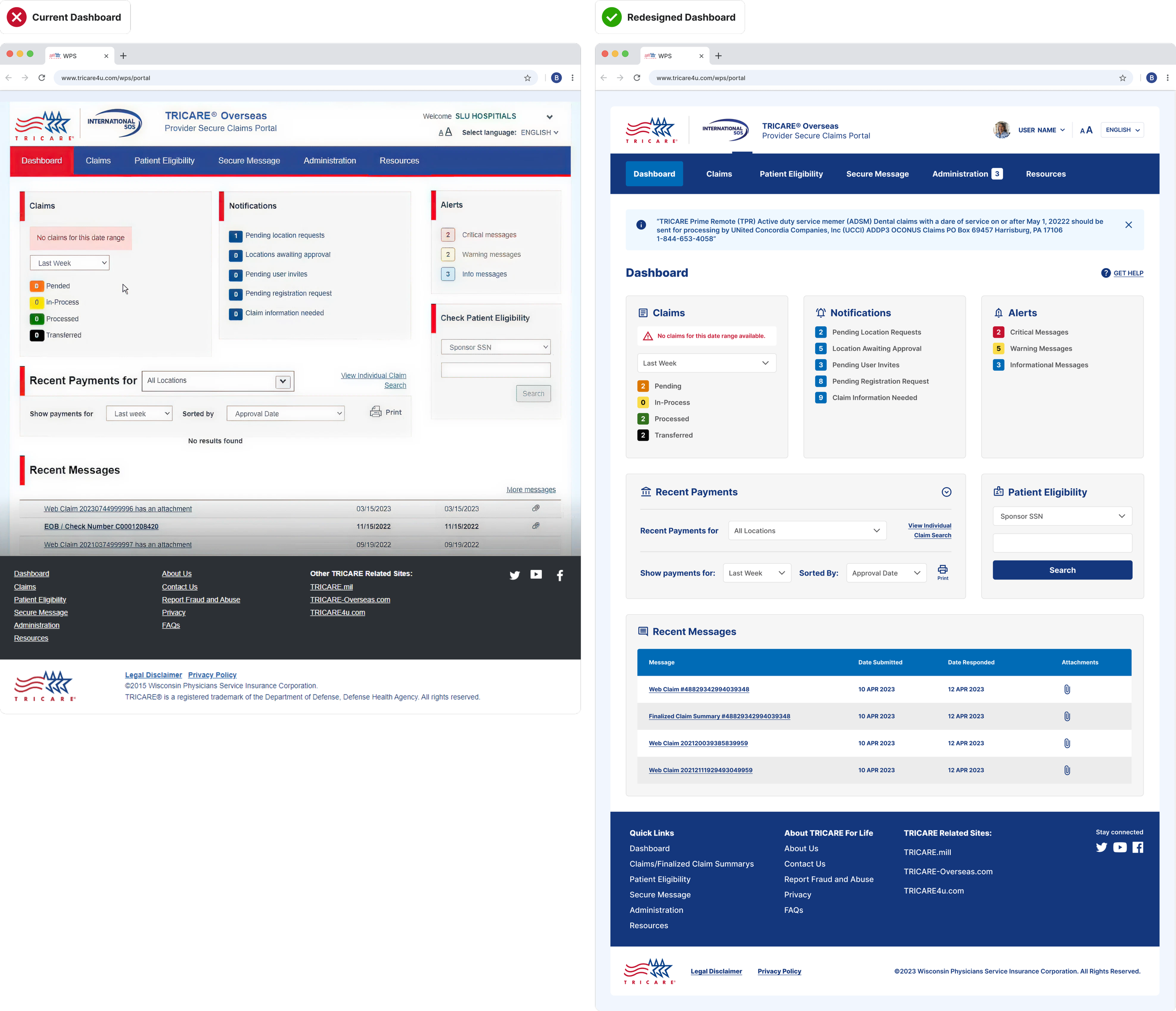
The redesign aimed to enhance usability, aesthetics, and backend functionality, creating a seamless user experience while boosting business efficiency. This case study focuses on a key aspect of the redesign—the dashboard—a critical section reimagined to meet both user and business needs. Below shows the before and after redesign.

The Negative Impacts of Outdated Interface
01 — Negative Impacts
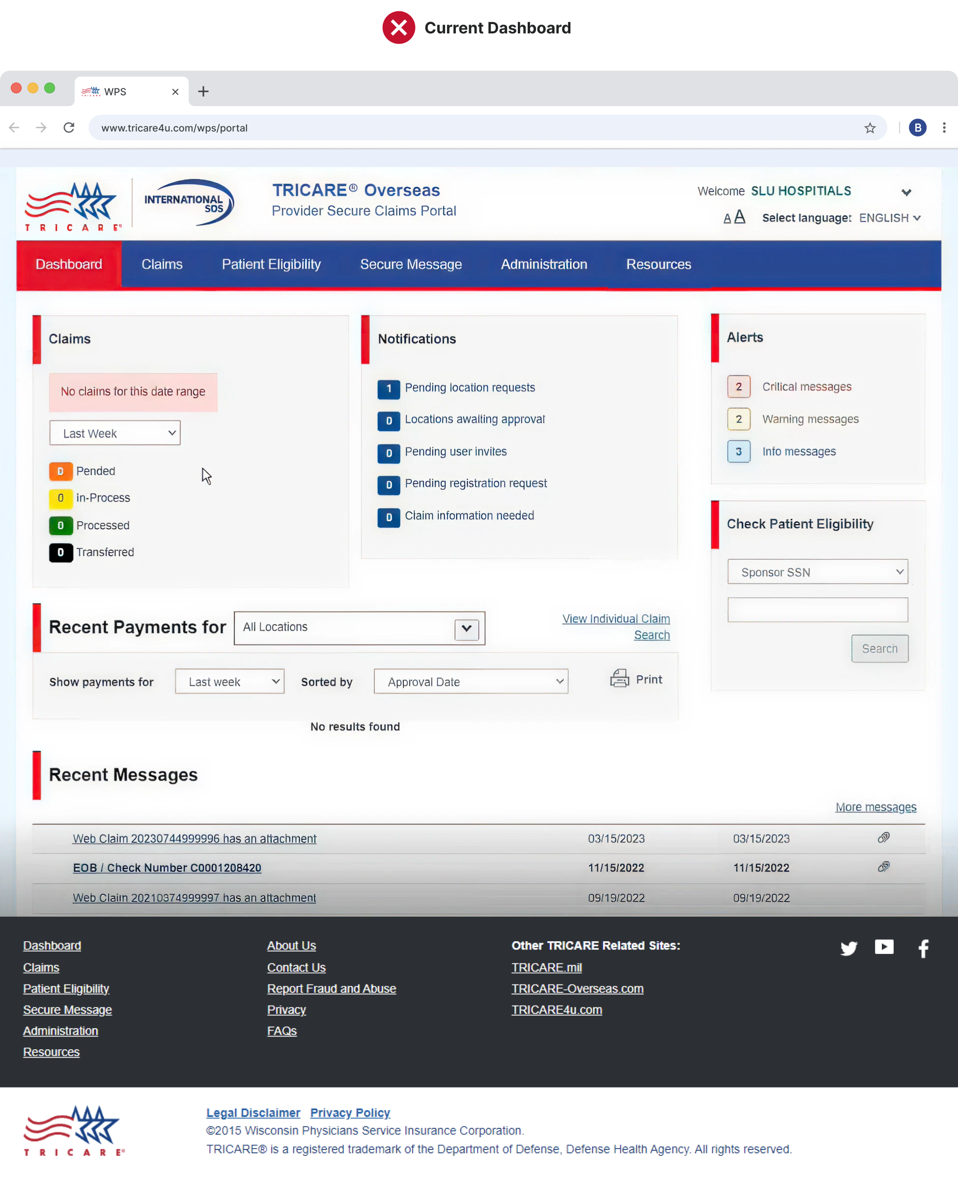
The original design suffered from confusing navigation, missing page labels, and inconsistent visual elements—leaving users disoriented and frustrated. Inconsistencies in spacing, card sizing, and treatments disrupted the page flow, making it harder to scan and adding visual clutter. Unnecessary details, like red highlights and decorative lines, increased cognitive load and reduced overall clarity and efficiency.
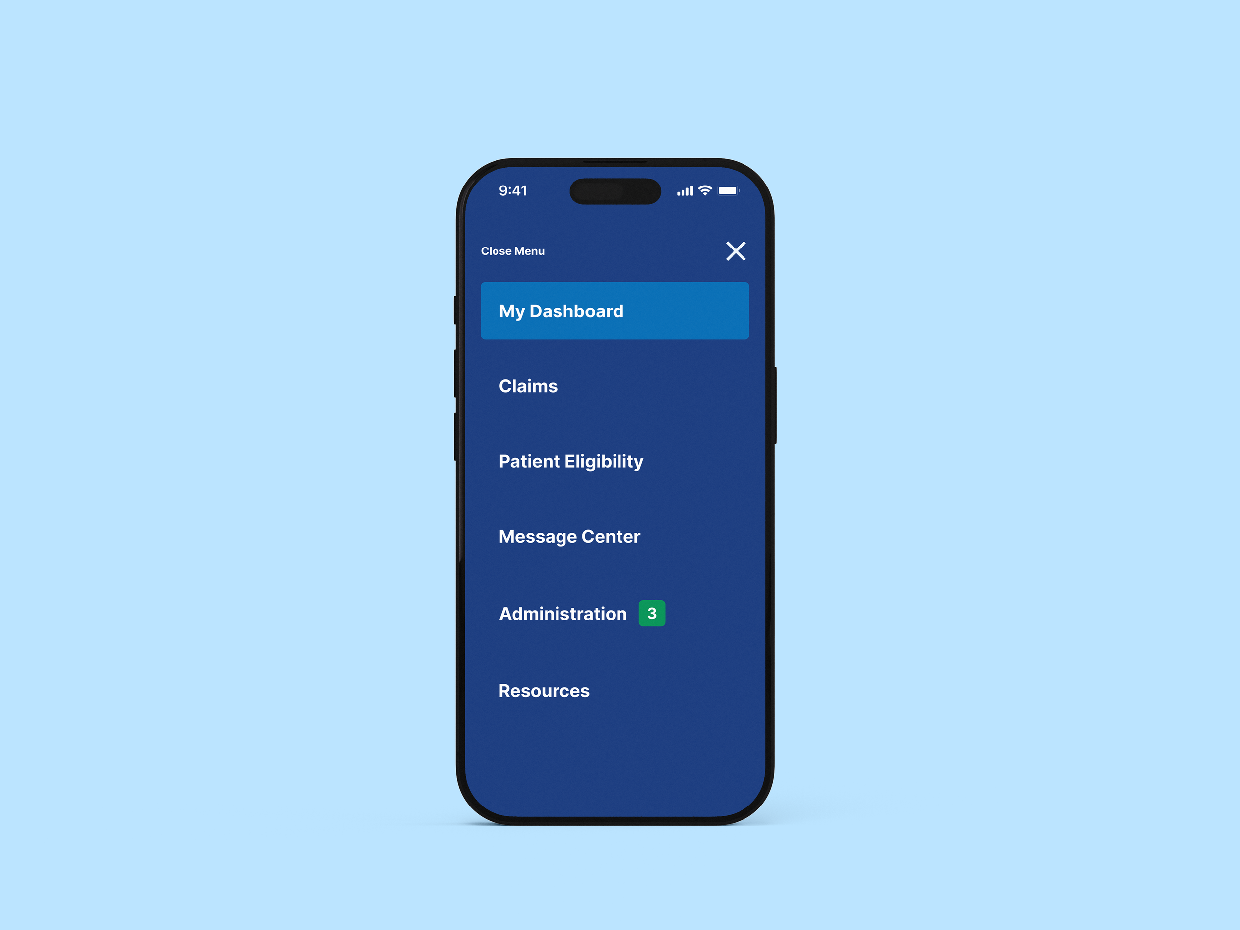
Cleaning Up Confusing Navigation
Red is commonly associated with errors or alerts, making it a poor choice for navigation. In the original design, the use of red—both in tab highlighting and the underline—sent mixed signals and added unnecessary visual noise. The updated navigation uses a calmer, more intuitive color system that improves clarity, reduces distraction, and better aligns with user expectations.

Fixing Flow to Reduce Friction
Inconsistent card sizing and spacing disrupted the visual flow, making it harder for users to scan content, complete tasks, and stay oriented. These small inconsistencies increased cognitive load and slowed down efficiency across the page.
By simplifying the layout and standardizing card structure, we created a clearer visual hierarchy. Removing distractions helped direct focus to the content that matters—making the experience faster, more intuitive, and easier to navigate.
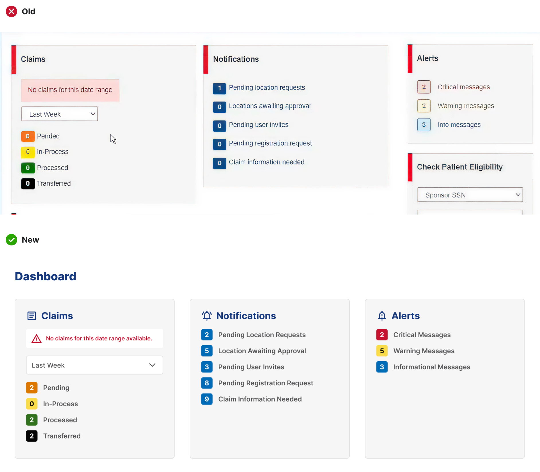
By removing distracting elements, attention is redirected to the card content. Consistent spacing and card sizing create a clear structure, making it easier for users to scan, find information quickly, and reduce cognitive load.
Card Treatment

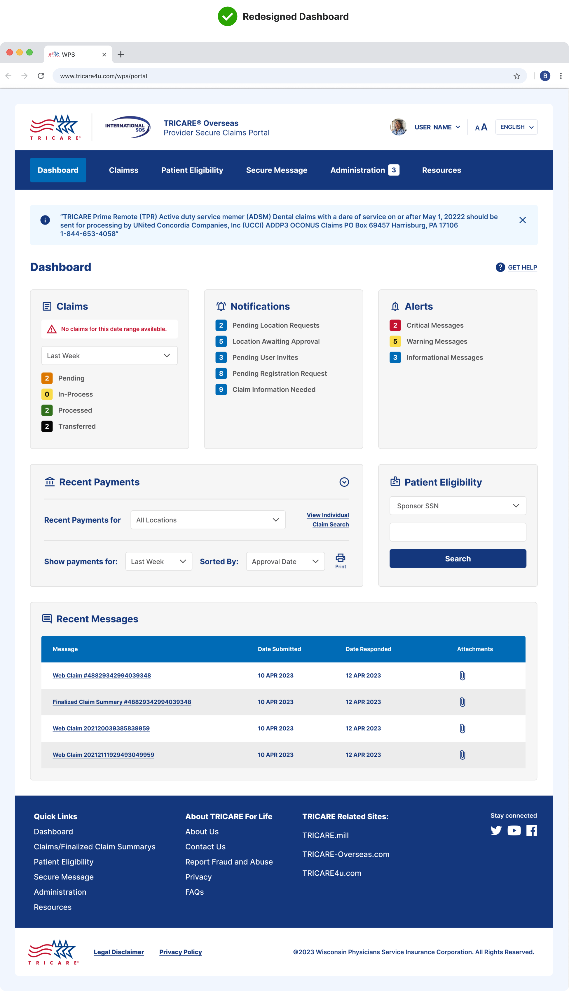
02 — The New UI
The new dashboard puts the user first—replacing visual noise and unclear pathways with intuitive structure and thoughtful spacing. Clear labels, simplified cards, and a refined hierarchy help users move through tasks with greater ease, building trust in both the platform and the brand behind it.
Elevated Dashboard
Confused to Clarity
The original dashboard was dense, visually inconsistent, and hard to navigate—leaving users confused and overwhelmed. Missing page labels, unclear navigation, and disjointed card layouts made it difficult to find key information quickly. The redesigned experience brings structure, clarity, and visual balance to the interface. With consistent spacing, simplified components, and a clear visual hierarchy, the new layout guides users effortlessly through tasks—boosting confidence, reducing friction, and reinforcing the credibility of the brand.