

Horizon Central at CityWay
Horizon Central Church serves the downtown Indianapolis community and beyond, offering a modern, welcoming space for all. The brand reflects a forward-thinking vision, symbolizing a look from the present horizon into the future. The identity is designed to be fresh, non-traditional, and distinctive, fitting seamlessly with the vibrant City Way area and its surroundings.
Deliverables
▸ Discovery
▸ Brand Identity Design
▸ Typography
▸ Color Palette
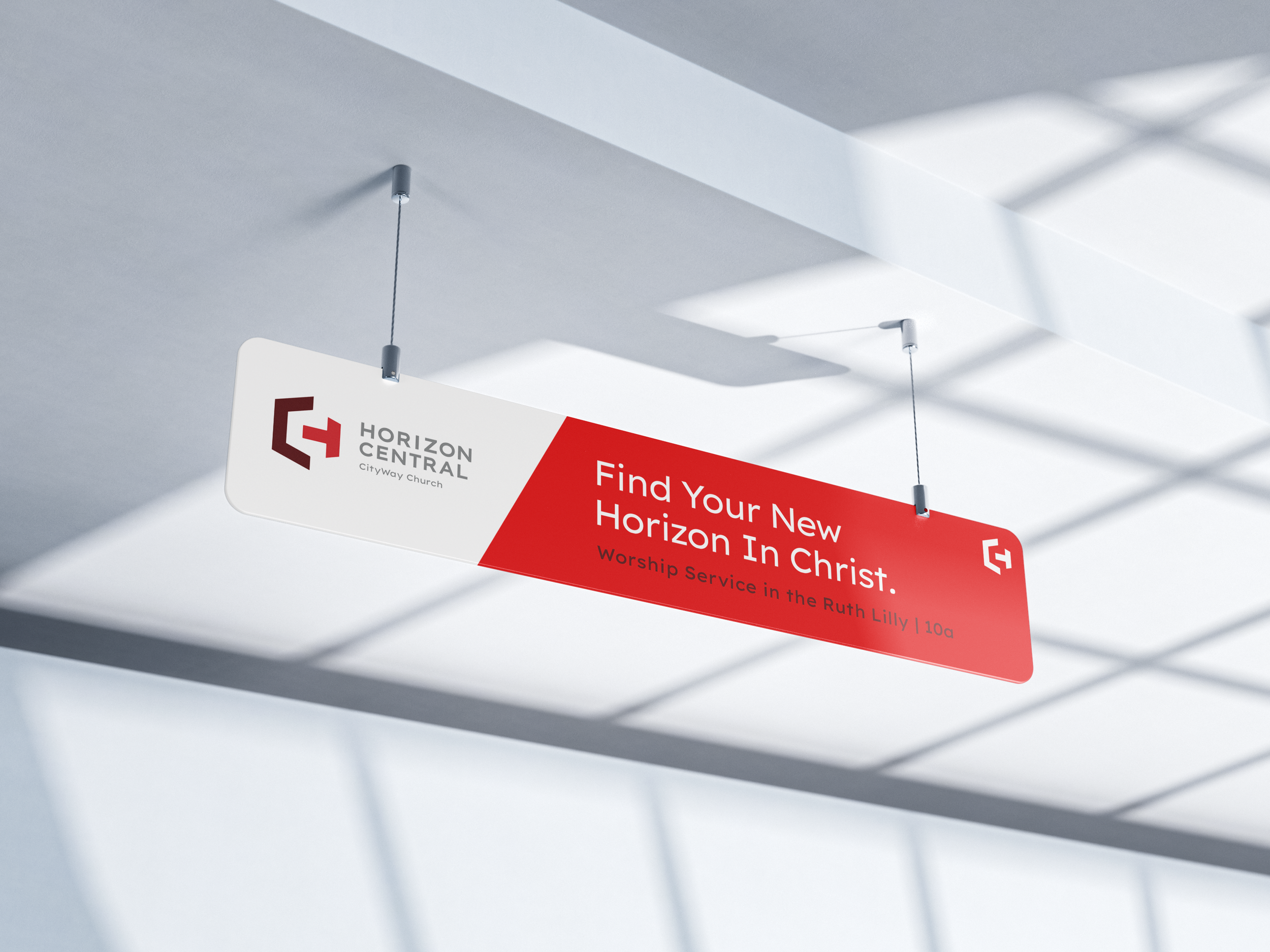
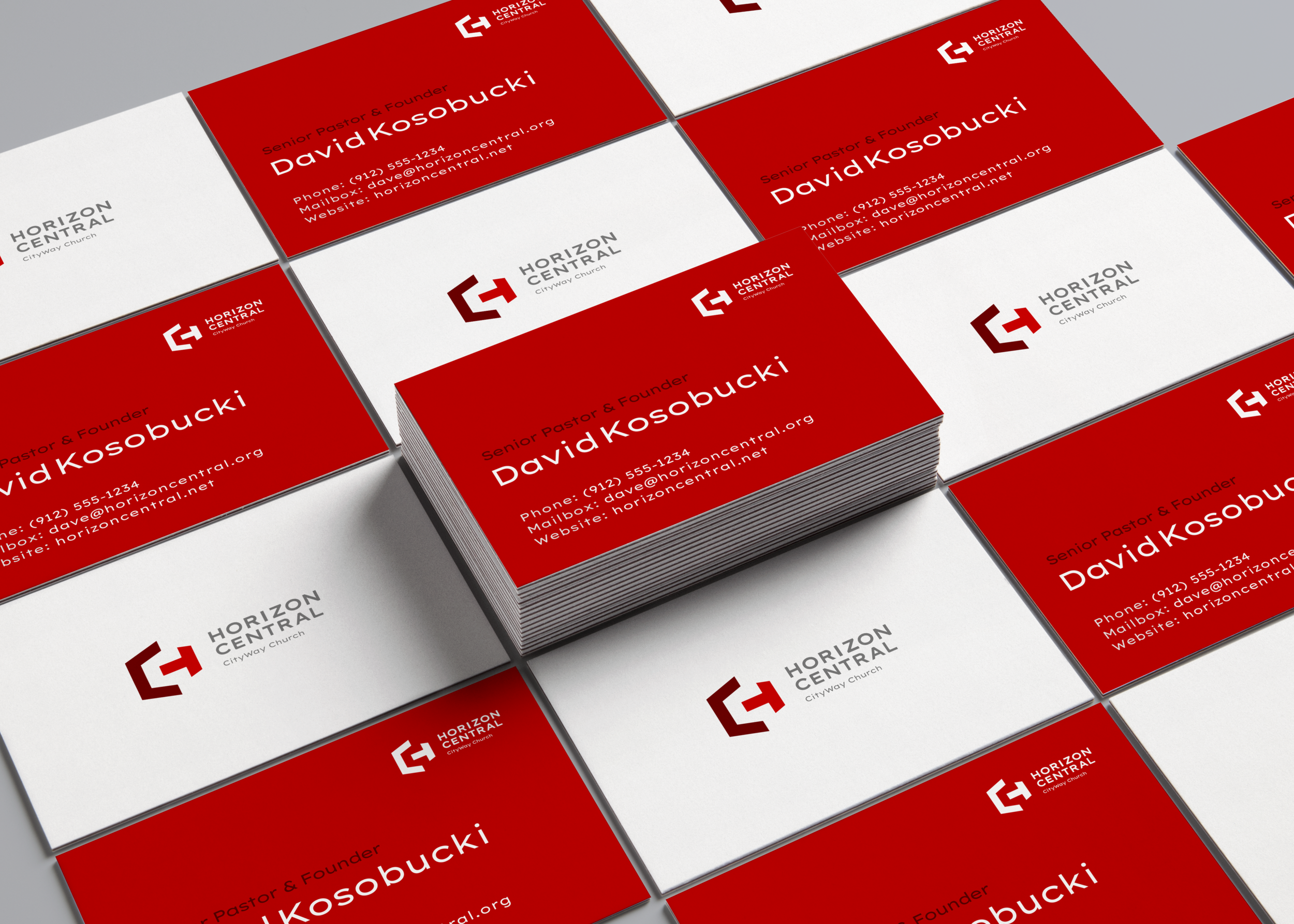
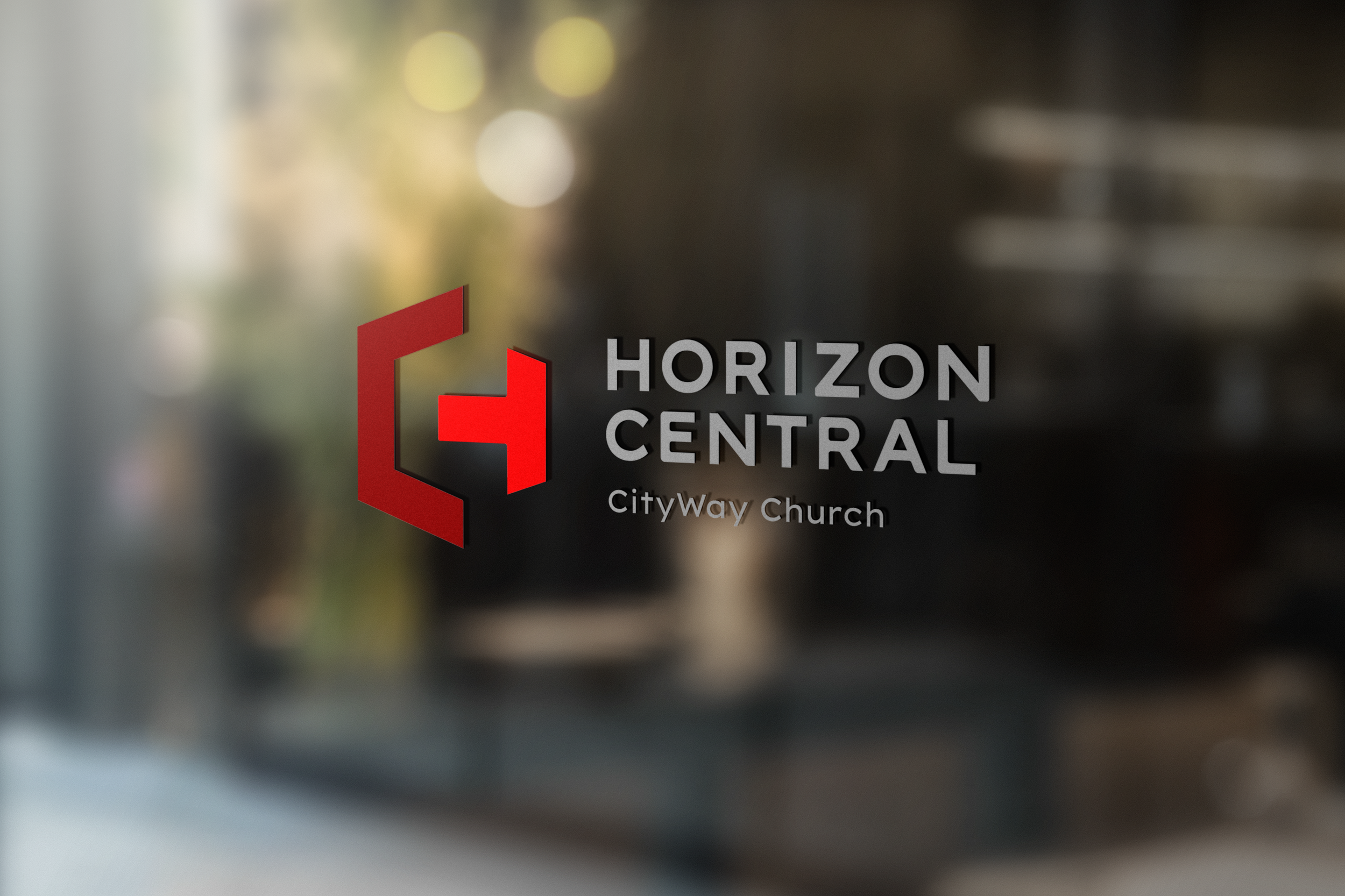
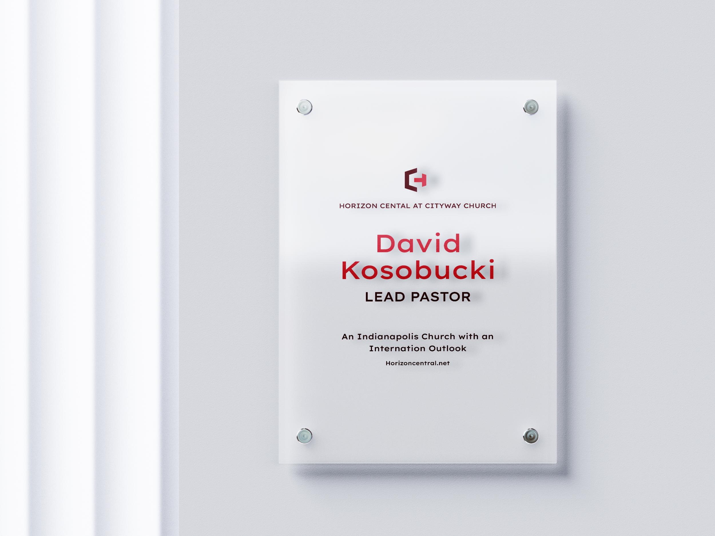
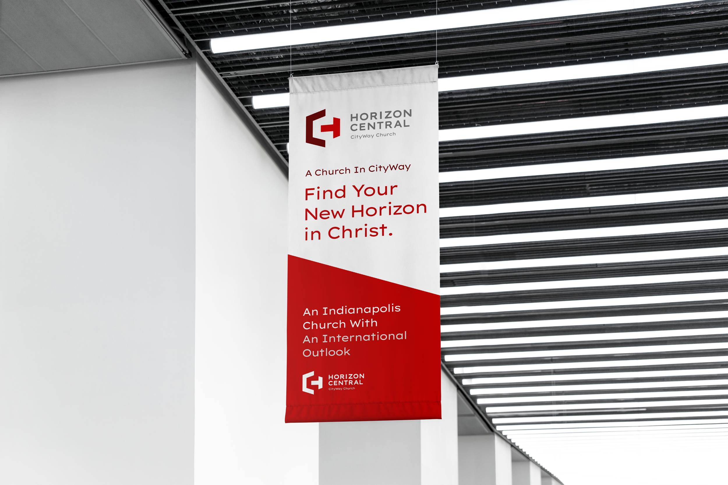
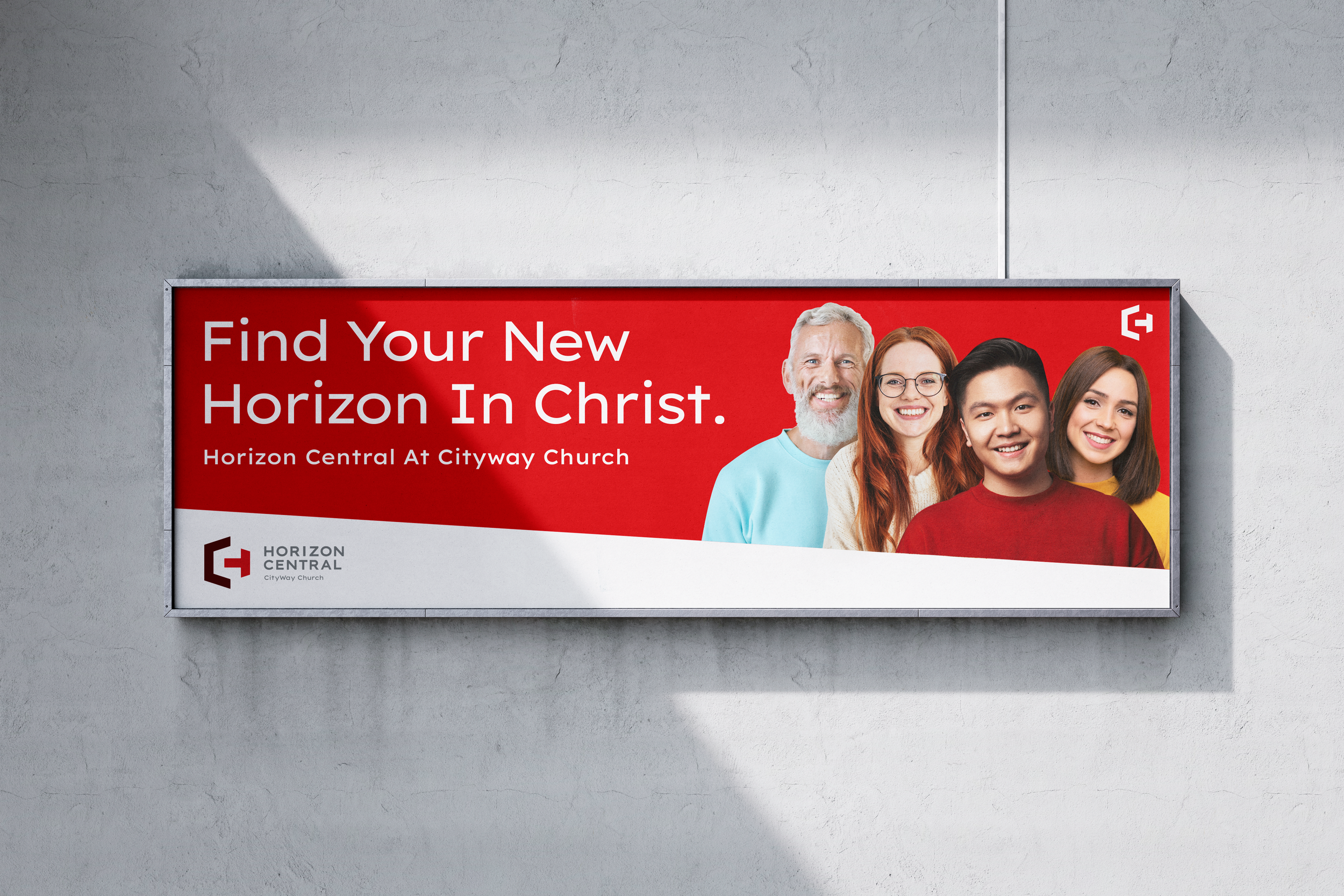
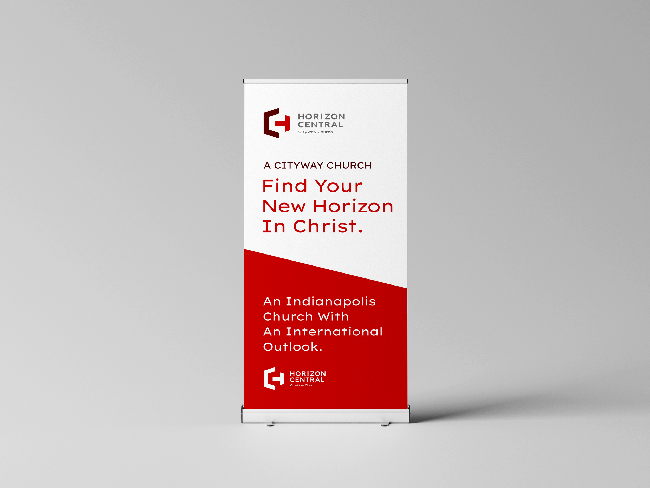
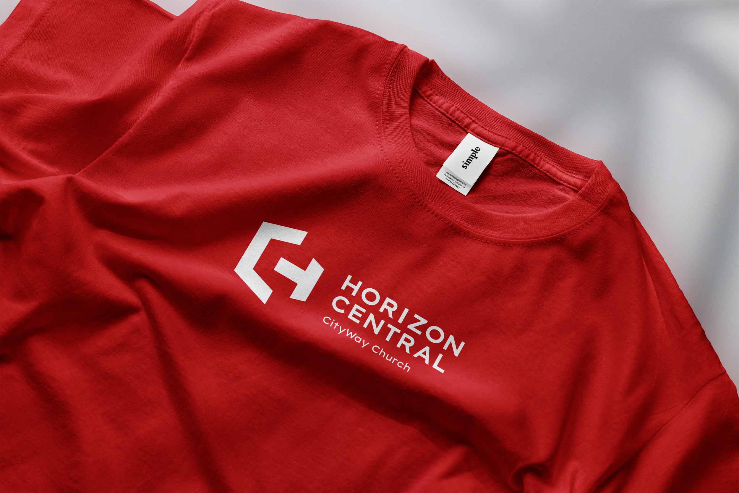
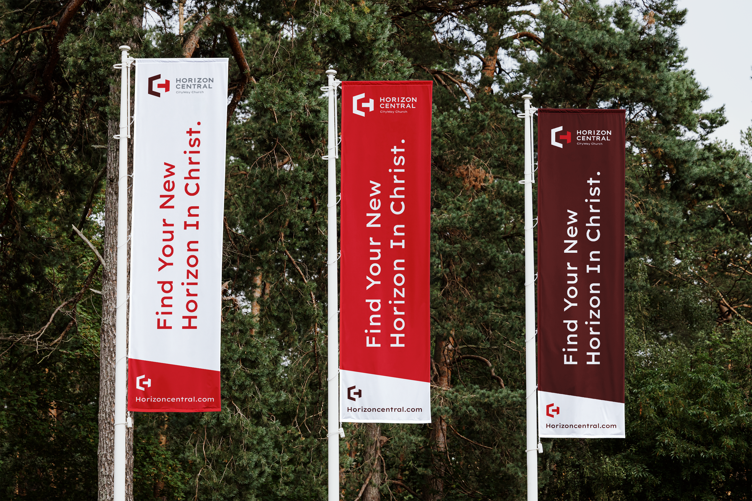
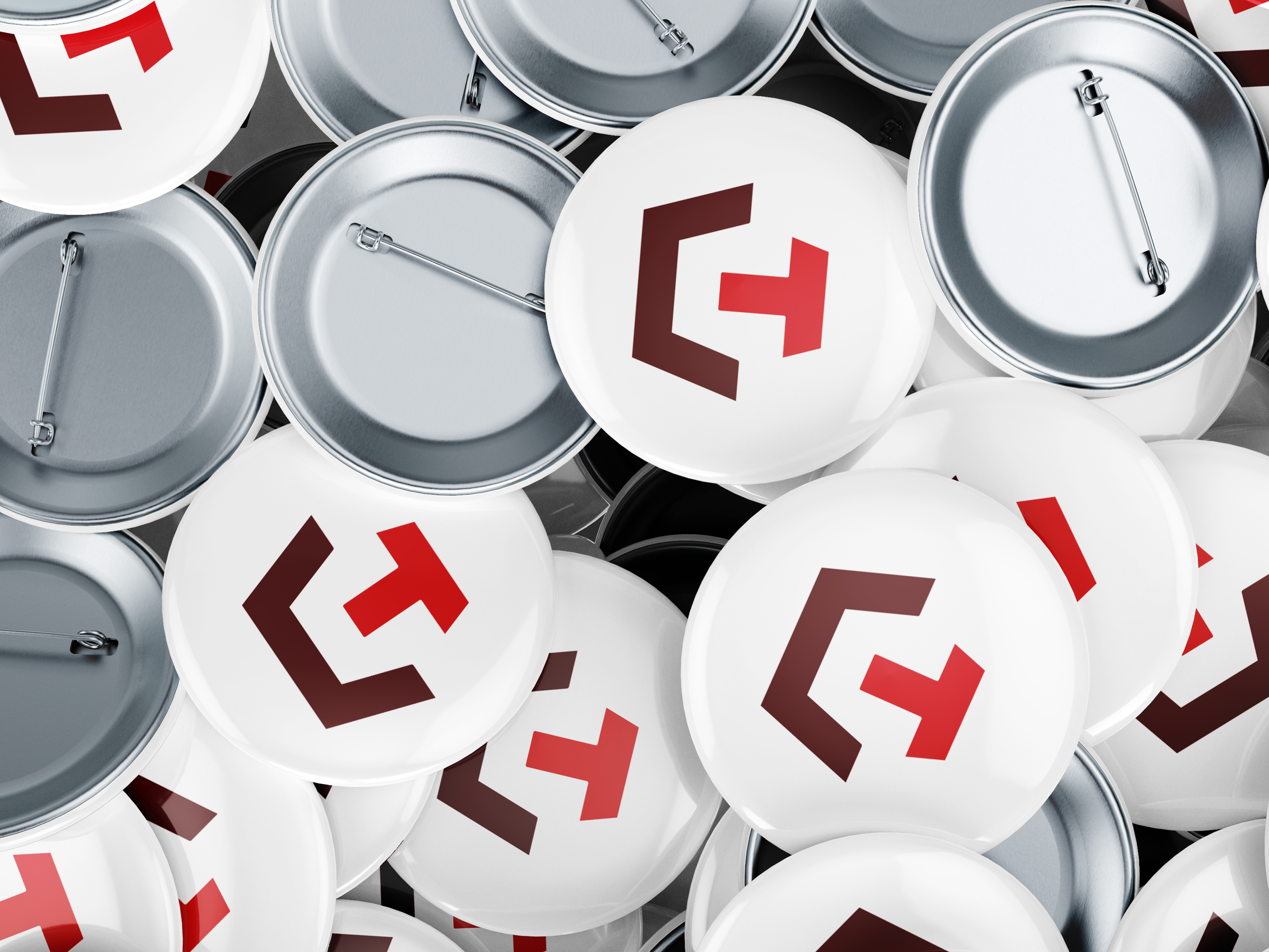
▸ Signage & Collateral

Designed With Vision. Built for Impact.
A New Bold Identity for The Future
Horizon Central’s former identity lacked clarity and energy—misaligned with the vibrant, forward-thinking spirit of the church. The refreshed mark simplifies the message while injecting modernity and strength. Designed to reflect momentum, warmth, and place, the new look positions Horizon as a cornerstone in the CityWay community.
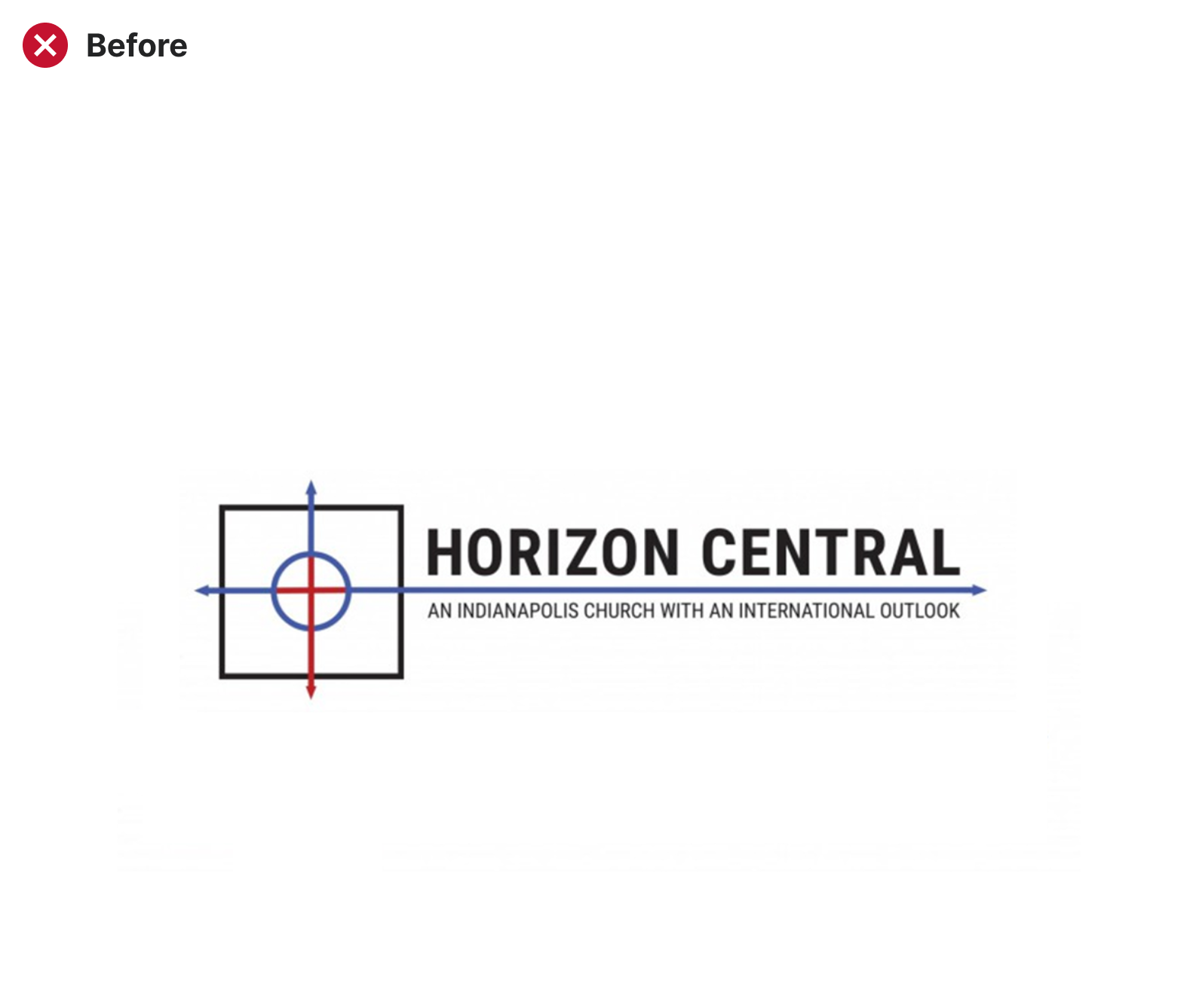
Original Identity

Elevated Identity

Original Logo
01 — Before the First Sketch
Development Process
We started by grounding the work in purpose—getting clear on the brand’s mission and how it needed to show up for its people. After unpacking the current logo’s meaning and limitations, we explored core values like warmth, growth, and clarity. That insight revealed the disconnect: the old mark aimed to say a lot, but didn’t speak clearly. The goal? A design that could carry meaning and feel modern, open, and true to the brand’s voice.
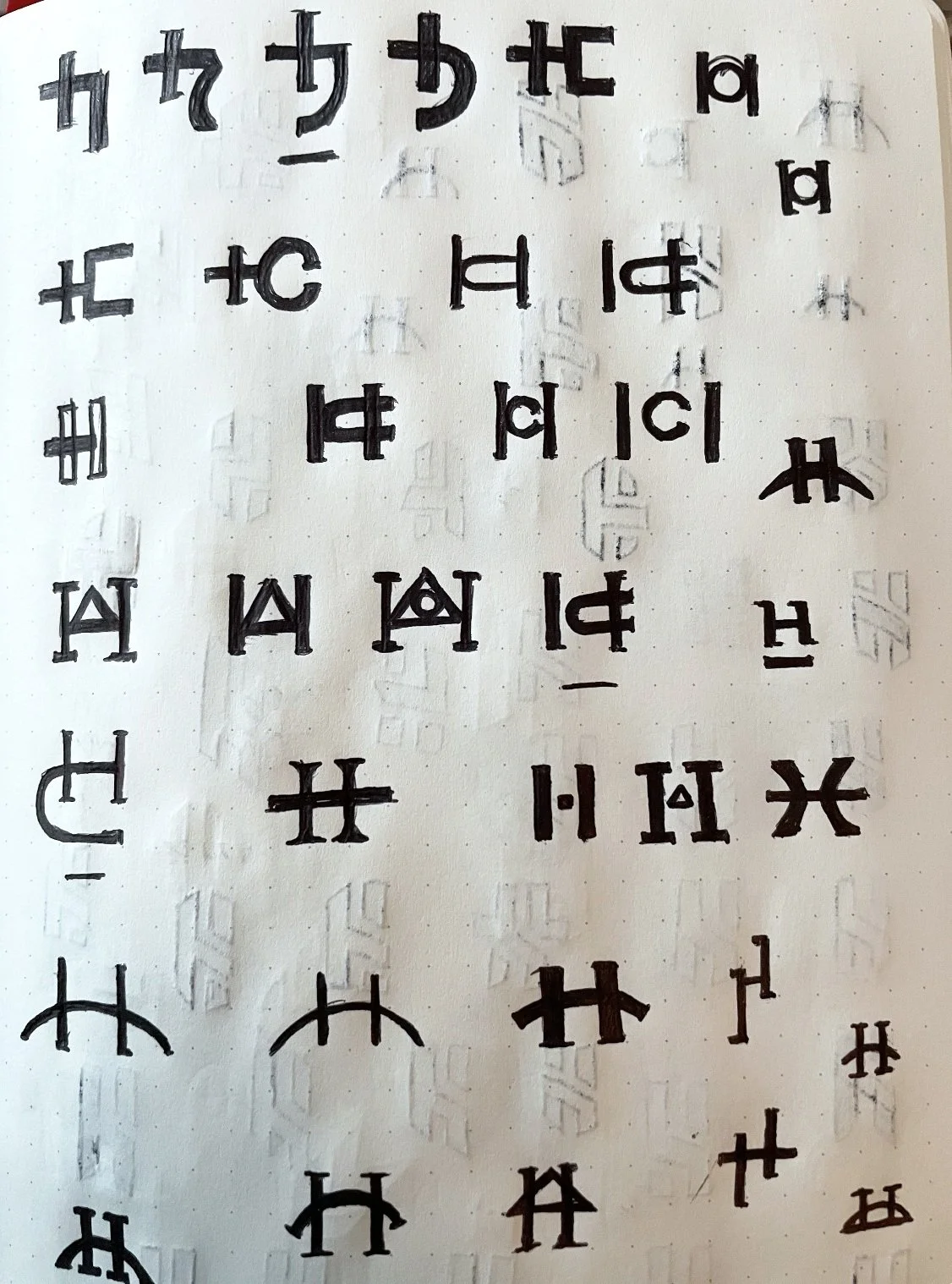
Rough Draft Sketches & Concepts.
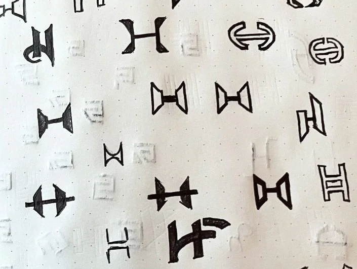
Rough Draft Sketches & Concepts.
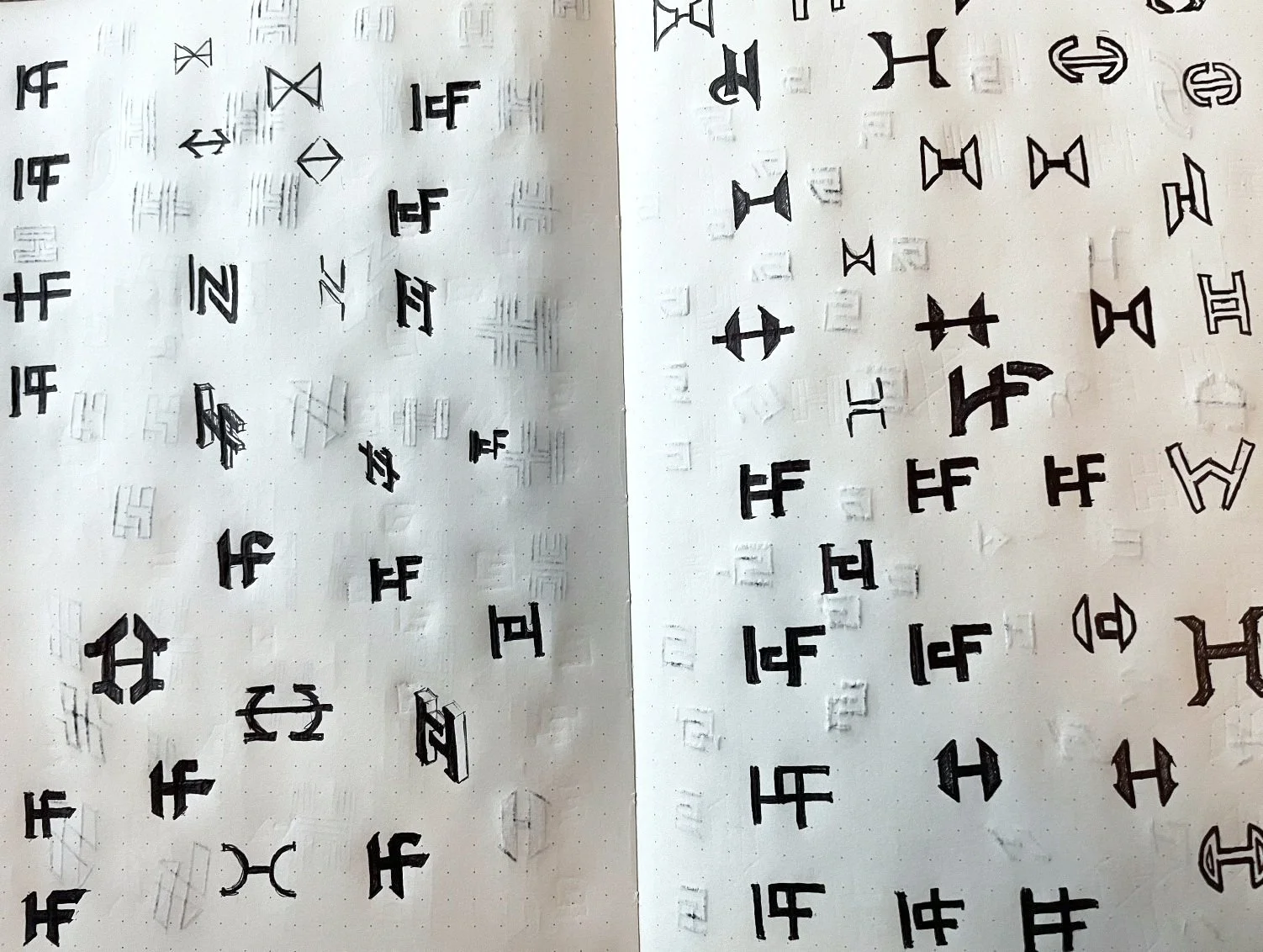
Rough Draft Sketches & Concepts.
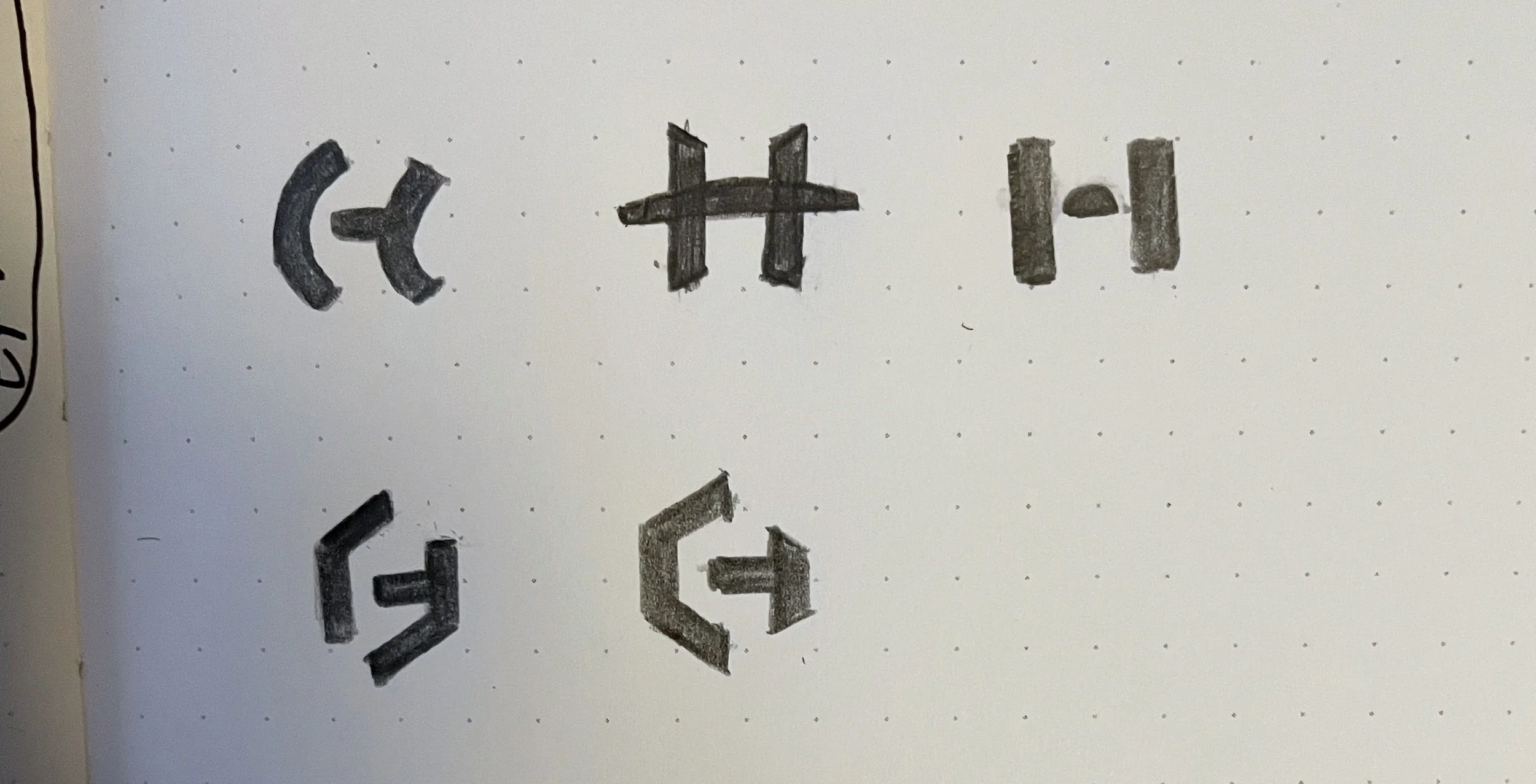
Rough Draft Sketches & Concepts.
Rough Draft Sketches & Concepts.
Emerged Sketches

An Emerged Concept
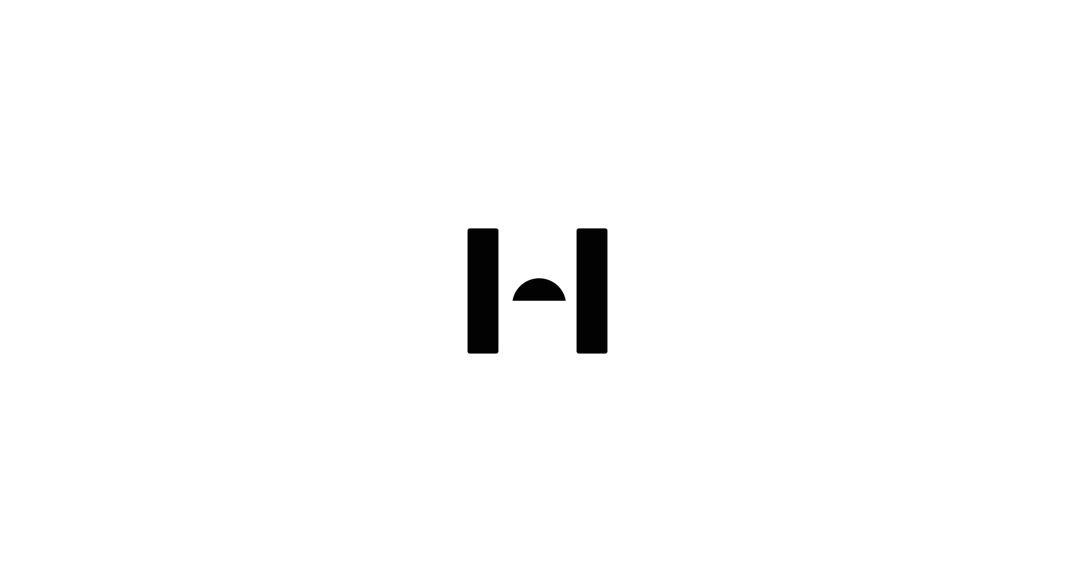
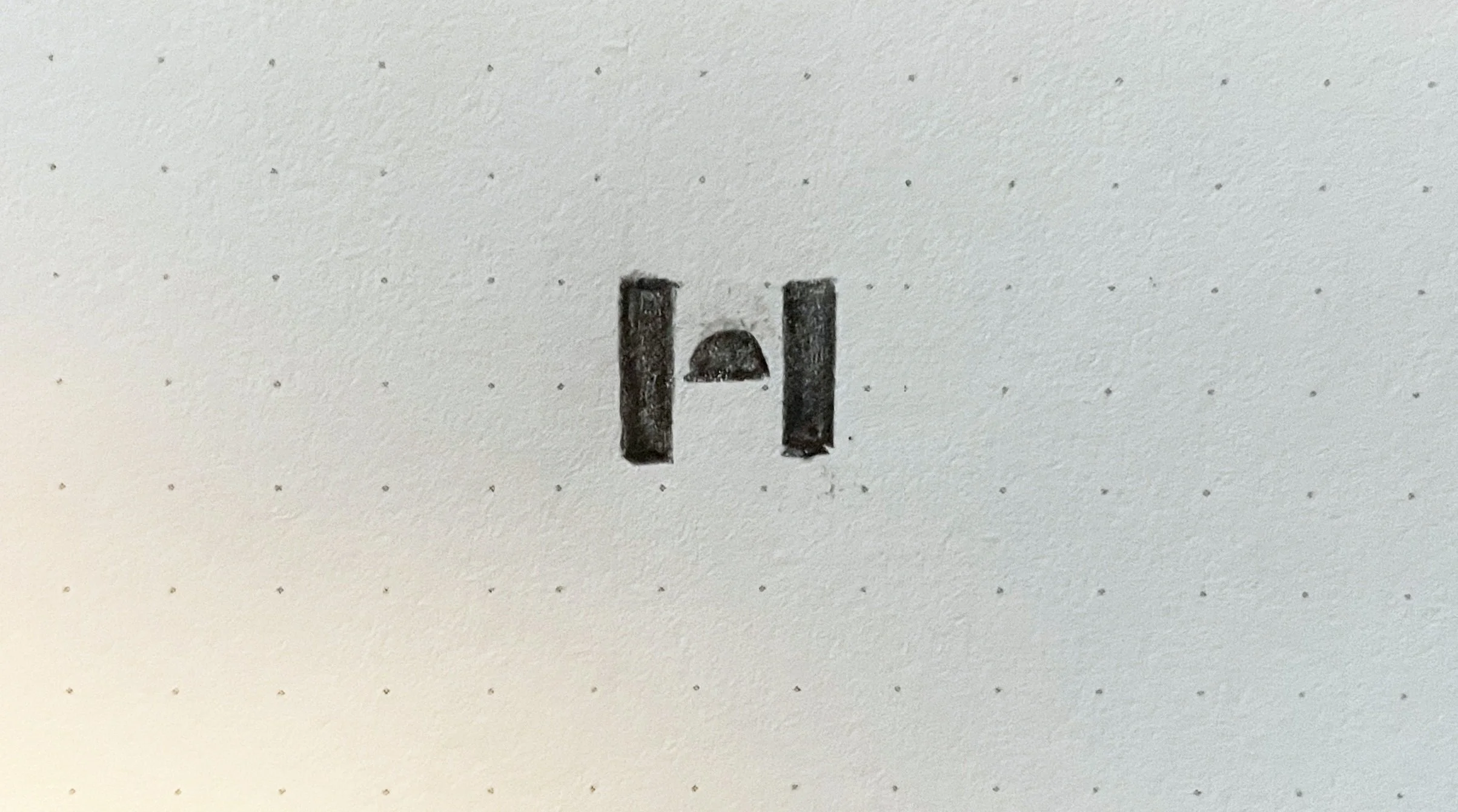
Concept - Letter H. Rising sun, reflects the meaning of “Horizon”.
Emerged Concept B

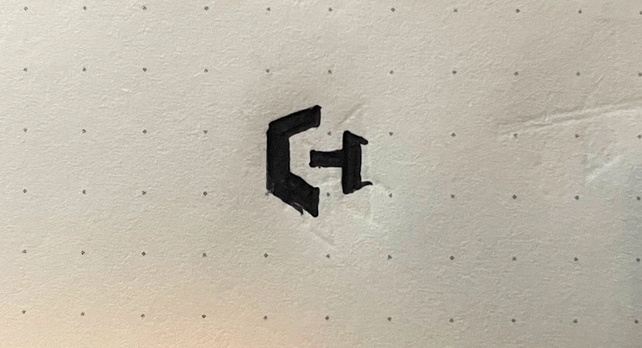
Concept B - Combo of letter C from “CityWay” and H from “Horizon”
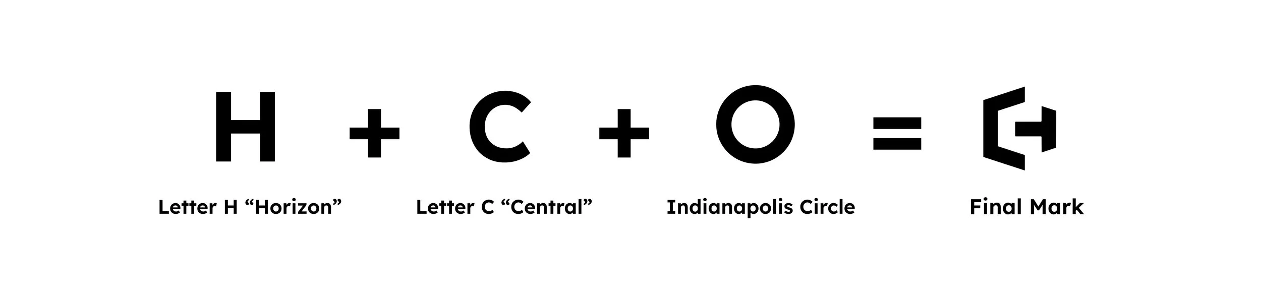
Equation of the Final Mark
02 — Design DNA
The Brand Elements
Grounded Design System
From color to type, each element was chosen to express warmth, energy, and modern clarity. The palette blends vibrancy with depth—reds that feel alive, neutrals that keep things grounded. The typography is structured yet soft, bringing a human quality to every touchpoint. Together, they form a flexible foundation for a brand that leads with purpose and feels right at home.

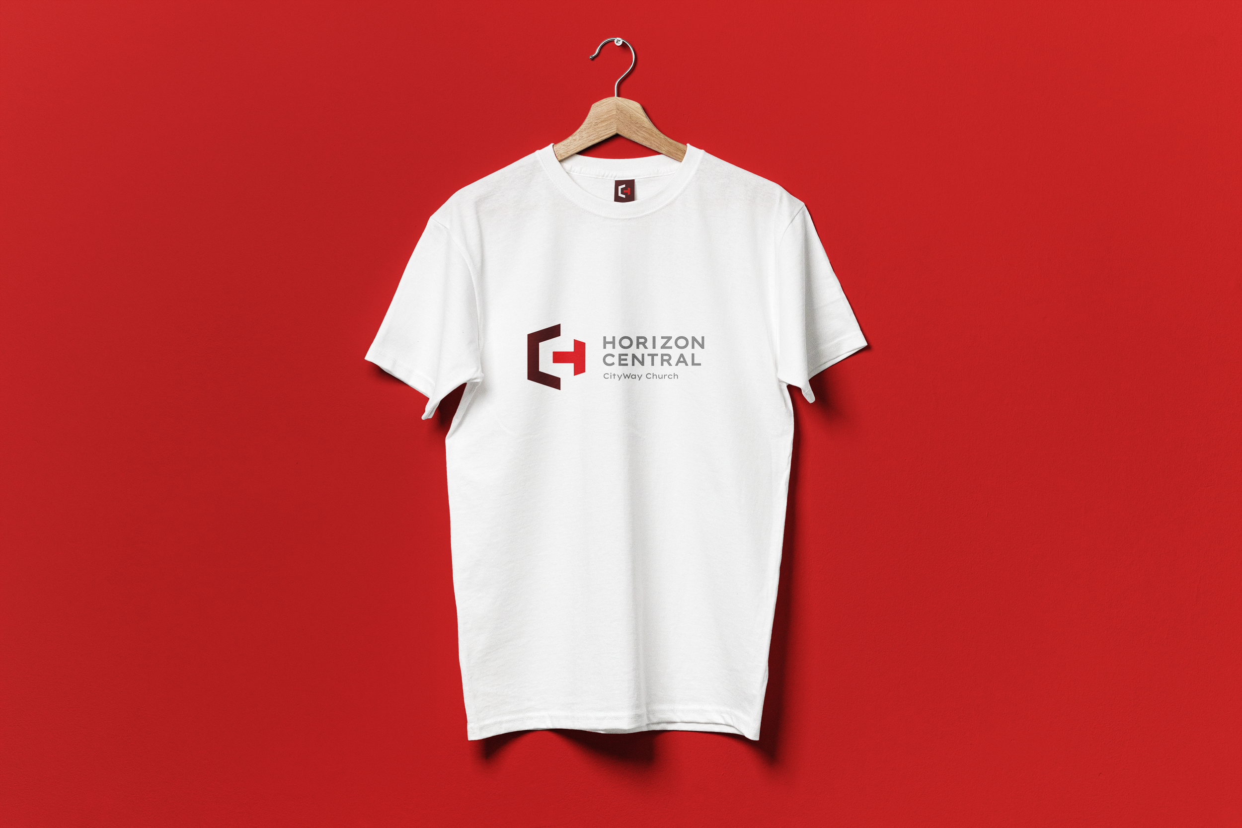
Typography
Lexend and Effra are the ideal fonts for this brand identity project because they combine clean lines with modern readability, reflecting the vibrant and edgy atmosphere of downtown. The contemporary design aligns with the brand’s urban and dynamic personality, while maintaining a welcoming, approachable feel that suits the heart of the city.
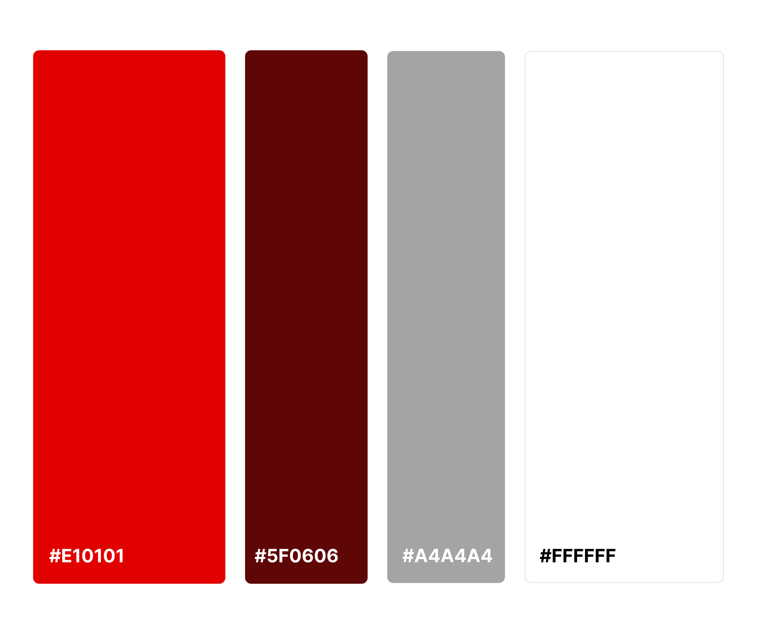
Color Pallette
Deep red and maroon evoke warmth, passion, and confidence, reflecting the brand's dynamic energy, while gray adds sophistication and balance. White provides clarity and simplicity, ensuring a clean, modern, and welcoming identity that aligns with the vibrant spirit of downtown.
Color Palette

03 — Mark Making
This Wasn’t Just a Move—it was a Reset.
Mark Evolution
As Horizon Central prepared to relocate from a historic neighborhood to the heart of downtown Indianapolis, the brand needed to evolve to meet the moment. The new home—CityWay—is modern, clean, and vibrant. The updated brand mark reflects that shift. Built from the initials “H” and “C,” the symbol draws inspiration from the iconic downtown Indianapolis circle, integrating its geometry while forming a bold, directional mark that signals movement, clarity, and welcome. It honors the legacy of the church while aligning visually with the contemporary energy of its new environment. This wasn’t just a move—it was a reset. And the new identity rises to meet it.
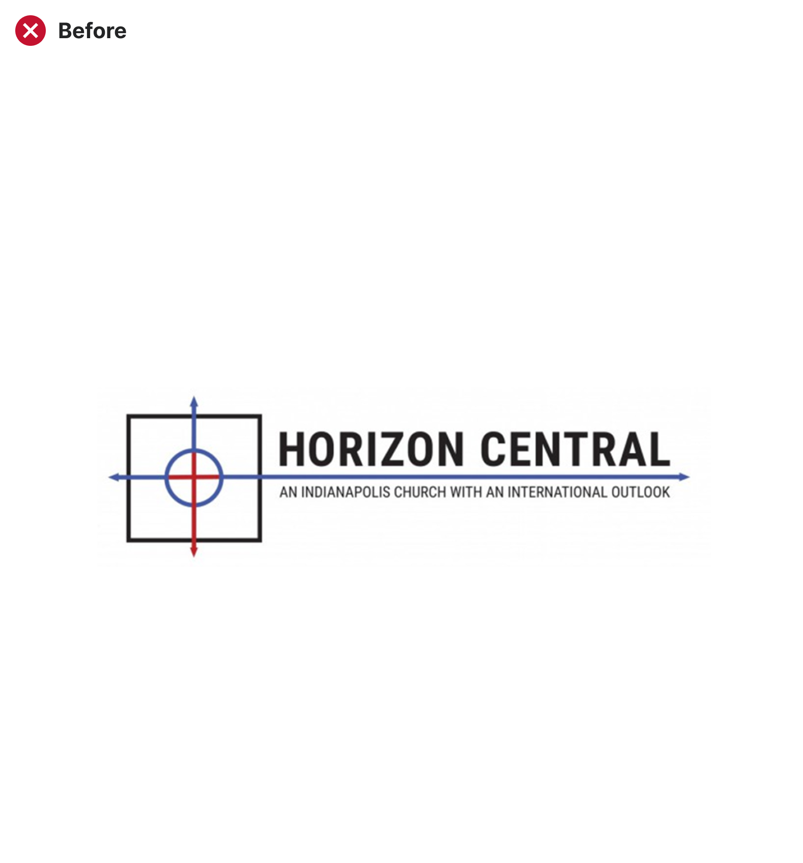
The Old Mark
- Intent: The original logo aimed to communicate global reach and spiritual direction, using intersecting arrows and a central target.
- Issues: While conceptually ambitious, the mark was visually rigid and overly technical. It resembled a coordinate grid or a military crosshair—conveying precision but lacking warmth or clarity.
- Limitations: Too literal and complex. The design didn’t translate well at small sizes and lacked emotional resonance.
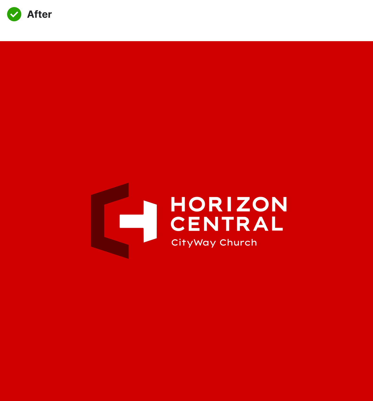
The New Mark
- Intentional Simplicity: The new identity mark fuses an abstract “H” and “C” into one cohesive, confident form.
- Symbolic Weight: The open arms of the “H” subtly invite—echoing the church’s welcoming posture. The “C” tucks in as a sheltering curve, hinting at care and community.
- Modern & Scalable: Bold geometry that holds up across digital and print, large and small—versatile and future-facing.

04 — Project Impacts
Brand Elevation Impact
The rebrand helped Horizon Central clarify its identity, strengthen community recognition, and build a visual system that supports future growth.
01
▸ Clear Brand Foundation
Crafted a bold, versatile identity rooted in purpose—reflecting both the church’s history and its move into a modern, urban environment.
02
▸ Stronger Visual Recognition
Developed a unique mark combining “H” and “C,” making it easy to recognize across signage, screens, and printed materials.
03
▸ Scalable Design System
Established a cohesive system of color, type, and logo assets that scales across Sunday service, outreach events, and digital channels.
04
▸ Community Alignment
Delivered a look and feel that resonates with both long-time members and new visitors—bridging legacy with what's next.
05
▸ Ready for Growth
Positioned the brand to confidently serve its expanding mission in the CityWay district and beyond.


Horizon Lead Pastor
Pastor David Kosobucki
"Gahrrett is professional, diligent, creative and uses his talents to serve the customer's needs. I give him five stars ⭐⭐⭐⭐⭐, a thumbs up 👍🏻 and a heart ❤️ ..."