


Archonsec Cyber Security
Archonsec needed a brand identity that matched its position as a trusted, forward-thinking cybersecurity partner. We developed a modern, authoritative visual system that communicates precision, vigilance, and adaptability — the core traits of a security leader. From the logomark to the color palette and typography, every element was crafted to inspire confidence, signal technical expertise, and remain adaptable across digital and print applications.
Deliverables
▸ Discovery & Strategy
▸ Visual Identity System
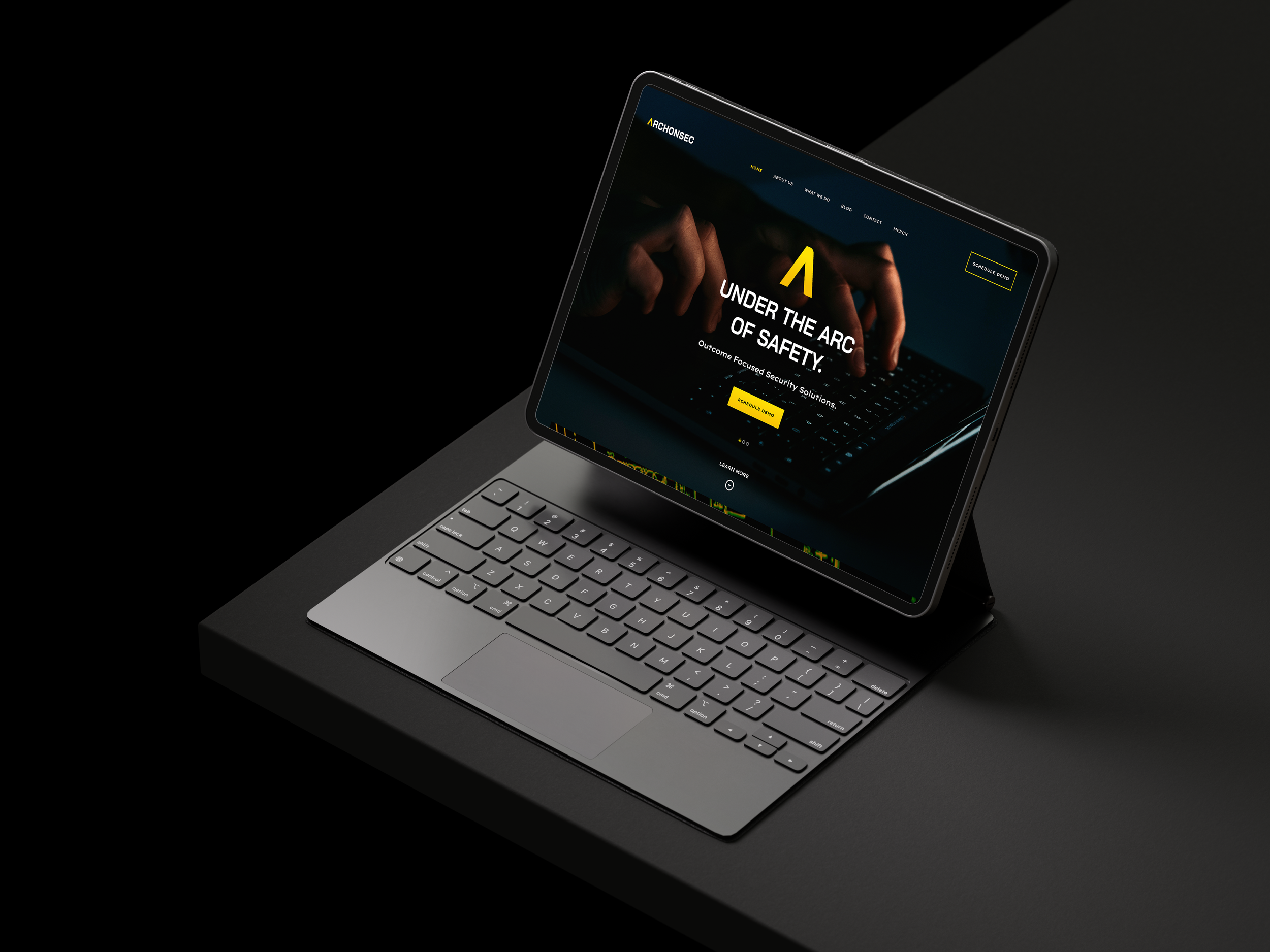
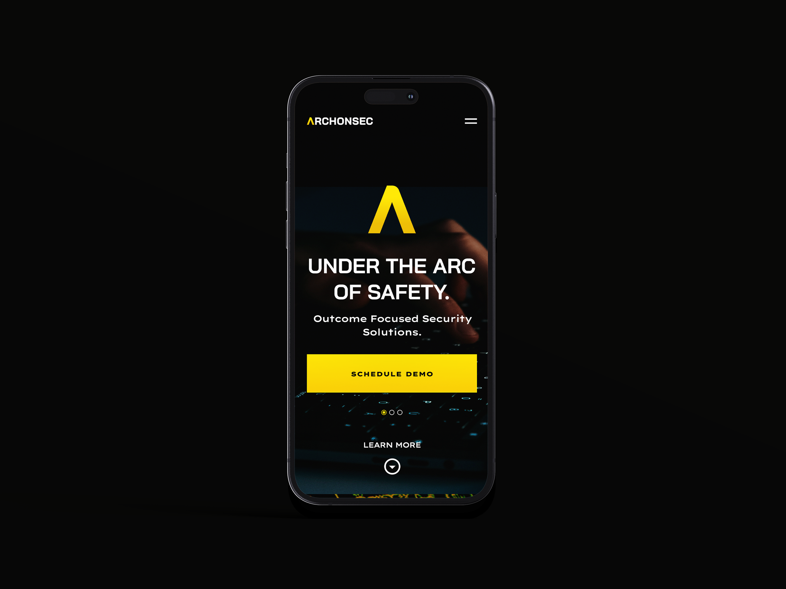
▸ UI/UX Design

Vision to Vigilance: Turning Security into a Strategic Advantage
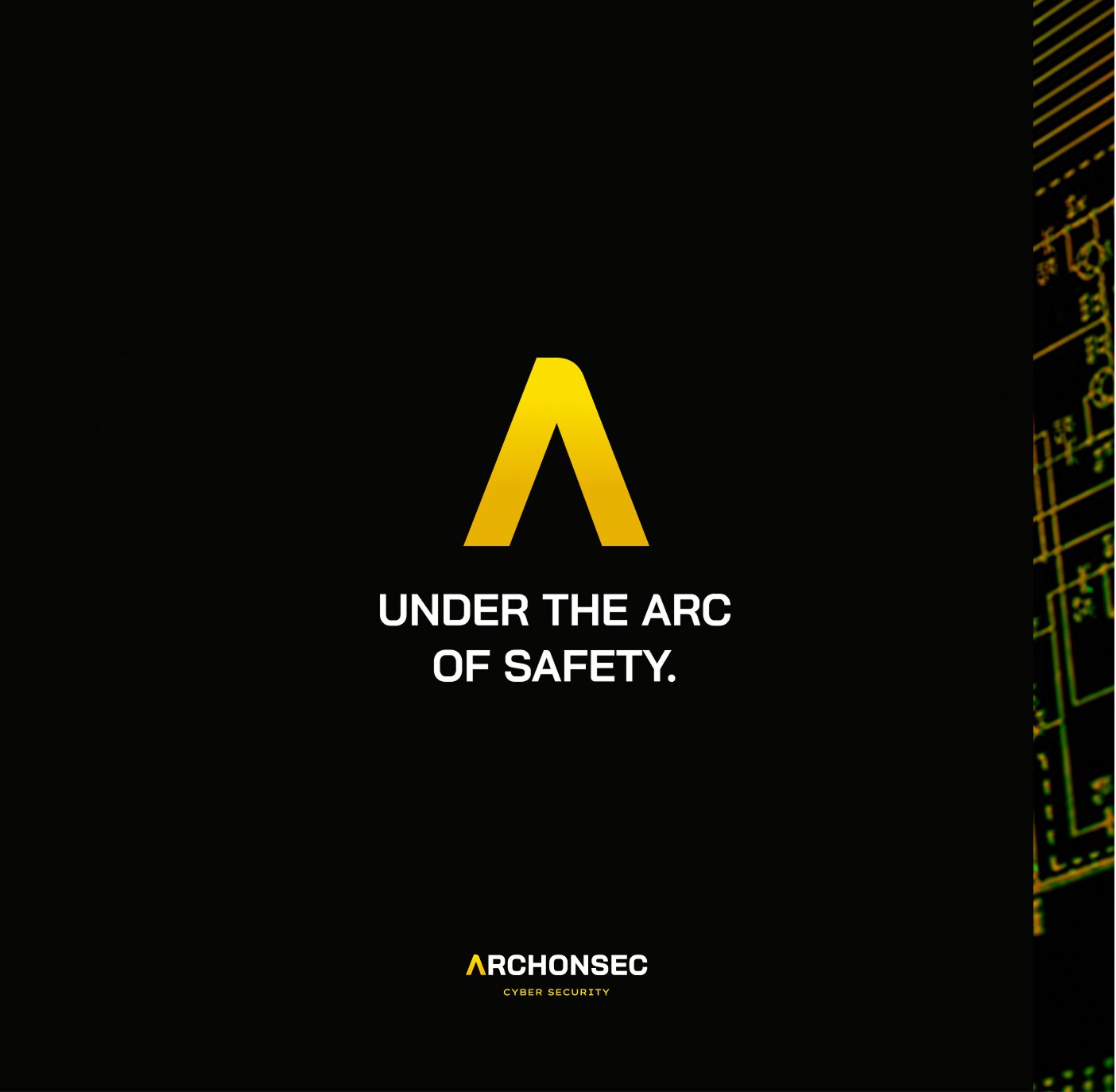
A Brand Forged in Security—Built to Protect
Archonsec was founded to unify fragmented IT security under one framework, guided by ISO 27001:2013 and expert insight. The brand identity reflects precision, adaptability, and proactive defense—communicating trust, authority, and a commitment to helping organizations protect, comply, and grow through better security.


01 — Protecting Organizations
Mission & Vision
Archonsec was founded to meet an urgent need: protecting organizations from the rising tide of cyber threats. Built by security veterans, the brand began with a mission to deliver proactive, tailored defense solutions that safeguard data, systems, and reputations. From day one, the vision was clear — combine deep technical expertise with a partnership mindset, so clients feel protected, informed, and confident in every decision.
02 — Discovery
Core Brand Values

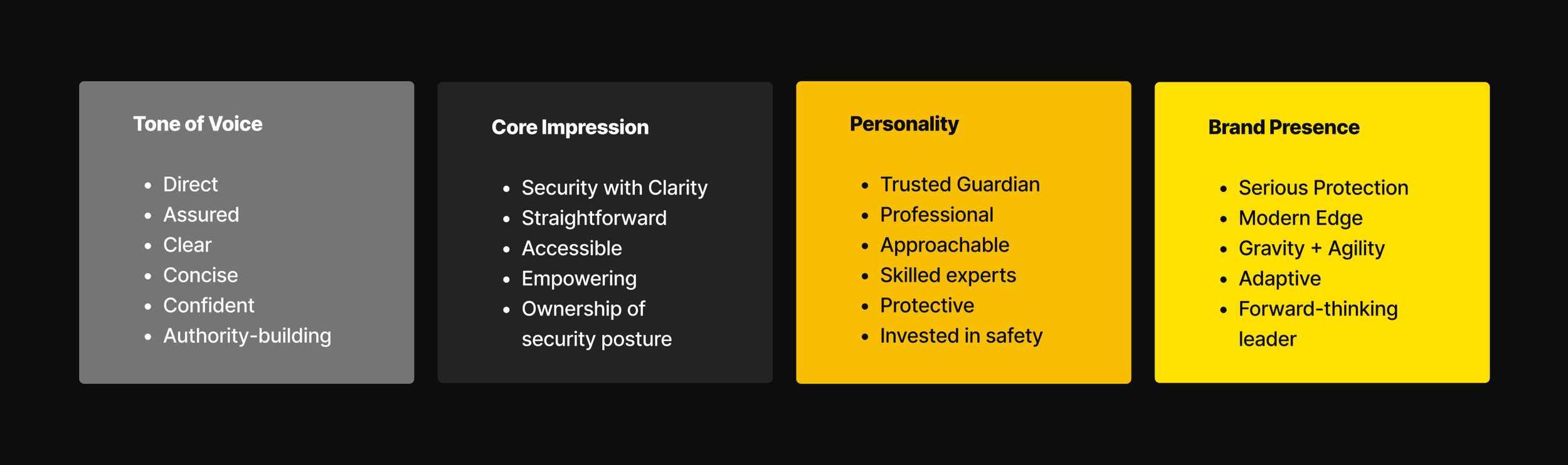
▸ Tone of Voice
Direct and Assured
Language is clear, concise, and confident — no jargon for the sake of it. Every word reinforces authority and builds trust without overcomplicating security concepts.

▸ Personality
Trusted Guardian
A professional yet approachable presence that reassures clients they are protected by experts who are both highly skilled and deeply invested in their safety.

▸ Core Impression
Security with Clarity
The brand communicates complex solutions in a way that feels straightforward and accessible, empowering clients to understand and take ownership of their security posture.

▸ Brand Presence
Serious Protection, Modern Edge
Visually and verbally, the brand balances the gravity of protection with the agility to adapt to emerging threats, positioning Archonsec as a forward-thinking leader.
03 — Conceptuals
Brand Direction
The brand direction grew from Archonsec’s core mission: Better Security is Better Business. Built on the principles of Confidentiality, Integrity, and Availability, the name — “Archon” for leadership, “sec” for security — signals authority and protection. The identity reflects four key pillars: a direct, assured Tone of Voice; a Core Impression of clarity and accessibility; a trusted, professional Personality; and a Brand Presence that balances serious protection with agility.
Designed to Speak
03 — Visual Identity
The Brand Essence
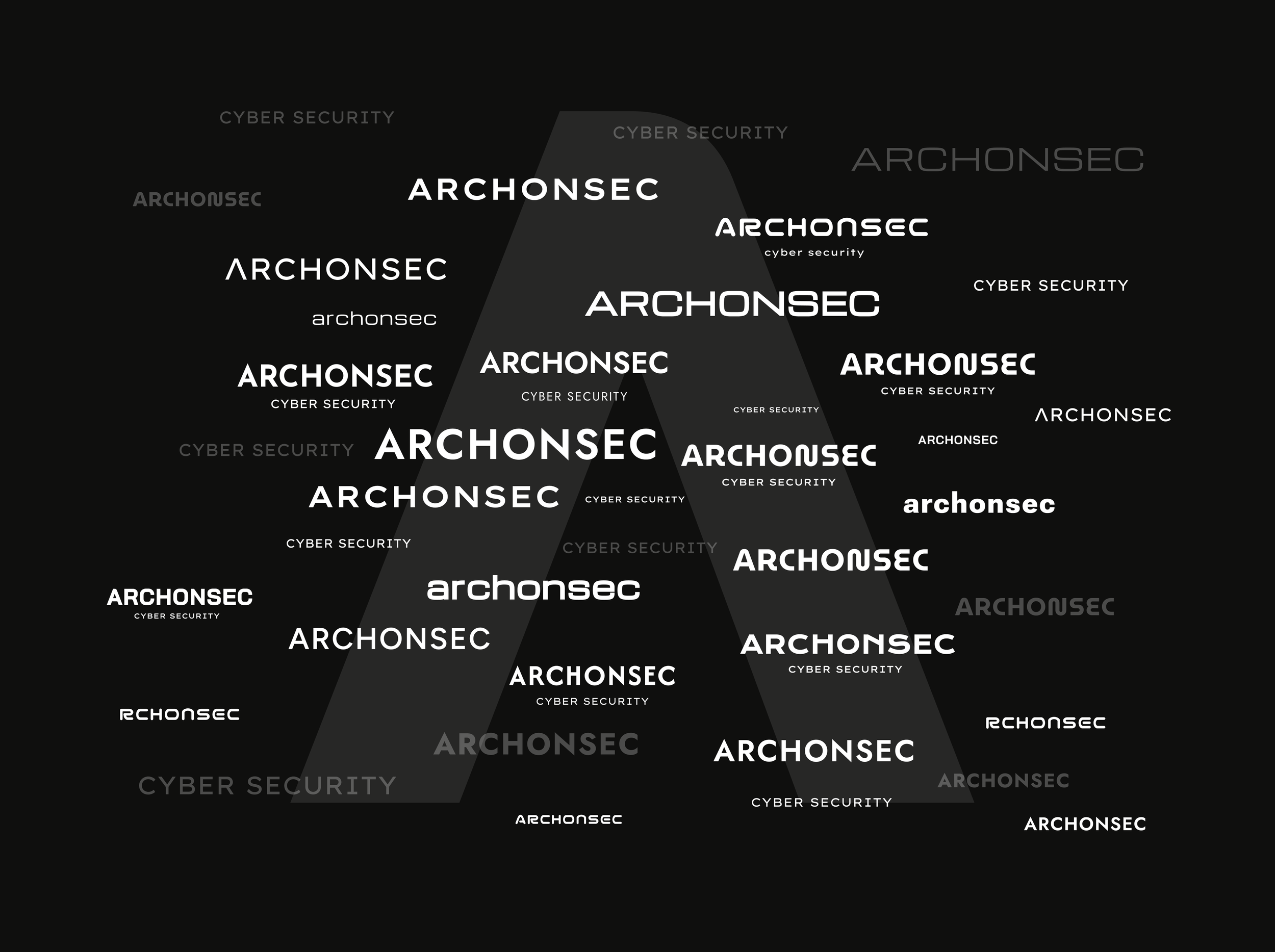
Dozens of type directions were explored to find the right balance of authority, clarity, and approachability. Early concepts tested everything from sharp, geometric precision to softer, trust-building curves. Refinements focused on clarity, weight, and forward-leaning energy — resulting in a modern, authoritative wordmark that stands strong with or without the symbol.
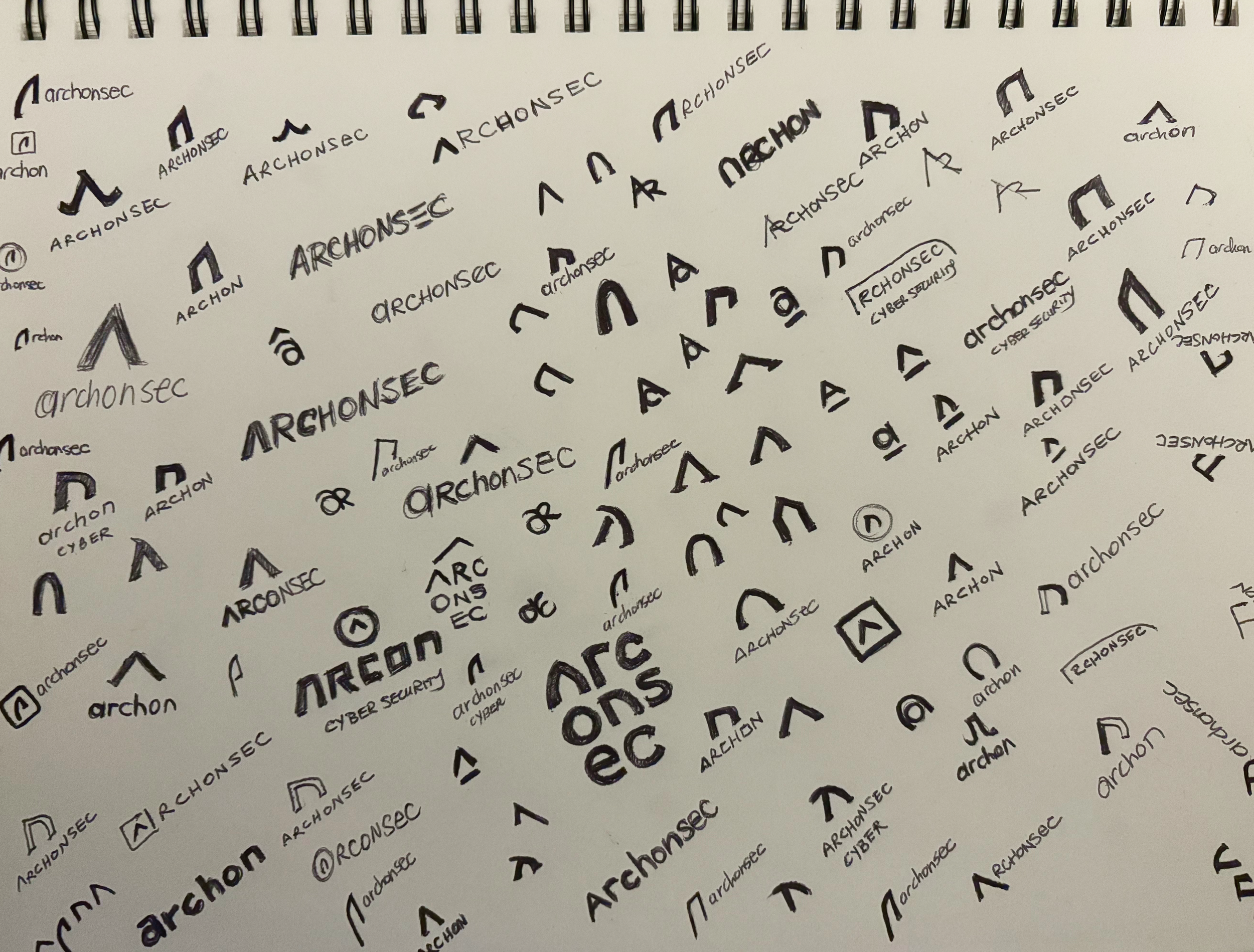
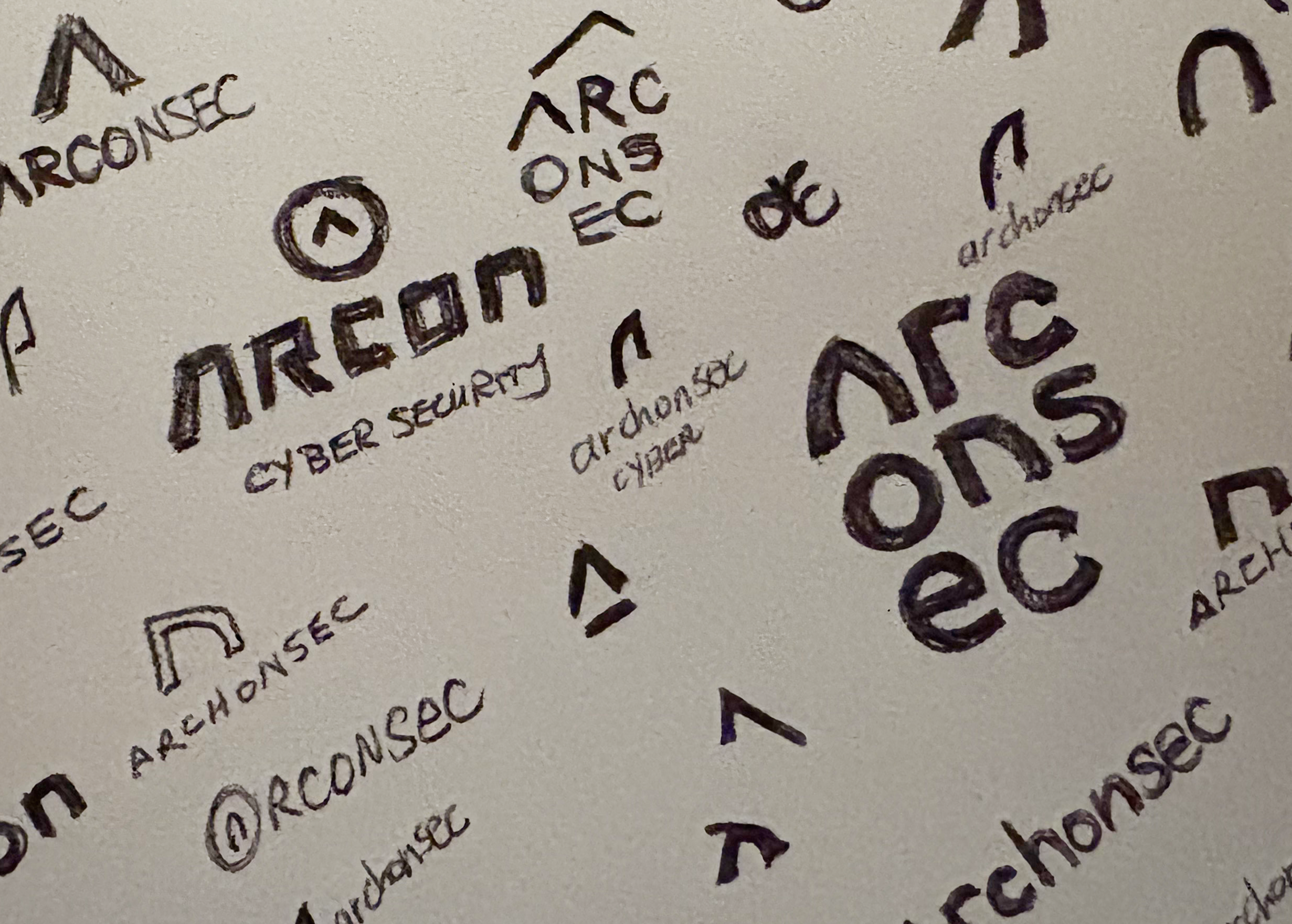
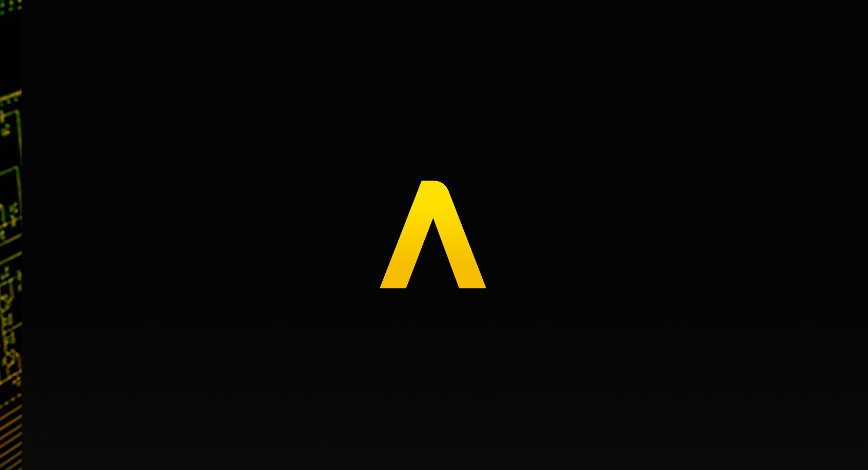
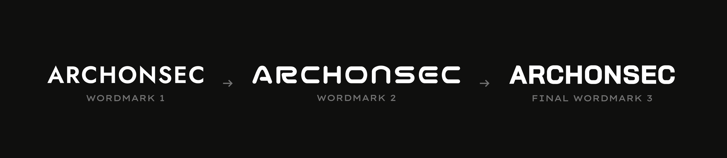
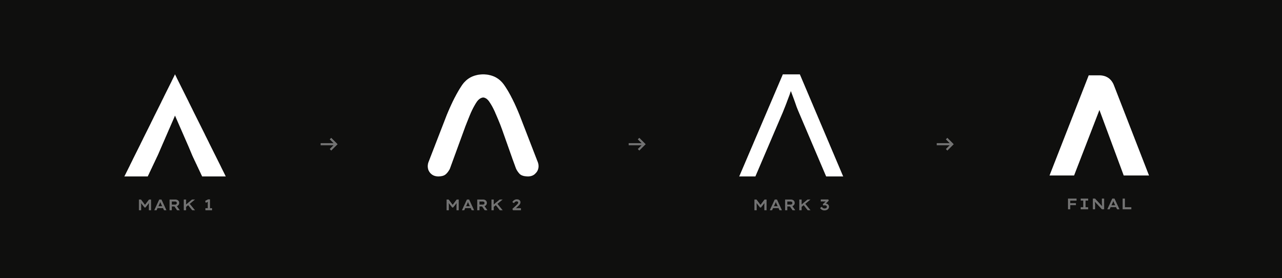
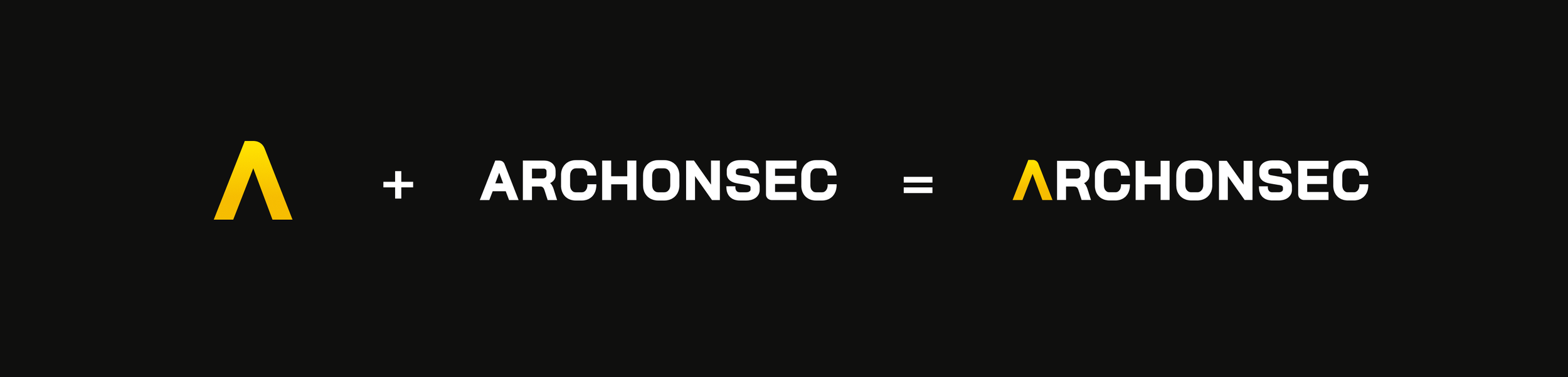
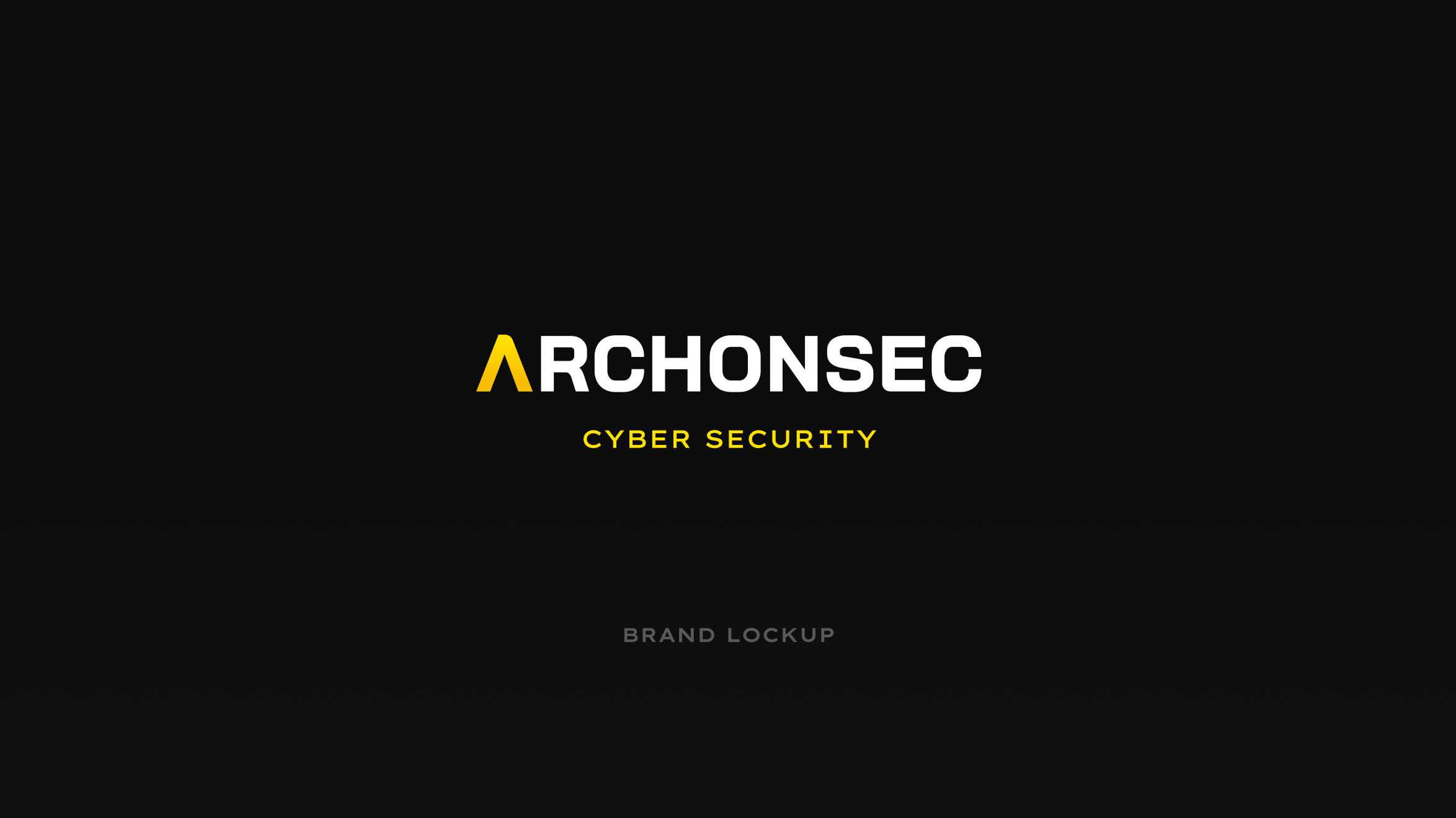
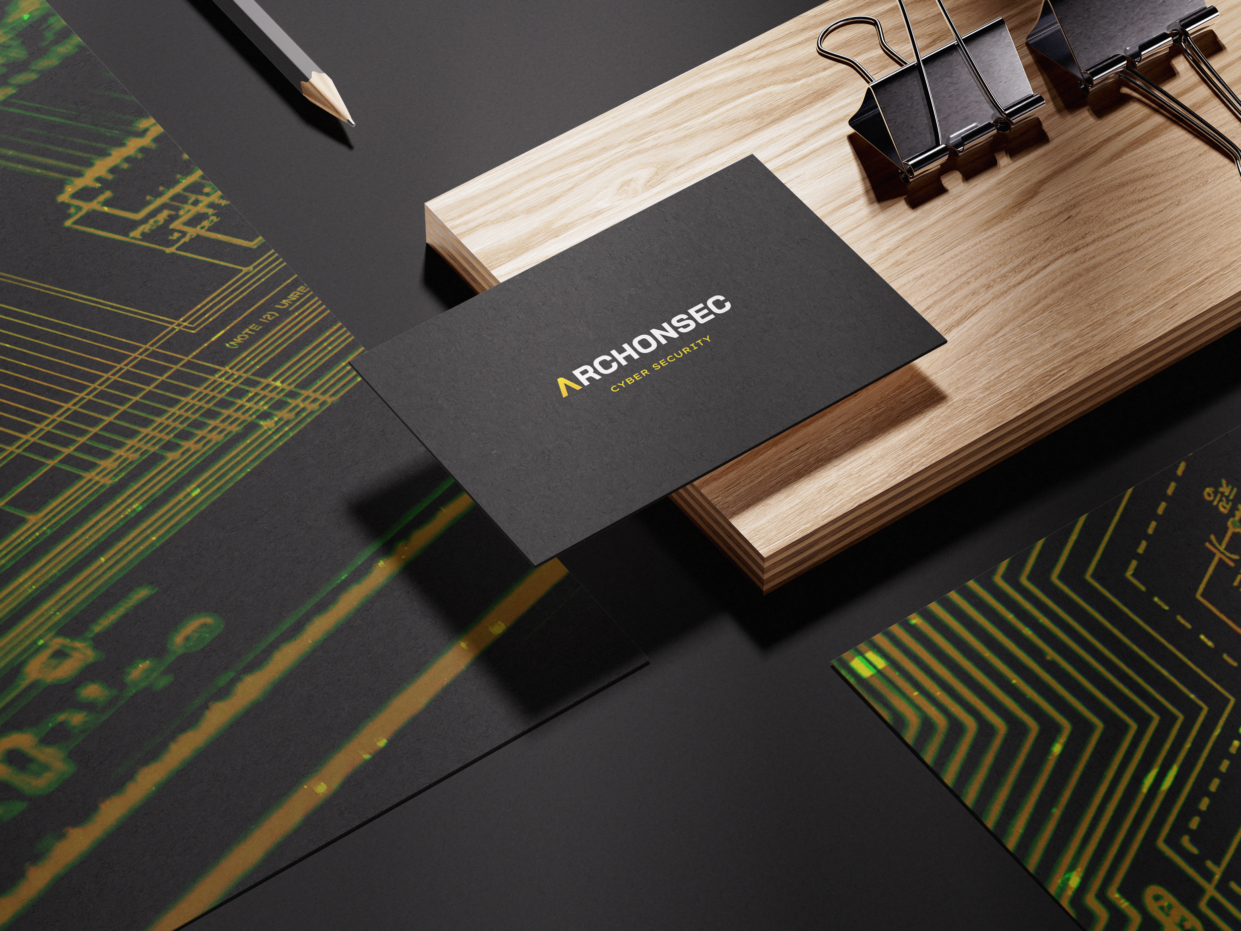
Logo Progression
Each iteration sharpened clarity, balance, and impact—culminating in a bold, modern wordmark built for authority.
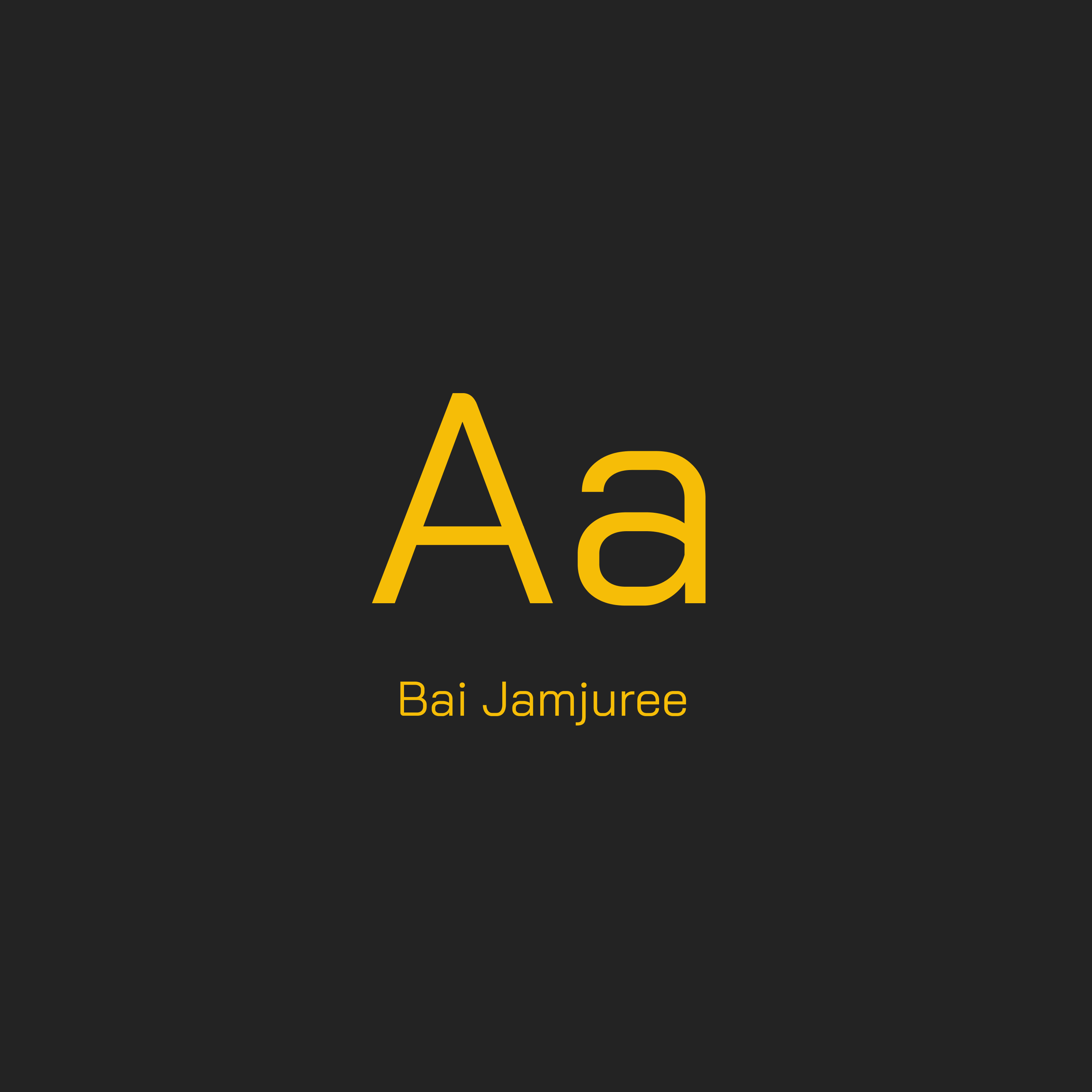
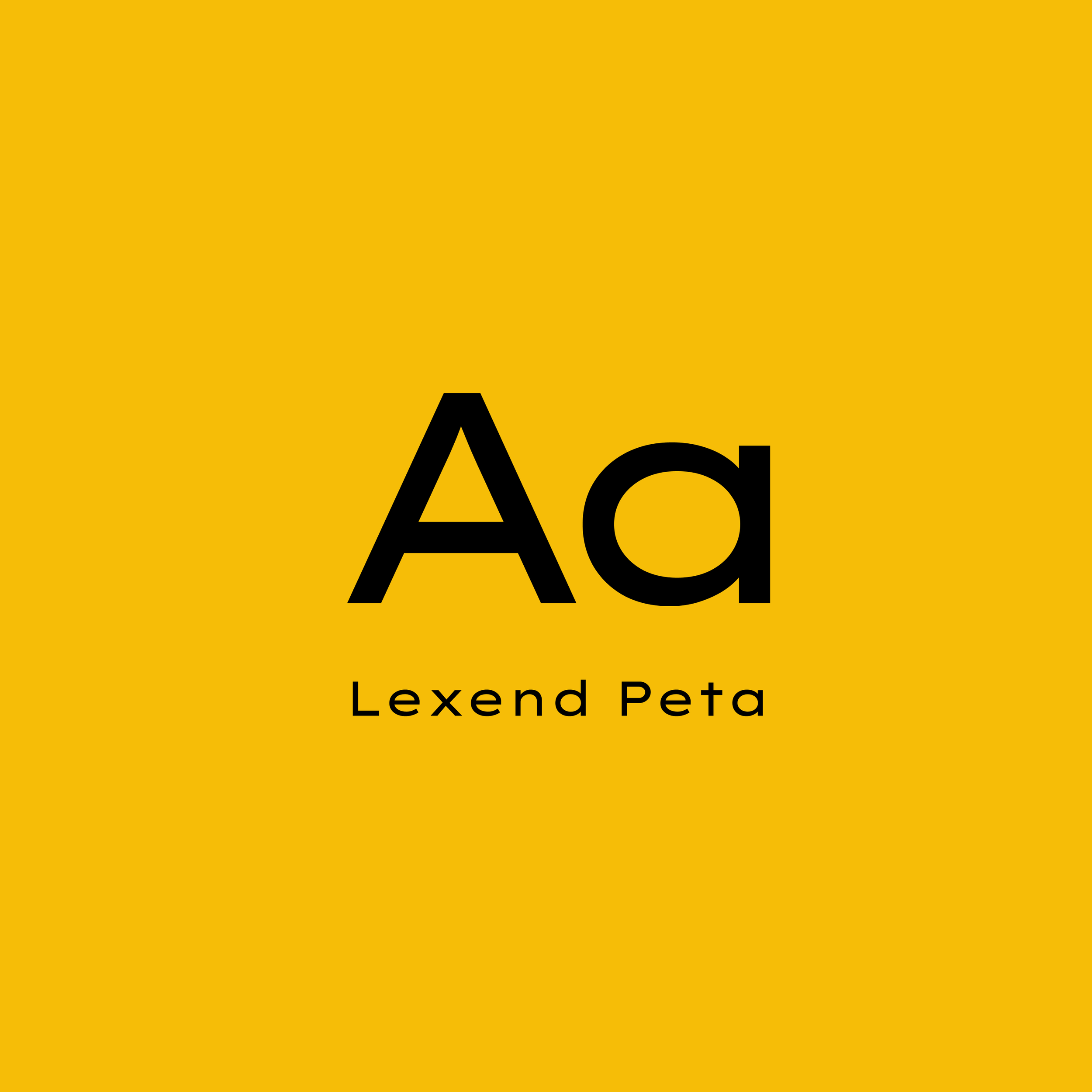
Typography
Archonsec’s type system pairs Bai Jamjuree and Lexend Peta—fonts that balance authority with clarity. Bai Jamjuree delivers clean, modern legibility across all applications, while Lexend Peta’s bold structure reinforces leadership and security. Together, they create a distinctive visual voice that is both strong and accessible.
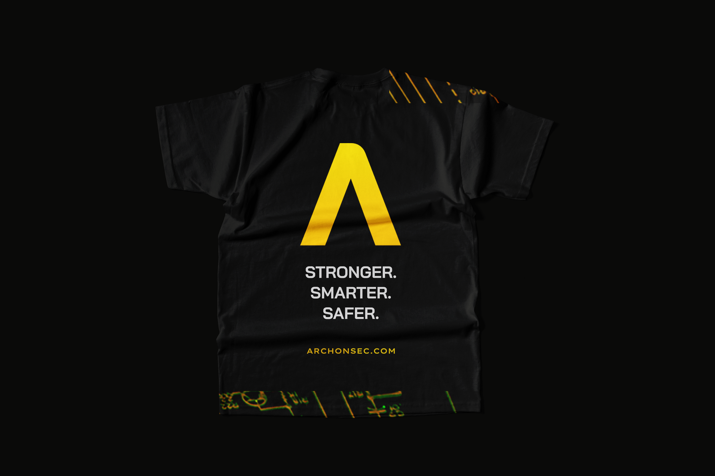
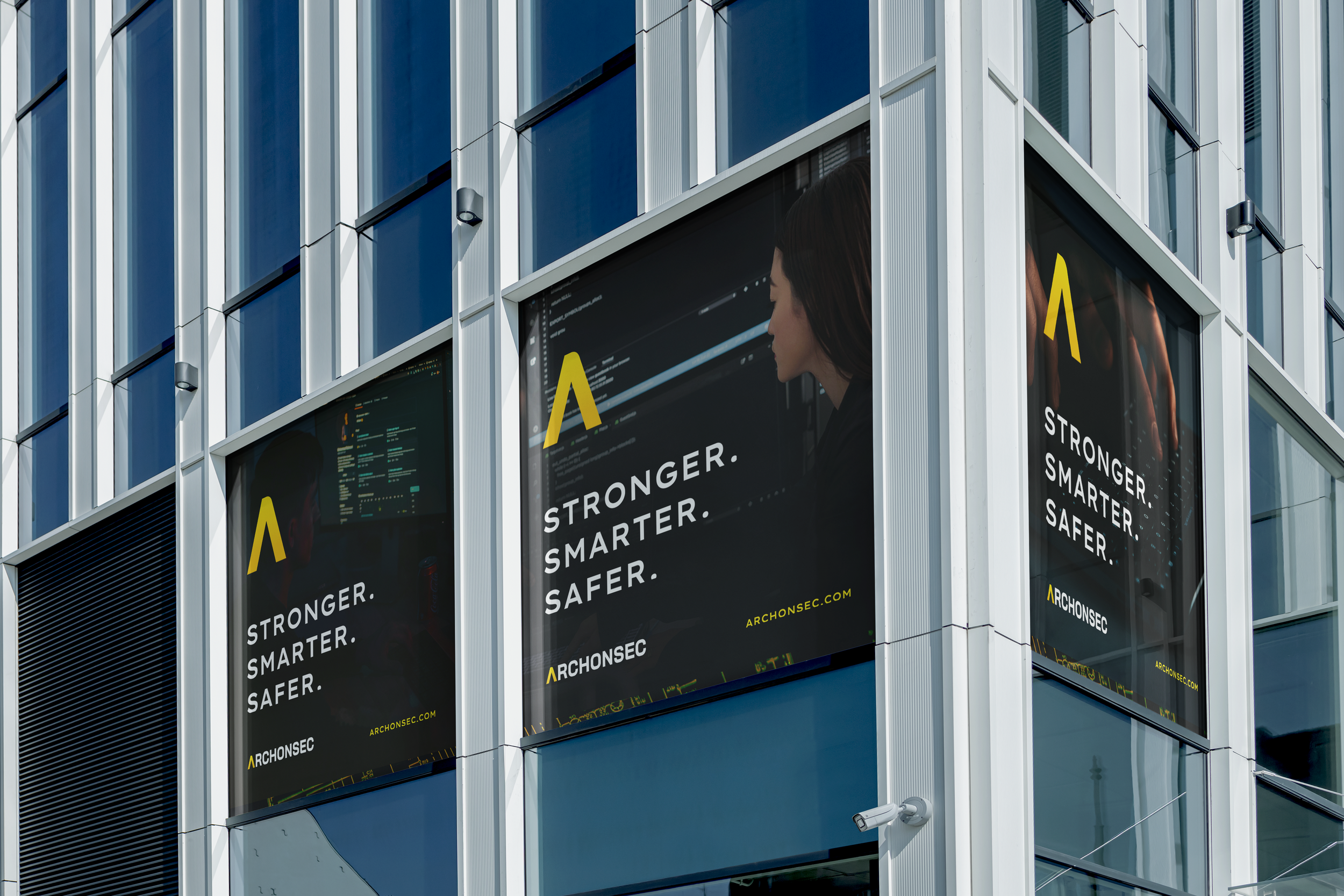
Color Selection

Archonsec’s palette combines strength and clarity. Onyx and Marine provide stability, Hunter adds a tactical edge, Squash and Golden bring energy, and Cotton delivers crisp contrast for standout visibility across all touchpoints.


Founder & CEO (In Memory)
Alaric Aloor
" He created an identity that was carefully crafted to capture the attention of potential customers while representing our brand. The mark is versatile, allowing us to utilize it effectively on multiple mediums such as our website, social media platforms and merch! "