Promina AI Assistant logo featuring a stylized magnifying glass with a star inside, accompanied by the text 'Promina AI Assistant'.

Promina AI Assistant


Promina, a women’s leadership mentorship organization, needed a way to unlock and utilize 15+ years of program data. While initially focused on mentor-mentee matching, we identified a greater need: centralizing data to support content, marketing, and internal operations.

Deliverables

Discovery

User Flows & Wireframes

UI/UX Design

Design System

Brand Identity Design

Icon of a question mark with a sparkle star in the middle, on a dark blue circular background.

An MVP That Moves: AI Chatbot for Smarter, Faster Operations

Harness AI to centralize data, automate content creation, & optimize internal workflows.

We launched an MVP featuring a chatbot assistant that made insights more accessible, streamlined workflows, and laid the foundation for future mentorship matching—enhancing both efficiency and impact.
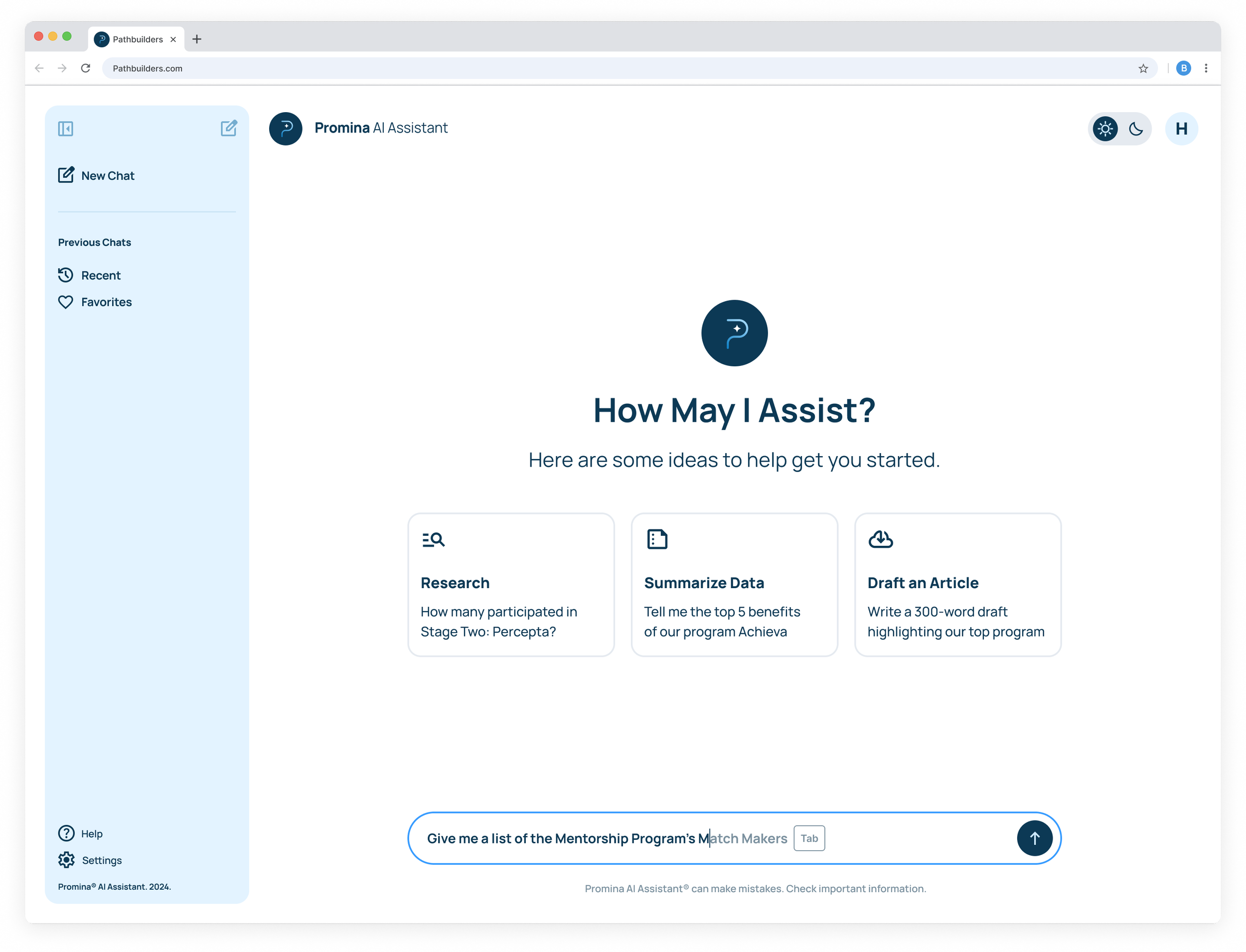
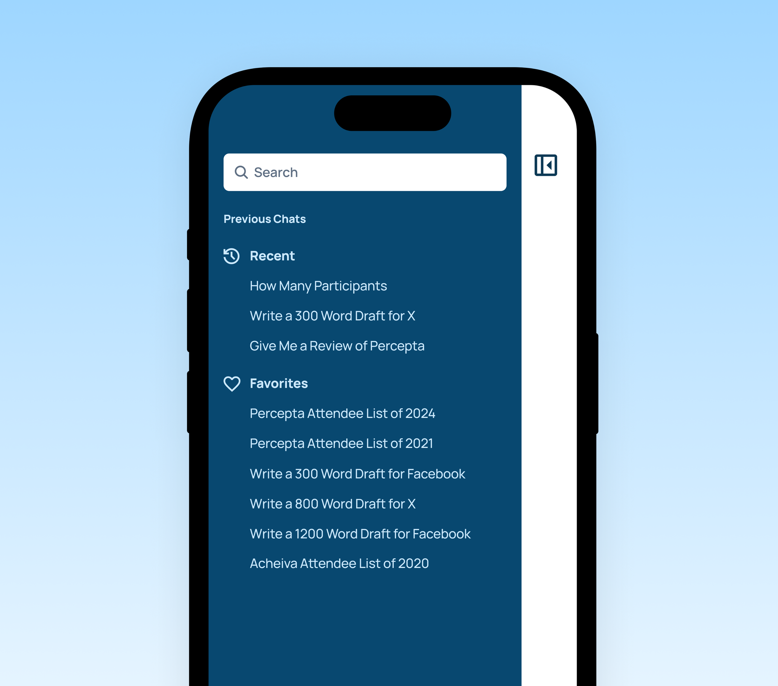
Screenshot of Promina AI Assistant webpage showing the main menu with options for research, data summaries, and article drafts, and a left sidebar menu with chat options, help, and settings.

See How We Got Here

A digital icon of a magnifying glass with a sparkle in the center, set against a dark background.

Unlocking 15+ Years of Impact with a Smarter Brand System

Promina’s new identity and AI-powered platform transform scattered program data into a clear, centralized system—streamlining operations, elevating trust, and empowering mentorship at scale.

01.

Discover

We uncovered Promina’s core challenge: making 15+ years of program data accessible to support marketing, operations, and long-term growth.

02.

Define

Through discovery, we identified and clarified immediate priorities—focusing on creating a centralized data tool that meets current needs, while also establishing a foundation for future mentor–mentee matching and program growth.

03.

Develop

With clear direction, we moved into wireframing and UX prototyping—mapping out intuitive flows for admins and users alike. We designed a bold, user-friendly interface grounded in accessibility and clarity, laying the foundation for a scalable design system.

04.

Deliver

We delivered a cohesive design system, UI library, and brand identity. Each element was built for flexibility, future-proofing the platform as they scale their programs and explore AI-driven enhancements to deepen the mentorship experience.

Into The Work

Two women sitting at a desk in an office, looking at a computer screen and discussing.

The Strain of Scattered Information Data

01 — The Problem

A centralized hub was essential to securely store over 15 years of sensitive program data. The system also needed to support seamless access and utilization of this data for diverse tasks such as marketing initiatives, blog writing, article creation, and printed materials.

02 — Moving Forward

Clarifying the Challenge

To move forward with confidence, two strategic options were developed to address key needs: one integrating with Microsoft Teams, and one offering a custom UI wrapper tailored to the organization. Each option provided a distinct path forward with clear next steps.

Project Path

The team began with a client meeting to gather insights and needs. We then brainstormed and developed two strategic options to present, ensuring clear next steps.
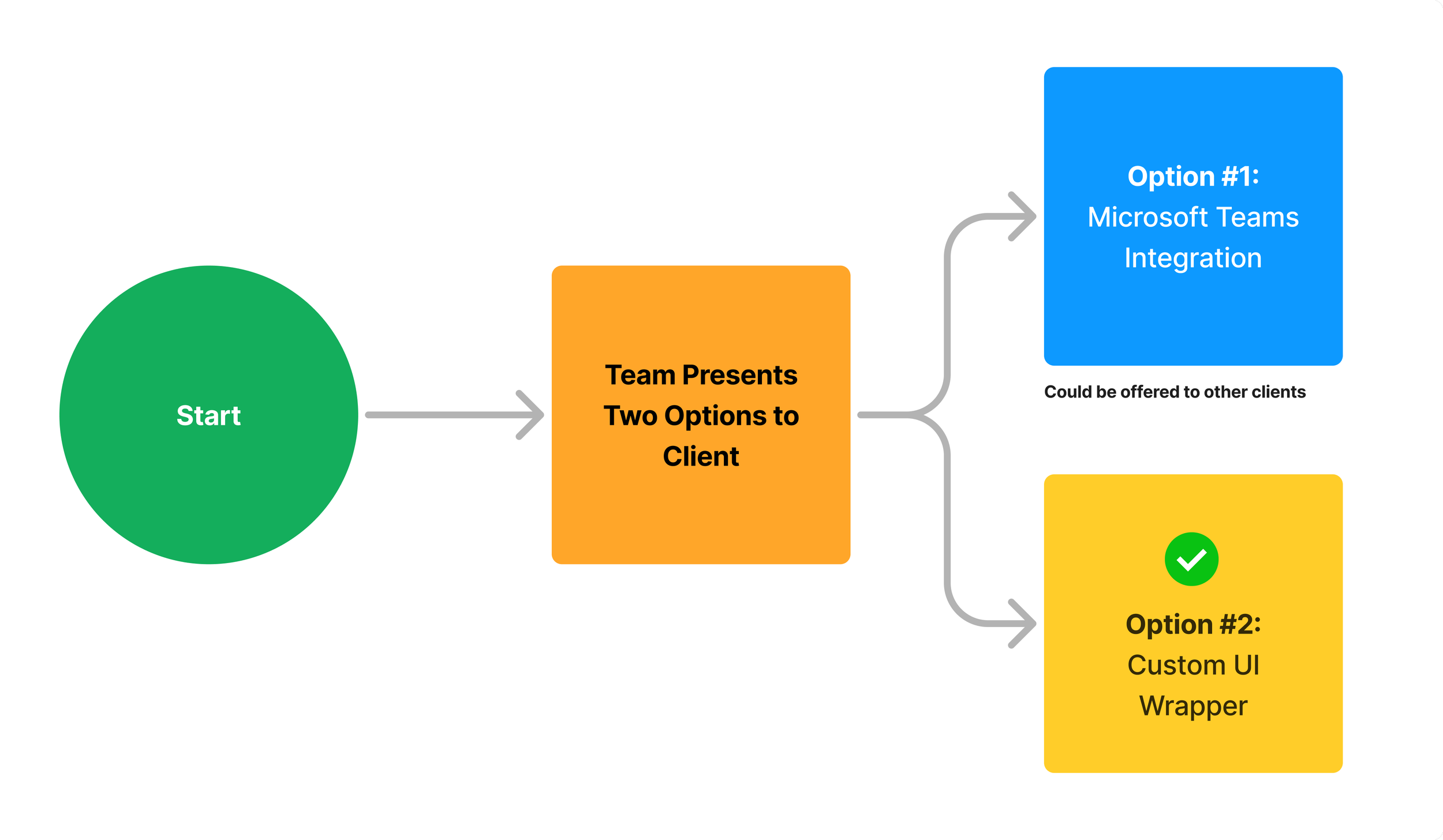
Flowchart illustrating a decision process starting with a green circle labeled 'Start', progressing to an orange box labeled 'Team Presents Two Options to Client.' Two options follow: a blue box labeled 'Option #1: Microsoft Teams Integration' with a note 'Could be offered to other clients', and a yellow box labeled 'Option #2: Custom UI Wrapper' with a green checkmark.

Stakeholder Map

We included a stakeholder map to clearly identify everyone involved in the project and understand their roles and needs. This helps us communicate effectively, focus on what’s important to each group, and ensure we’re delivering a solution that works for everyone.
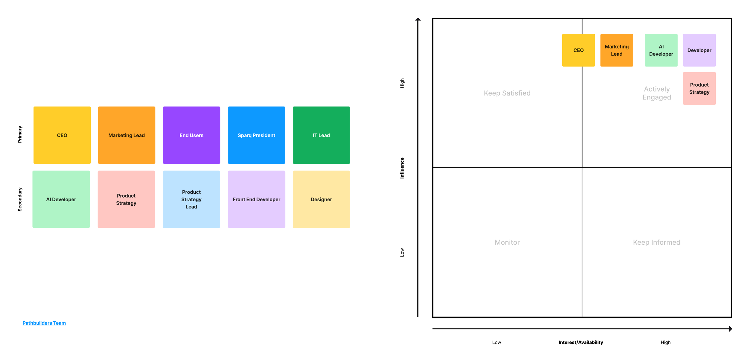
A visual chart comparing individuals by influence and interest, with colorful blocks representing roles such as CEO, Marketing Lead, End Users, Sparq President, IT Lead, AI Developer, Product Strategy Lead, Front End Developer, and Designer. The chart is divided into four quadrants labeled Keep Satisfied, Actively Engaged, Monitor, and Keep Informed.

Competitive Analysis

A competitive analysis was conducted to get an idea of where Promina stands against its main competitors, Women Unlimited and Mentium. Findings didnt present relevance to this as the application being built would only serve as an internal tool. Data we gathered can be utilized in the future beyond MVP, across future features of the app including the Mentorship Matching.
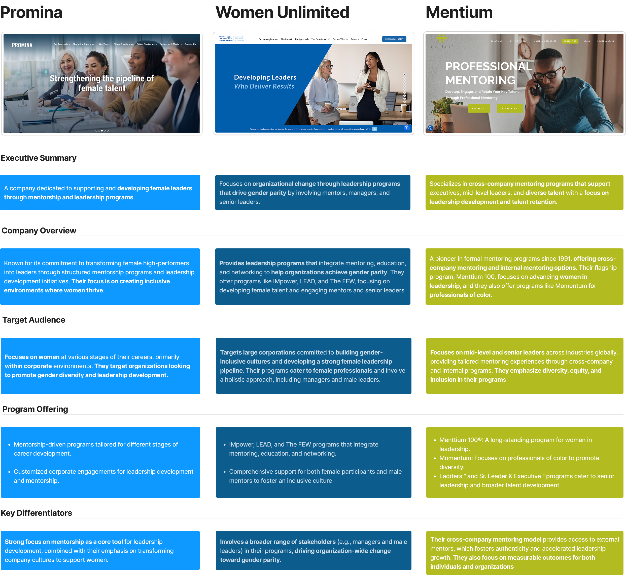
A detailed comparison chart of organizations supporting female talent and leadership development, featuring website screenshots and bullet points describing their focus areas, programs, and approaches.

Personas

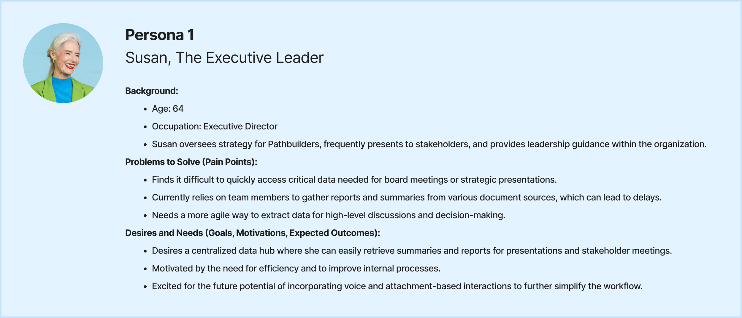
Profile card of Susan, The Executive Leader, age 64, with a photo of an older woman with white hair, wearing a bright green blazer and a blue top, smiling. The card lists her background, problems to solve, and goals.

Used during design phase to help inform decisions and features to include in MVP.
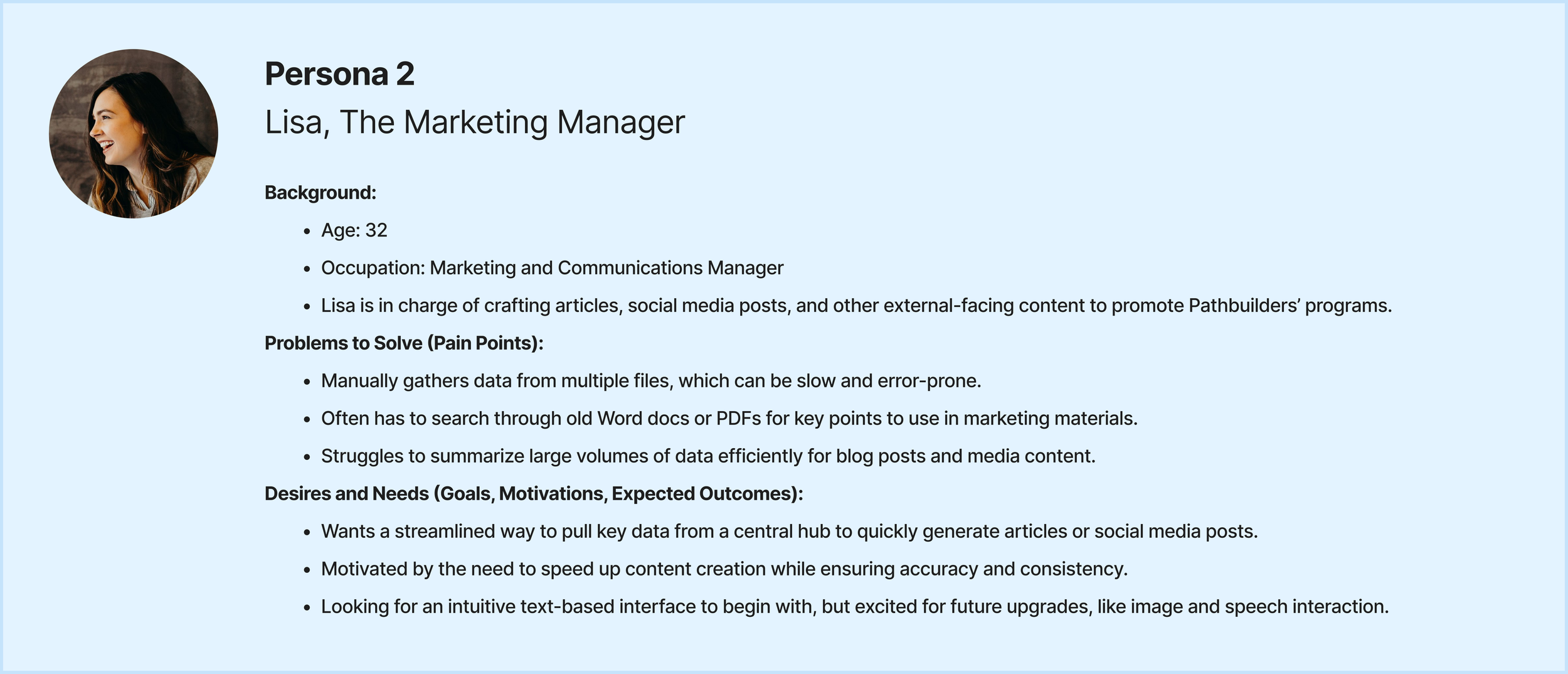
Screenshot of Lisa's professional profile, showing her photo, name, title, background details, problems to solve, and goals for content management.

Key Insights

These are the key findings extracted from the personas.
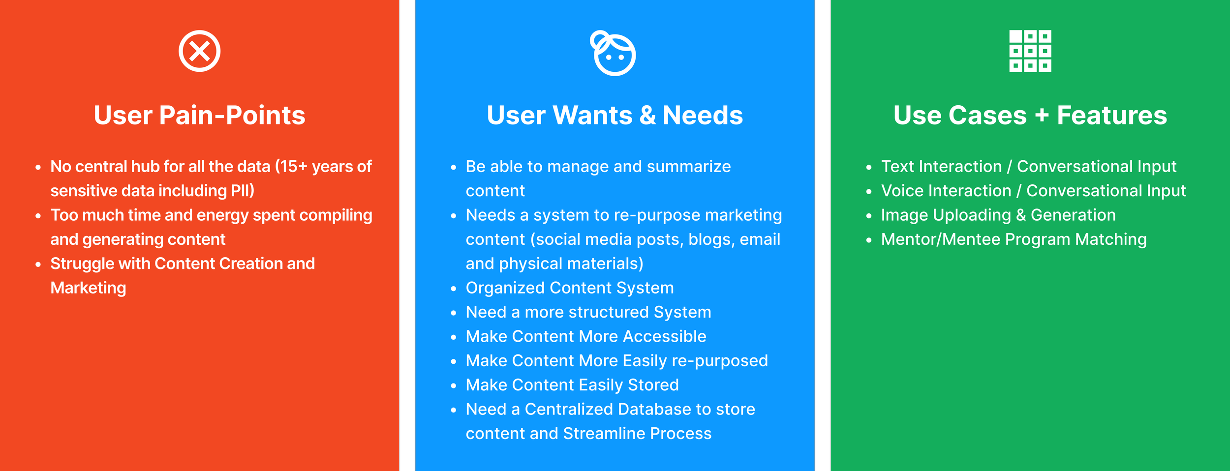
A three-column infographic with the titles 'User Pain-Points', 'User Wants & Needs', and 'Use Cases + Features'. The left column, 'User Pain-Points', is orange with points about data centralization, time and energy spent creating content, and marketing struggles. The middle column, 'User Wants & Needs', is blue, listing managing content, system needs for marketing, organized content, accessibility, and ease of content reuse and storage. The right column, 'Use Cases + Features', is green, mentioning text and voice interactions, image uploading, and mentor-program matching.

Workflows

Workflows were developed based on three different use cases we were looking at developing for MVP: Text based interaction, Speech Interaction and image upload. It was decided that text based interaction would be the key feature for MVP, Speech Interaction and Image Upload would be features in later releases.
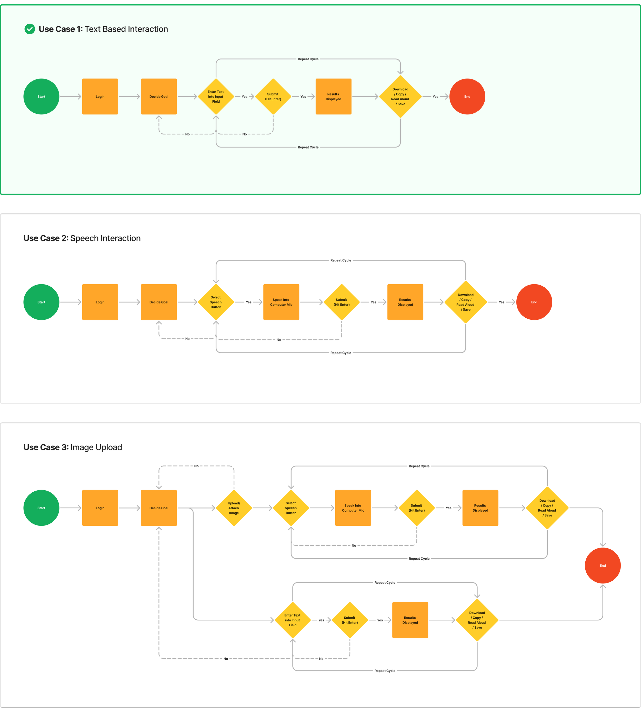
Three flowcharts illustrating different use cases: 1. Text-based interaction, 2. Speech interaction, 3. Image upload. Each flowchart includes steps with decision diamonds, process rectangles, and start/end ovals, showing step-by-step procedures for each interaction type.

03 — Brand Identity & UI

Designing The User Interface

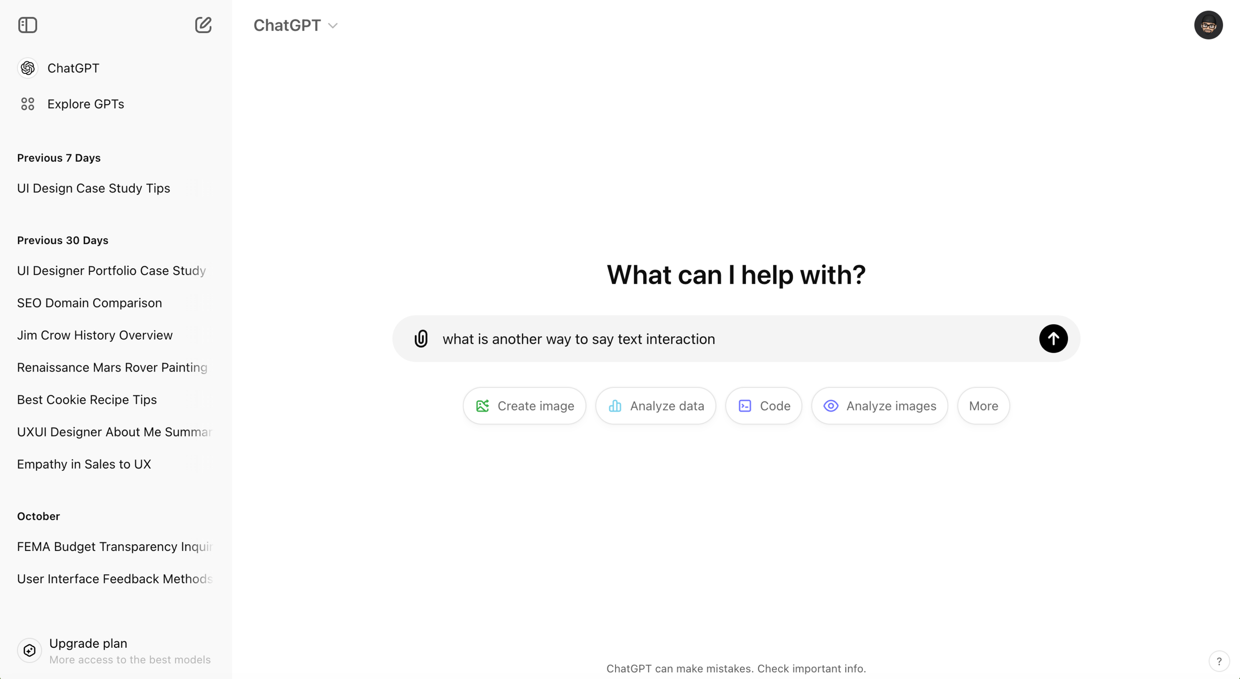
The focus for the Promina interface was to create a design that was clean, minimal, simple, and intuitive. Through research and analysis, ChatGPT and Google Gemini emerged as the top platforms for inspiration.
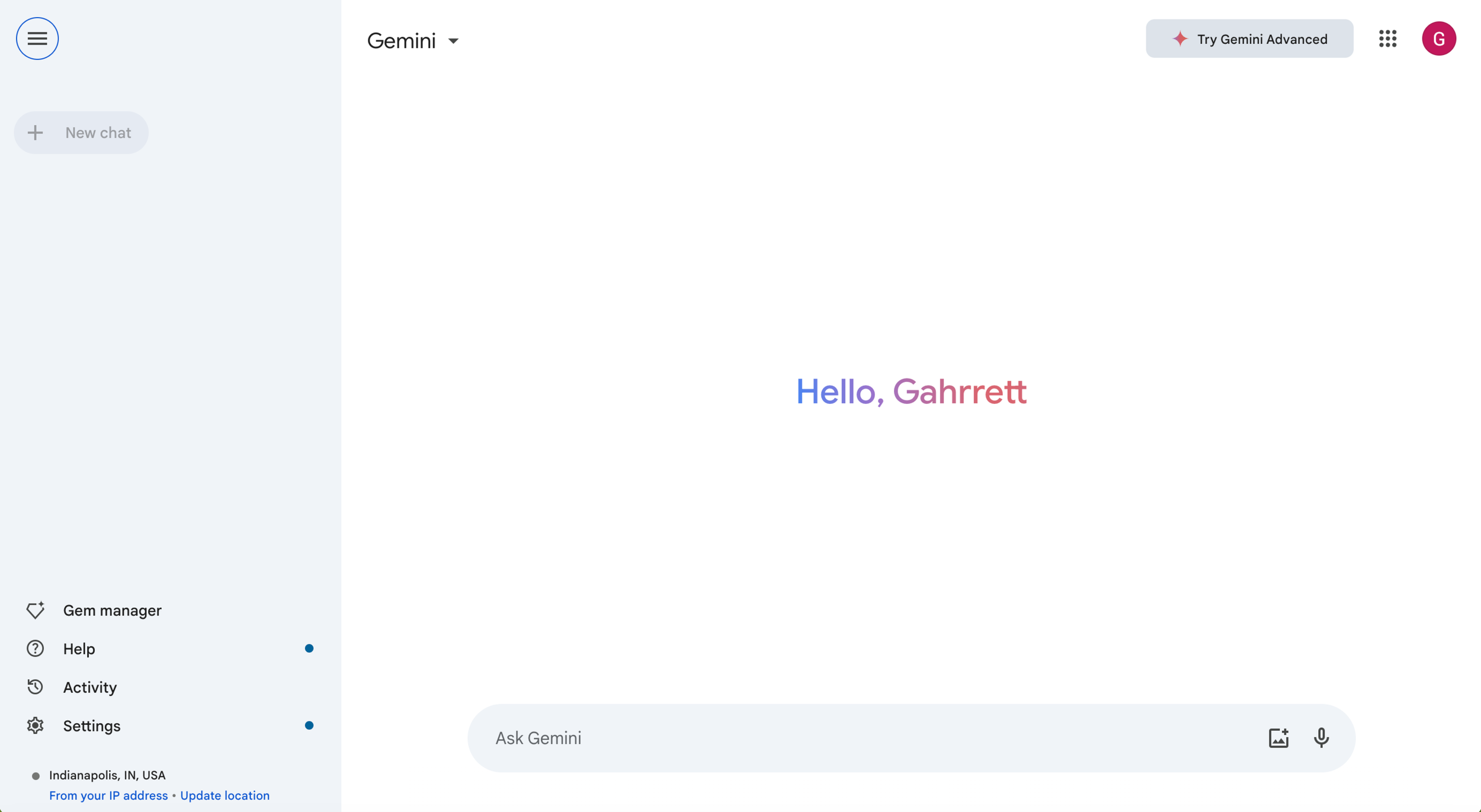
Google chat interface with the message 'Hello, Gahrrett' displayed in the center.
Open ChatGPT interface with the prompt "What can I help with?" and a text input box containing the sentence "what is another way to say text interaction." There are buttons below for creating images, analyzing data, coding, analyzing images, and more.

Brand Identity

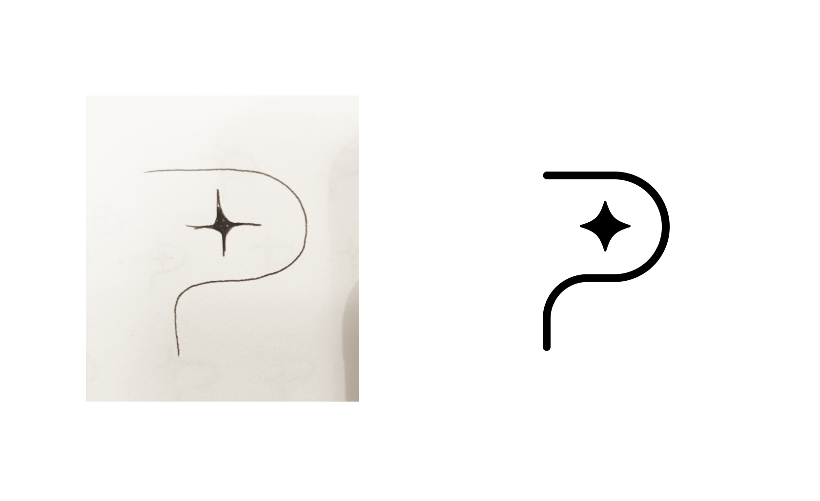
The brand identity for Promina was designed to feel intelligent, approachable, and instantly recognizable as an AI-powered tool—without losing the warmth and clarity of the Promina brand. Early sketch explorations focused on pairing a stylized “P” with a spark-like symbol, representing both insight and guidance.
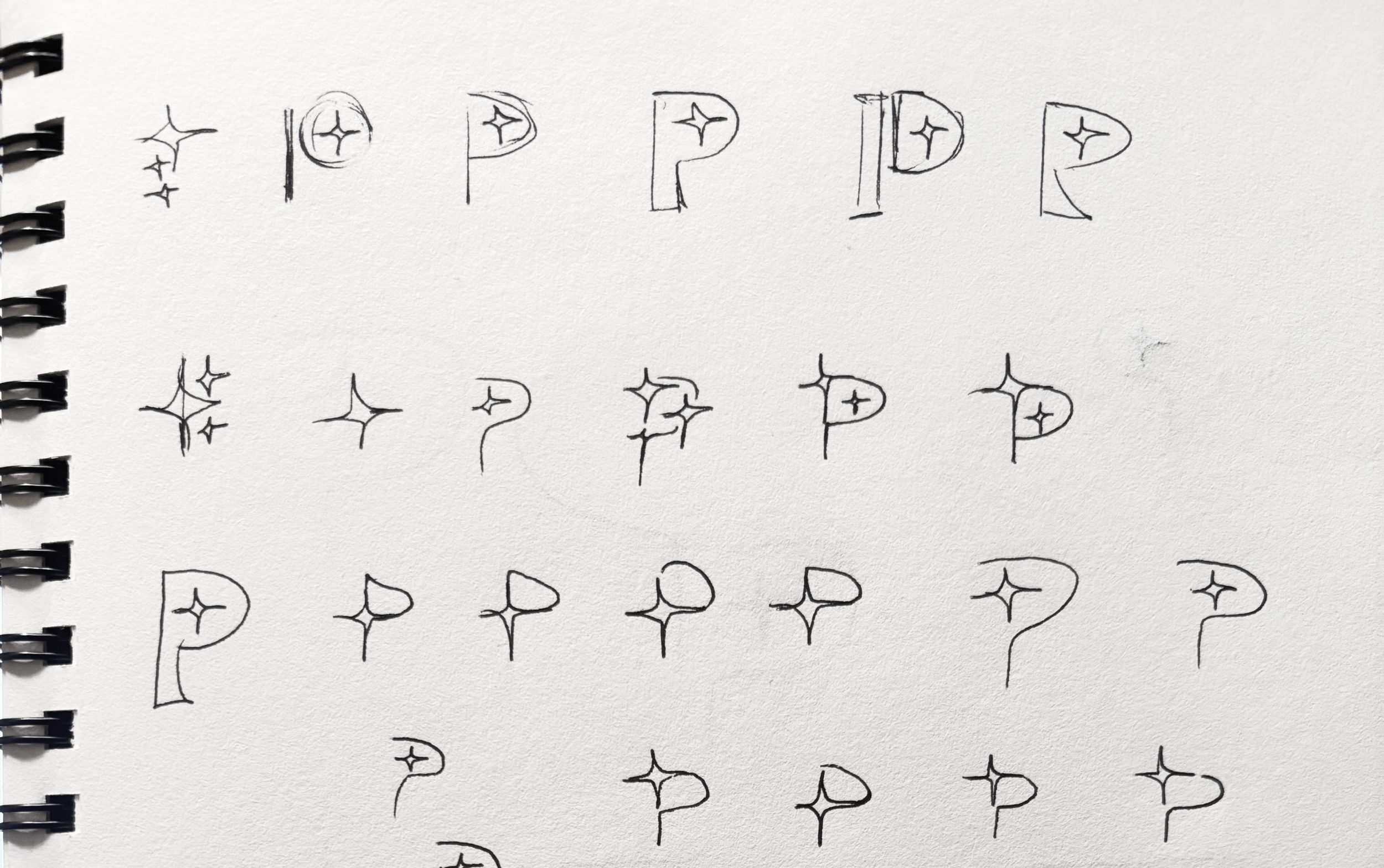
Hand-drawn sketches of the letter 'P' with a star or sparkle symbol inside, arranged in rows and varying styles.
Comparison of a hand-drawn and a digital version of a question mark with a star in the dot area.

A Confident Palette & Approachable Type

A deep navy anchors the brand with trust and professionalism, while soft blues and light neutrals add a sense of calm and clarity. Paired with IBM Plex Sans—a modern, humanist typeface—the identity feels both tech-forward and human-centered, aligning perfectly with Promina’s mission to support and empower.
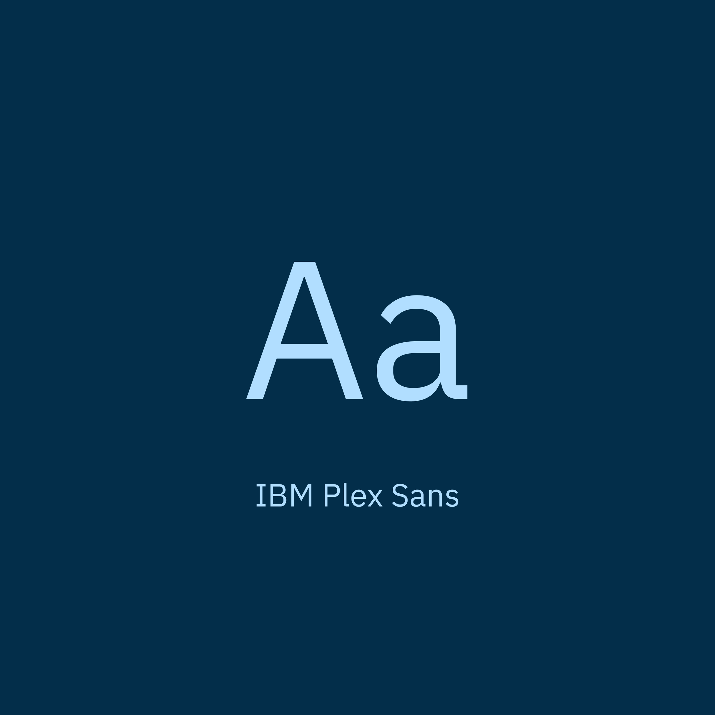
A color palette showing four colors: dark blue (#032E4A), light blue (#B1DEFF), pale gray (#F1F4F6), and white (#FFFFFF).

Brand Identity Lockup

The final mark strikes a balance between elegance and utility, reflecting Promina’s role as a thoughtful assistant.
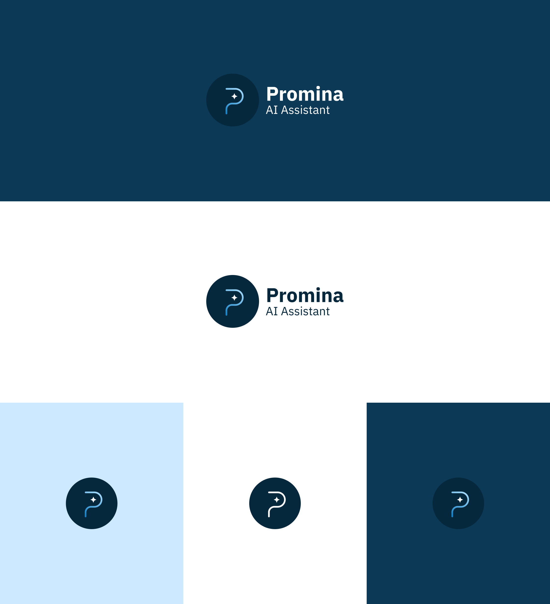
Logo for Promina AI Assistant with a question mark icon and the text 'Promina AI Assistant' in four different color backgrounds.

User Interface (UI) Design

Drawing inspiration from ChatGPT and Gemini, we created a high-fidelity mockup. Given the simplicity of the design and the project’s tight timeline, we opted to skip wireframing and moved directly into high-fidelity concepts.

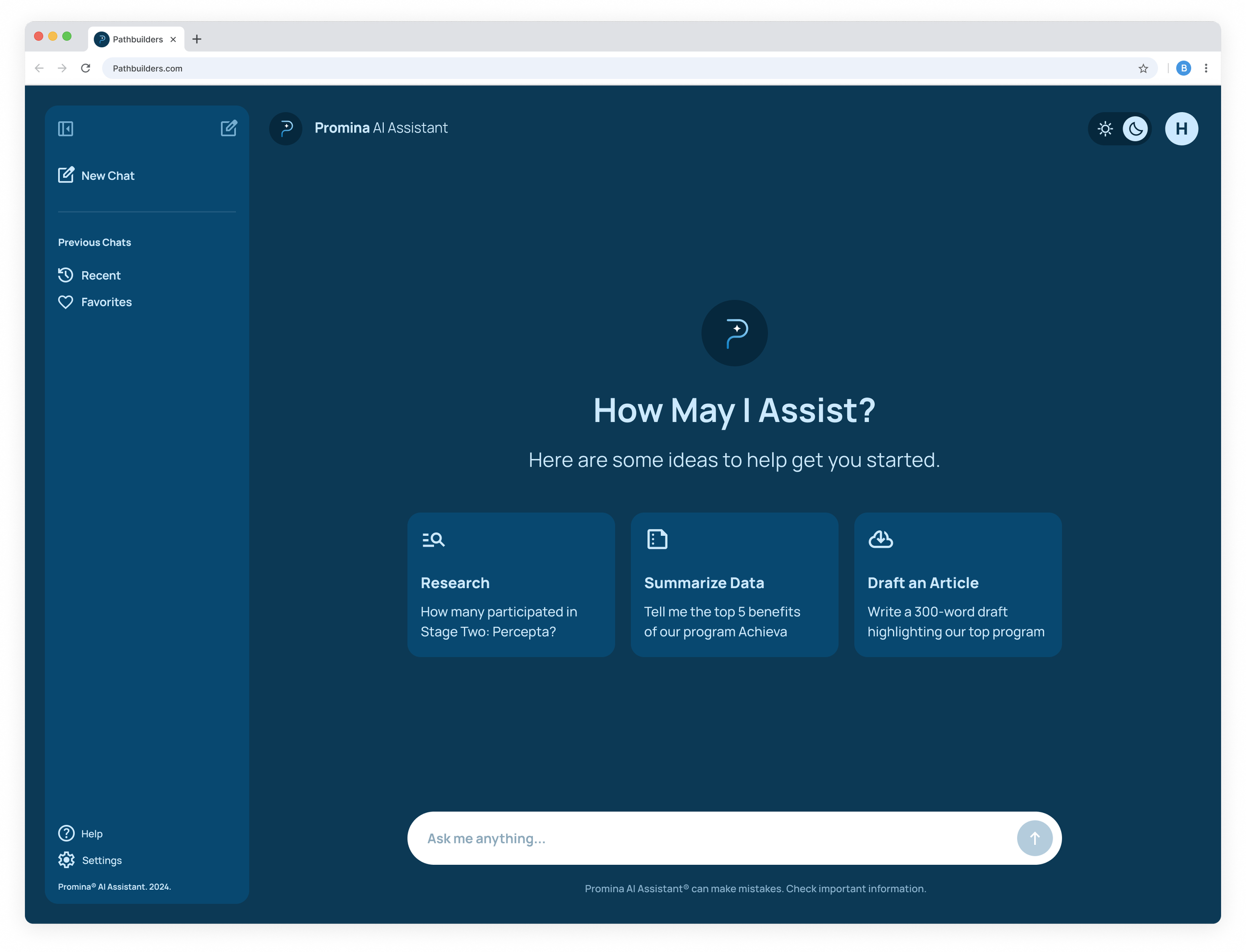
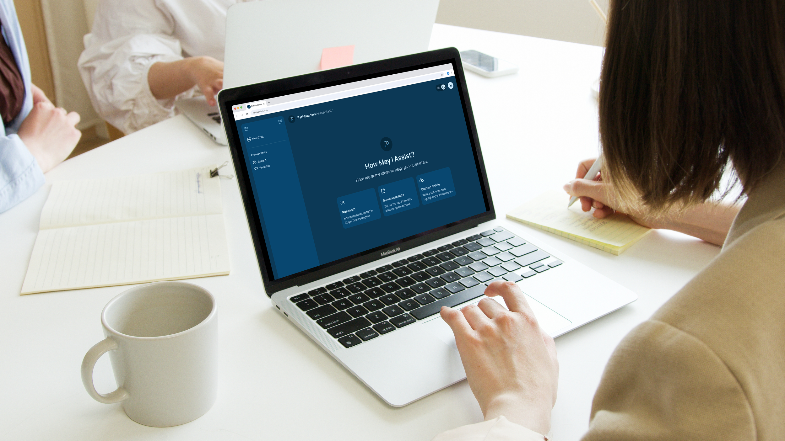
Screenshot of the Promina AI Assistant website UI on a computer screen, featuring a light blue sidebar with options for chat, help, and settings; main area with three options to get started: Research, Summarize Data, Draft an Article; and a text box at the bottom with a prompt to provide a list of mentorship programs.
Screenshot of a computer screen displaying the Promina AI Assistant interface. The interface has a dark blue background with options for research, data summary, and article drafting. There is a chat input box at the bottom that says 'Ask me anything...' and menu options on the left sidebar for New Chat, Recent, Favorites, Help, and Settings.
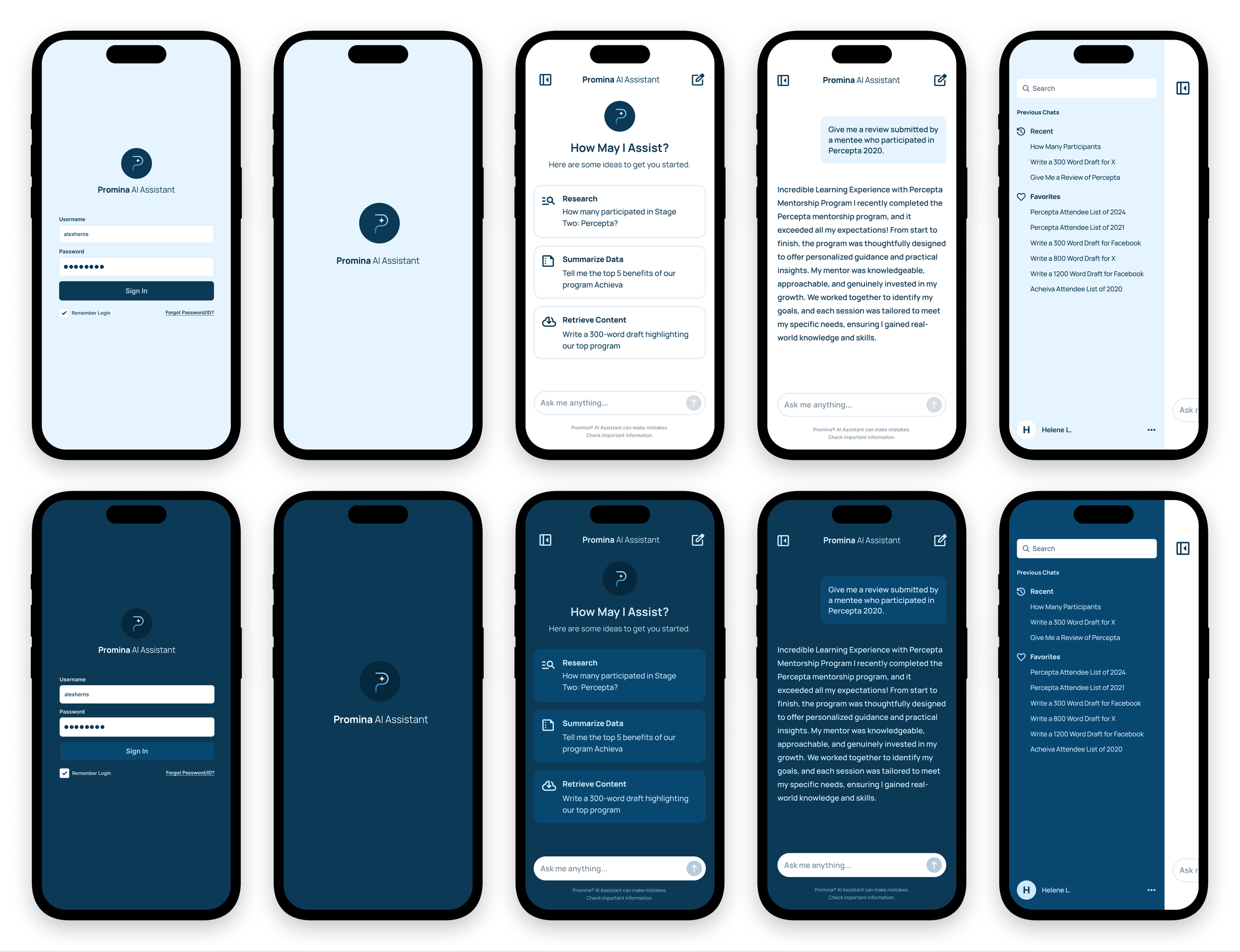
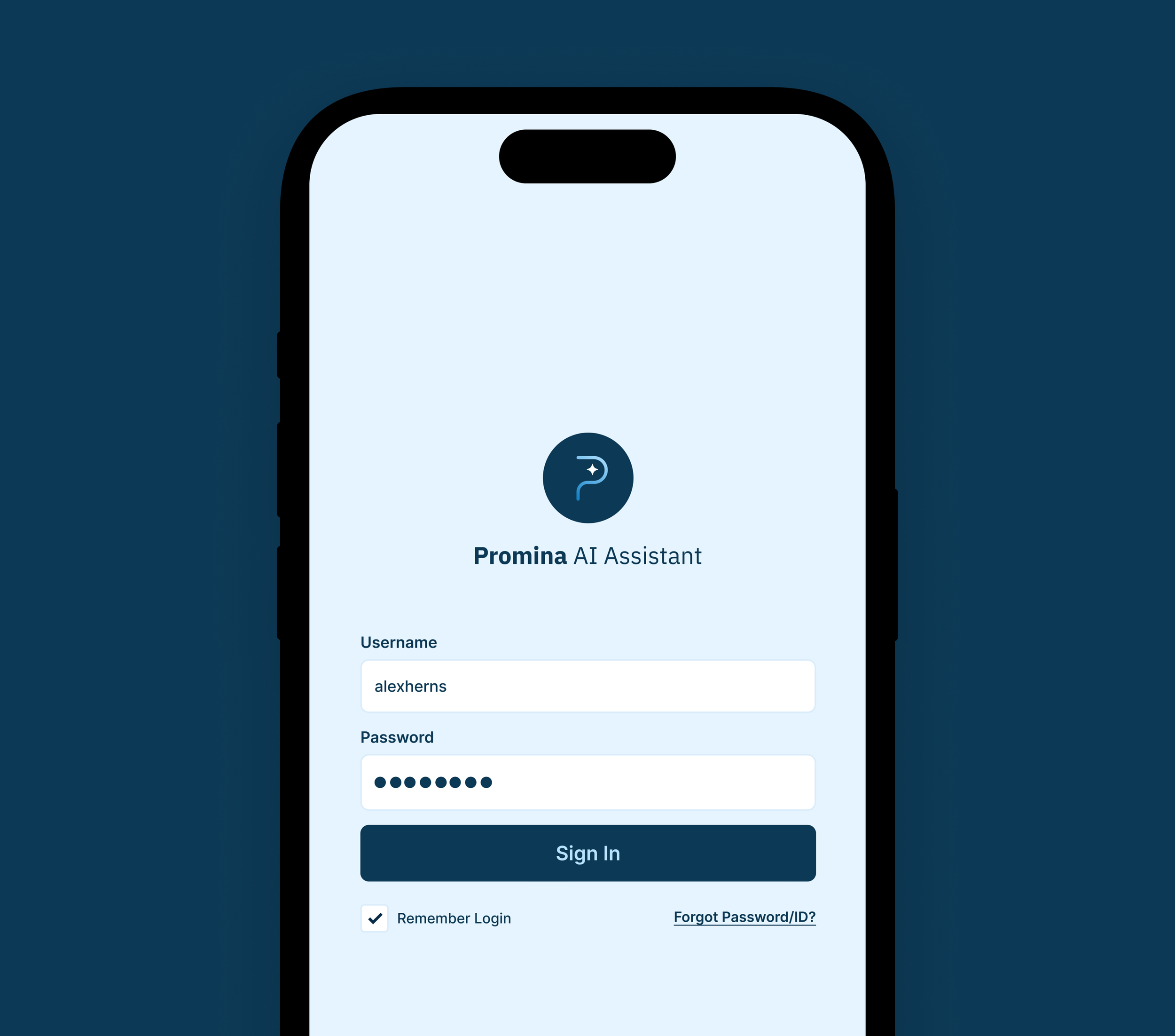
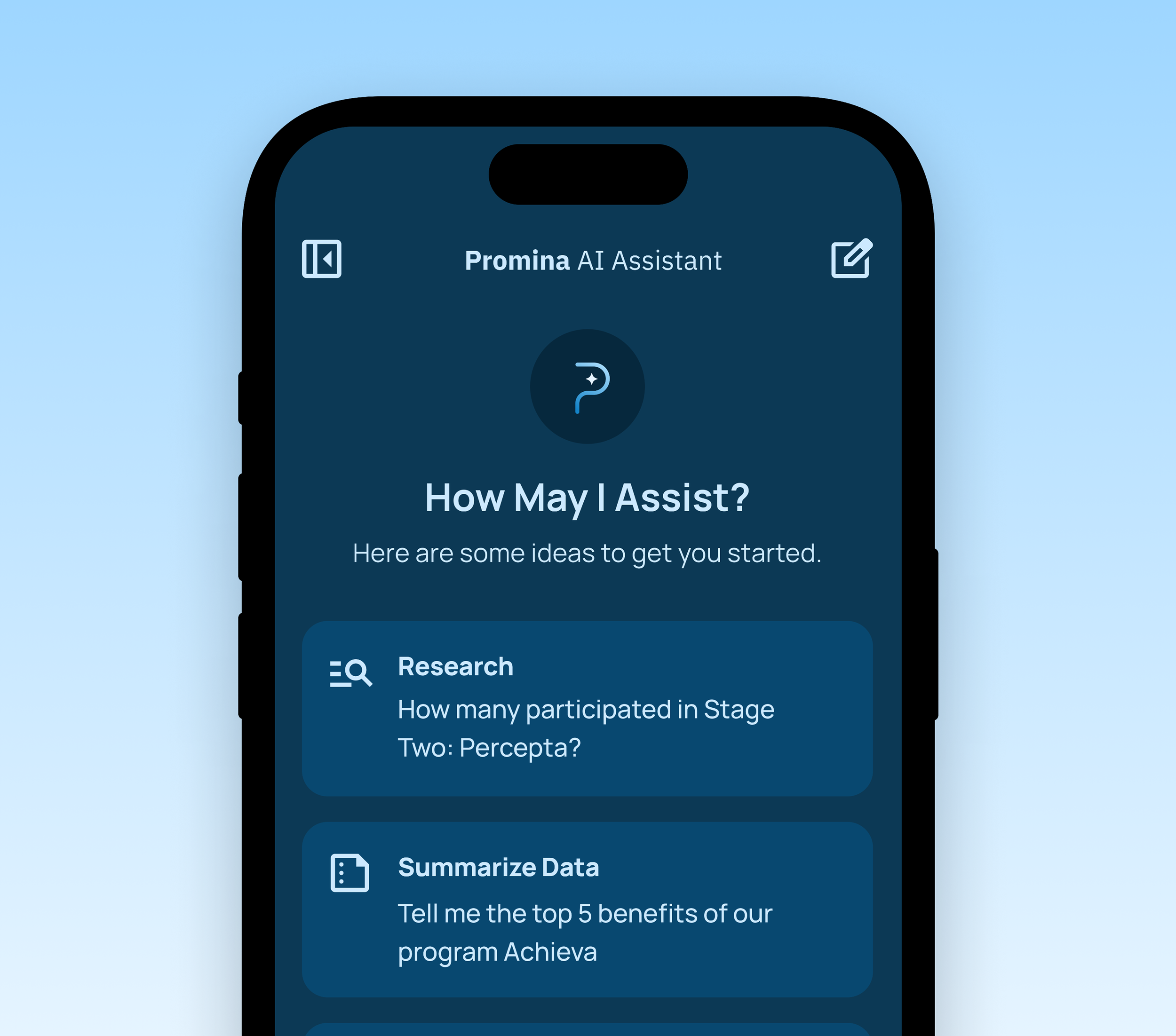
Screenshots of a mobile app interface for Promina AI Assistant showing login screens in light and dark modes, and chat screens with user prompts and responses.

04 — Outcomes

Final MVP Features

The final MVP featured a streamlined AI assistant that made data access fast, intuitive, and actionable. Users could research program stats, summarize key takeaways, or draft content directly within the tool. Features like favorites, chat history, and suggested prompts helped reduce friction and boost productivity. With this launch, Promina took a major step forward—transforming 15 years of data into a dynamic resource that supports storytelling, strategy, and growth.
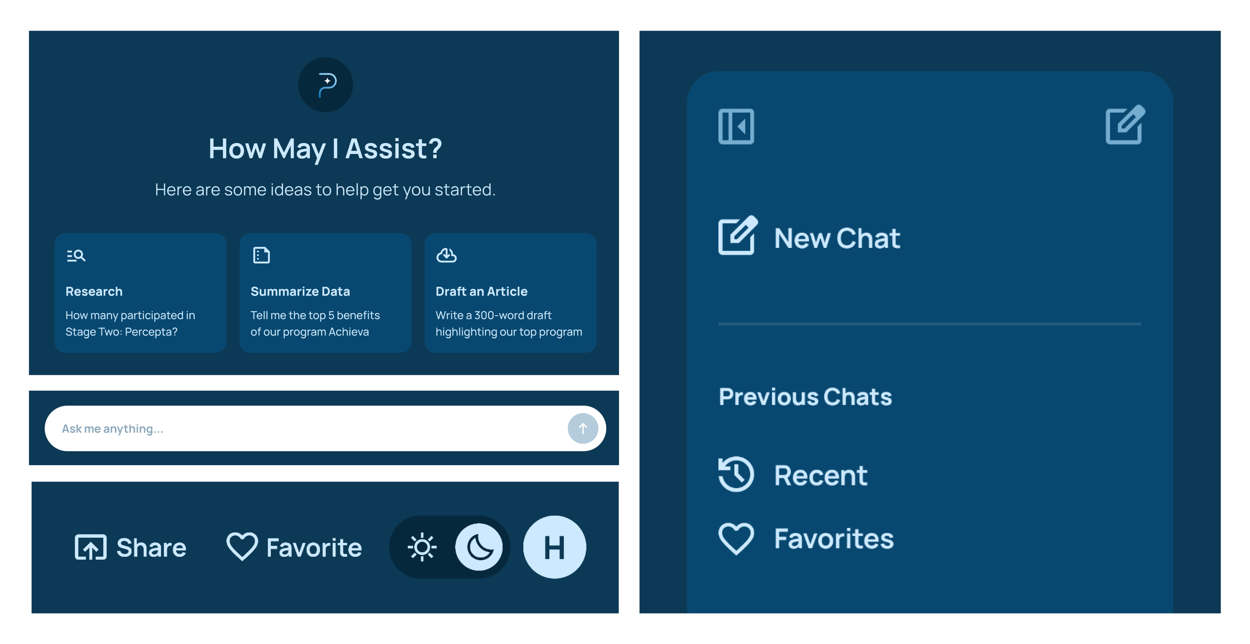
Screenshot of a website interface with a dark blue background, displaying options for assistance such as research, data summarization, and article drafting, along with a chat window titled 'New Chat' and options for previous chats, sharing, favoriting, and toggling day/night themes.

Identity Applied

A digital icon of a question mark with a star in the center, set against a dark circular background.

04 — Project Impacts

Built to Look Sharp. Built to Work Smarter.

Paired with a custom-built AI assistant, the updated brand system enhanced recognition, and operational efficiency across the board.

01

▸ Solidified Brand Expression

Transformed Prima’s existing brand foundation into a clear visual language that communicates its expertise and credibility across all channels.

02

▸ Elevated Professional Presence

Designed a refined identity system that makes Prima look as established and reliable as the services it provides, boosting confidence with clients and stakeholders.

03

▸ Unified Visual Consistency

Created a cohesive design framework—color, type, iconography, and imagery—that ensures every touchpoint feels connected and unmistakably Prima.

06

▸ Future-Proofed Design

Equipped Prima’s team with ready-to-use brand guidelines and assets, enabling consistent execution now and as the brand grows.

04

▸ Flexible, Scalable System

Built a toolkit of logo variations, graphic elements, and templates that adapt to different platforms and campaigns without losing brand strength.

05

▸ Stronger Market Recognition

Delivered a visual identity that is distinct and memorable, making it easier for customers to identify and recall Prima in a competitive space.

More Cases

More Studio Cases

← See Previous
See Next →

Ready to Refresh Your Brand?

Brands stuck in the past lose trust. I bring yours forward—modernizing outdated visuals into a clear, credible identity your audience connects with, and one you’ll be proud to stand behind.

Refresh My Brand Identity →