


DarkButter Bakeland
DarkButter began without an audience, sales history, or launch data. The challenge wasn’t simply to make something look good — it was to design a brand system that could generate desire before scale, feel premium at low volume, and remain consistent as the business grows.
Dark Butter launched without an audience, sales track record, or category positioning — meaning the visual identity had to do the heavy lifting for credibility, desirability, and future scale from Day One.
This case wasn’t about just looking yummy — it was about creating trust and desire before scale exists.
Services: Visual Identity Design
Industry: Food & Beverage
Year: 2026
DarkButter needed to build credibility from scratch before customers, sales, or proof ever existed.
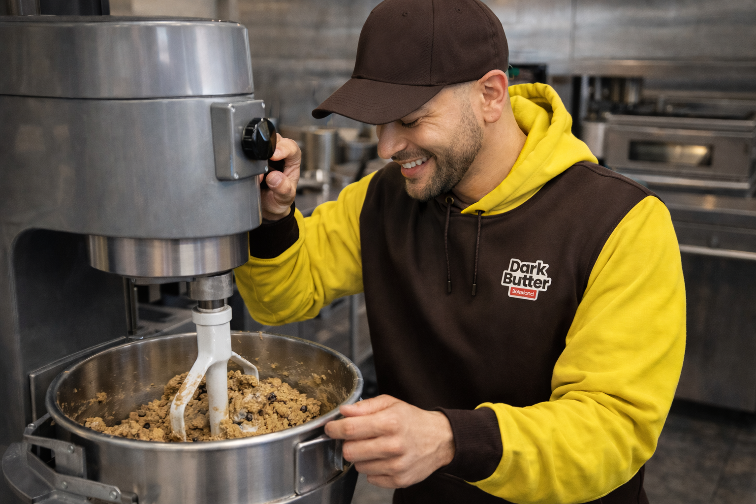
DarkButter started from zero—no audience, no sales history, and no proof that the brand would work. That meant the brand itself had to earn trust before customers ever took a bite. The goal wasn’t just to make things look good, but to make DarkButter feel legit, premium, and worth paying attention to from day one. Everything needed to hold up as the business grew, without feeling like it was trying too hard to get off the ground.
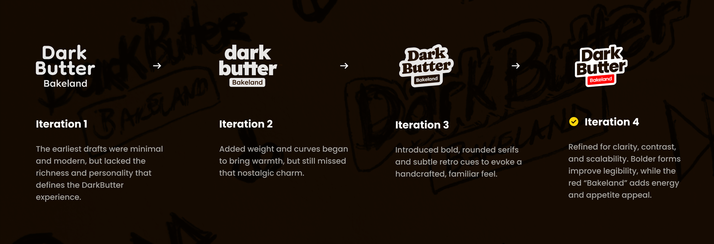
The DarkButter mark started from a solid idea, but the early versions didn’t fully hold up once they were placed into real situations.
The first iterations were clean and modern, but felt a bit flat and didn’t reflect the warmth or richness of the product. As the mark evolved, weight and softness were added to give it more presence and personality. Rounded shapes and subtle retro influence helped it feel more familiar and food-forward, without leaning into nostalgia too heavily.
The initial logo direction skewed too clean and overly polished. Through iterative refinement, the wordmark evolved into a bolder, more rounded form with greater warmth and character. Handcrafted curves, layered depth improved recognition while reinforcing a nostalgic, premium tone. The refined “Bakeland” tag added contrast and energy, balancing approachability with brand confidence.
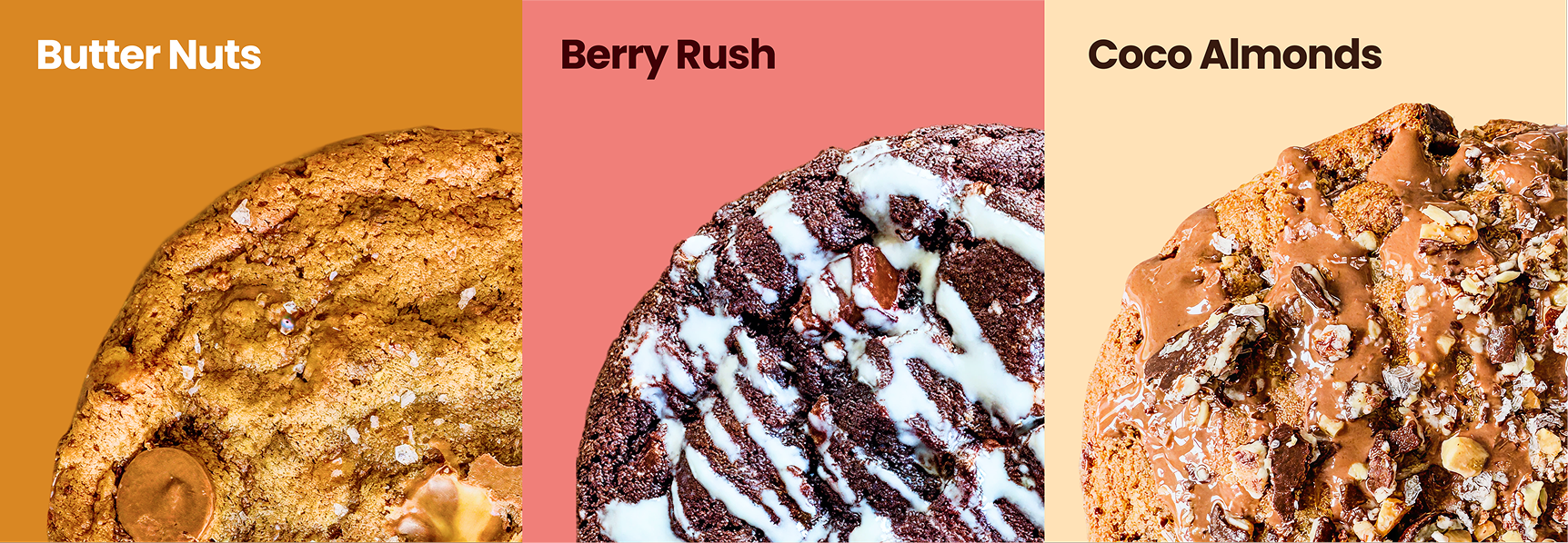
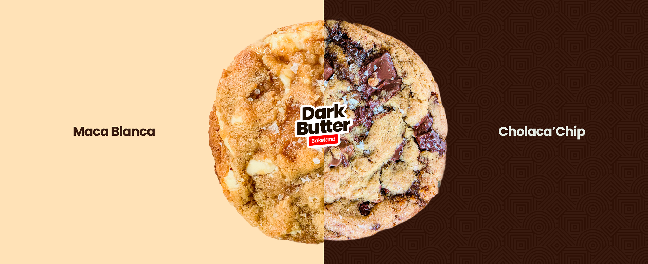
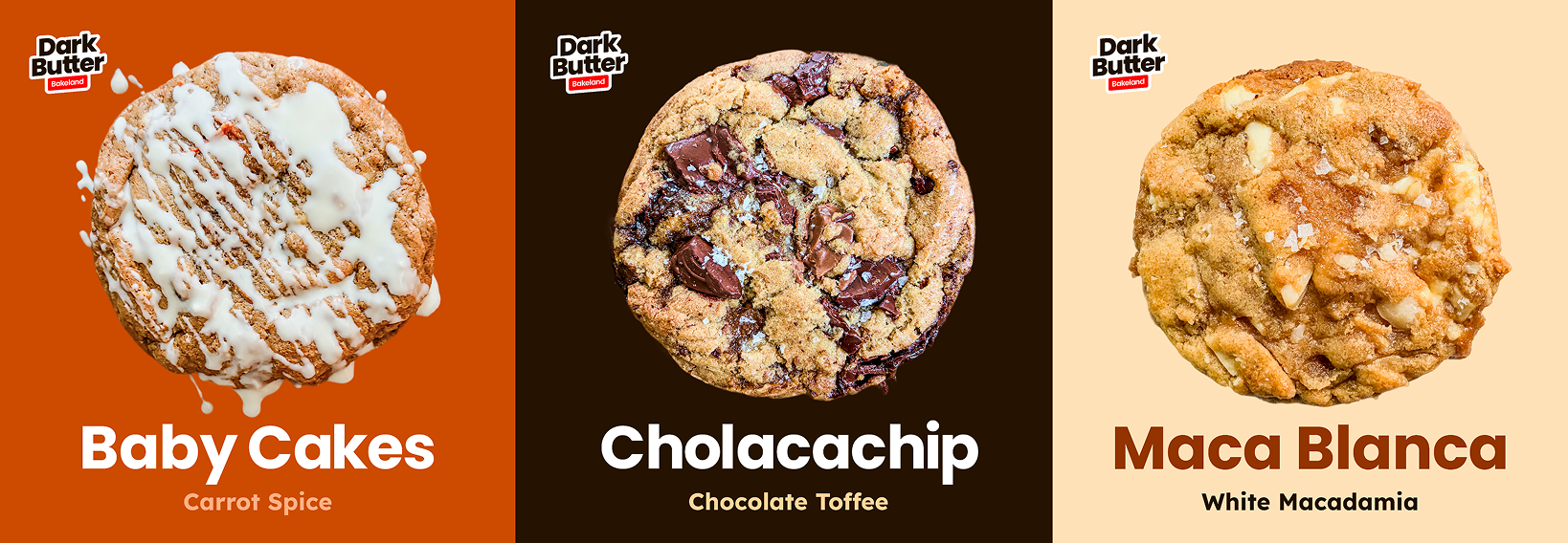
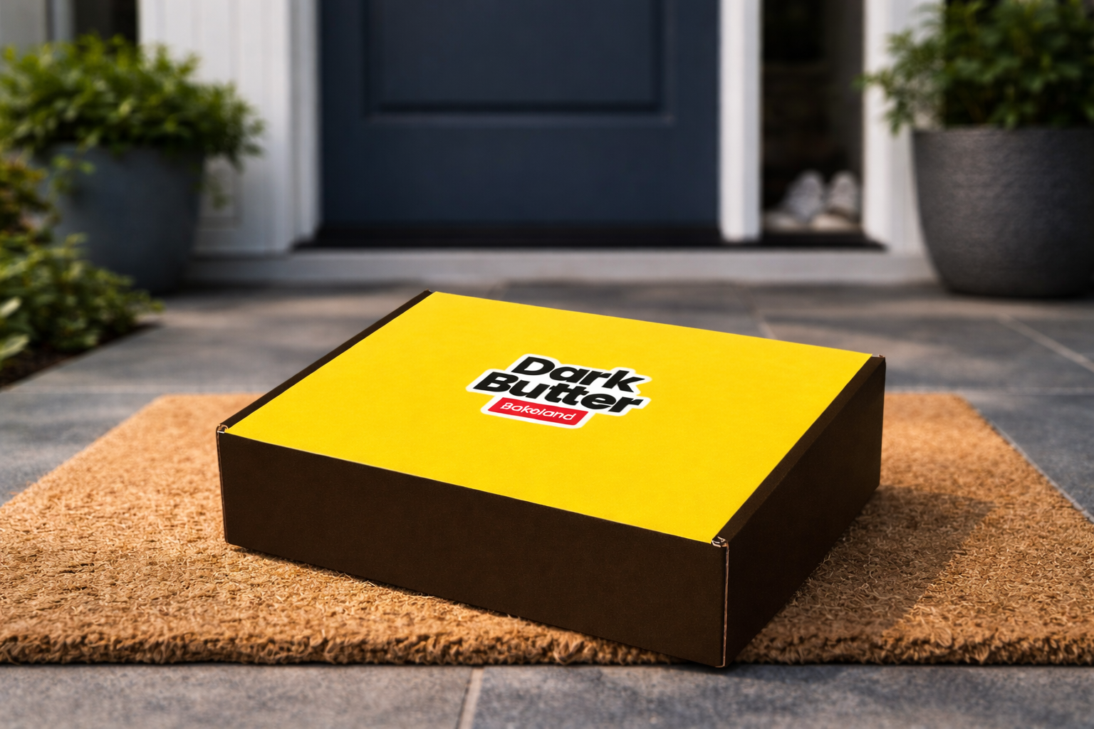
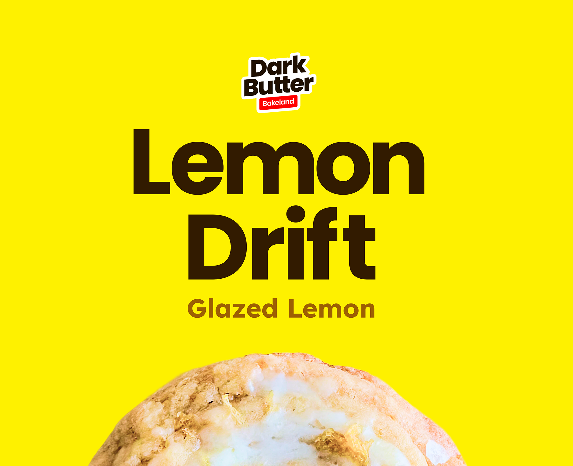
Designing packaging that sells the product first, while reinforcing the brand behind it in a clear, confident way.
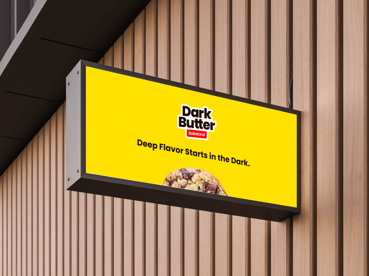
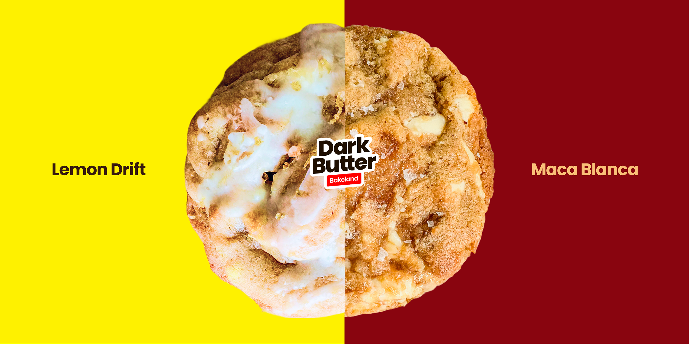
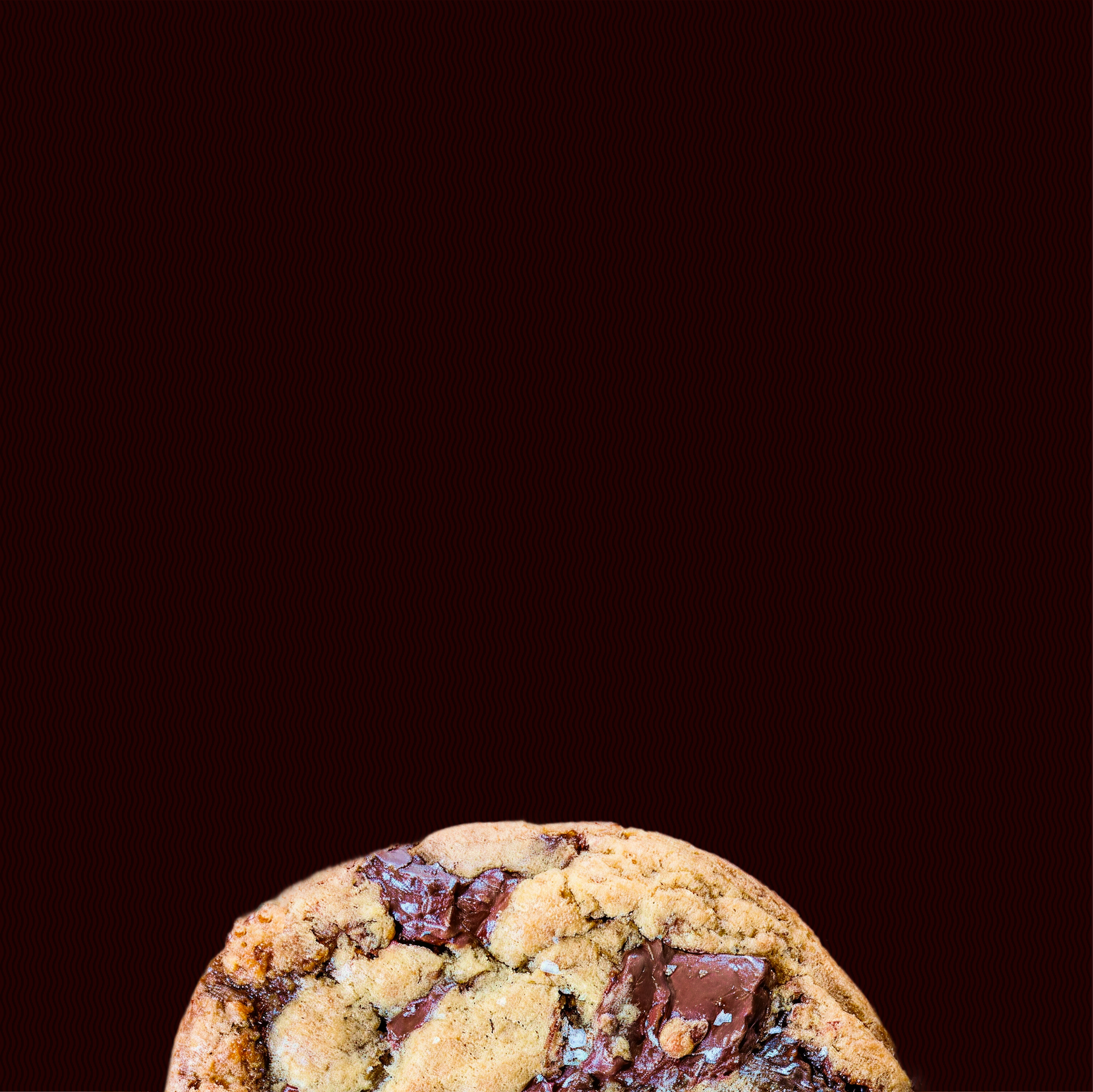
Packaging and graphics were designed to let the product lead while keeping the brand clear and recognizable. Each layout prioritizes the cookie itself, using bold type, high contrast, and simple hierarchy so flavors are easy to scan and remember. Color is used intentionally to differentiate products without breaking the system, allowing each flavor to feel distinct while still part of the same family. The result is packaging that feels confident, consistent, and flexible—able to work across digital displays, physical packaging, and future product extensions without needing constant redesign.


Building a brand system meant to scale naturally, not be rebuilt as the business evolves.
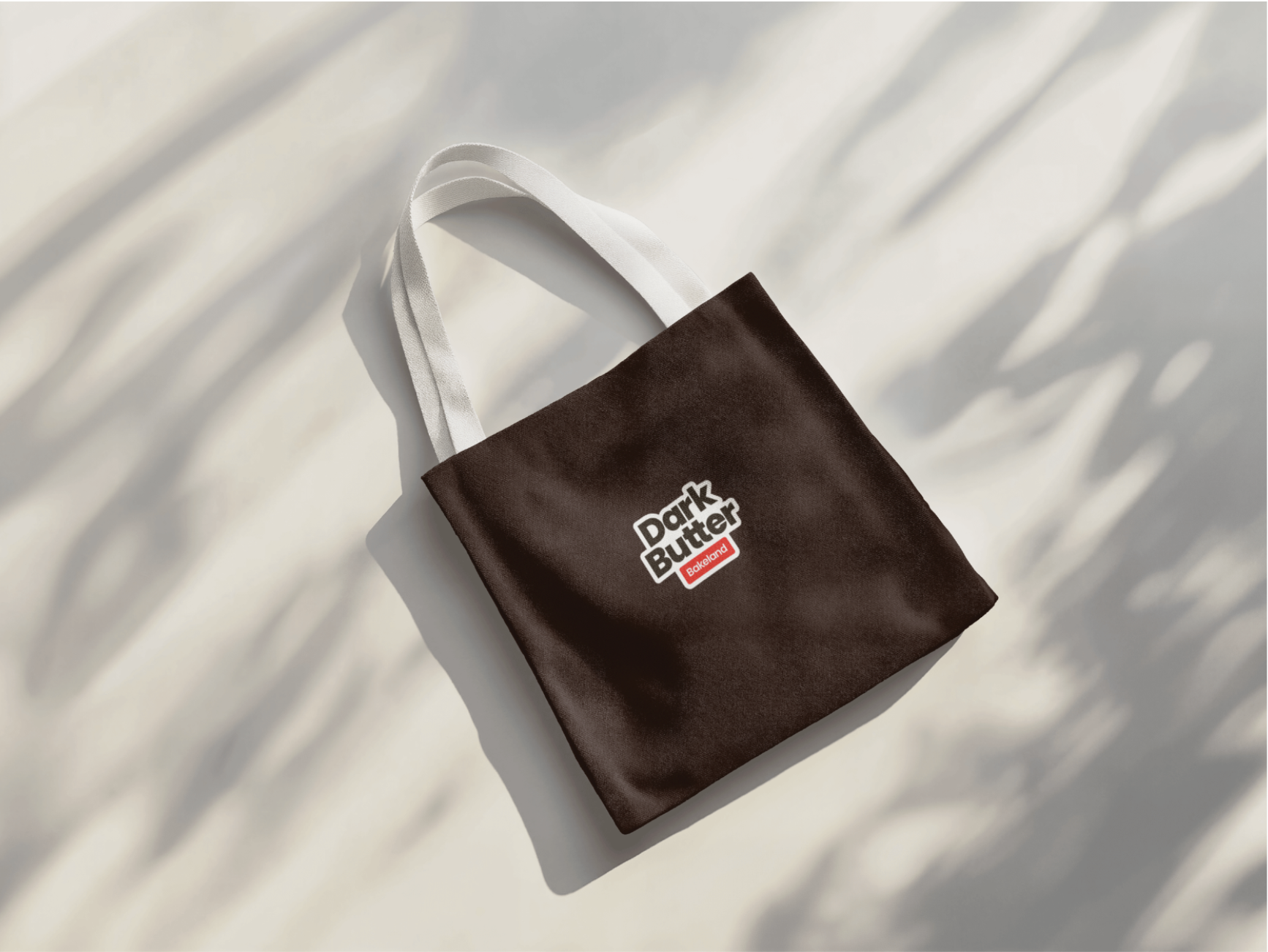
From the beginning, the goal wasn’t to design for a single moment, but to build a foundation that could support growth over time. The brand needed to work across packaging, digital touchpoints, physical environments, and future products without losing clarity or recognition. Strategic decisions around hierarchy, color, and structure were made to keep the system flexible while maintaining consistency. This approach allows DarkButter to introduce new flavors, formats, and experiences without reinventing the brand each time, keeping the focus on momentum rather than maintenance.