


Jireh Vision Consulting
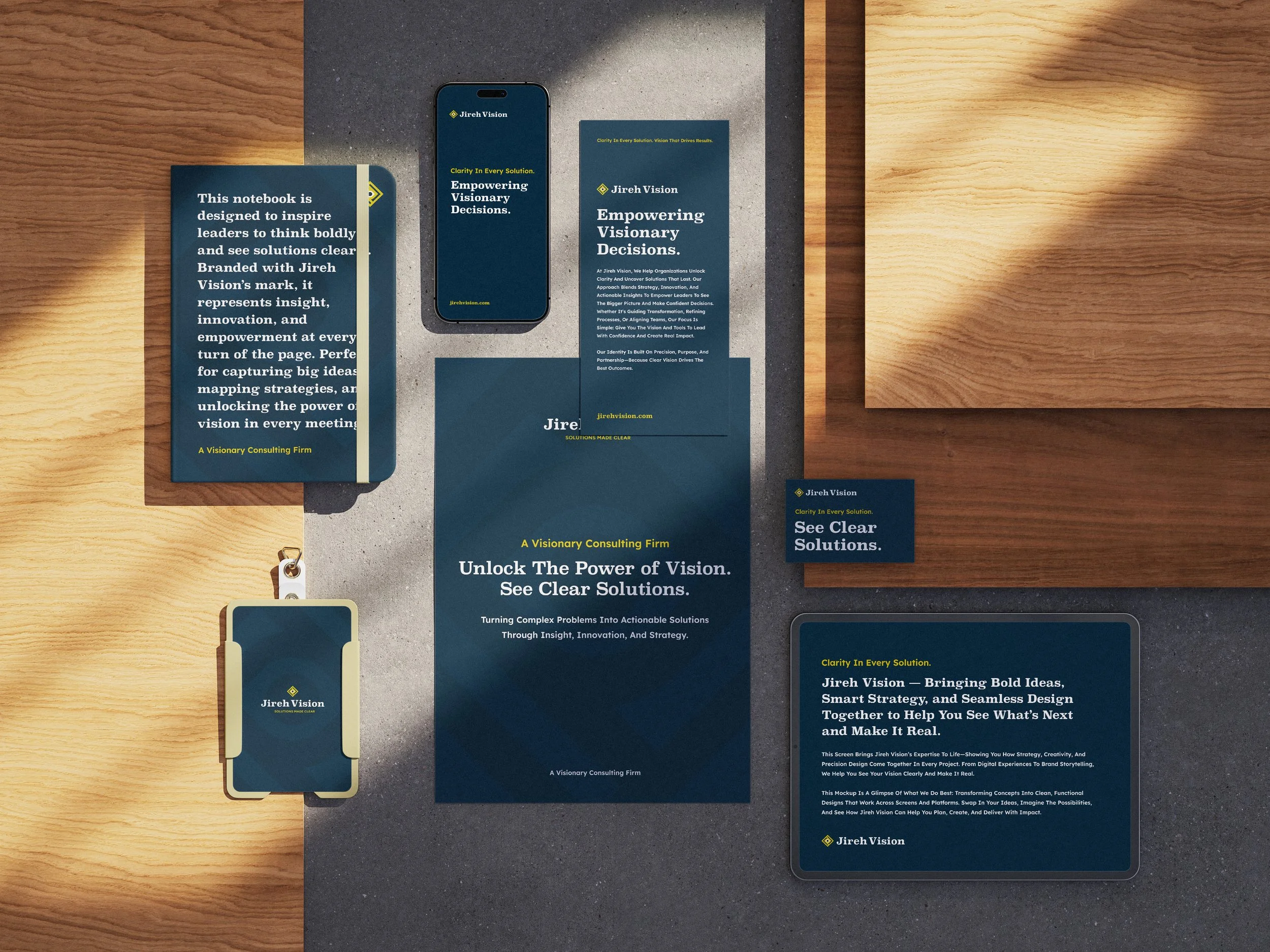
Jireh Vision is a strategic consulting firm empowering businesses through training, research, and grant writing. We created a bold, professional identity rooted in their mission of clarity and transformation. Inspired by the idea of “Unlocking the Power of Vision,” the logo centers on the human eye—a symbol of focus and insight. The final mark is simple, distinctive, and forward-looking, just like their approach to problem-solving.
Deliverables
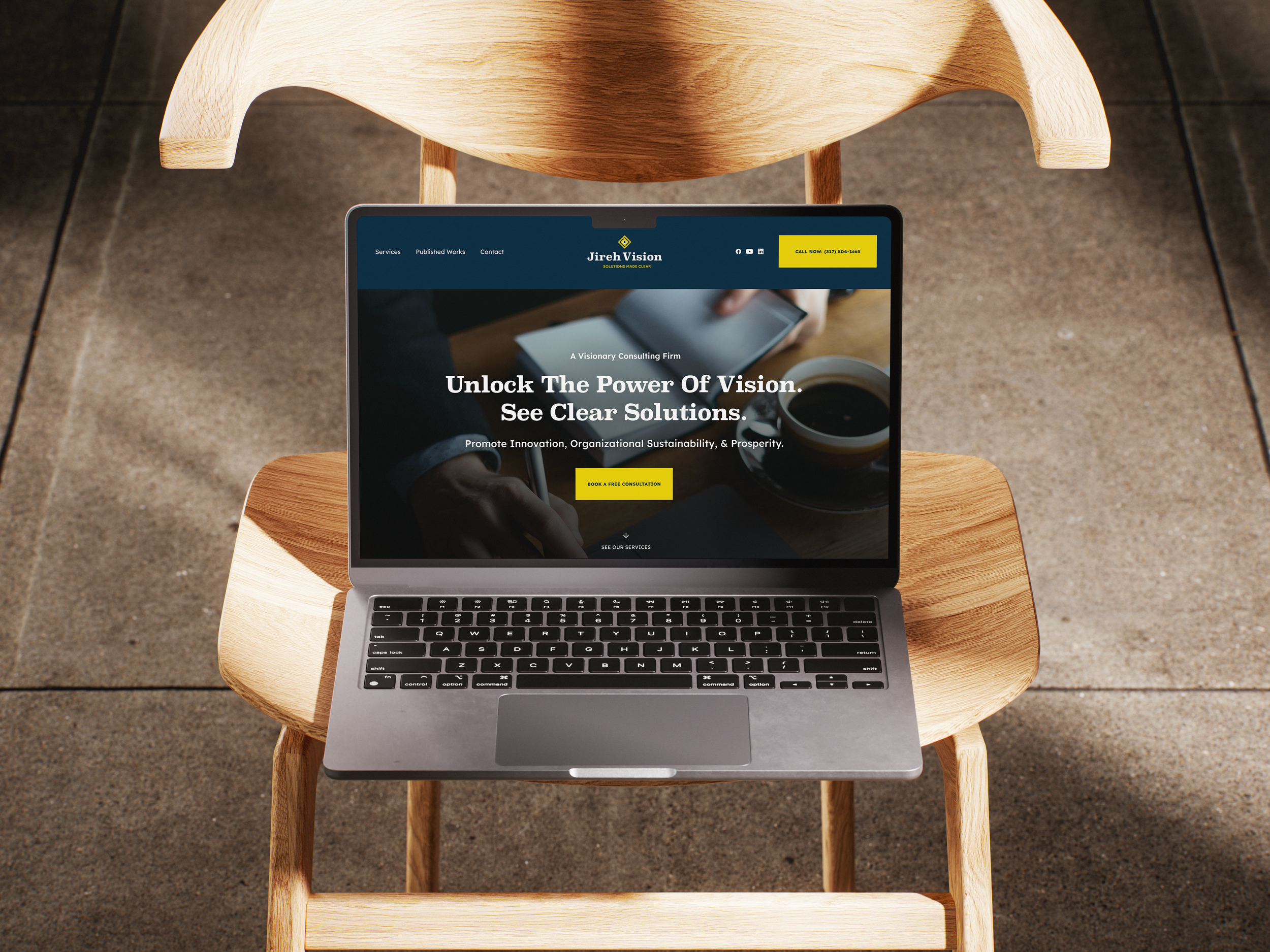
▸ Brand Identity Design
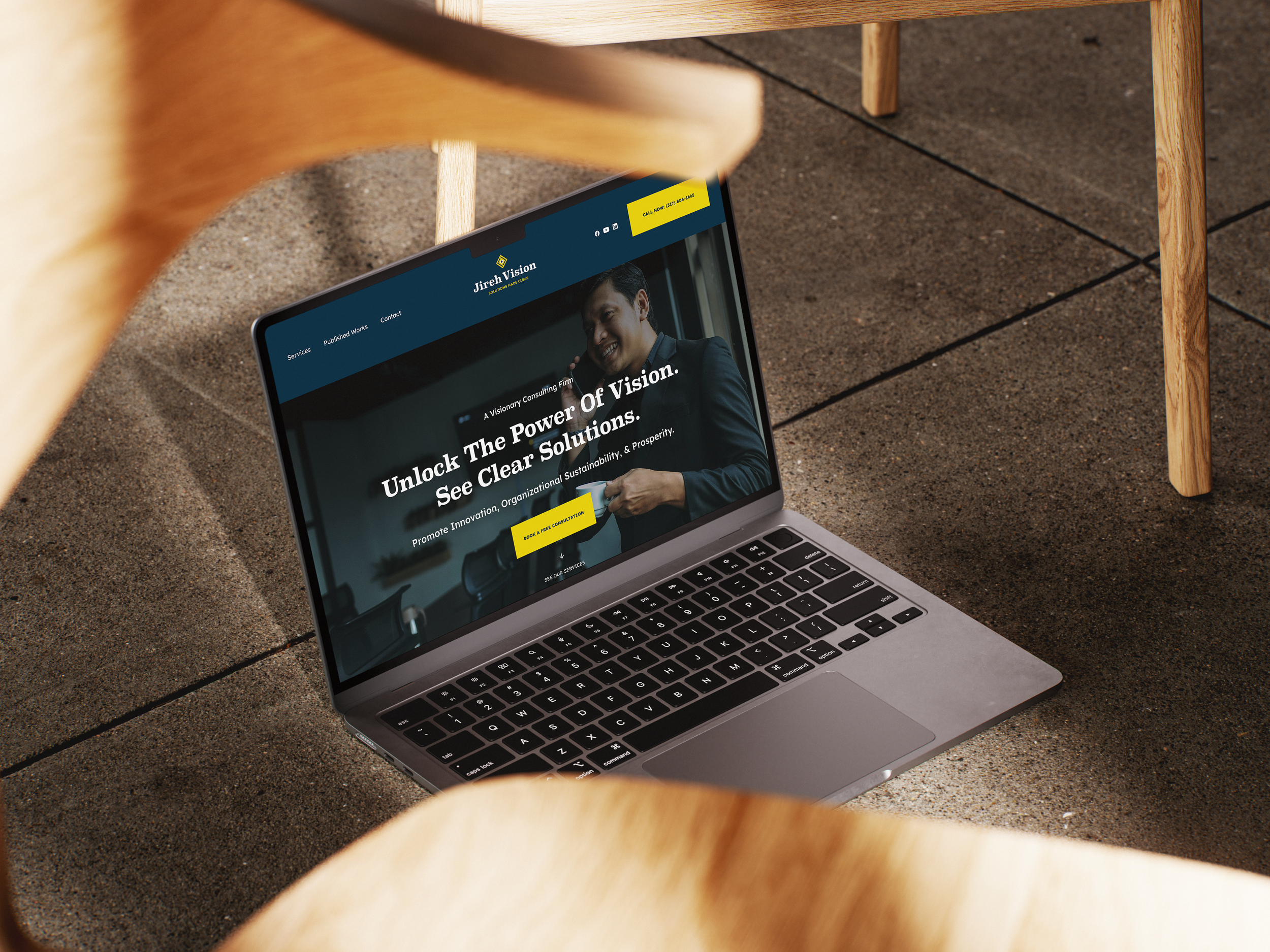
▸ Web Design & Development
▸ Identity Exploration
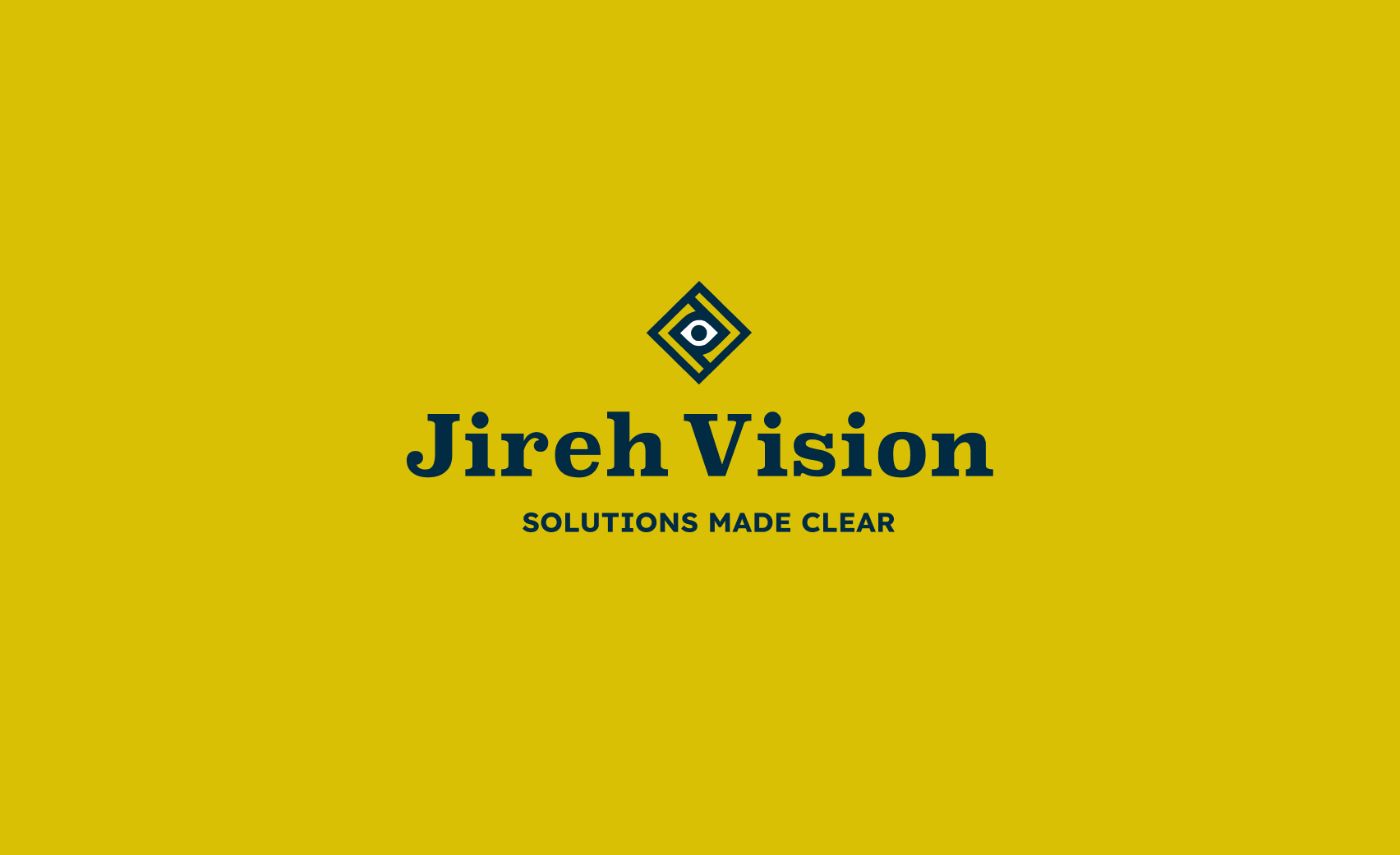
A Bold Beginning, Designed for Clarity
With no prior identity in place, we built the Jireh Vision brand mark from the ground up—anchored in the concept of insight and direction. The eye at the center symbolizes focus, clarity, and future thinking—core to the firm's mission. The result is a mark that’s striking, modern, and unmistakably aligned with the brand’s purpose: to help others see clearly and move forward with confidence.
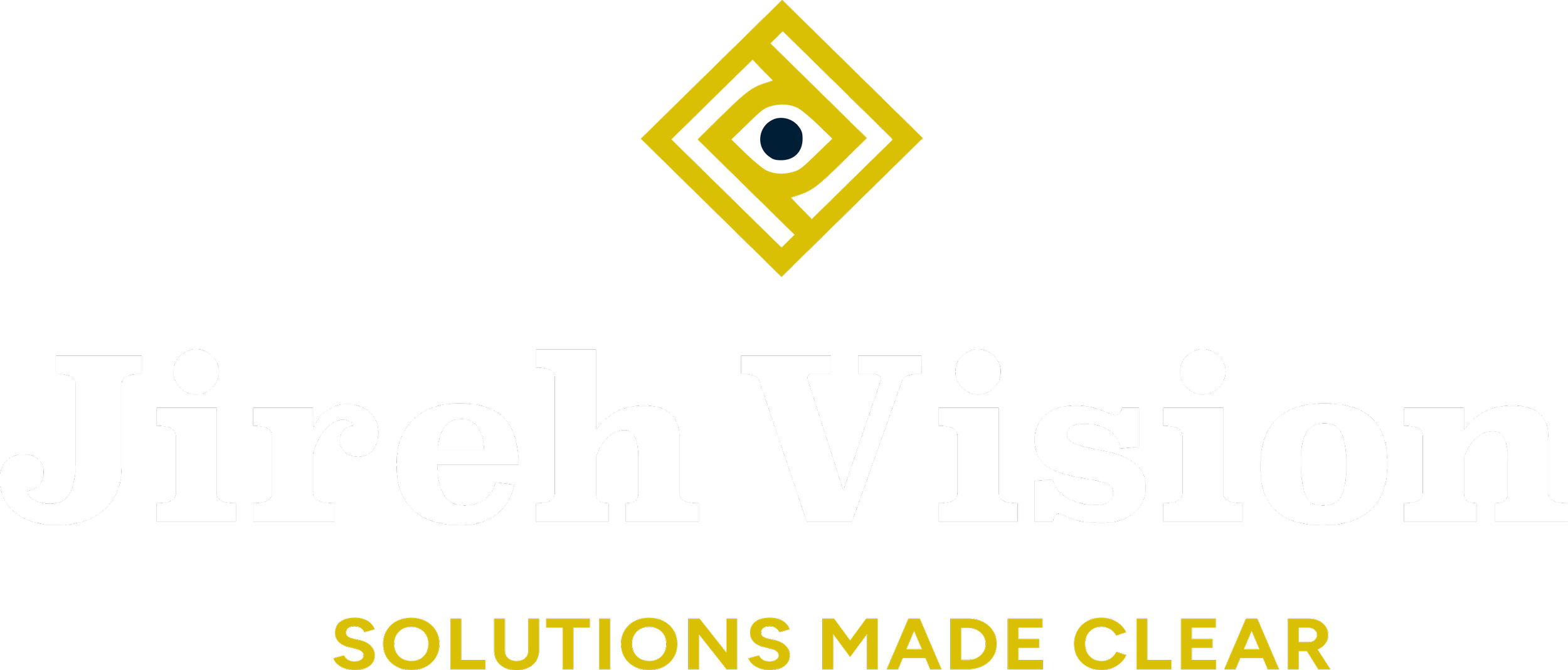
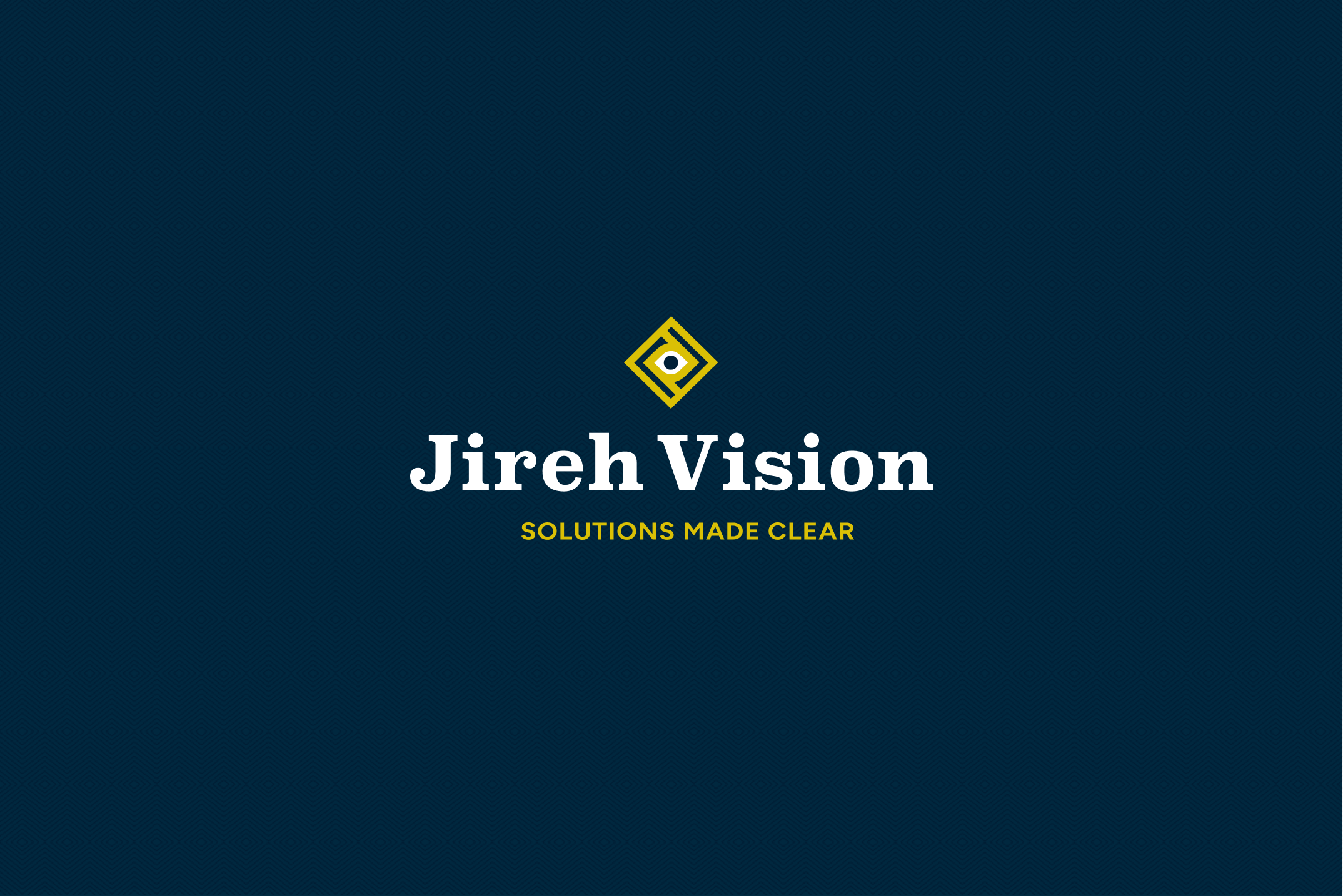
Final Brand Lockup
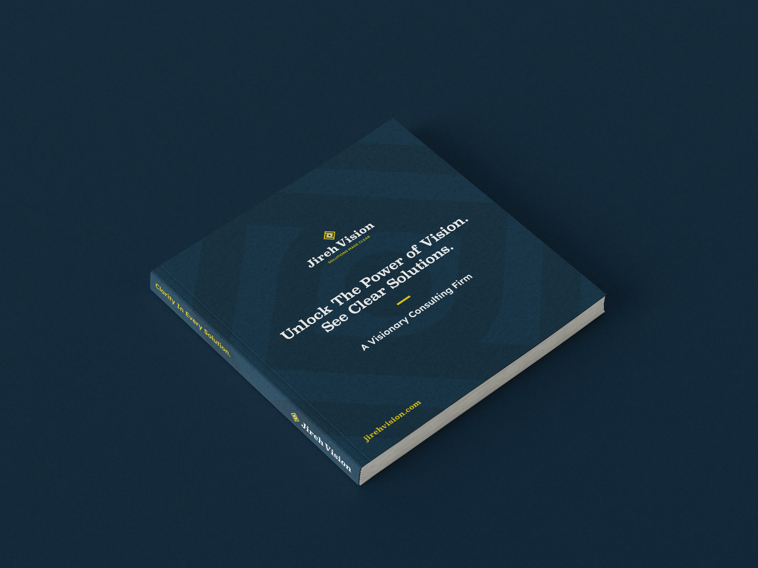
The Jireh Vision logo combines clarity, focus, and trust into a single, memorable mark. The geometric eye symbol represents insight and vision—core to the brand’s promise of providing “solutions made clear.” The clean, structured lines suggest precision and reliability, while the bold typography reinforces confidence and professionalism.

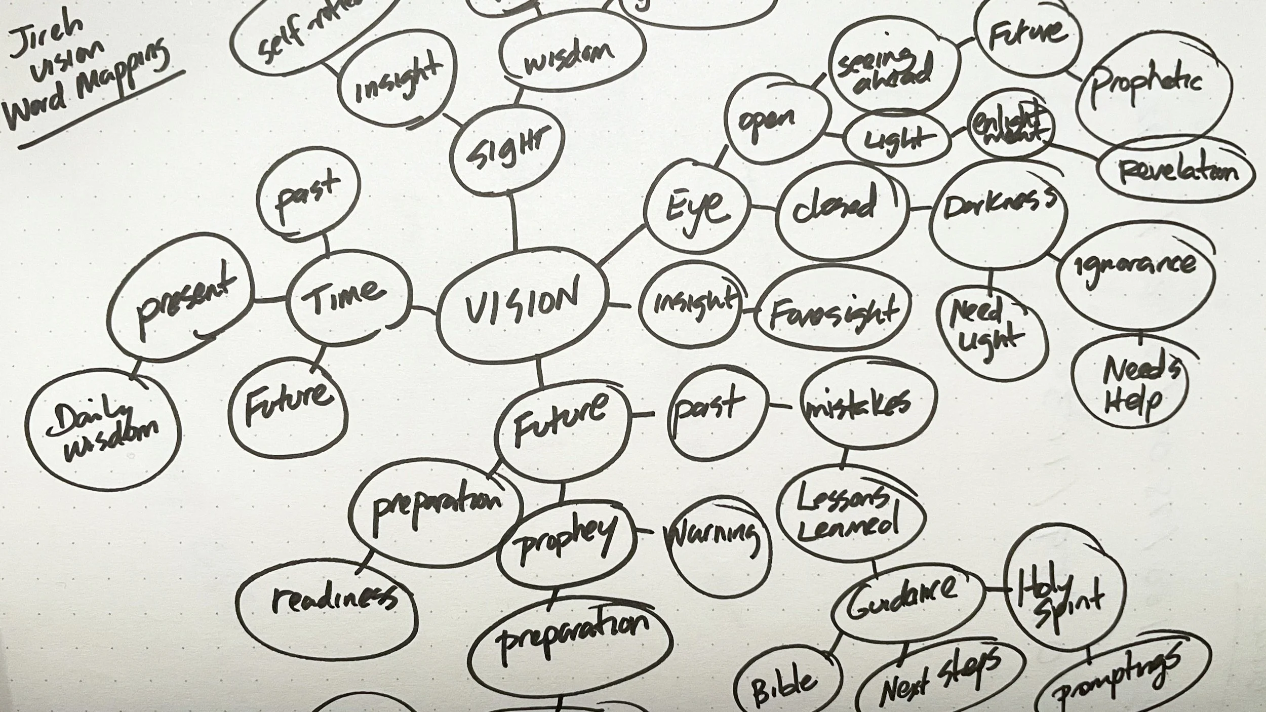
Word Mapping Exercise
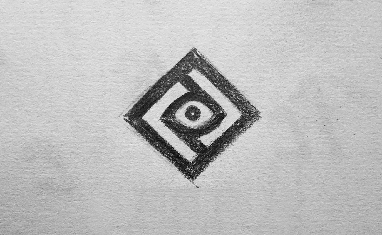
01 — First Sketch
The logo design process begins with understanding the client’s goals and the message they want to communicate. Diving into the brand’s values and creating a word map helps unlock fresh ideas and inspiration.
The Building Process
Rough Draft Sketches & Concepts.
Rough Draft Sketches & Concepts.
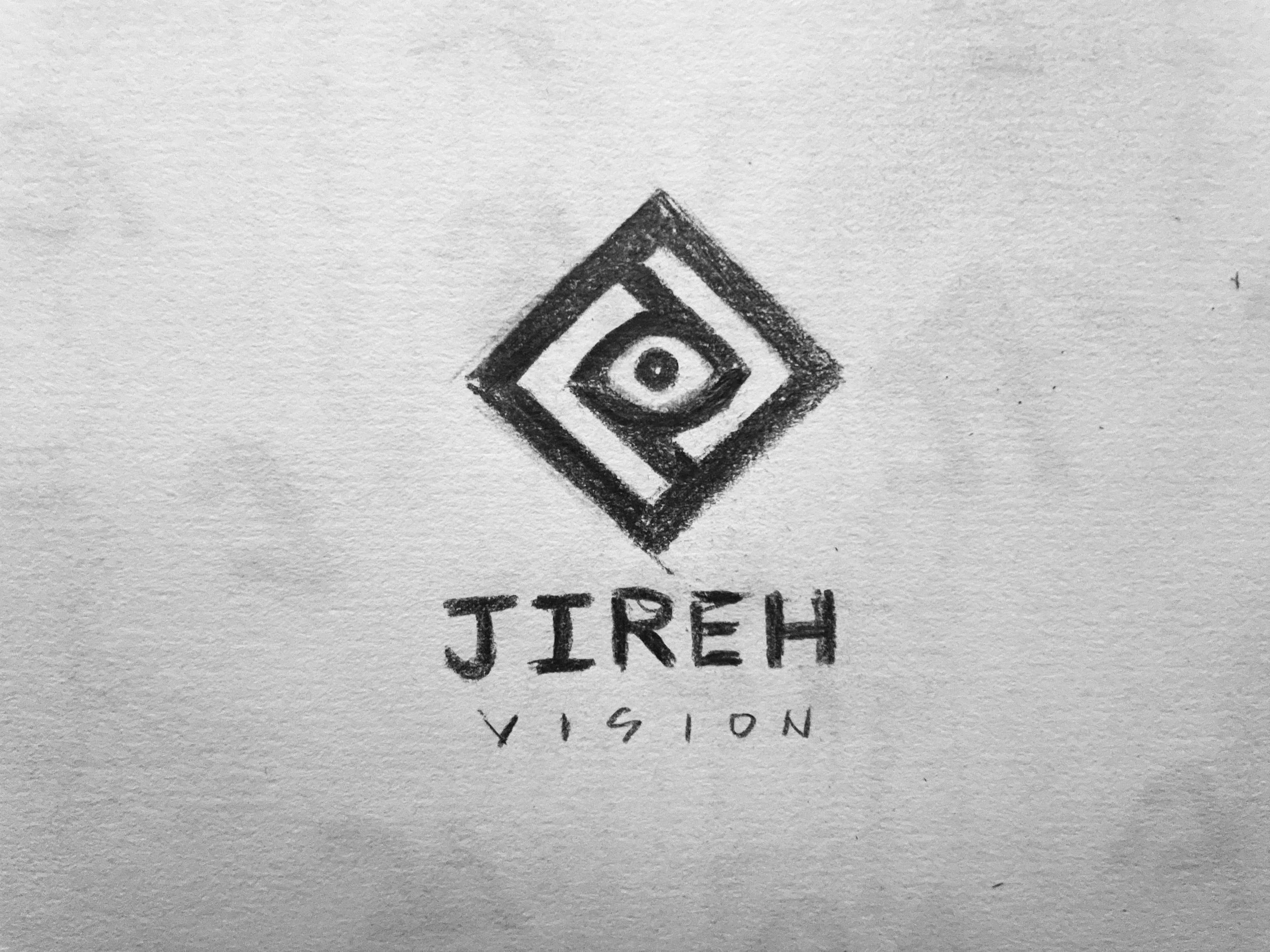
Emerged Sketch
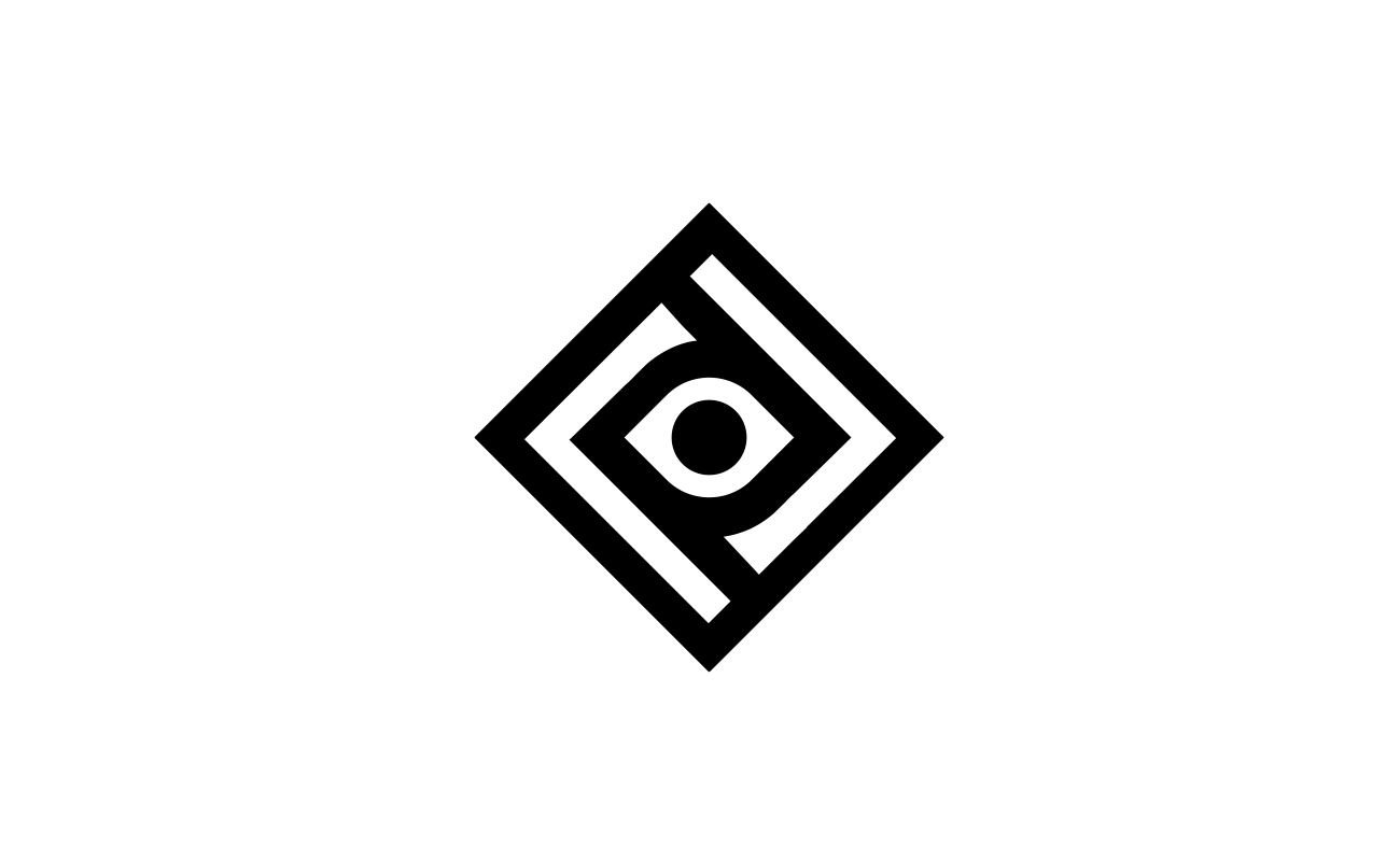
Final Brand Mark
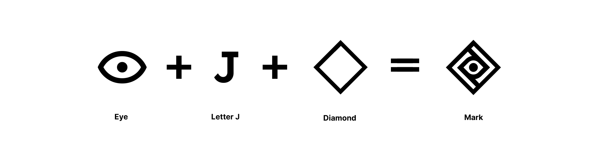
Equation of the Final Mark
02 – Identity
The Brand Elements
Jireh Vision’s identity is built on clarity, insight, and bold simplicity.
Typography
We aimed for a design that was bold yet elegant, refined, and clean. The typeface Legend was selected for its perfect balance of strength and simplicity.
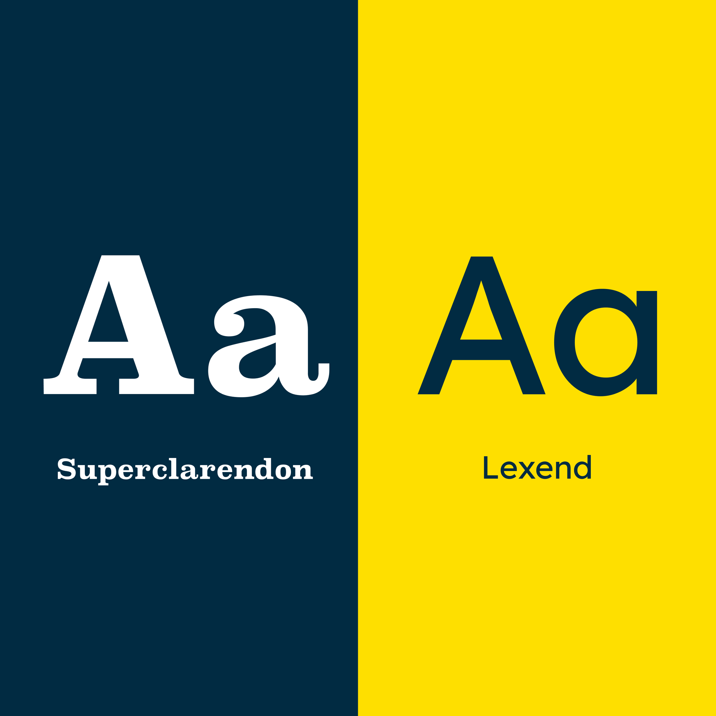
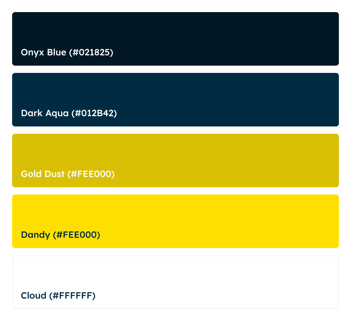
Color Palette
We aimed for a bold, attention-grabbing design that felt balanced. Dark blue evokes trust, professionalism, and stability, while yellow adds energy, optimism, and a sense of innovation. The white creates a sense of clarity and balance, ensuring the colors complement each other without overwhelming the viewer.

03 — Mark Making
Symbol of Sight and Strategy
The Jireh Vision mark is a visual anchor of clarity and foresight, blending the form of an eye and a compass to symbolize guidance and purpose. Its bold symmetry and simplicity communicate trust, focus, and intentional design across all applications.
Vertical Lockup

Final Mark

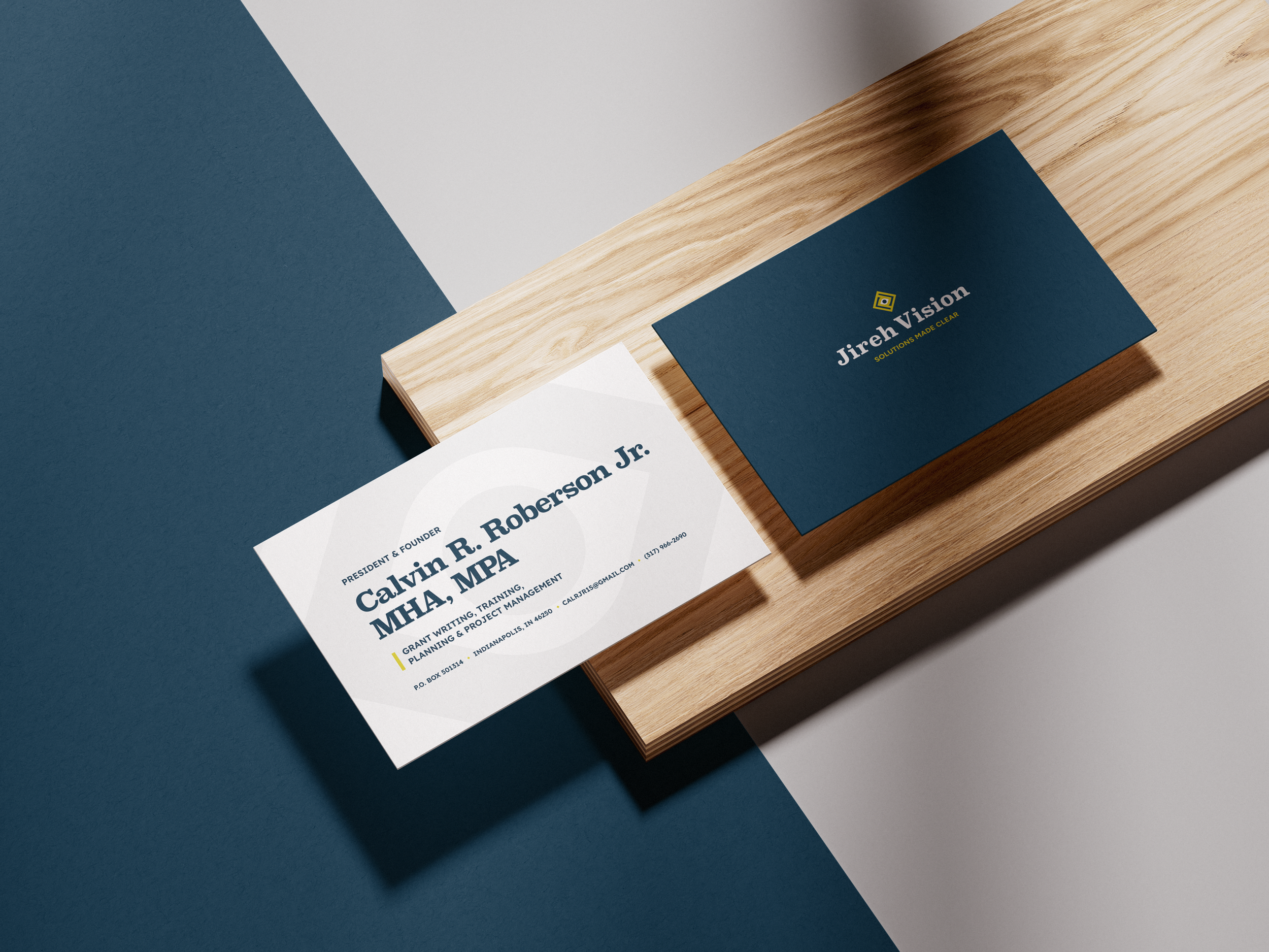
Horizontal Lockup


CEO & Founder
Calvin R. Roberson
"Jireh Vision isn’t Typical—We Needed An Iconic Identity to Stand Out in the Marketplace. GBaby delivered. "

