
WPS
WPS-GHA’s outdated portal was frustrating users and risking key business outcomes. Confusing flows and unclear navigation led to poor survey scores and threatened millions in funding. We redesigned the experience with a clean, intuitive interface—streamlining tasks, aligning with brand values, and improving both usability and user satisfaction to help protect critical revenue.
Deliverables
▸ UX Audit
▸ Information Architecture
▸ Wireframes & Prototypes
▸ High-Fidelity UI Design
▸ Design System Components

Simplified. Streamlined. Stronger.
Aligning function with mission—one intuitive step at a time.
The original WPS portal was cluttered, text-heavy, and difficult to navigate—leaving users overwhelmed and unsure where to begin. The redesigned experience introduced a clean, structured layout with intuitive visual groupings, simplified navigation, and clearer task flows—making the platform feel more approachable, modern, and aligned with WPS’s mission to serve.
See How We Got Here
↓


Modernized for Impact. Designed to Serve.
A refreshed digital experience for a government health organization—built to reduce friction, support mission-critical outcomes, and elevate brand trust through better usability.
01.
Discover
We began by identifying key pain points in WPS’s digital experience—outdated design, inconsistent navigation, and barriers to user trust. Listening to both internal teams and end users uncovered the need for a streamlined platform that could better support mission-critical healthcare services.
02.
Define
Insights were translated into a clear direction: modernize the interface, simplify information flow, and establish a cohesive brand system that reinforced WPS’s credibility. Priorities included accessibility, usability, and a consistent design language across platforms.
03.
Develop
We designed a clean, user-friendly interface supported by a flexible UI library. Prototyping and testing ensured every element—from navigation to content hierarchy—was intuitive and accessible. The new design emphasized trust, clarity, and efficiency.
04.
Deliver
The final system delivered a scalable digital identity and design framework that elevated WPS’s online presence. Built for flexibility, the refreshed platform reduces friction, strengthens usability, and empowers WPS to serve its audience with clarity and confidence.
See How We Got Here
↓


01 — Pain Points
User Frustration
The WPS-GHA portal was plagued by confusing navigation, inconsistent workflows, and redundant pathways—leaving users frustrated and unable to complete essential tasks. These usability issues triggered a wave of complaints and poor survey scores, putting critical funding at risk. Redesigning the portal wasn’t just a design decision—it was a business imperative.
02 — Strategy
Discovery & Research
WPS-GHA set out to redesign its portal with a clear mission: reduce user frustration, simplify navigation, and streamline workflows. The goal was to create a more intuitive, seamless experience that would improve customer satisfaction, boost survey scores, and help secure critical funding—ultimately strengthening the organization’s position in a competitive market.
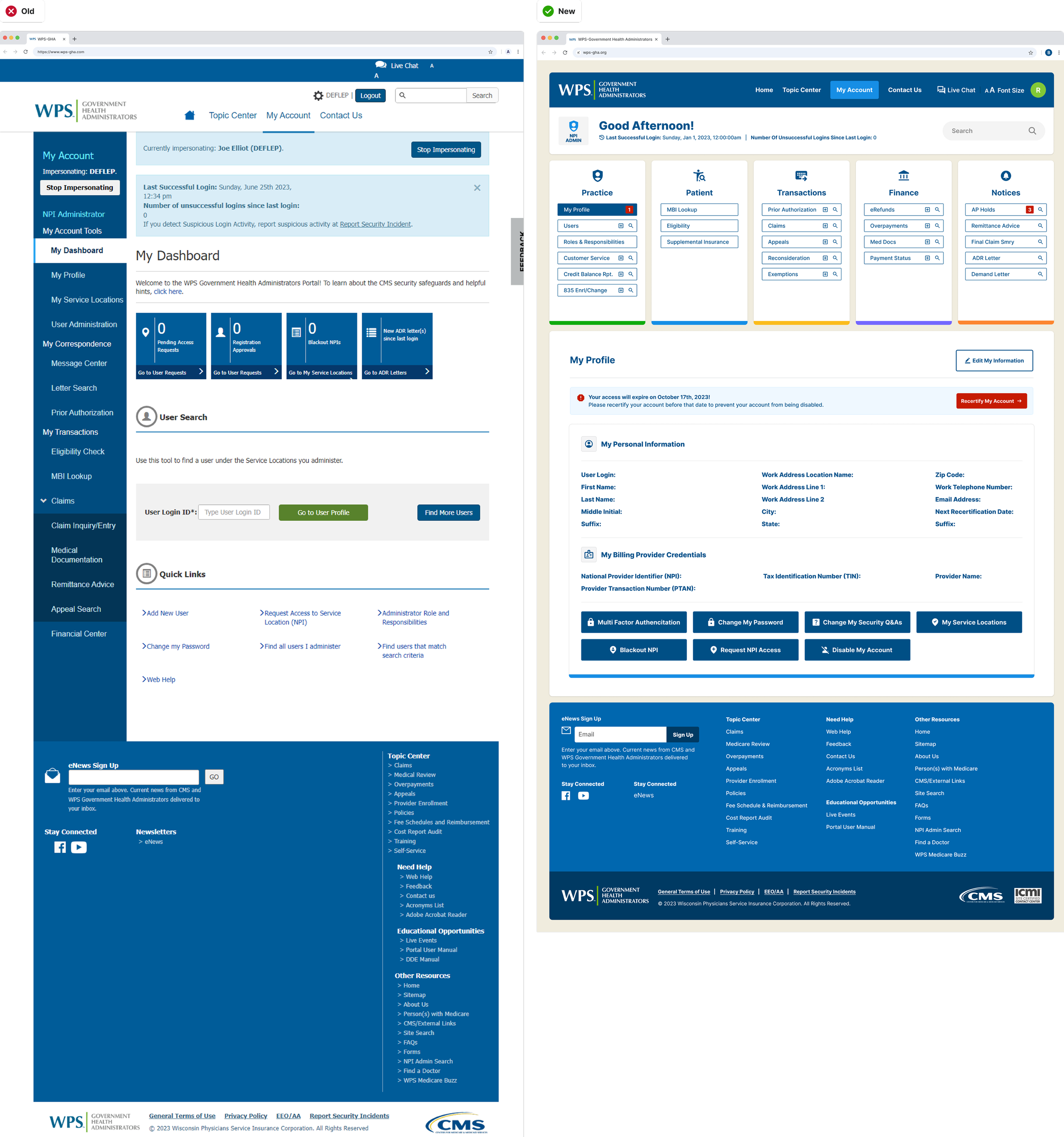
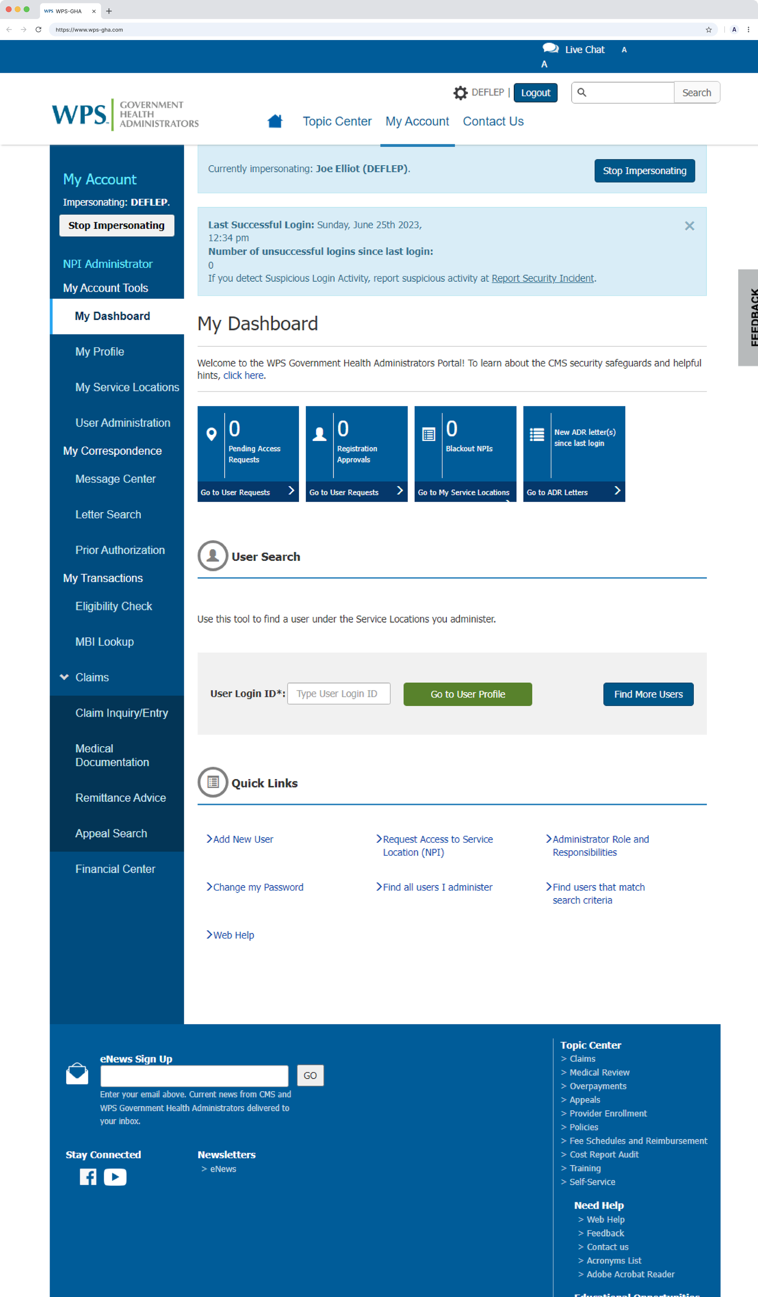
The Legacy Portal
The old WPS-GHA portal design was cluttered, confusing, and inefficient—making it difficult for users to find information or complete key tasks. Redundant menus, unclear labels, and inconsistent workflows led to frequent frustration, poor survey scores, and mounting complaints. These usability issues didn’t just impact user experience—they posed a serious risk to the organization’s funding and reputation, making a redesign essential.
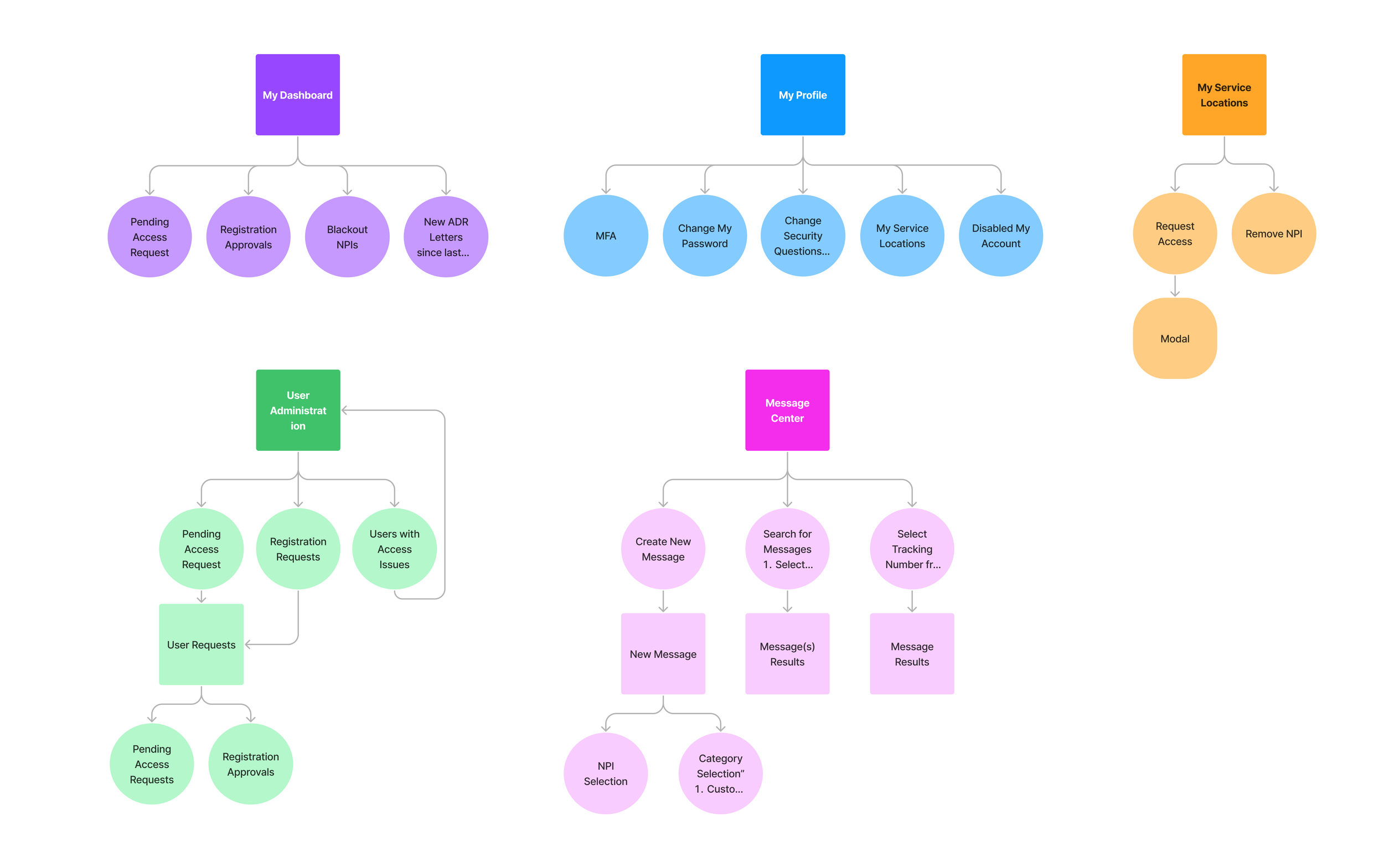
Rethinking Navigation for Clarity and Flow
We mapped the legacy site link by link to uncover pain points and visualize how users were actually moving through the system. Through working sessions, we removed redundancies, reorganized content, and introduced clearer, more intuitive categories—resulting in a navigation structure that felt natural, purposeful, and user-friendly.
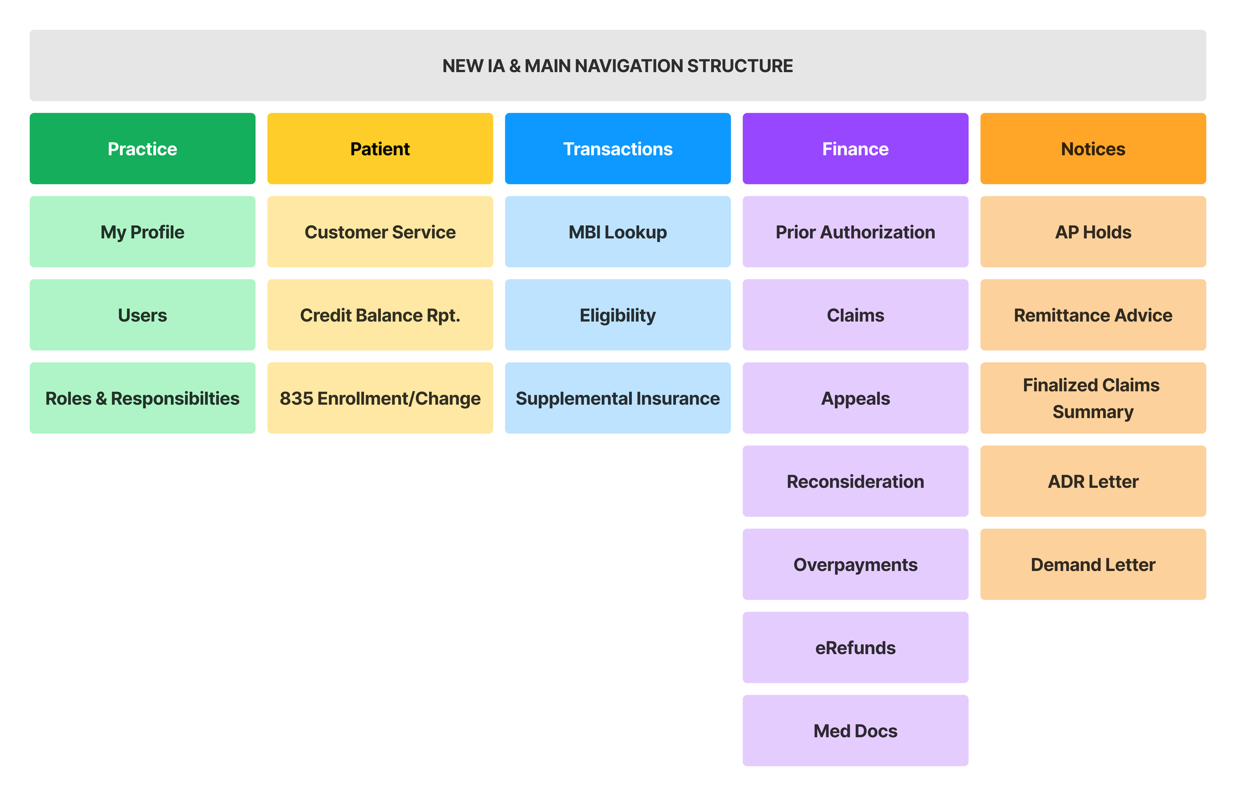
New Navigational Structure
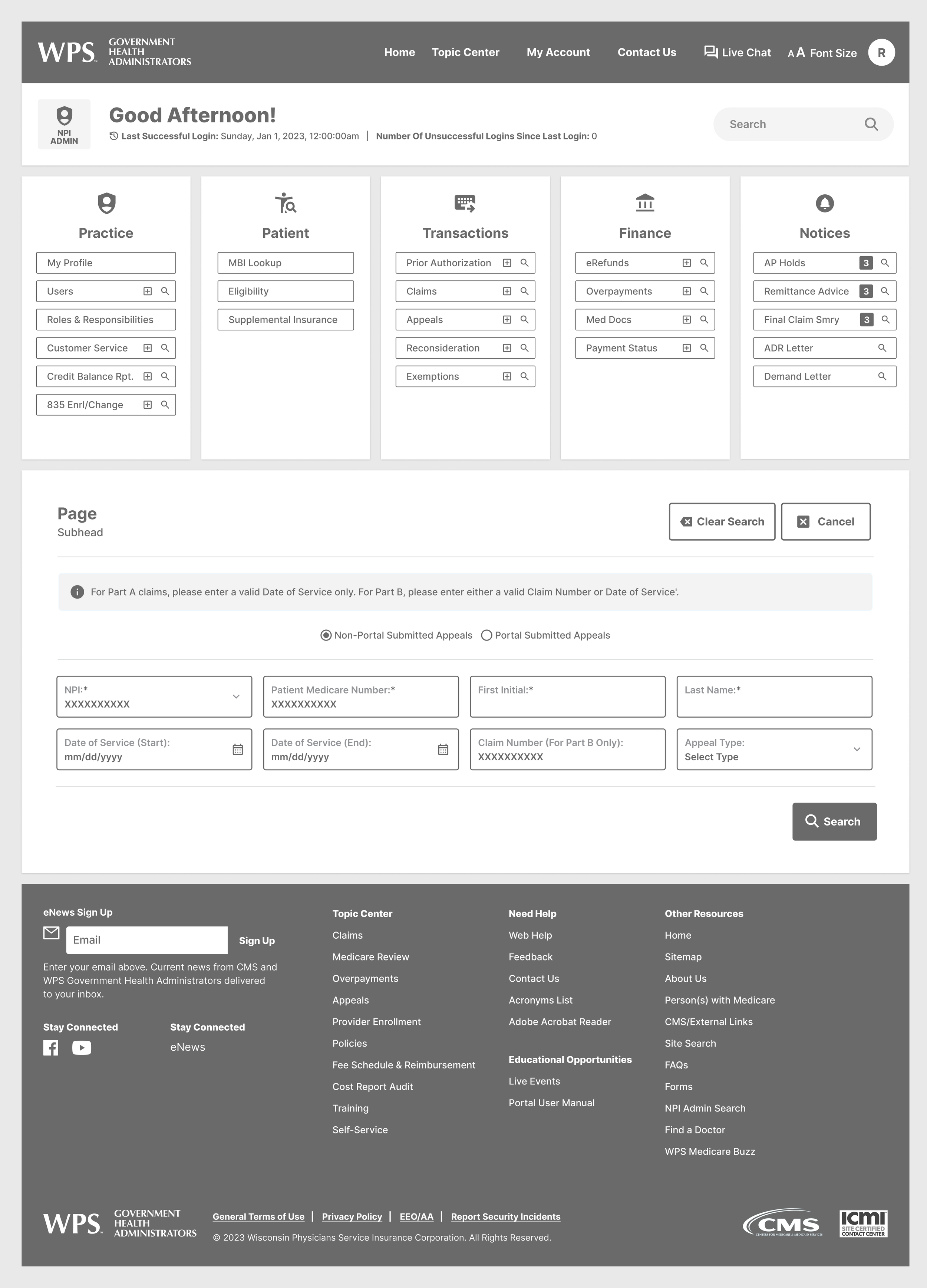
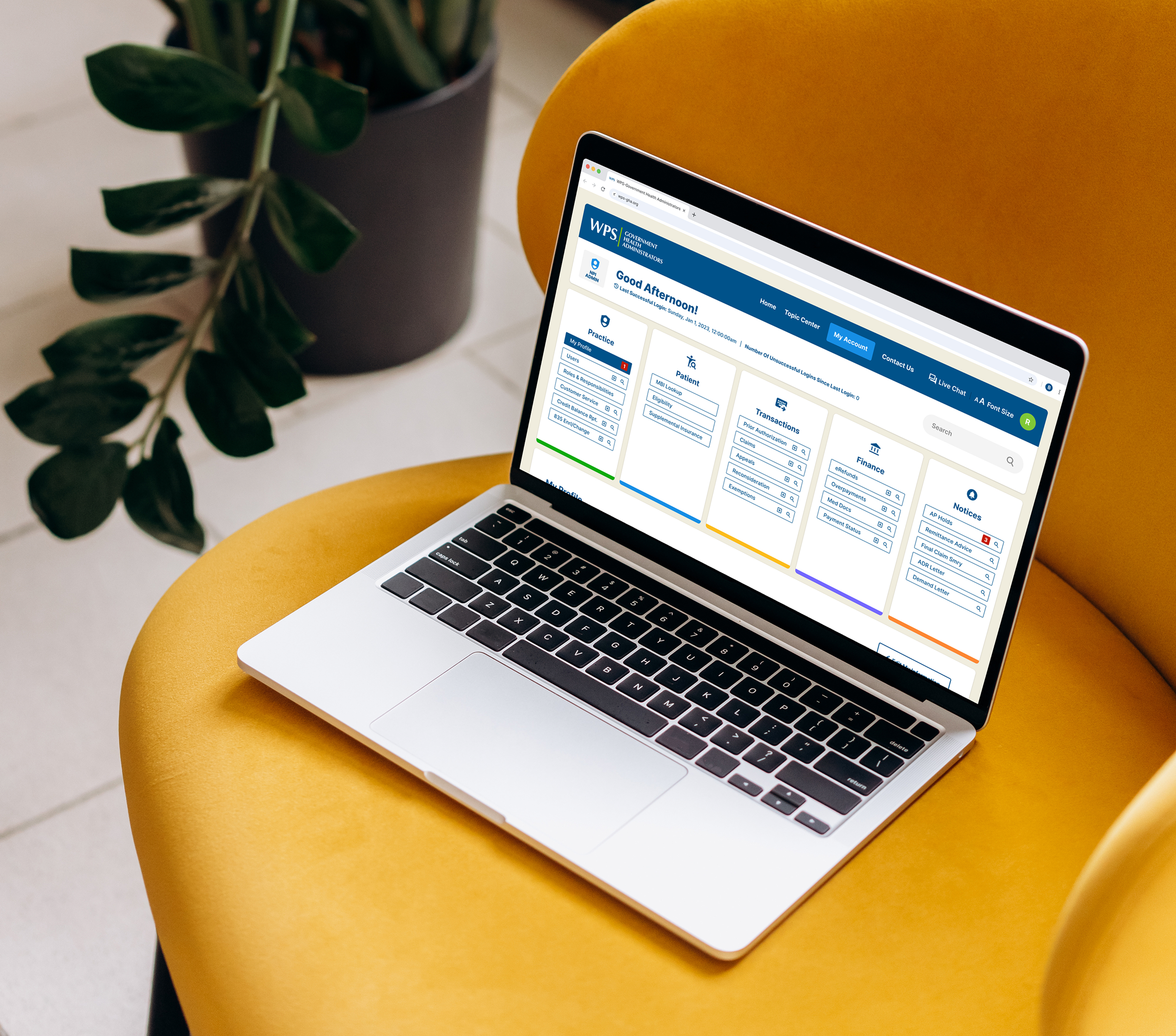
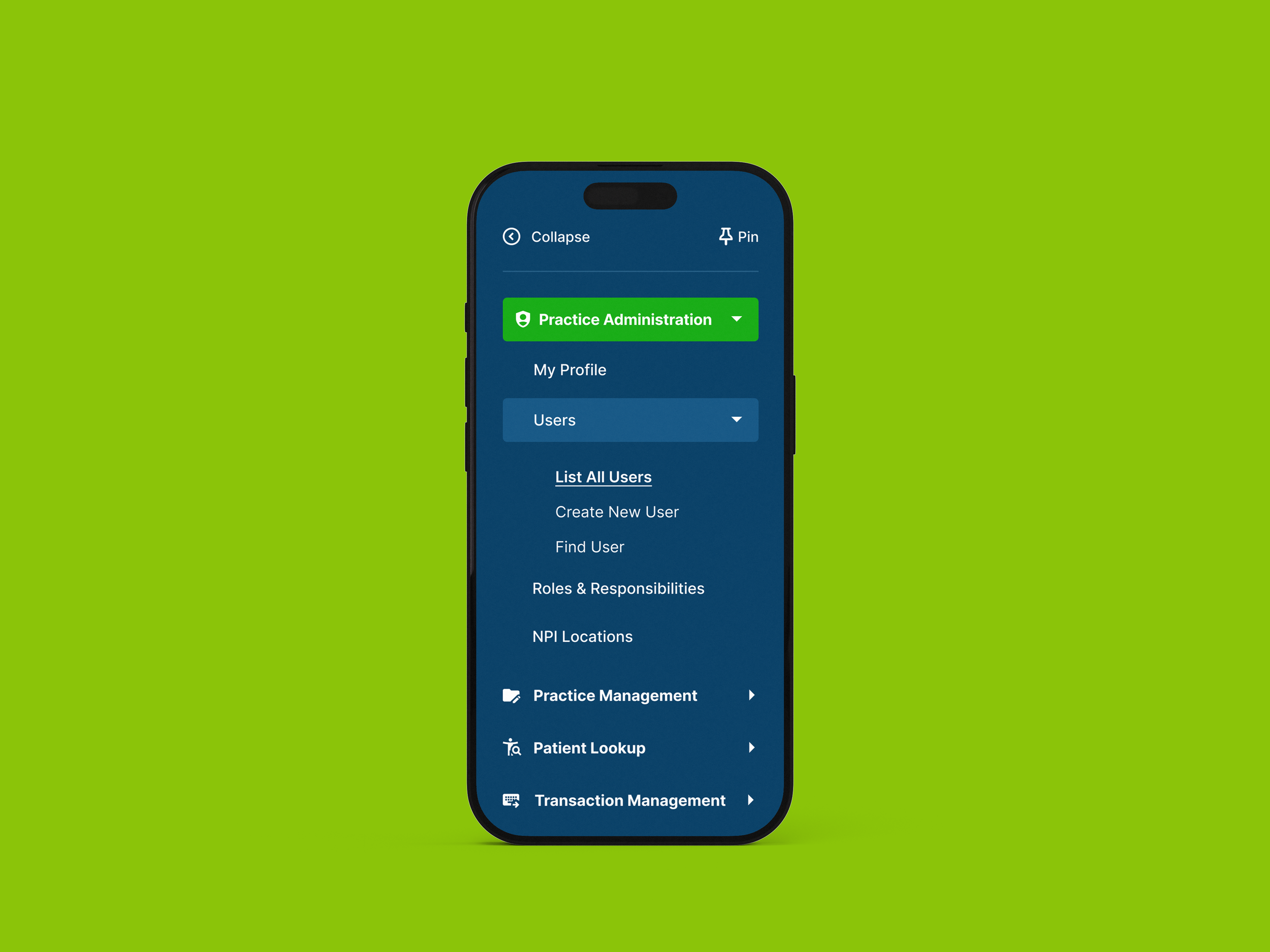
We reorganized WPS’s information architecture into a streamlined, user-first system. By grouping content into clear categories—Practice, Patient, Transactions, Finance, and Notices—the navigation reduces friction, improves findability, and supports faster decision-making.
Legacy Task Flows & Pain-Points
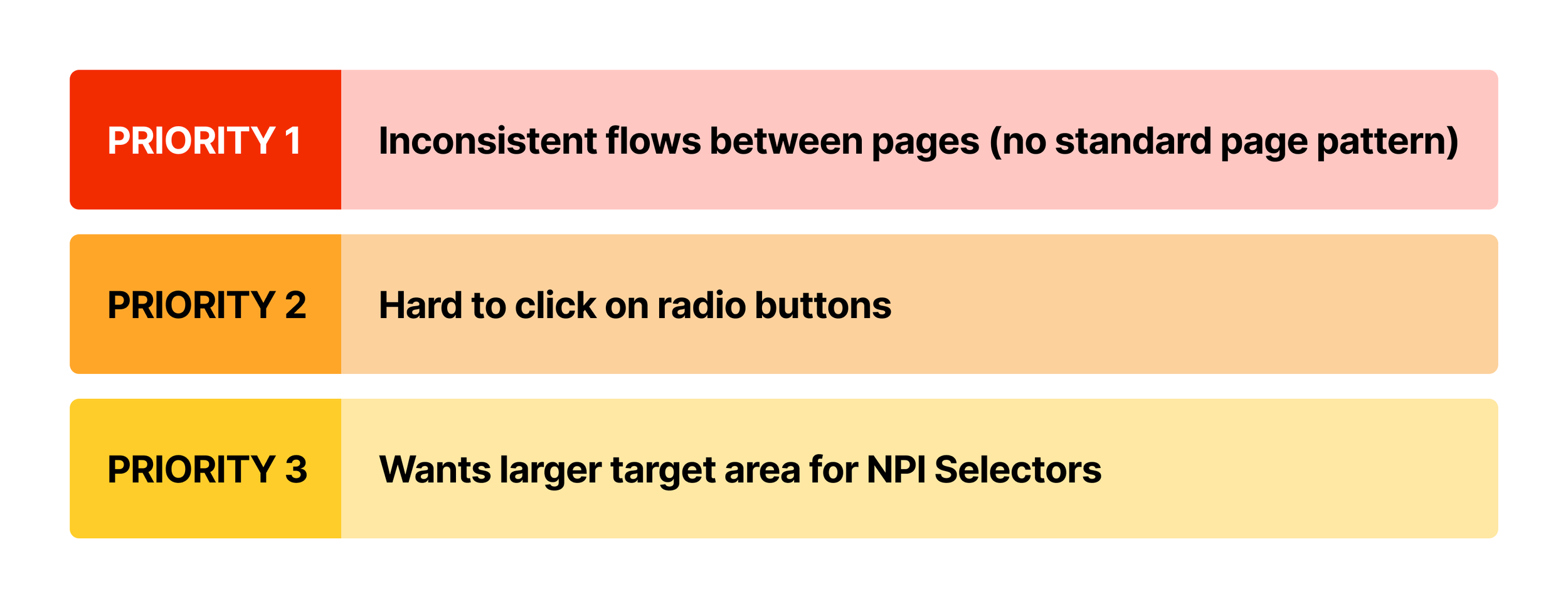
We mapped out task flows from the legacy portal to identify friction points within each workflow, focusing on tasks users needed to perform within the portal. We then compiled the major friction points from these workflows and cross-referenced them with internal user feedback from surveys and other collected data. Finally, I worked with the business analyst to prioritize these pain points, creating a clear, business-driven roadmap for improvement.
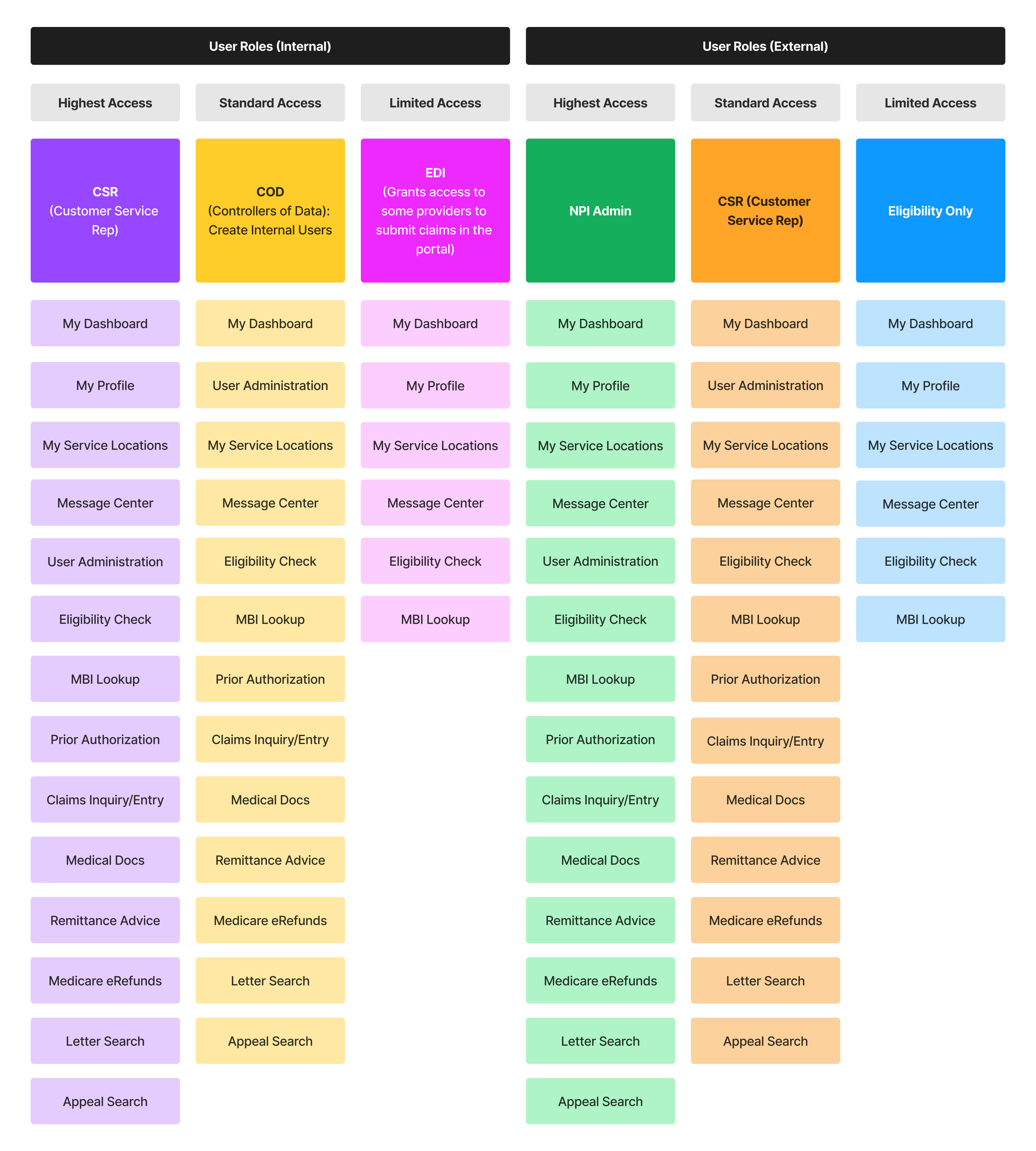
User Roles + Access Levels
Held multiple meetings with stakeholders and the business analyst to gather critical insights into user profiles, roles, and access levels. This information was essential for designing workflows and navigation tailored to user needs. It also played a key role in shaping ideas for the overall structure and user experience of the new portal.
03 — UI/UX Design
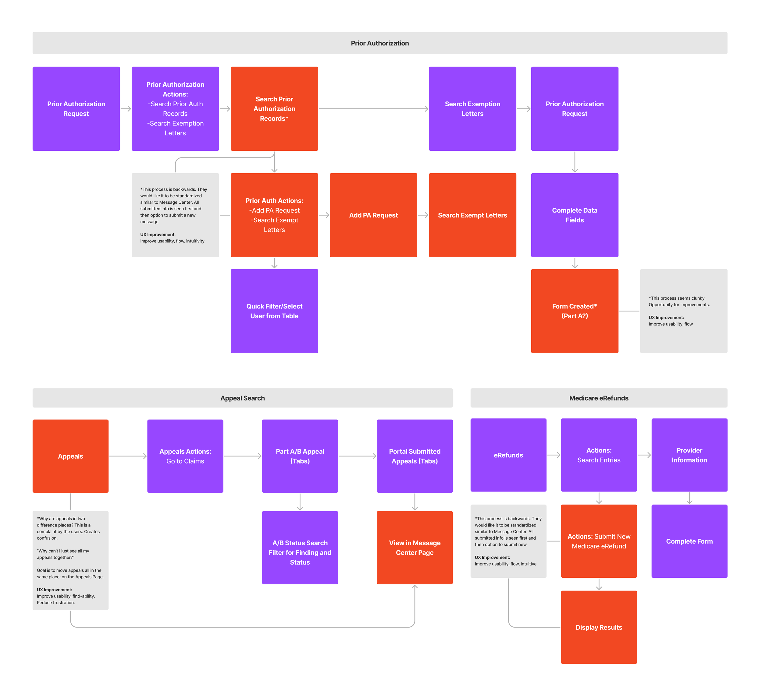
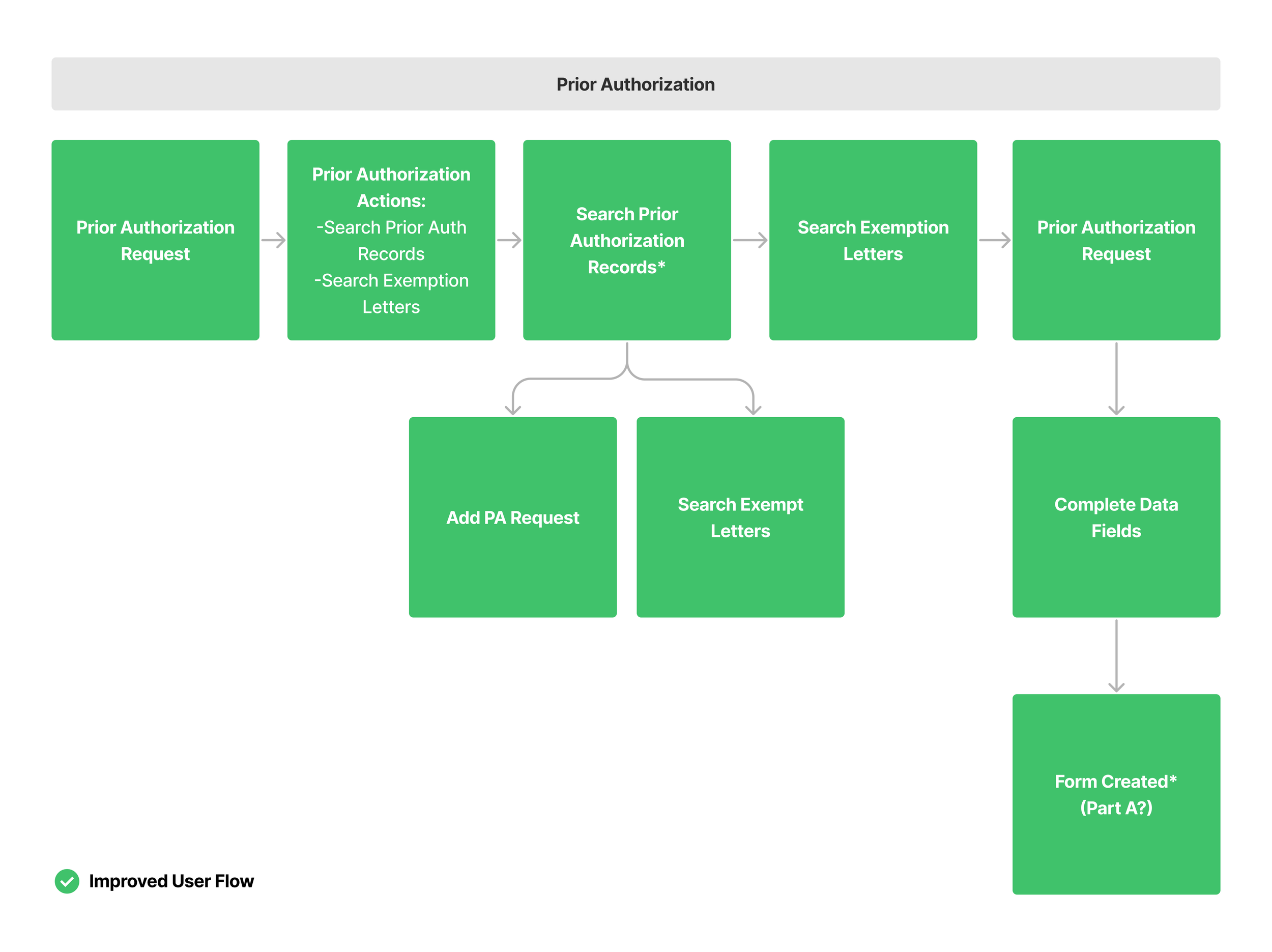
Improved User Flows
With a prioritized list of pain points, we updated the user and task flows for each workflow within the portal. While streamlining the processes, it was essential to preserve core functionality, ensuring power users could still rely on these features to complete their daily tasks.
Hi-Fi Wireframes
To solve issues in the legacy portal, I designed and iterated on low- and high-fidelity wireframes with the team, focusing on surfacing essential links and tasks. Critical pages were brought forward, simplifying flows and making navigation faster and more intuitive.
User Interface (UI) Design
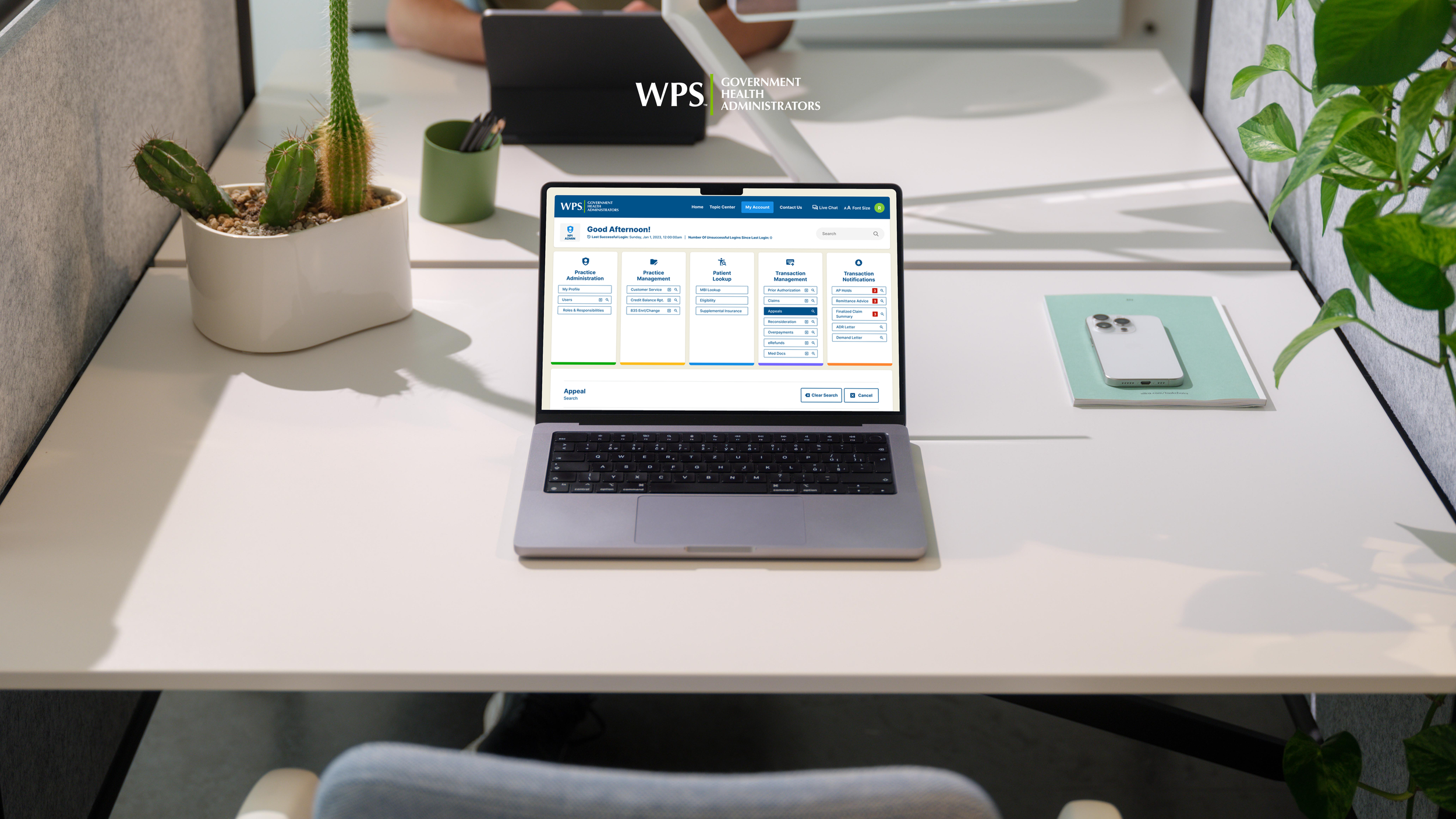
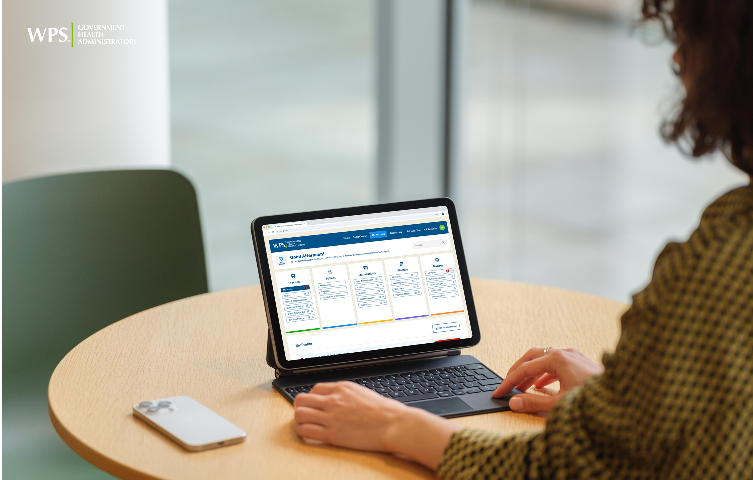
We shared the new design with stakeholders—many also legacy users—whose feedback shaped a cleaner, dashboard-style interface. The final portal consolidated scattered flows, streamlined navigation, and delivered a faster, more user-friendly experience.
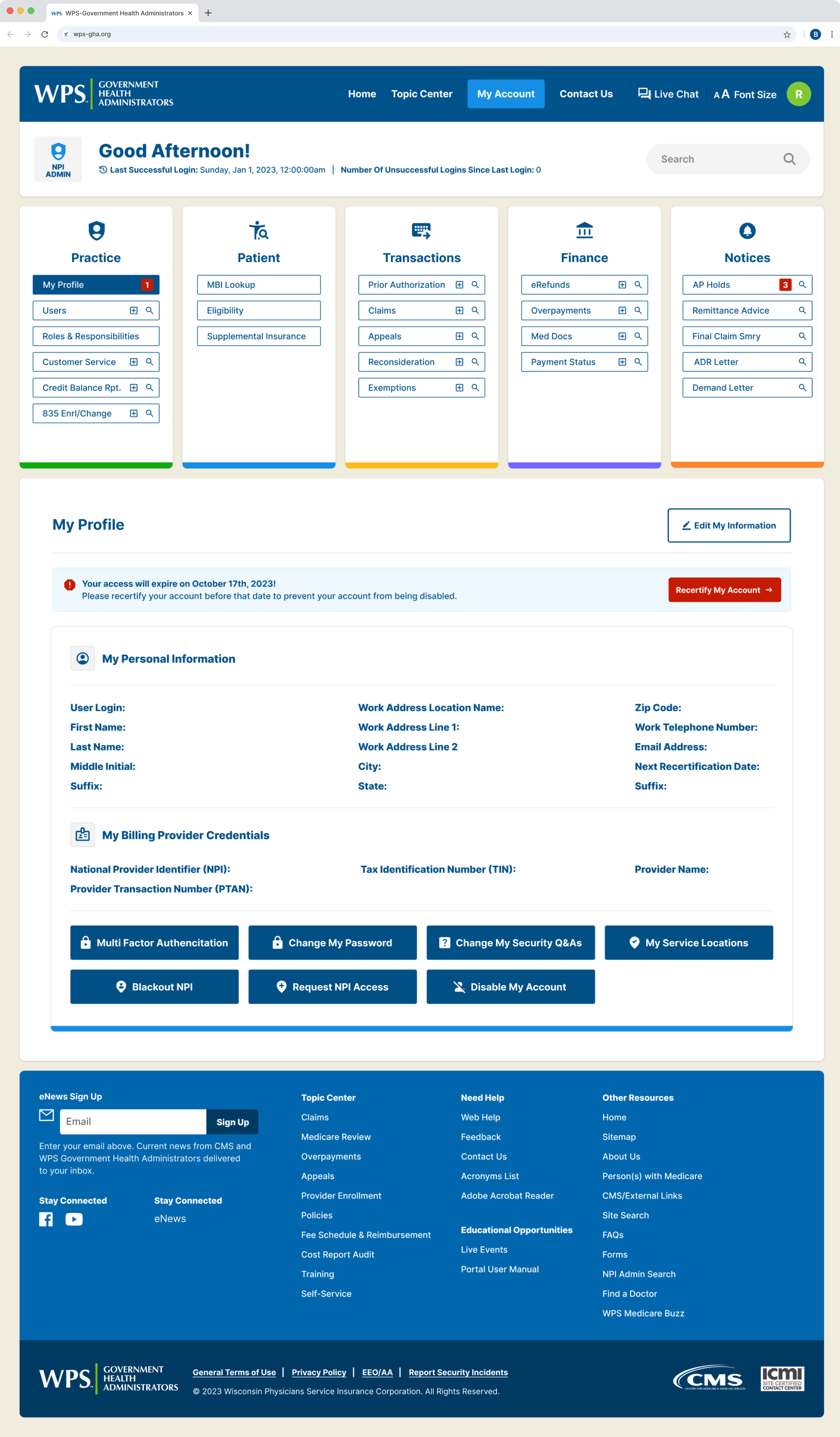
Breakdown of Core Functionality the New Design
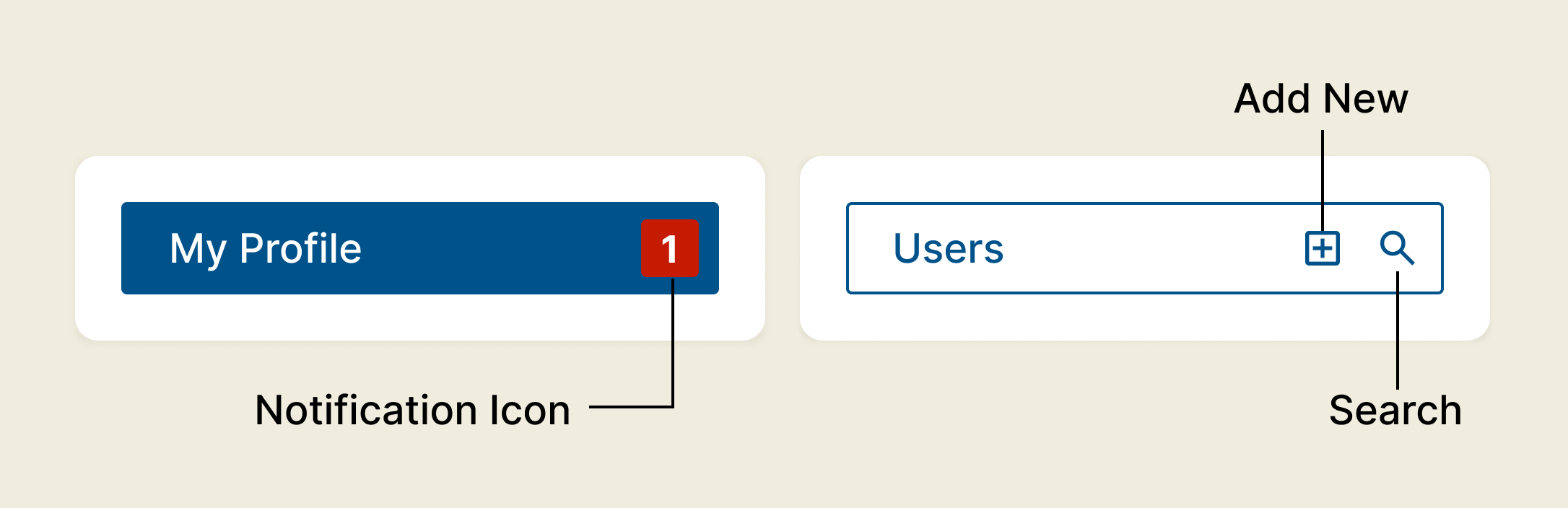
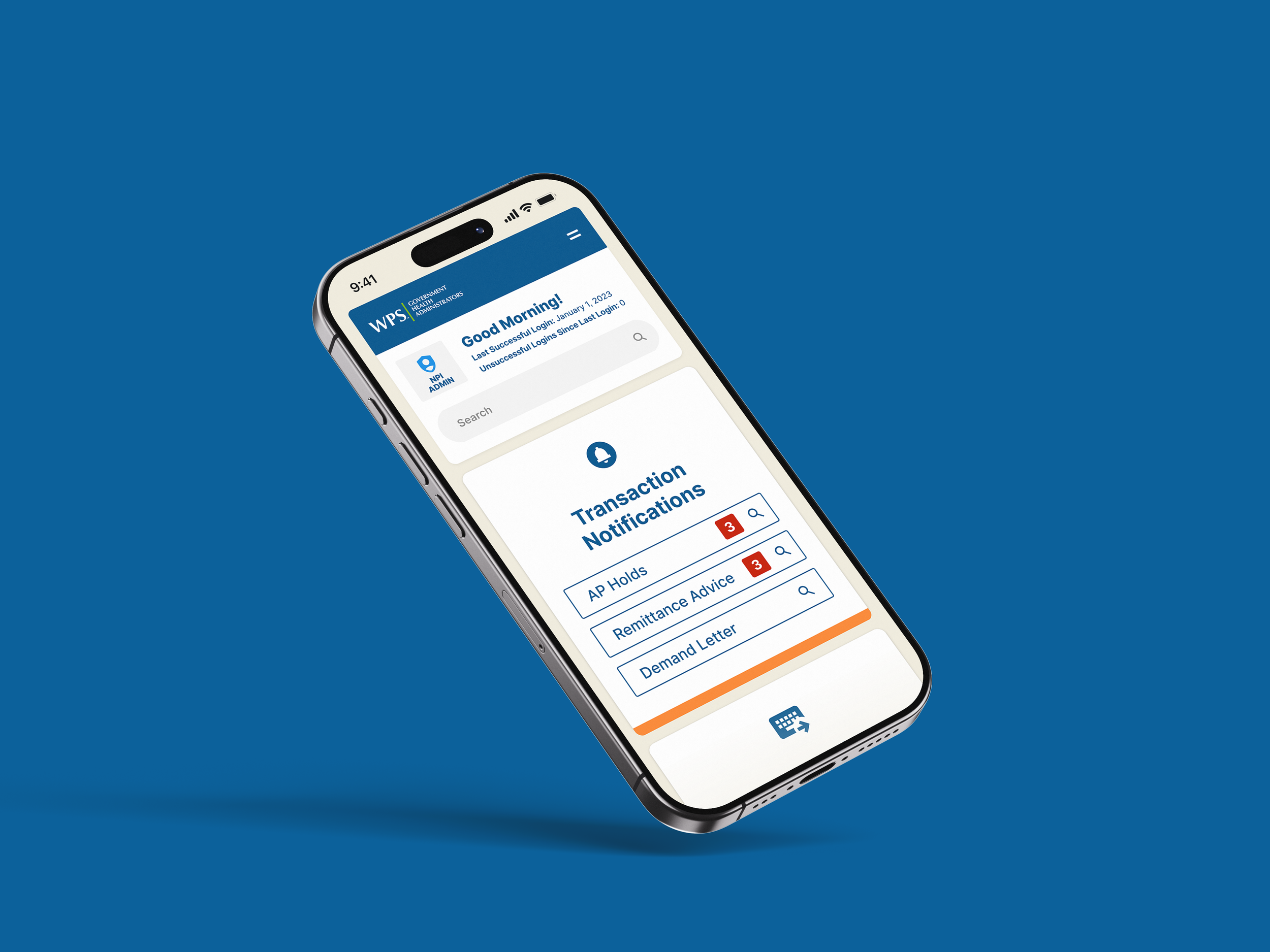
The new design brought all key tasks and content into a streamlined, centralized layout—eliminating dead-ends and reducing user confusion. The portal was reorganized into five clear categories: Practice, Patient, Transactions, Finance, and Notices. Each category features three core actions—Add New, Search, and Notifications—designed to help users complete tasks faster and with less friction.
▸ Add New lets users start tasks (like a new claim) right from the dashboard.
▸ Search provides quick access to content within each category.
▸ Notifications show real-time counts, helping users prioritize their attention.
We also held user feedback sessions to test navigation and workflows. High-priority input was folded into the final design, with remaining ideas tracked for future updates. This approach led to a more intuitive, efficient experience that directly addressed the biggest frustrations of the old portal.
04 — Outcomes
From Frustration to Flow
The old WPS-GHA portal overwhelmed users with cluttered navigation, confusing workflows, and poor structure—leading to frustration, complaints, and low survey scores that threatened funding.
The new design focused on clarity, ease of use, and efficient task flow, transforming the experience into one that feels simple, fast, and reliable.
Key Improvements:
▸ Streamlined Workflows: Removed dead ends and loops with smooth, logical task flows.
▸ Clear Interface: Clean, uncluttered layout highlights what matters most.
▸ Quick Navigation: Dashboard keeps key actions visible and easy to access.

Custom Design Library (Snippet)
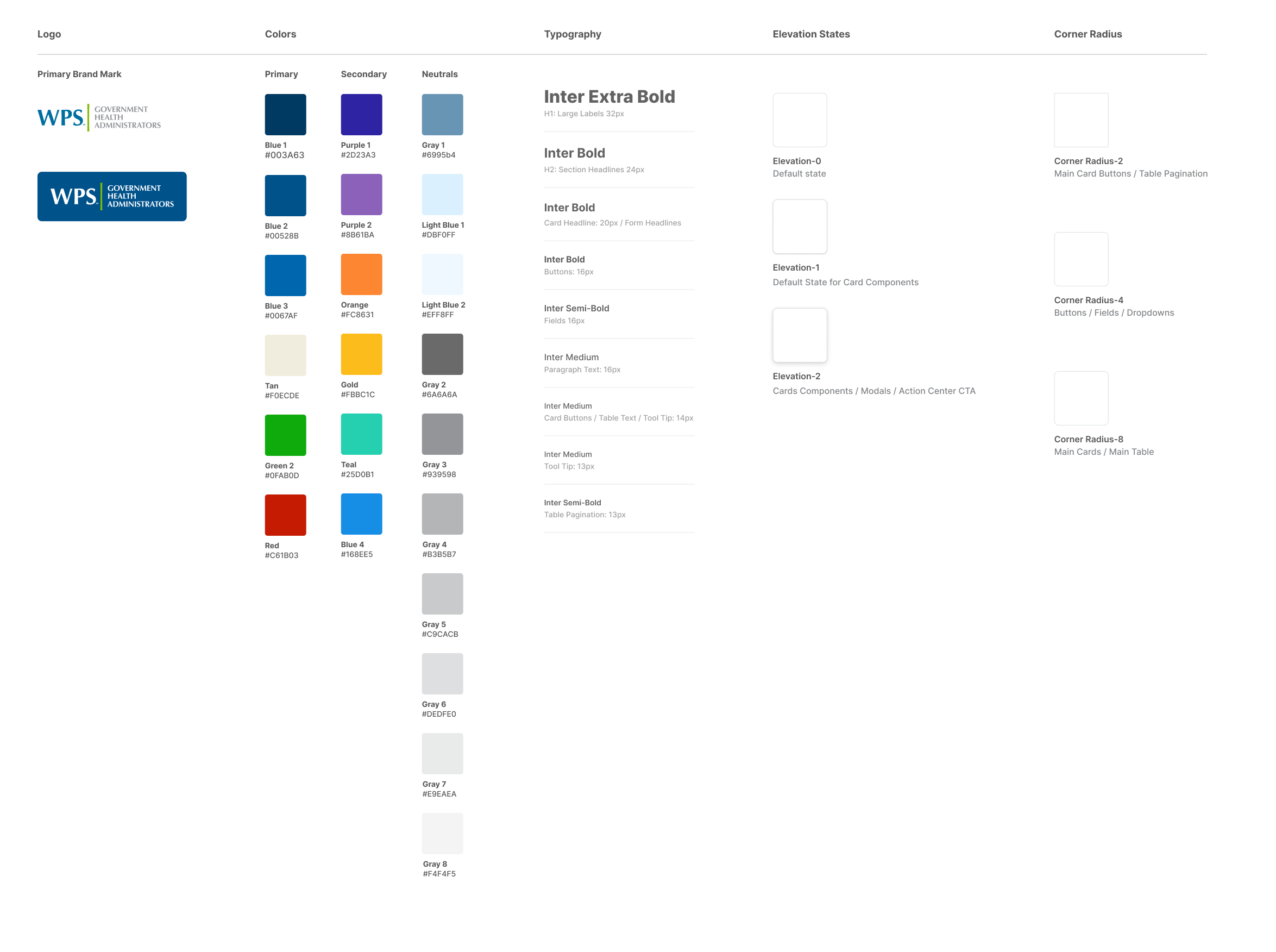
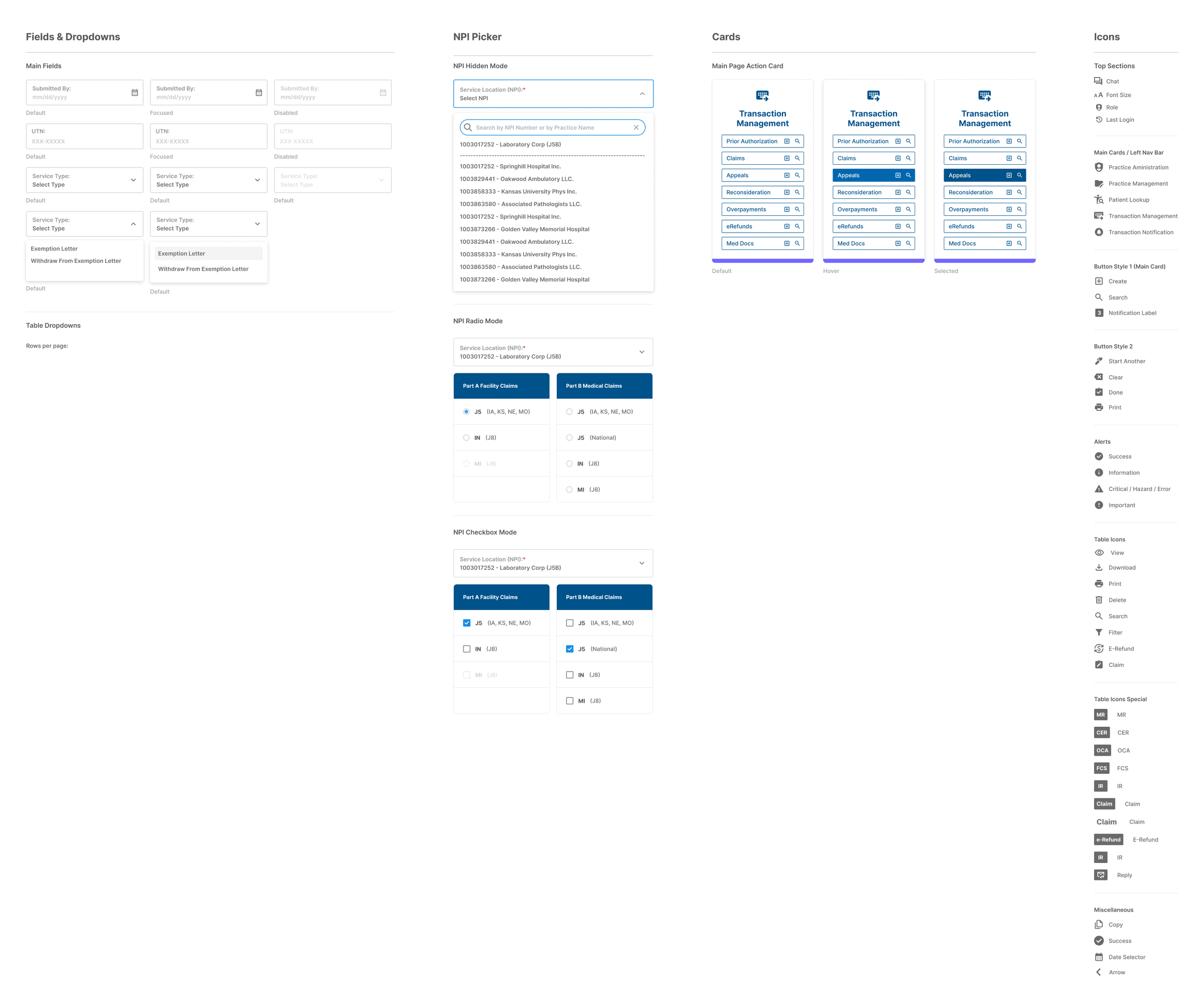
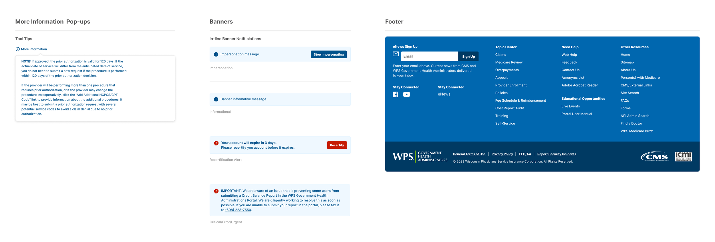
Redesign Applied
↓

04 — Project Impacts
Digital Experience Gains
The redesign improved clarity, accessibility, and overall usability, creating a more seamless experience for all WPS GHA users.
01
▸ Streamlined User Experience
Reorganized site architecture and workflows, reducing friction for providers and beneficiaries to access forms, guidance, and key resources quickly and confidently.
02
▸ Improved Accessibility and Clarity
Introduced a clean, modern interface with better hierarchy, contrast, and responsive design, ensuring accessibility compliance and a more inclusive experience for all users.
03
▸ Consistent Visual System
Established a scalable design library of reusable UI components, patterns, and templates, enabling internal teams to roll out new pages and updates with consistency and speed.
04
▸ Reduced User Errors
Refined forms and step-by-step instructions to minimize mistakes and improve completion rates across the platform.
05
▸ Consistent Interface Design
Created a cohesive visual and interaction system that feels familiar across all pages, reducing cognitive load.

More Studio Cases