


Dark Butter Bakeland
Dark Butter Bakeland is an emerging gourmet baked goods brand born from a craving to create in the middle of life’s chaos. With a focus on small-batch indulgence, the brand reimagines comfort sweets through bold flavors, nostalgic texture, and a modern, premium identity. The challenge was building a brand from scratch that could capture this story—something personal yet elevated, warm yet distinctive. From visual identity to packaging and product strategy, every decision is designed to stir desire, spark curiosity, and carve out a space in a crowded market with confidence and clarity.
Deliverables
▸ Brand Positioning & Strategy
▸ Visual Identity System
▸ Packaging Concepts &
▸ Product Naming &
▸ Flavor Architecture
▸ Market Research
Turning Flavor Into a Brand You Can Feel
A Brand Born in the Kitchen—Smooth Like Butter
The idea started with butter in a hot pan and a craving that wouldn’t quit. The original concept was raw but rich with emotion. I took that spark and shaped it into a full brand identity—one that captures the warmth, depth, and nostalgia of each bake. From flavor to form, we built a bold, craveable system designed with heart.

See How We Got Here
↓
Crafting a Brand That’s Rich, Real, and Ready to Rise.
A bold, flavor-forward identity built from scratch—rooted in story, elevated by design, and made to leave a lasting taste.
01.
Discover
We started with the story behind the dough: a personal turning point, backyard eggs, and a craving to create. Through deep dives into the founder’s journey and early customer reactions, we unearthed what made Dark Butter different—comfort, edge, and obsession baked into every bite.
02.
Define
We transformed insights into a clear brand direction: unapologetically indulgent, nostalgic with a twist, and full of personality. This meant defining a tone, palette, and visual rhythm that felt as craveable as the product itself.
03.
Develop
From naming conventions to visual identity, we crafted a bold-but-balanced system. Think gooey meets grown-up. Refined, playful type meets buttery, nostalgic color. Every choice—from logo shape to photo styling—was made to stir craving and stick in memory.
04.
Deliver
The brand system is actively coming to life—being applied across packaging concepts, pop-up experiences, and digital touchpoints. Every output is crafted to reflect the same richness as the product itself: bold, craveable, and ready to grow. This is just the beginning.
Inside The Work
↓


01 — Brand Spark
Where It All Started
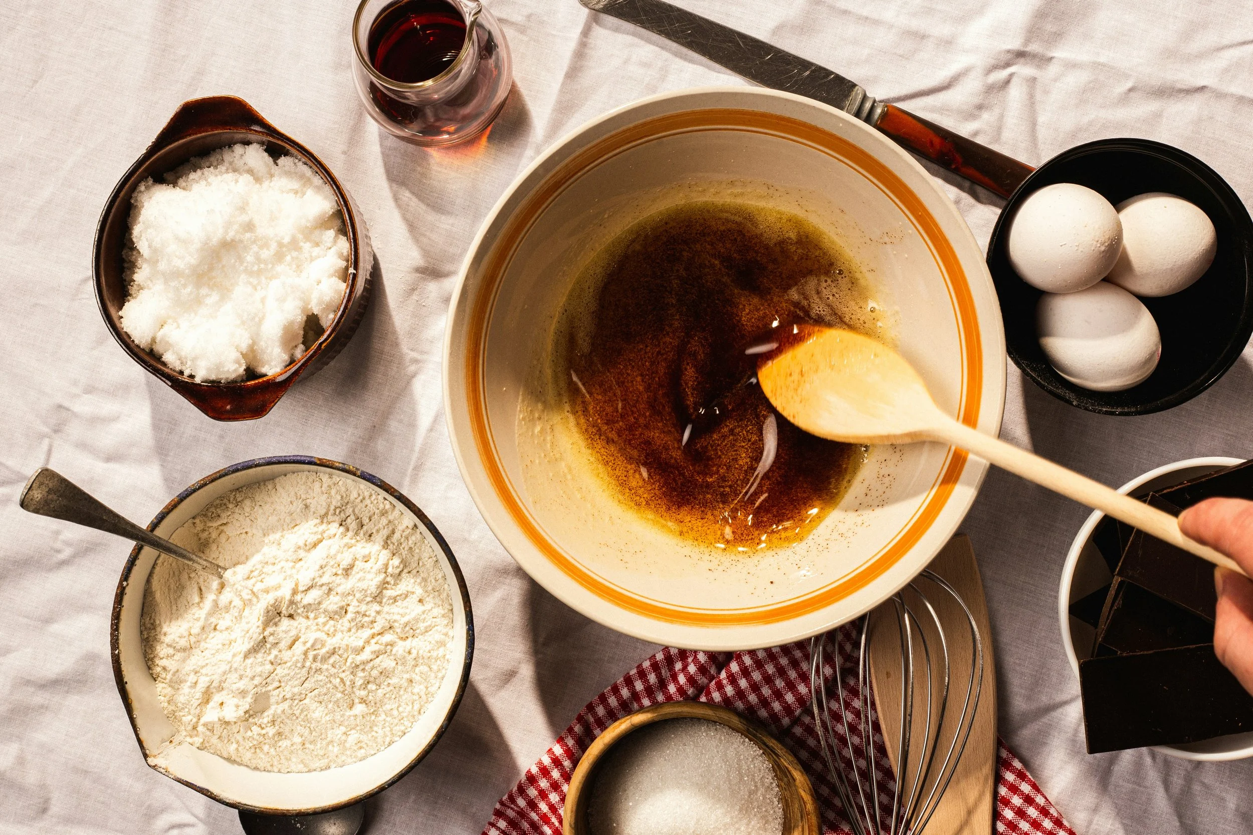
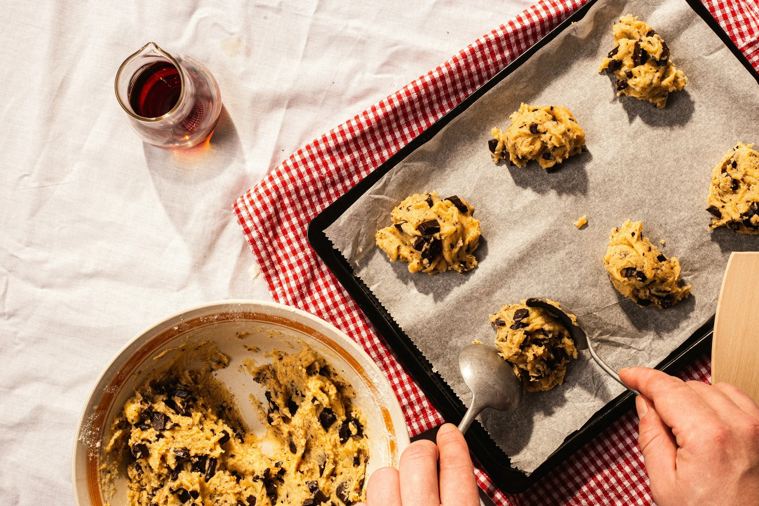
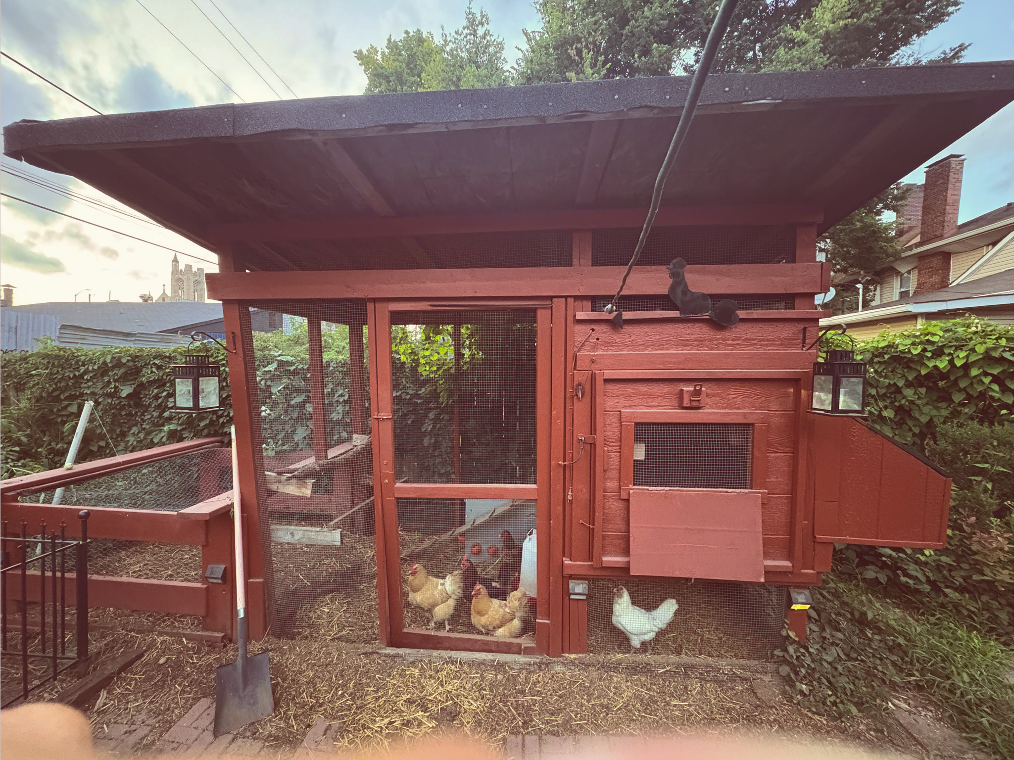
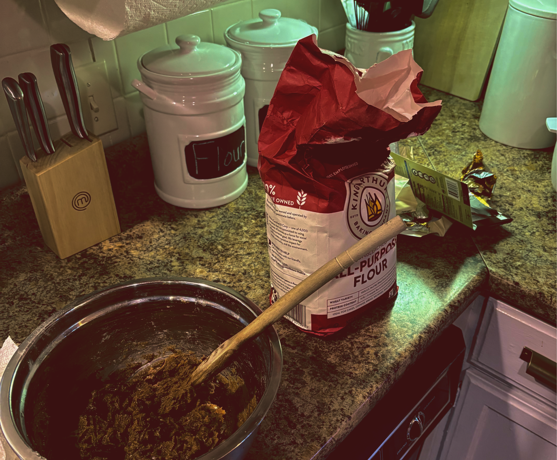
DarkButter was born in the thick of uncertainty—after an unexpected layoff. What began as stress relief in the kitchen turned into something deeper: a craving to create, and the joy of turning simple ingredients into something rich, indulgent, and shareable. Each batch of cookies became a tiny moment of escape.
There was something deeply satisfying about starting from scratch and ending with something that made people pause and smile. That spark grew into a vision: to make baked goods that feel like comfort—but with an edge. Not basic. Not overly fancy. Just bold, crave-worthy indulgence, done with taste.
02 — Concept Exploration
Starting to Take Shape
The brand’s direction began with the name: DarkButter. It came from the origin story itself—navigating the heaviness of a layoff, with nothing but time, emotion, and fresh eggs from a backyard coop. That’s where the baking began. And at the center of it all: butter.
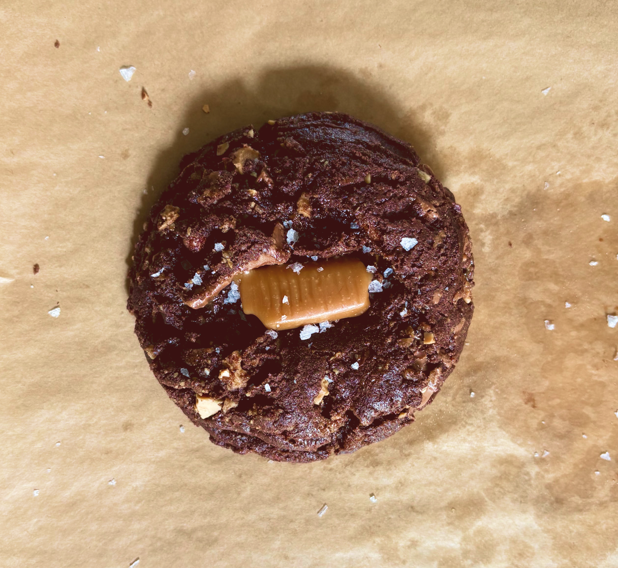
Not just any butter—brown butter. Heated slowly until it deepens in color, flavor, and aroma. That transformation—from plain to rich, light to dark—is what gives cookies their depth, their edge, their unforgettable taste. It’s also symbolic. Just like butter changes under heat, so did this brand. Forged in fire. Made better by the process. DarkButter.
Recipe Behind the Brand

Color Palette
▸ Browns + yellows = warmth & crave
▸ Inspired by butter, chocolate, sugar
▸ Golden-hour nostalgia vintage luxe

Tone of Voice
▸ Warm, cozy, craveable, old school
▸ Simple words that stick
▸ Feels like comfort—with class

Personality
▸ Nostalgic, but fresh
▸ Confident, comforting, indulgent
▸ Retro soul, luxe finish

Imagery
▸ Friends, snacks, quiet joy
▸ Homey dessert vibes
▸ Cozy moments with vintage flair

Brand Symbolism
▸ Heat transforms—so does flavor
▸ Browning = depth, richness, resilience
▸ Dark isn’t burnt—it’s becoming

Logo Development
▸ Retro-modern feel
▸ Vintage soul, modern shelf
▸ Curvy, warm, and distinctly luxe
Look and Feel
03 — Visual Identity Foundations
The visual identity for DarkButter was built to reflect the heart of the brand—playful yet nostalgic, warm yet bold. Every element was chosen to evoke indulgence, familiarity, and that just-out-of-the-oven charm.

Original Concept
From the beginning, the goal was to create something that felt both familiar and elevated—a brand rooted in warmth, but shaped by style. The early concept for DarkButter aimed to strike that sweet spot between traditional and fresh: cozy, comforting, and nostalgic, but with a clear sense of modern polish.
It needed to feel fun and approachable, like something you’d want to share—but still carry an unmistakable sense of quality, exclusivity, and class. Vintage charm, luxe presence. Something that could live in your grandma’s kitchen and on a high-end retail shelf. Sketches were where the tone began to take form—balancing playfulness with identity, and setting the stage for a brand that doesn’t just taste good, but feels like something special.
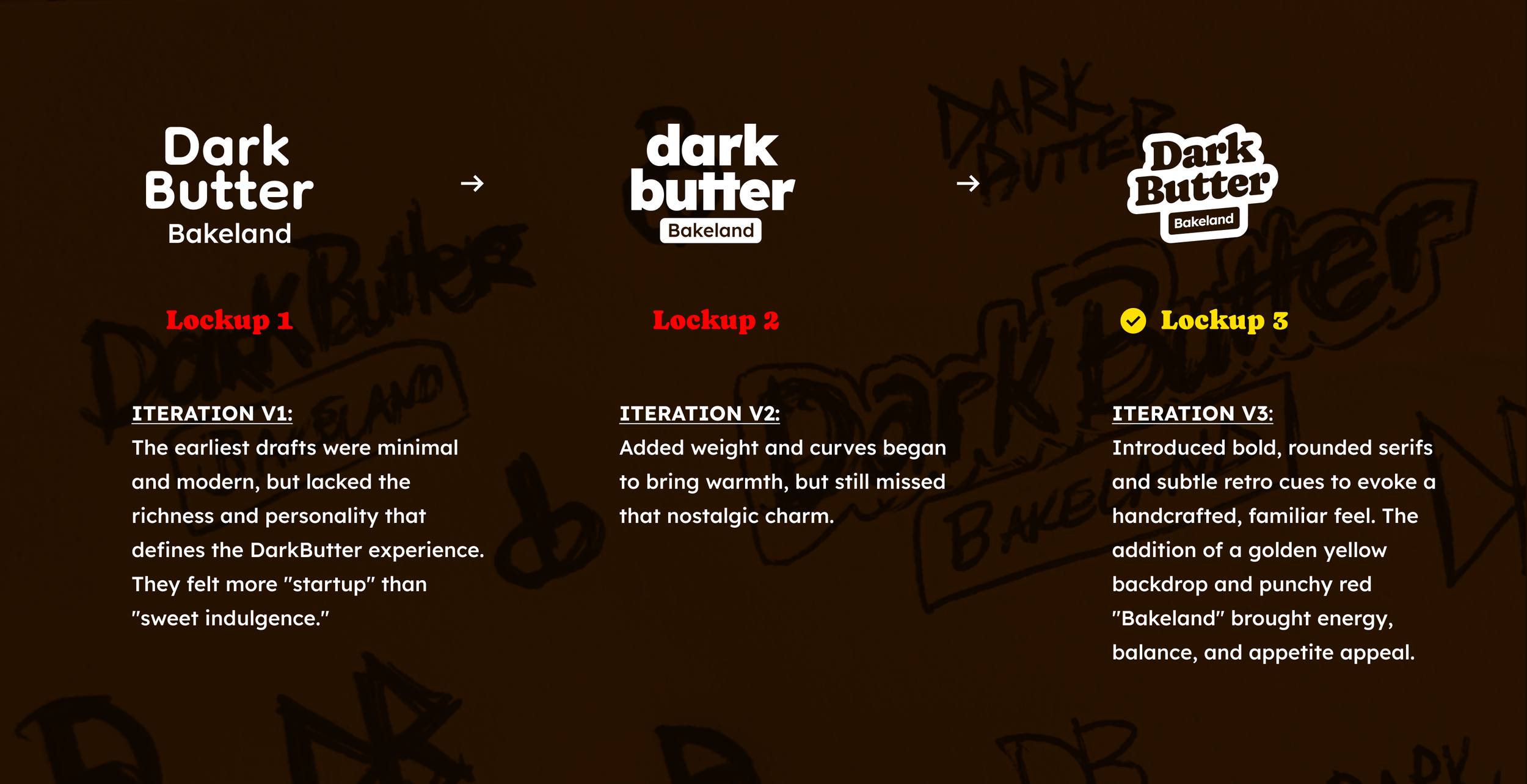
Logo Evolution
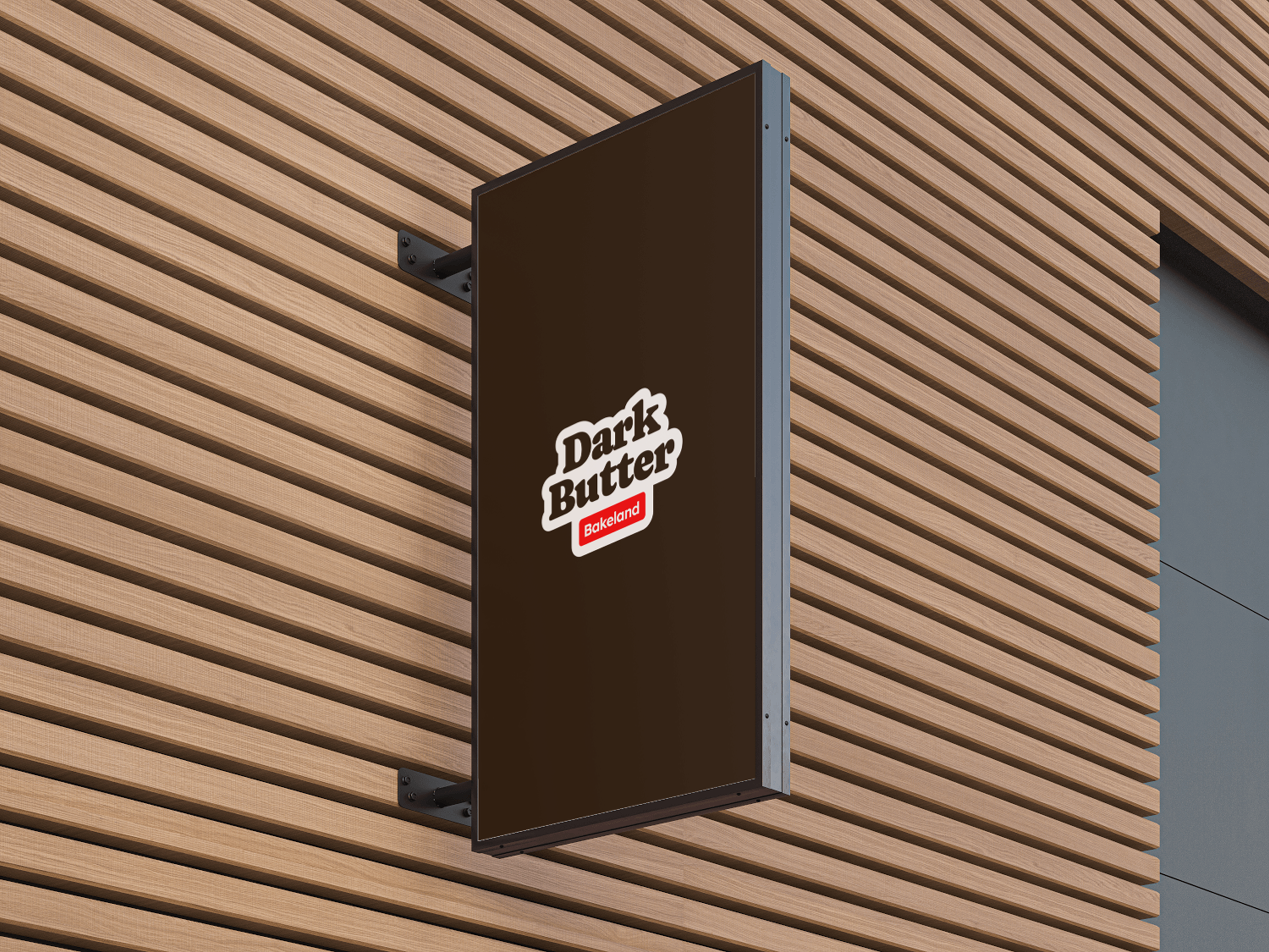
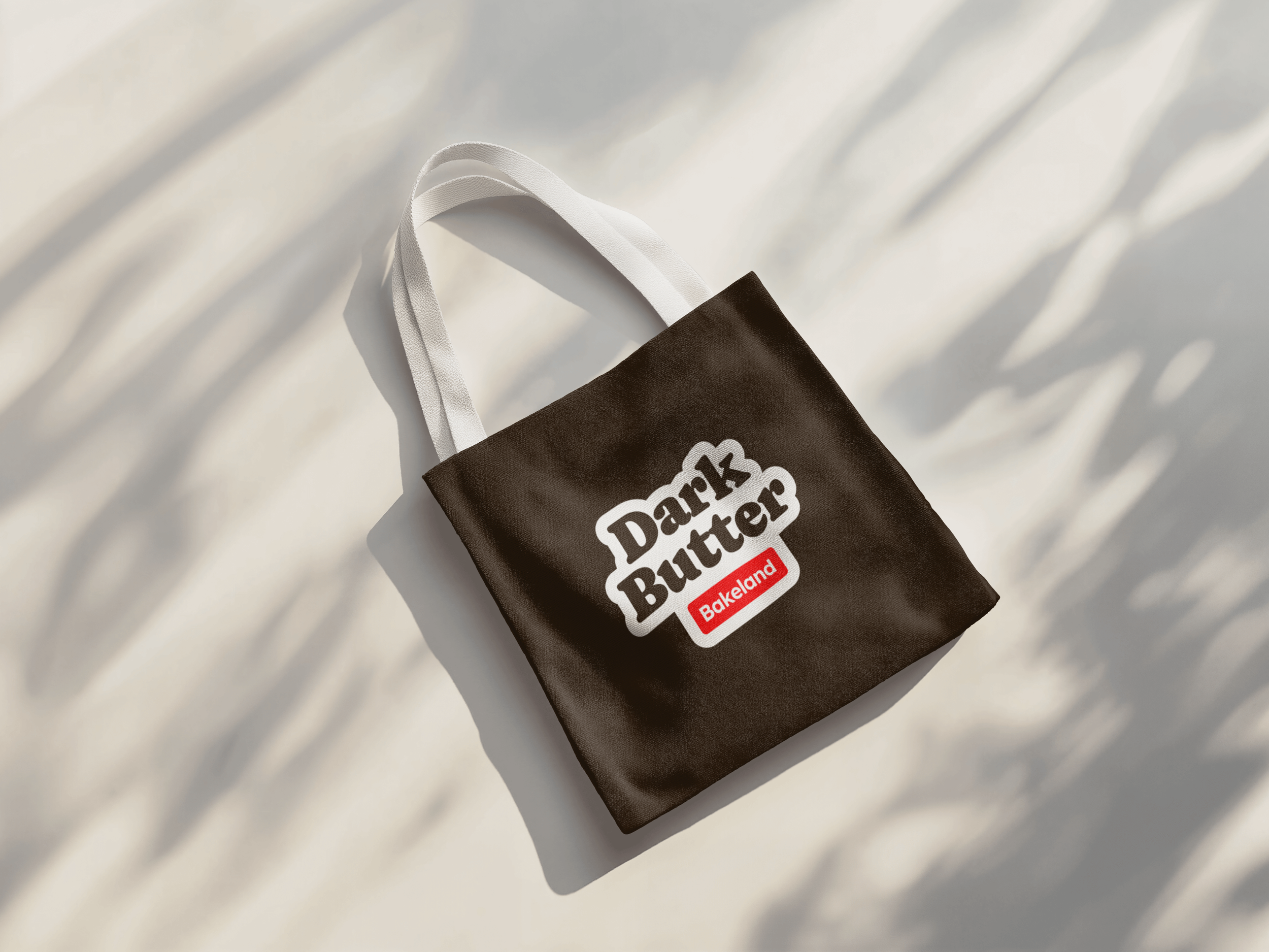
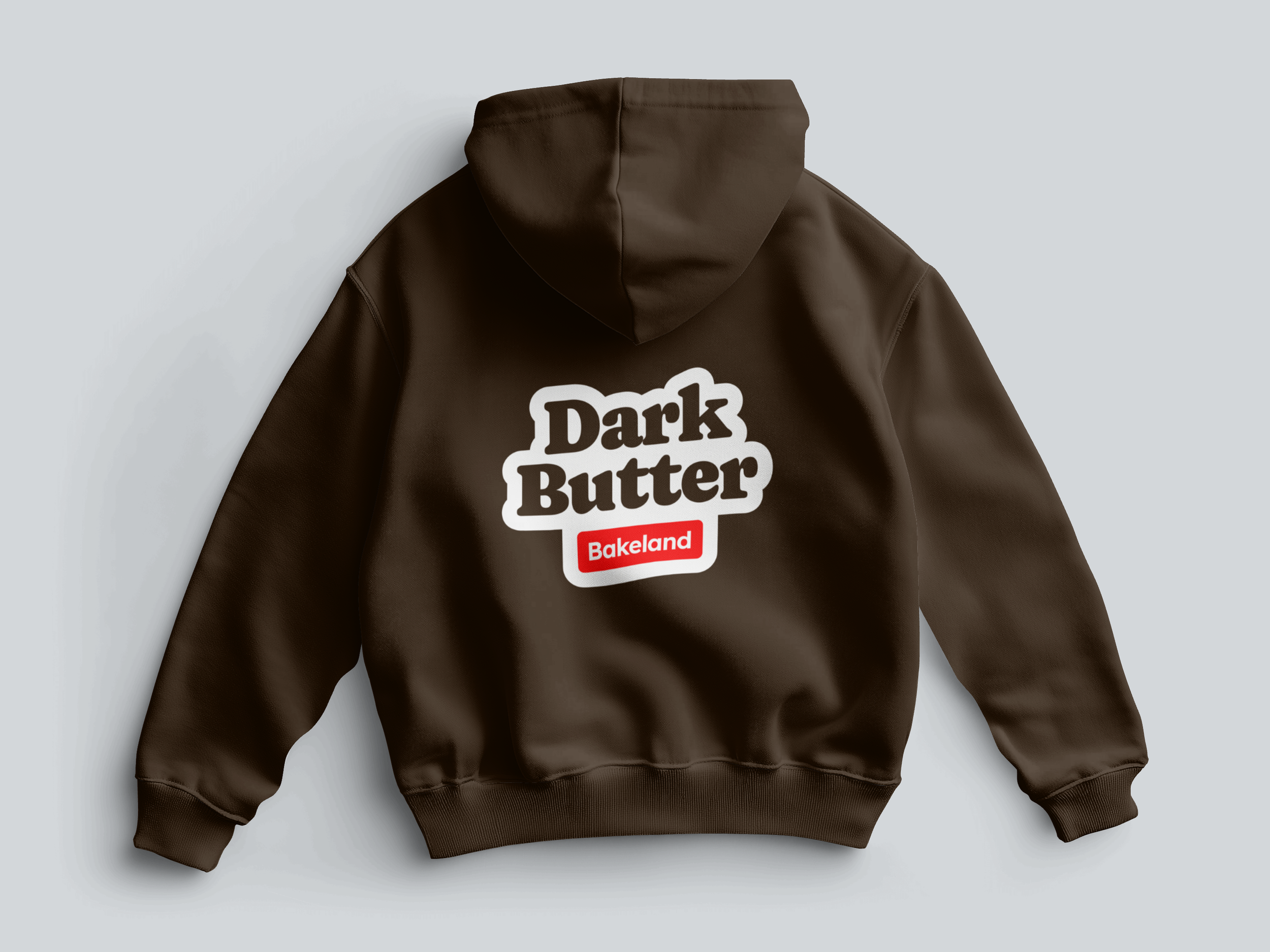
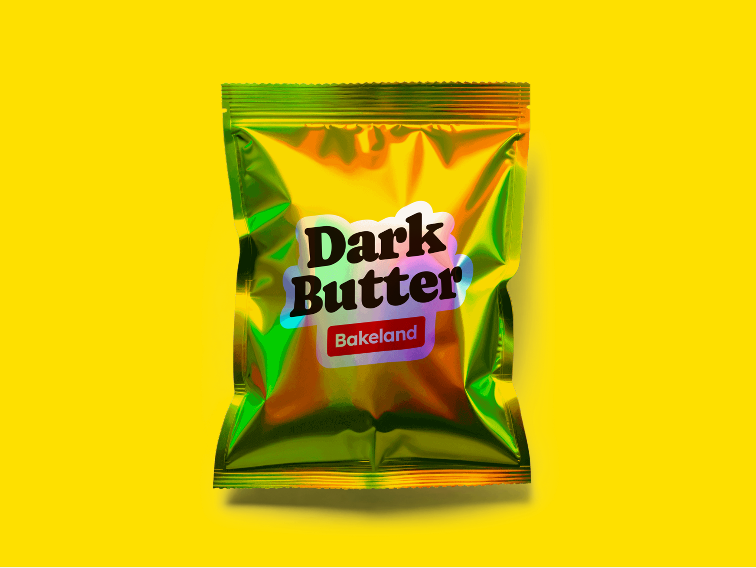
The first logo leaned too clean—too polished. It needed more soul. Through rounds of iteration, the wordmark evolved into something bolder, rounder, and more nostalgic. The final version introduced handcrafted curves and layered depth, sitting on a buttery yellow backdrop to increase warmth and recognition. The “Bakeland” tag was refined with a playful tilt and red pop—bringing balance, reinforcing tone, and adding a sense of fun and premium edge.
Typography

The brand type system pairs Caprismo and Lexend—two fonts that balance emotion and clarity. Caprismo was chosen for the logo: bold, curvy, and full of personality, it captures the handmade, buttery essence of the product. Lexend supports the system with clean, legible friendliness—ideal for packaging, labels, and digital touchpoints. Together, they strike the perfect balance between charm and utility.
Color Palette
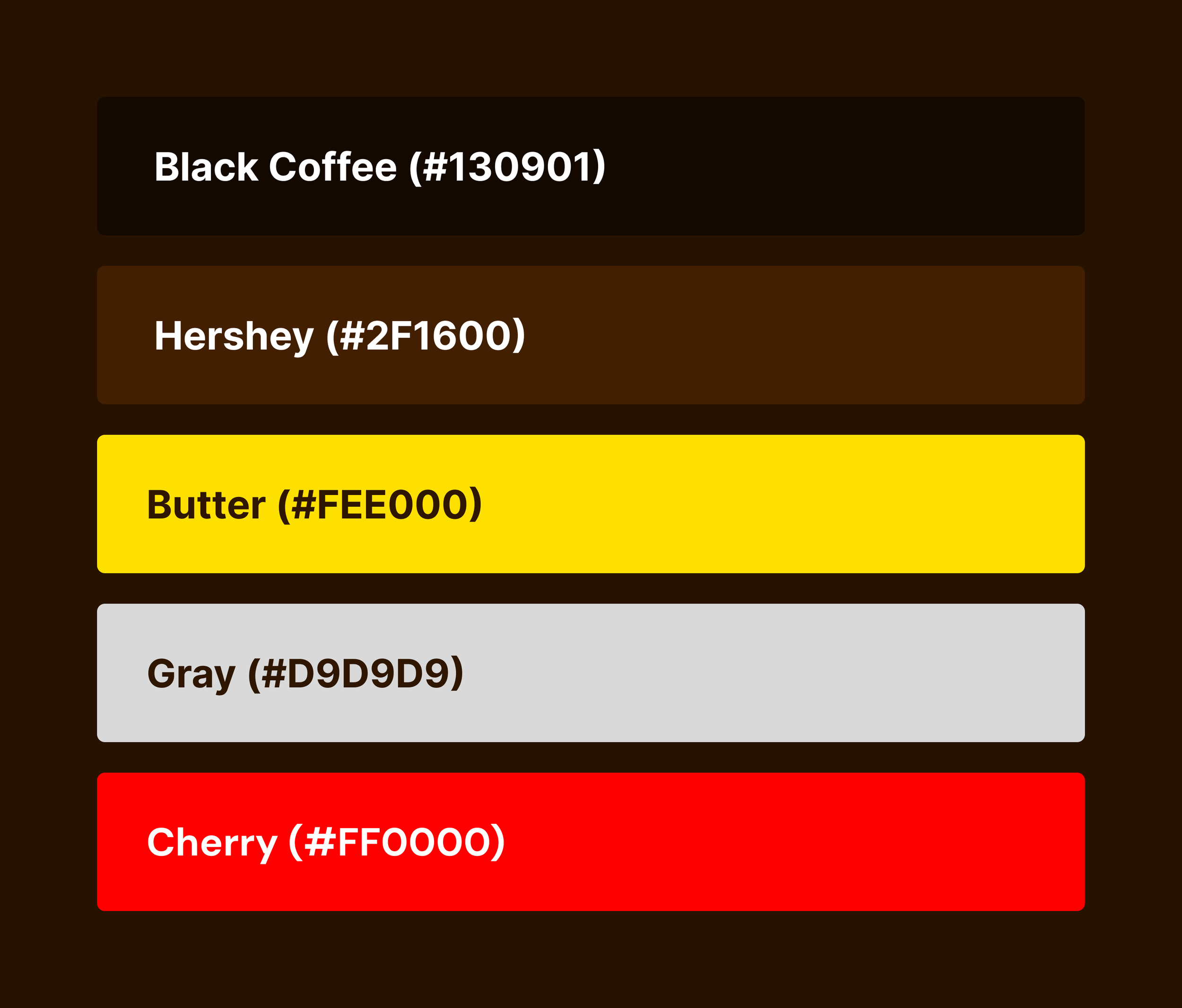
DarkButter’s palette leans into craveable warmth: a rich chocolate brown and golden butter yellow create the base, evoking brown butter, caramel, and cookie edges. A bold red accent injects energy, appetite, and a modern kick—making the brand feel vibrant, standout, and memorable across touchpoints.
04 — Naming Ideas
Naming The Flavors
Right now, naming at DarkButter is pure instinct. It’s gut-level, on-the-spot creativity—shaped by the vibe of the cookie, the ingredients, and whatever’s inspiring in the moment. A little playful, a little poetic, and always craveable.
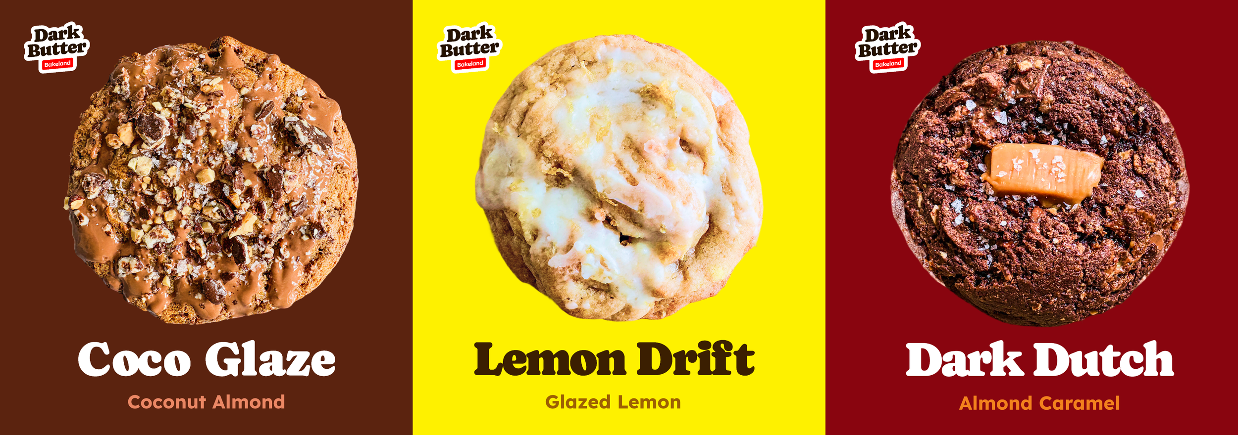
Dark Dutch
Almond Caramel Cinnamon
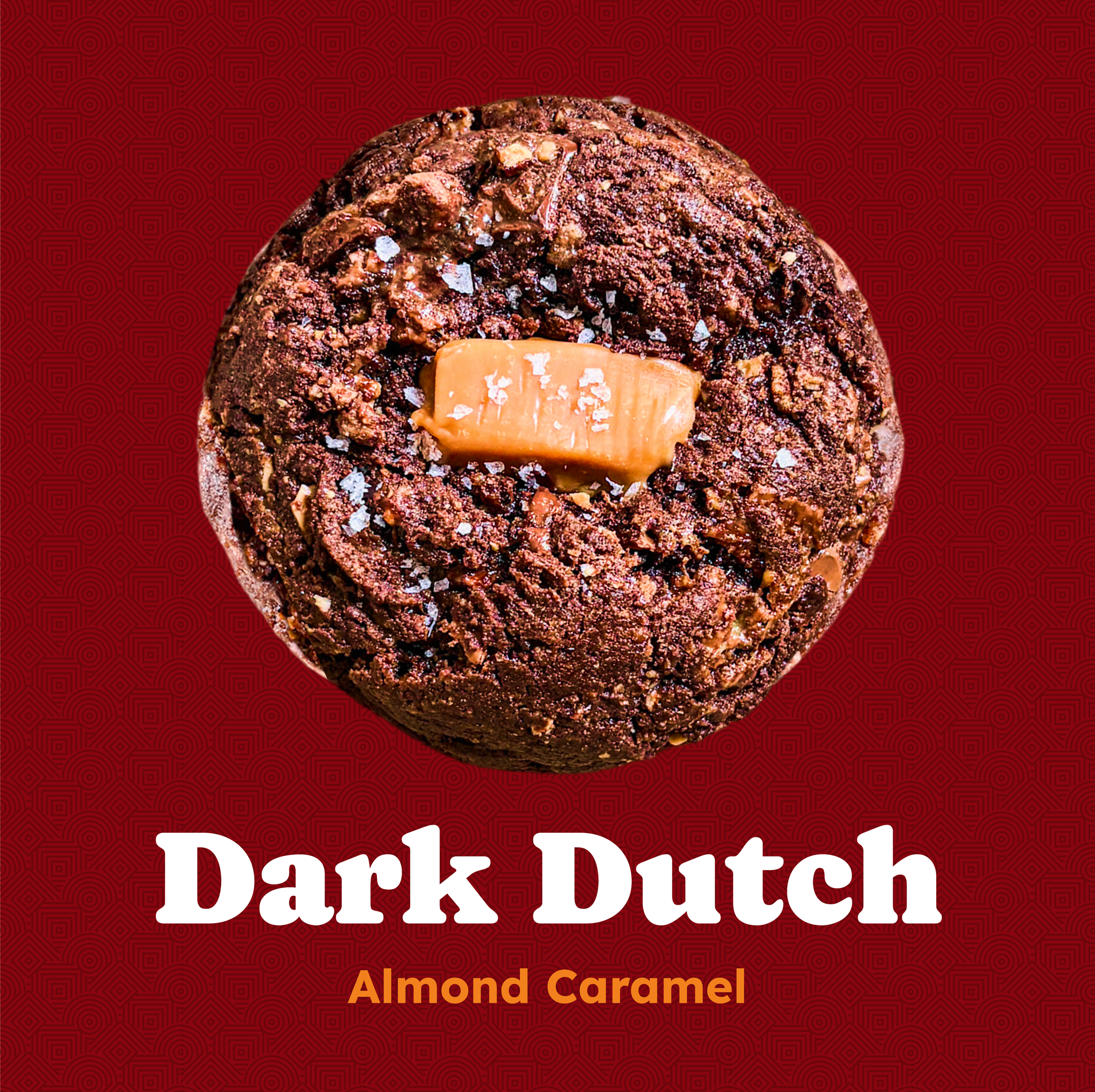
This was the cookie that started it all. Back in 2021, during late nights in the kitchen, this was the first batch that hit. Deep cocoa, warm cinnamon, toasted almonds. Simple but layered. Familiar but surprising.
The name came together just like the recipe—instinct first, meaning after. “Dark” for the intense chocolate base. “Dutch” for the Dutch-process cocoa used in the dough. It sounded rich, a little mysterious, and nostalgic.
Names Come From Pure Instinct. Whether Playful, Poetic, or a Little Nostalgic, Each One Adds Something Special.
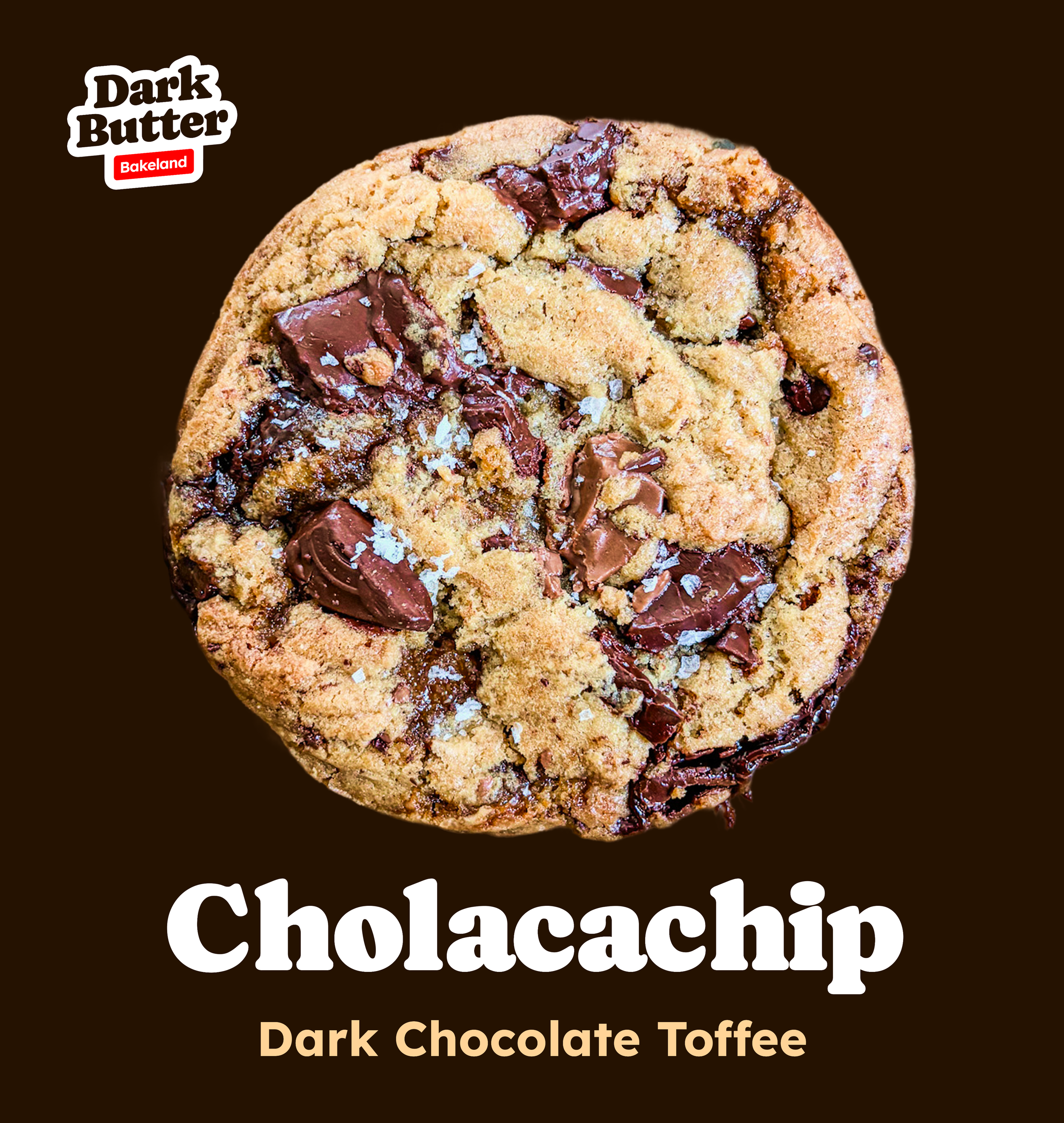
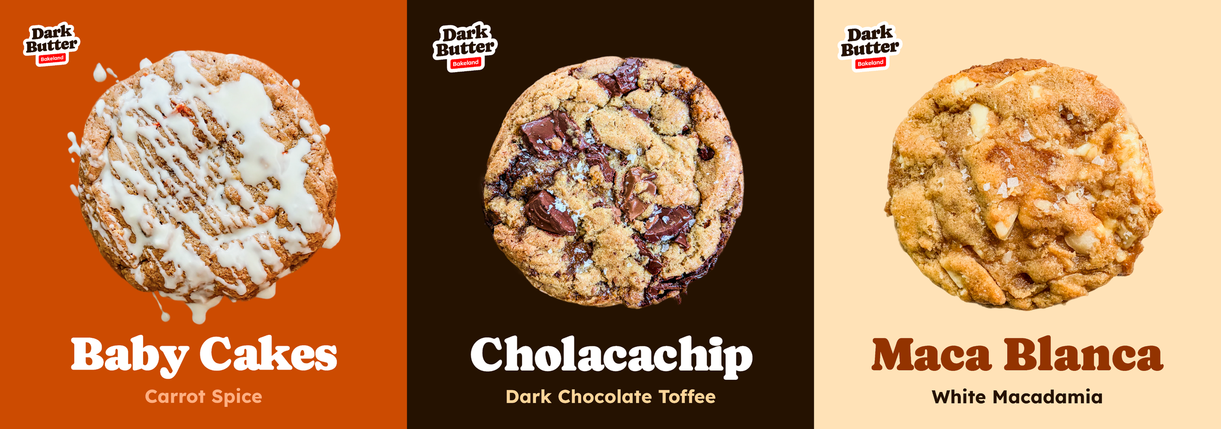
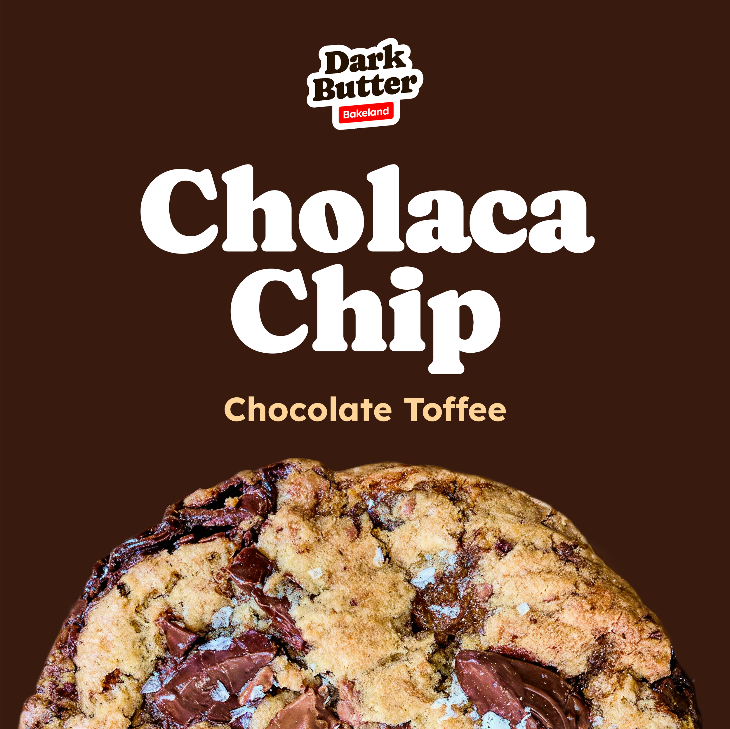
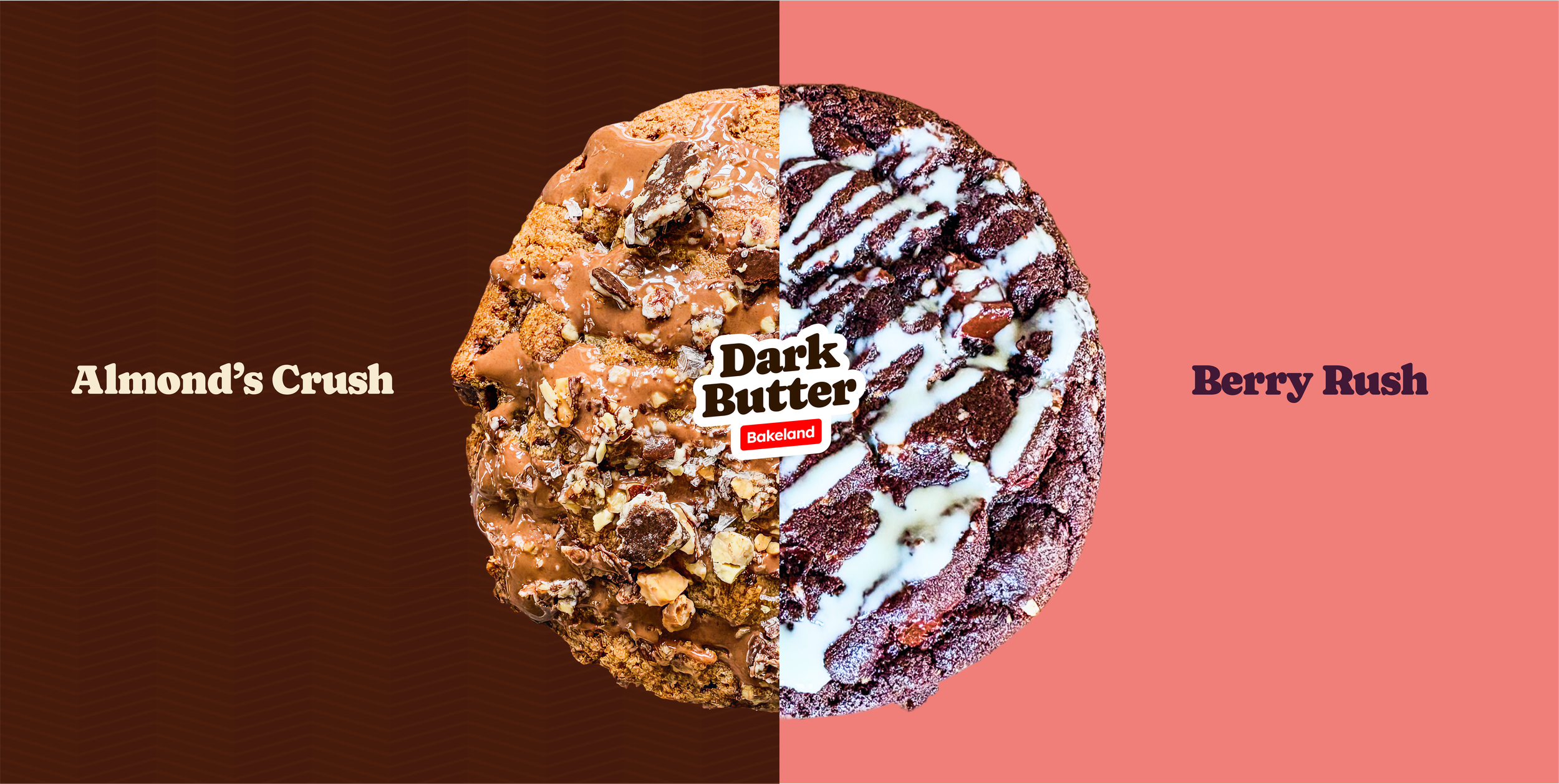
Cholacachip
The loudest chocolate chip in the room. Big dark chunks. Rich brown butter. Gooey toffee. And that salty-sweet edge. The name is fun to say, a little over-the-top—just like the cookie.
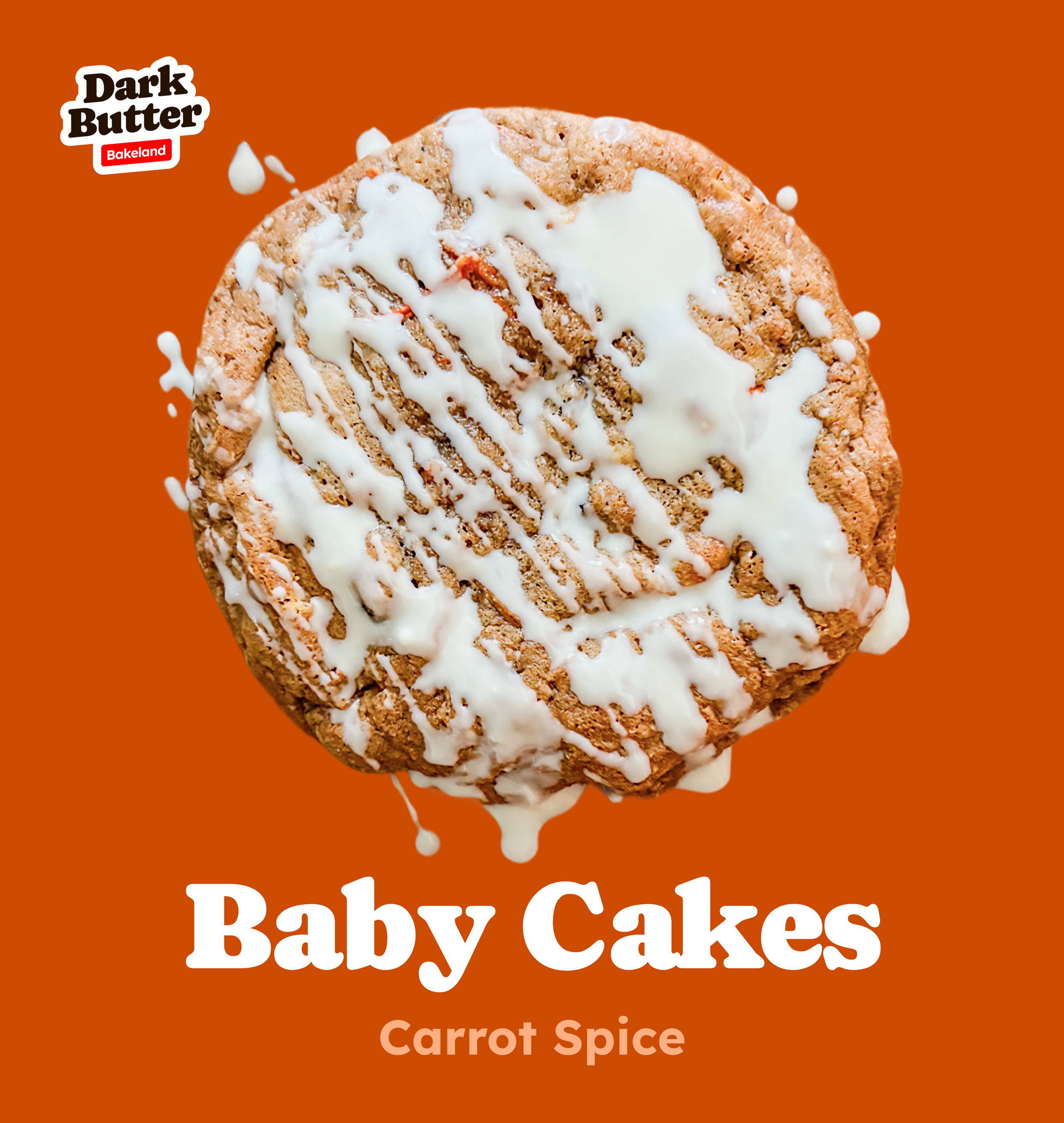
Baby Cakes
A carrot spice cookie that eats like dessert and brunch at the same time. Sweet, soft, and glazed in white chocolate icing, this one’s got warm bakery energy. The name is all comfort—like a nickname someone sweet gives you.
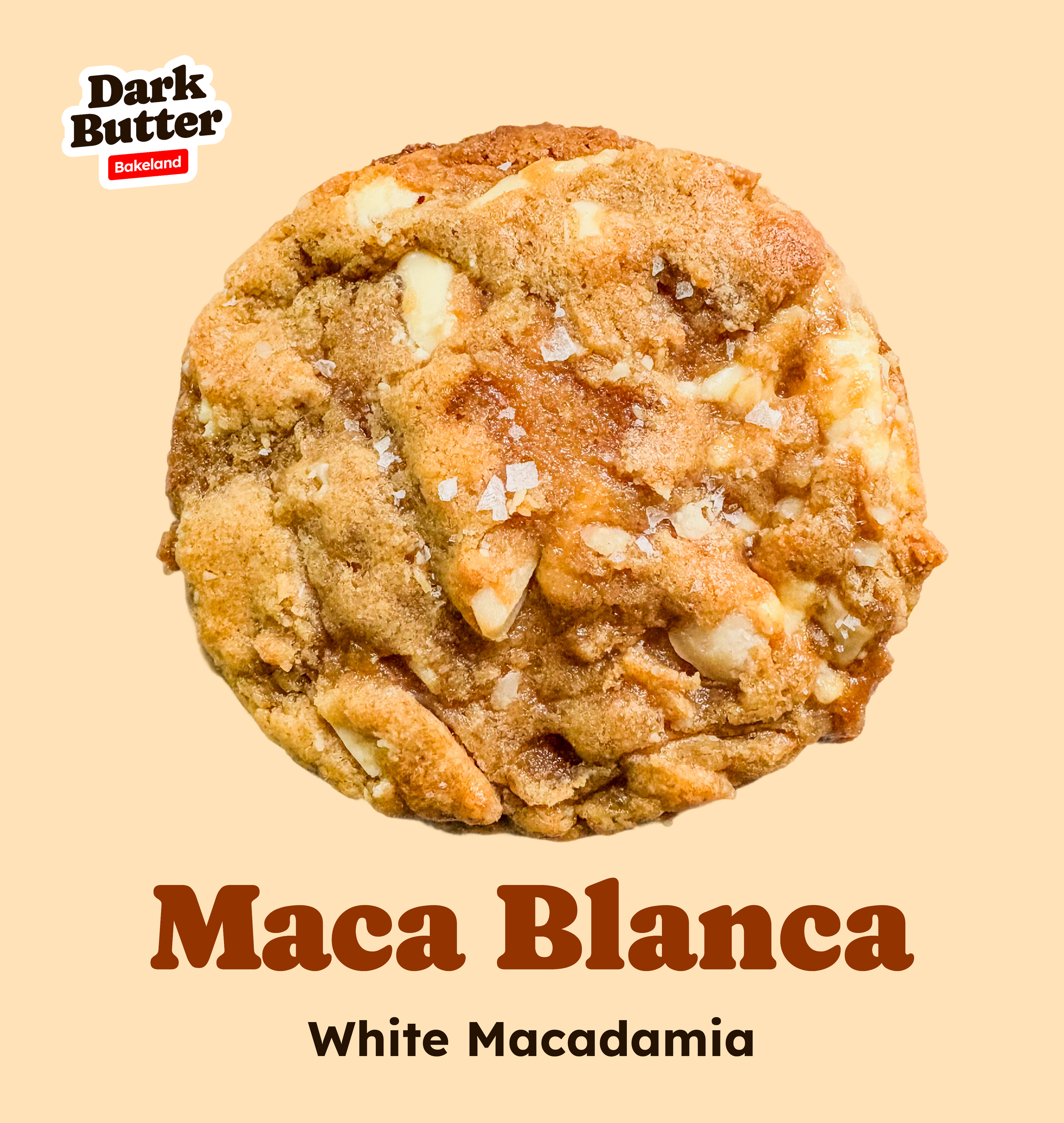
Maca Blanca
White chocolate macadamia but done the DarkButter way. Salted, golden, chewy. “Maca” for the macadamia. “Blanca” for its bright, buttery color. The name gives it a slight Latin flair—warm, crisp, and sun-kissed.
05 — What’s Next
Focus & Future Vision
DarkButter started as a craving—but the vision is bigger. The next step is bringing that craving to more people, one bite (and one box) at a time.

Short-Term
▸ Finalize brand + launch website
▸ Start batch-drops online sales
▸ Weekly drops of luxe cookies
▸ Organic growth via social, events

Mid-Term
▸ Secure commercial kitchen
▸ Open flagship: bakehouse
▸ Retail counter + cookie-only drive-thru
▸ Add office space for ops + shipping

Long-Term
▸ Sweet breads – sold by loaf or slice
▸ Mini versions – for gifting + sampling
▸ Monthly drops + subscriptions
Identity Applied
↓

Best Flavor is Born in the Dark.


Best Flavor is Born in the Dark.
06 — Project Impacts
Building a Crave-Worthy Brand
From a spark of inspiration in the kitchen to a fully realized premium cookie brand, DarkButter was built from the ground up with strategy, storytelling, and design. The result: a bold identity, crave-inducing visuals, and a scalable system that positions DarkButter as a go-to indulgence for cookie lovers.
01
▸ Clear Brand Foundation
Defined the brand’s voice, story, and visual identity from scratch—rooted in authenticity and the founder’s journey from layoff to baking obsession.
02
▸ Strong Market Presence
Developed bold, high-impact packaging and visuals that stand out both online and in person, making DarkButter instantly recognizable and desirable.
03
▸ Scalable Design System
Created a flexible design framework that can adapt to new flavors, seasonal drops, and future product lines without losing consistency.
04
▸ Elevated Perceived Value
Positioned DarkButter as a premium, small-batch indulgence—commanding attention and justifying higher pricing through storytelling and design.
05
▸ Connection with Customers
Built a brand experience that goes beyond the cookie—tapping into nostalgia, comfort, and indulgence, creating a loyal following that craves not just the product but the story behind it.
More Case Studies
↓

Next Studio Case
