Building a Premium Brand Before Scale
A limited-drop cookie brand designed with strategy, restraint, and longevity in mind.
Brand Identity · Packaging · Digital Foundation

Overview
DarkButter launched as a premium cookie concept built to feel established from day one. The work focused on creating a flexible brand and packaging system that supports limited drops now and can scale later without redesign.
The Challenge
DarkButter began without an audience, sales history, or launch data. The challenge wasn’t simply to make something look good — it was to design a brand system that could generate desire before scale, feel premium at low volume, and remain consistent as the business grows.
The Goal
Build a brand that feels established from day one
Create visual desire without relying on ads or discounts
Support a limited-drop model with intentional design
Leave room to scale without reworking the identity
Scope of Work
Brand identity system
Logo and mark refinement
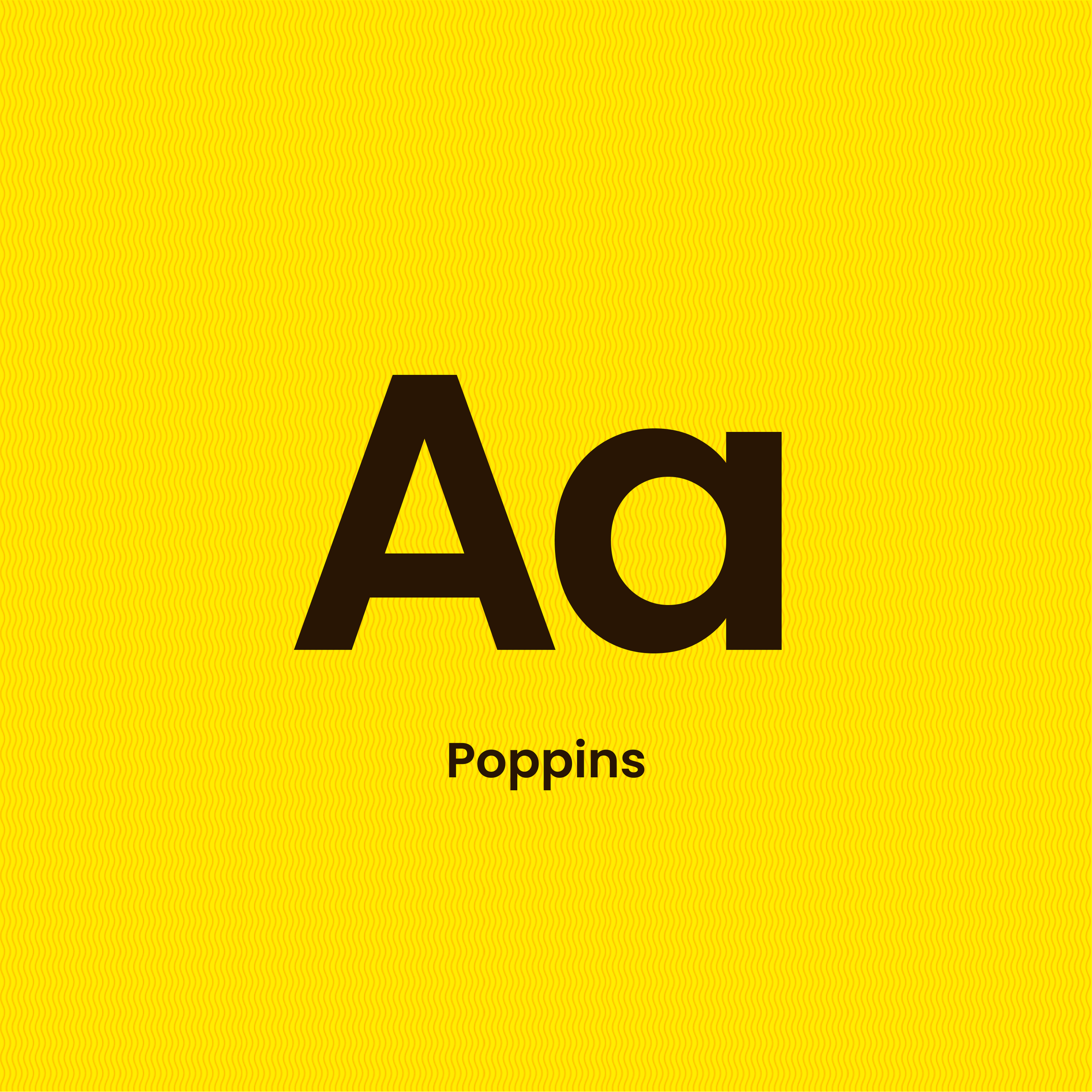
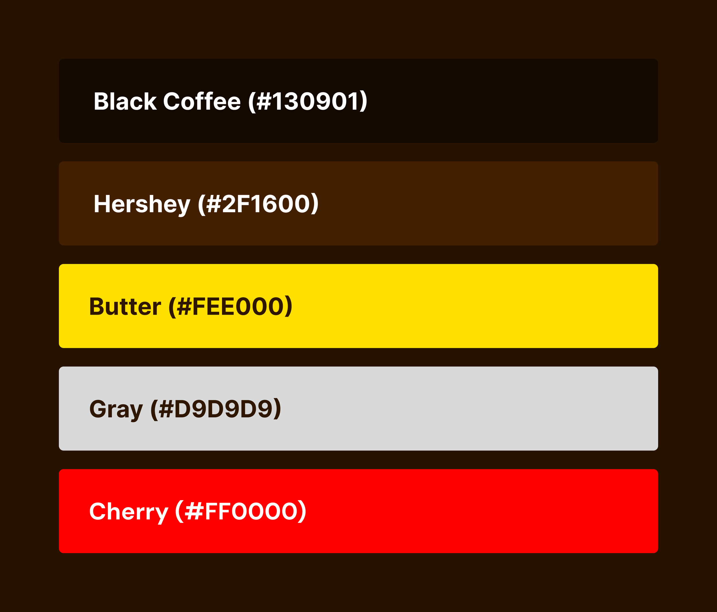
Color and typography direction
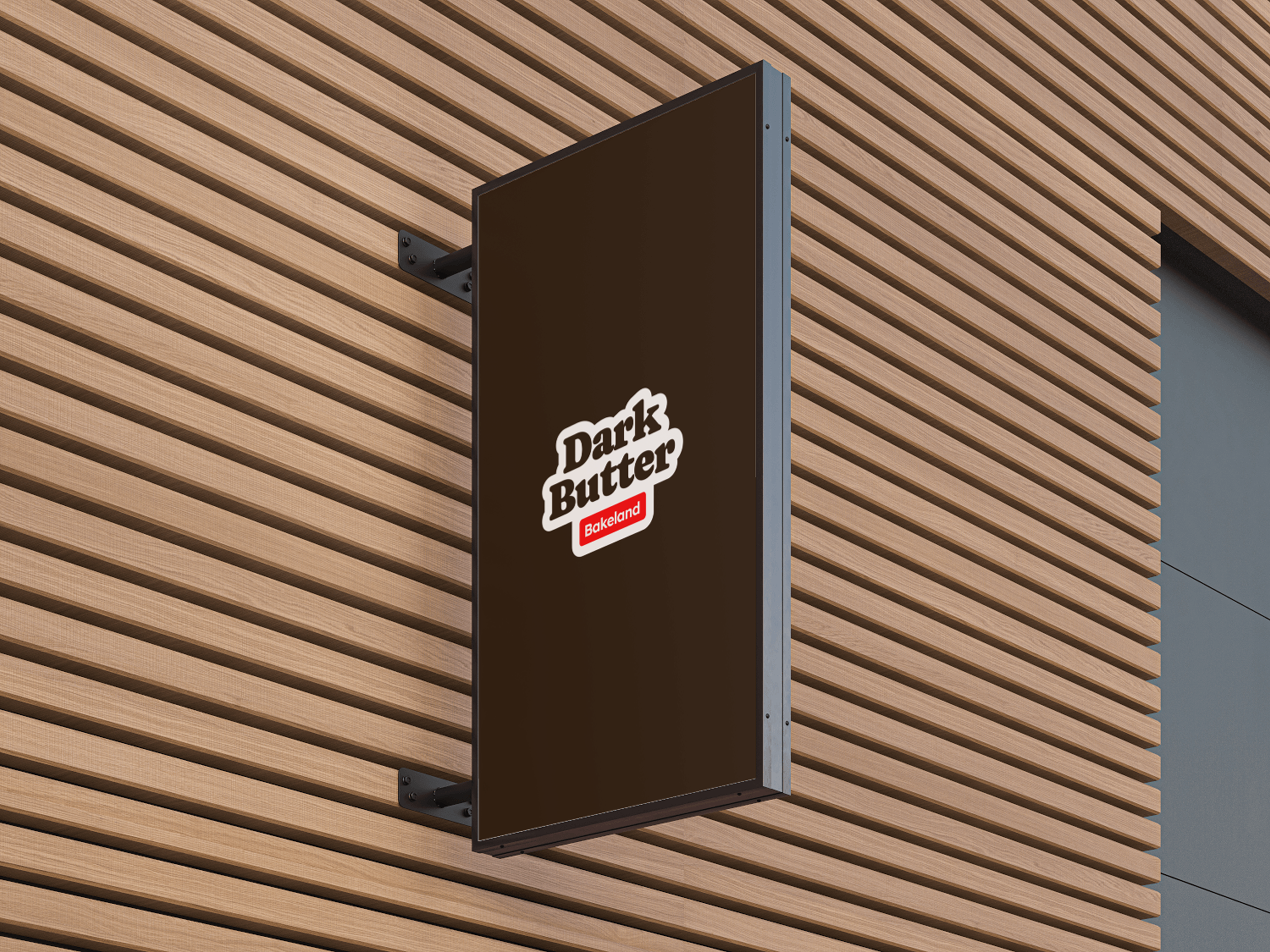
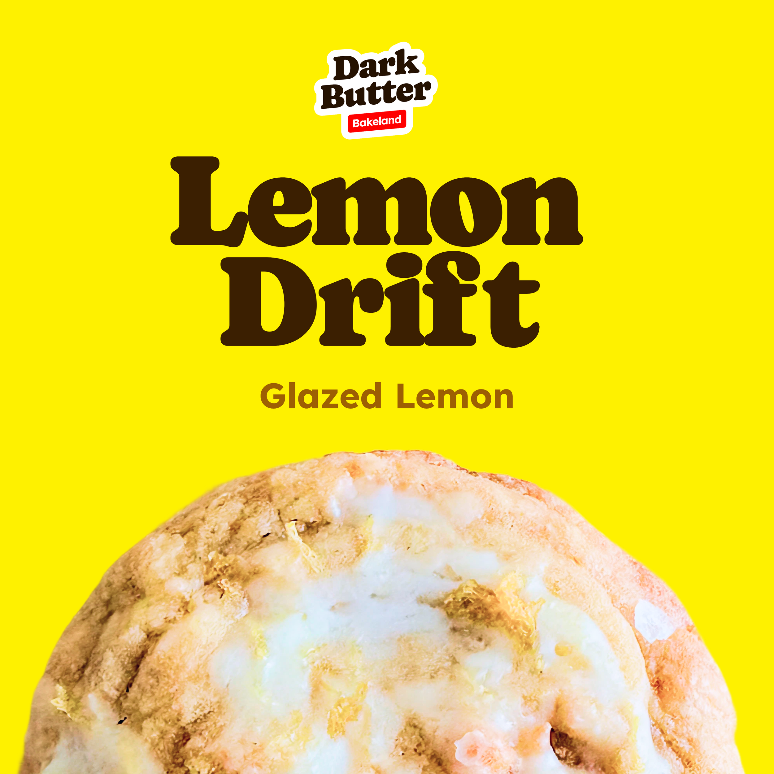
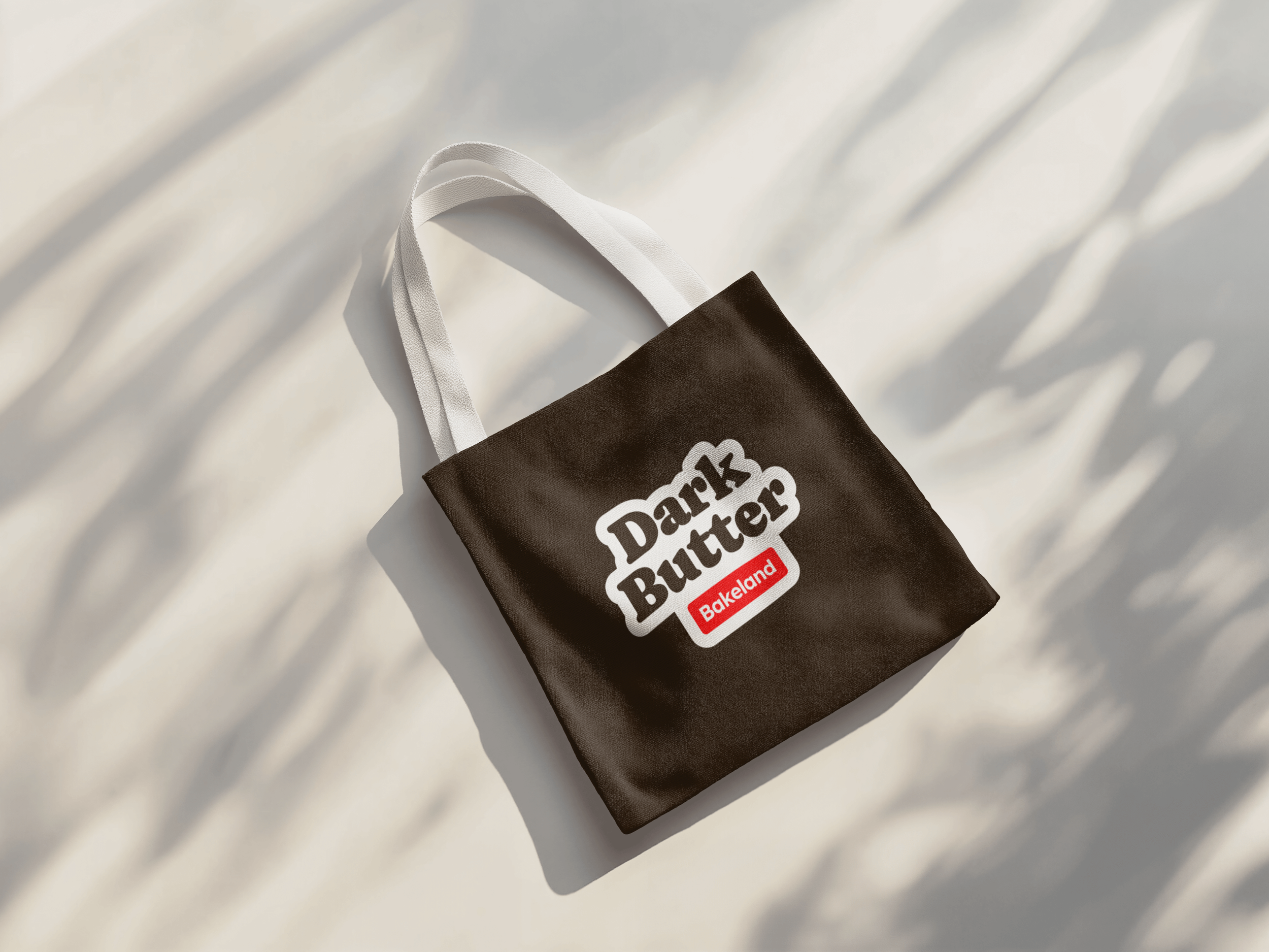
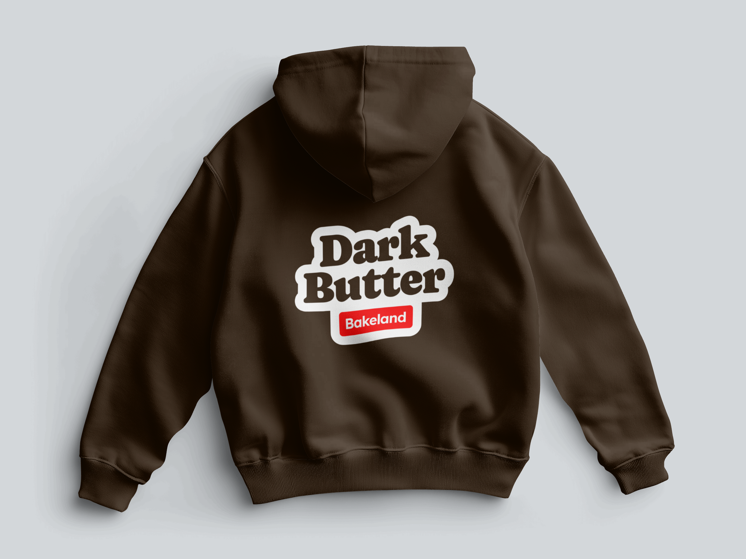
Packaging design
Digital launch foundation
The Approach
Discover — Define category cues and the emotional tone the brand needed to communicate.
Define — Establish positioning and a visual direction rooted in simplicity and memorability.
Develop — Build a cohesive identity and packaging system across physical and digital touchpoints.
Deliver — Create a launch-ready foundation designed for limited drops and future expansion.
Strategy & Key Decisions
Lead with a minimal, high-contrast identity to improve memorability
Design packaging for recognition at a glance
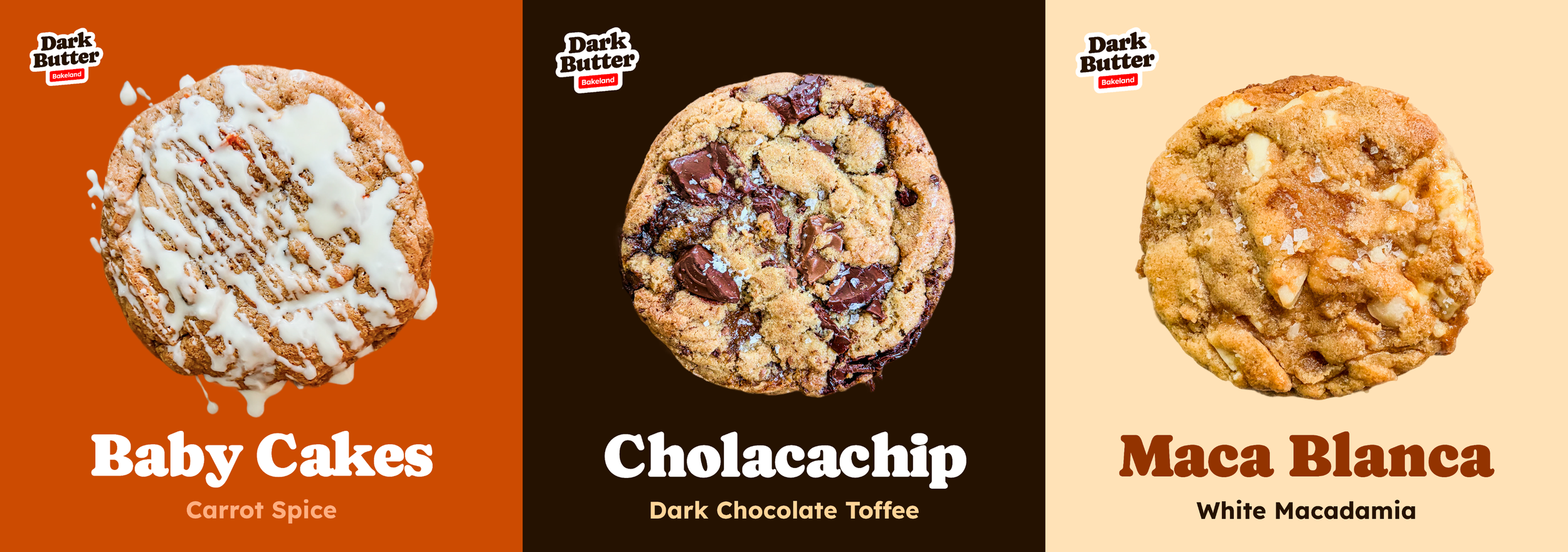
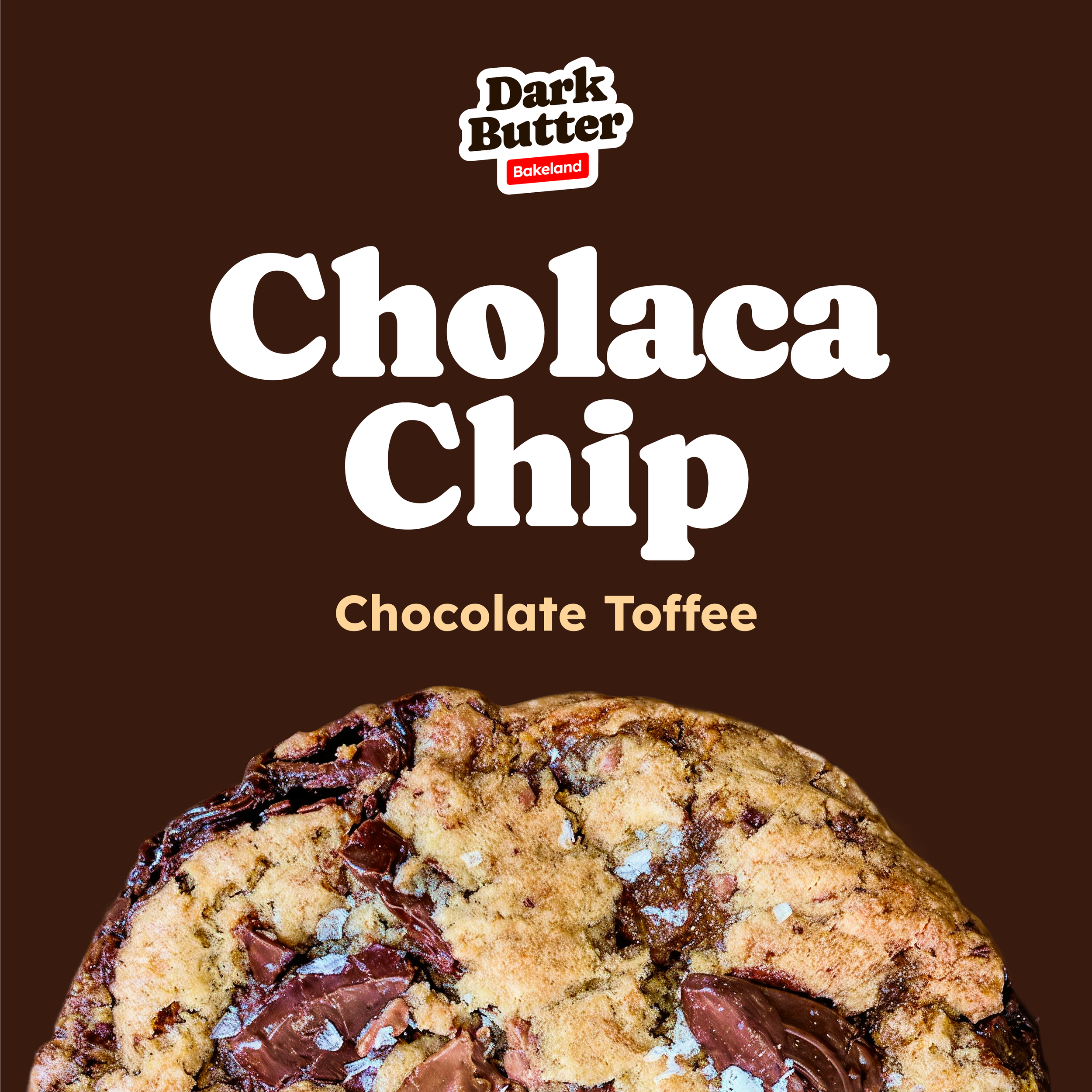
Build a flexible system for new flavors, formats, and channels
Visual Identity

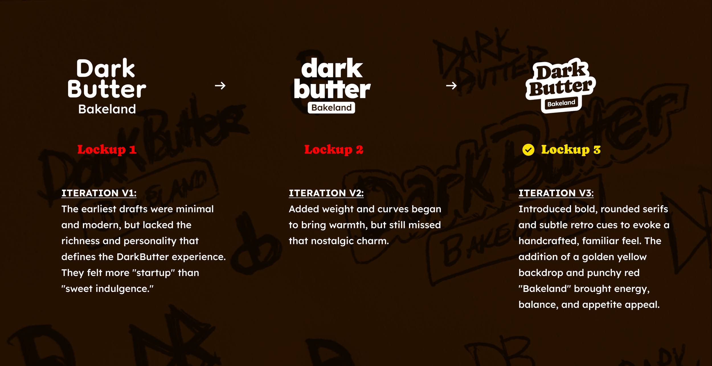
Logo Evolution
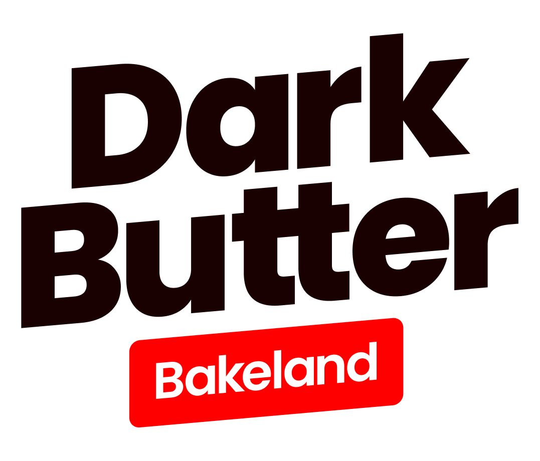
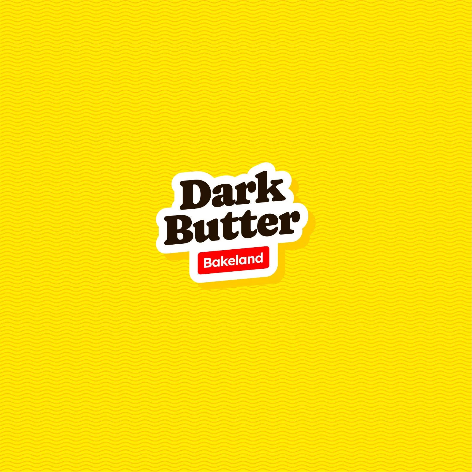
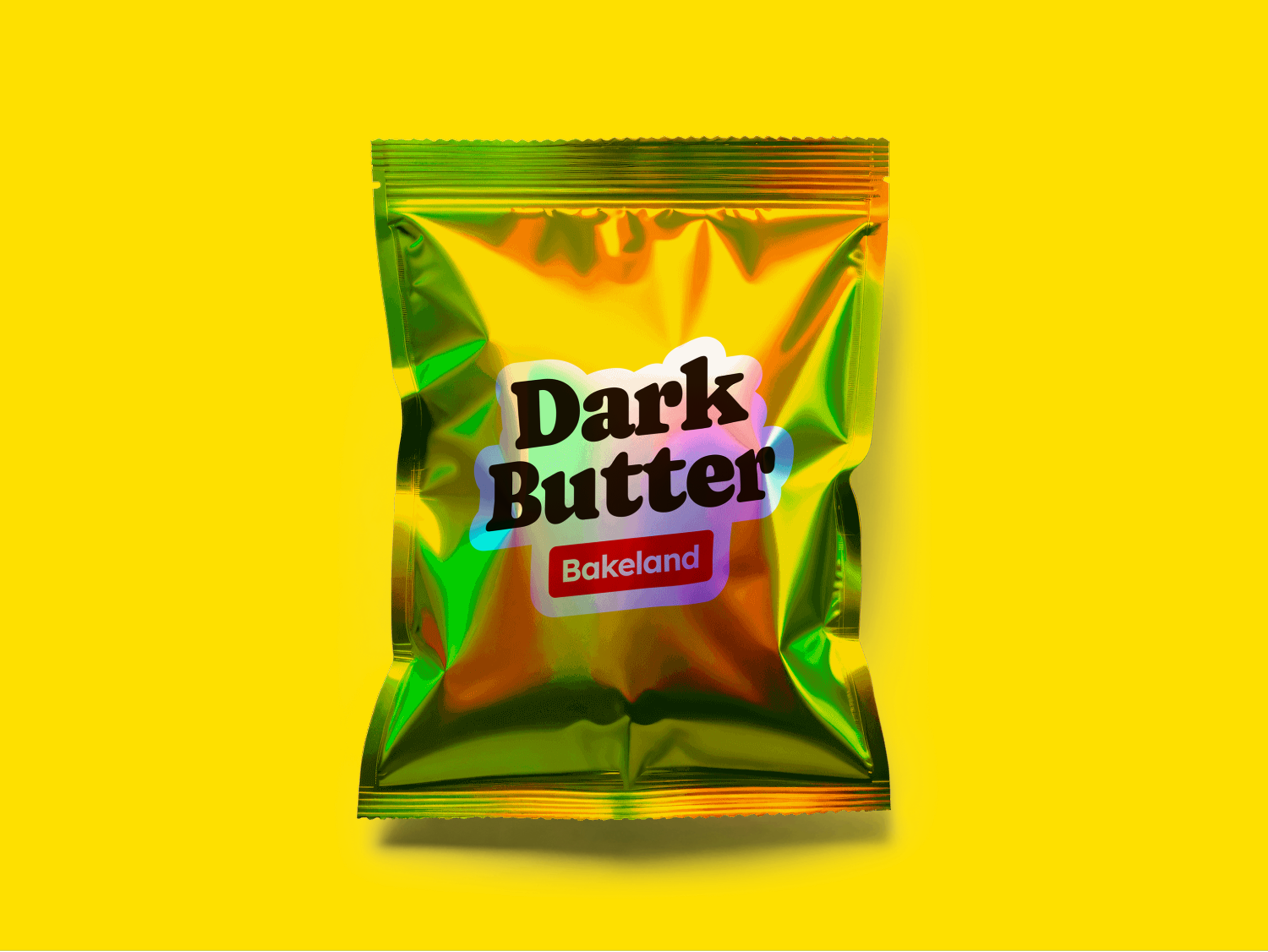
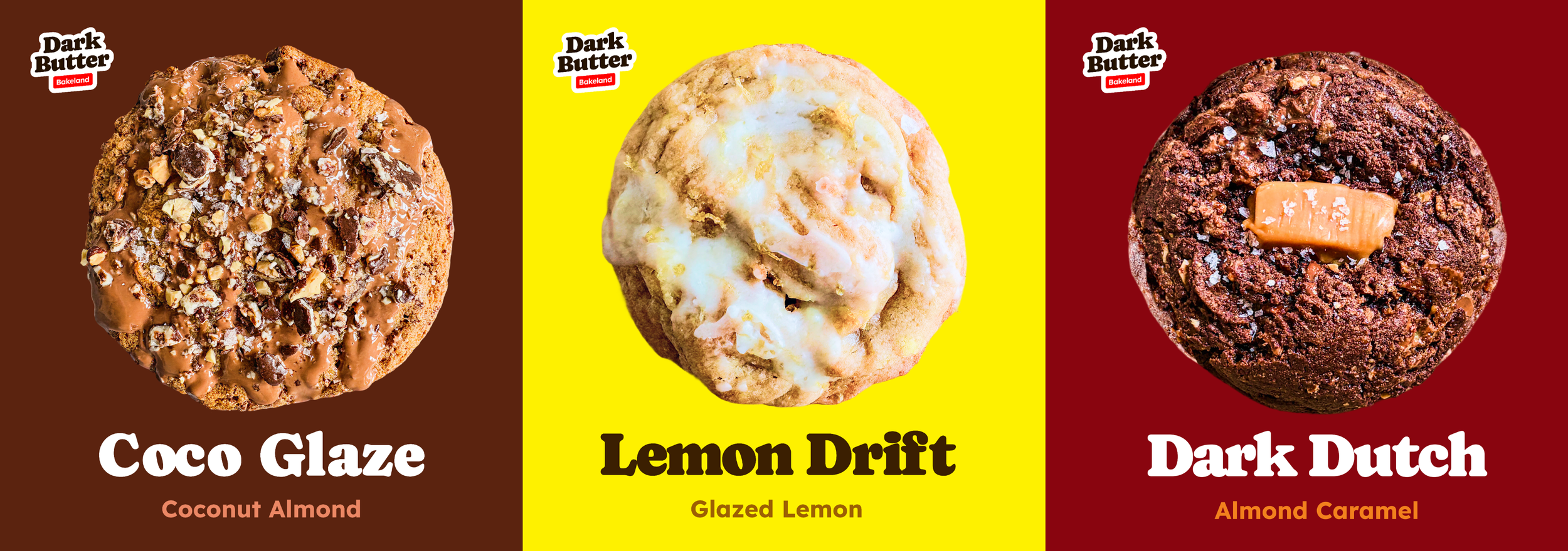
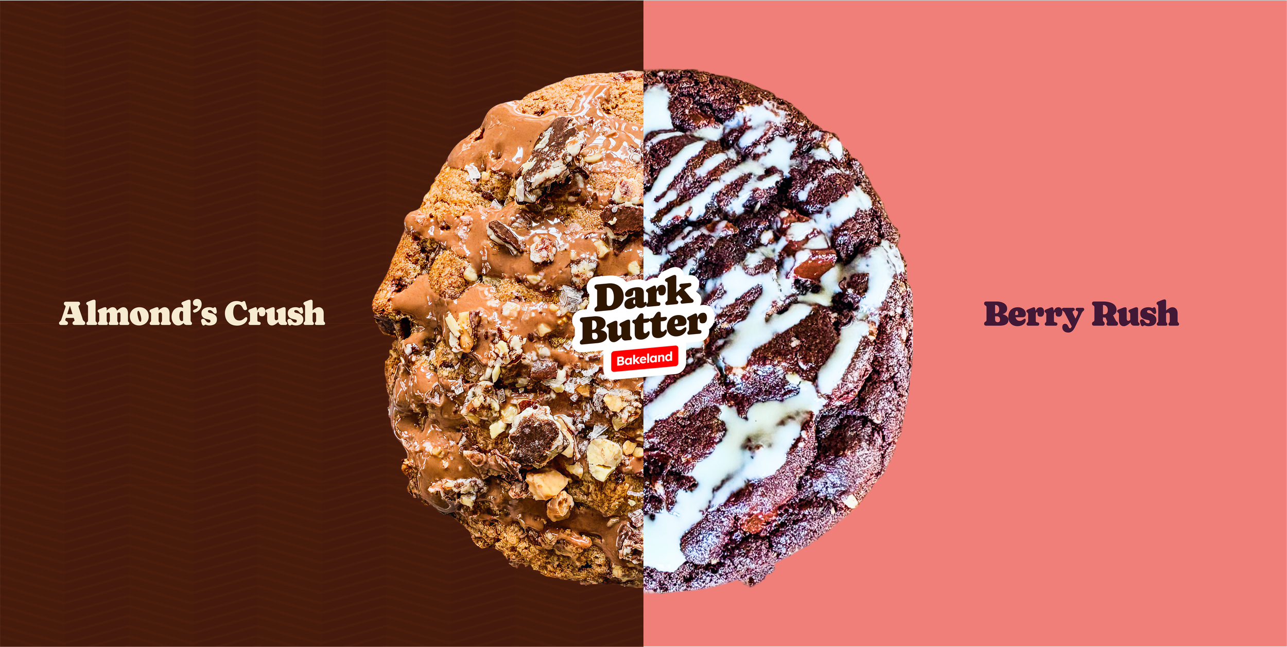
The initial logo direction skewed too clean and overly polished. Through iterative refinement, the wordmark evolved into a bolder, more rounded form with greater warmth and character. Handcrafted curves, layered depth, and a buttery yellow backdrop improved recognition while reinforcing a nostalgic, premium tone. The refined “Bakeland” tag added contrast and energy, balancing approachability with brand confidence.
Website: DarkButter.com →

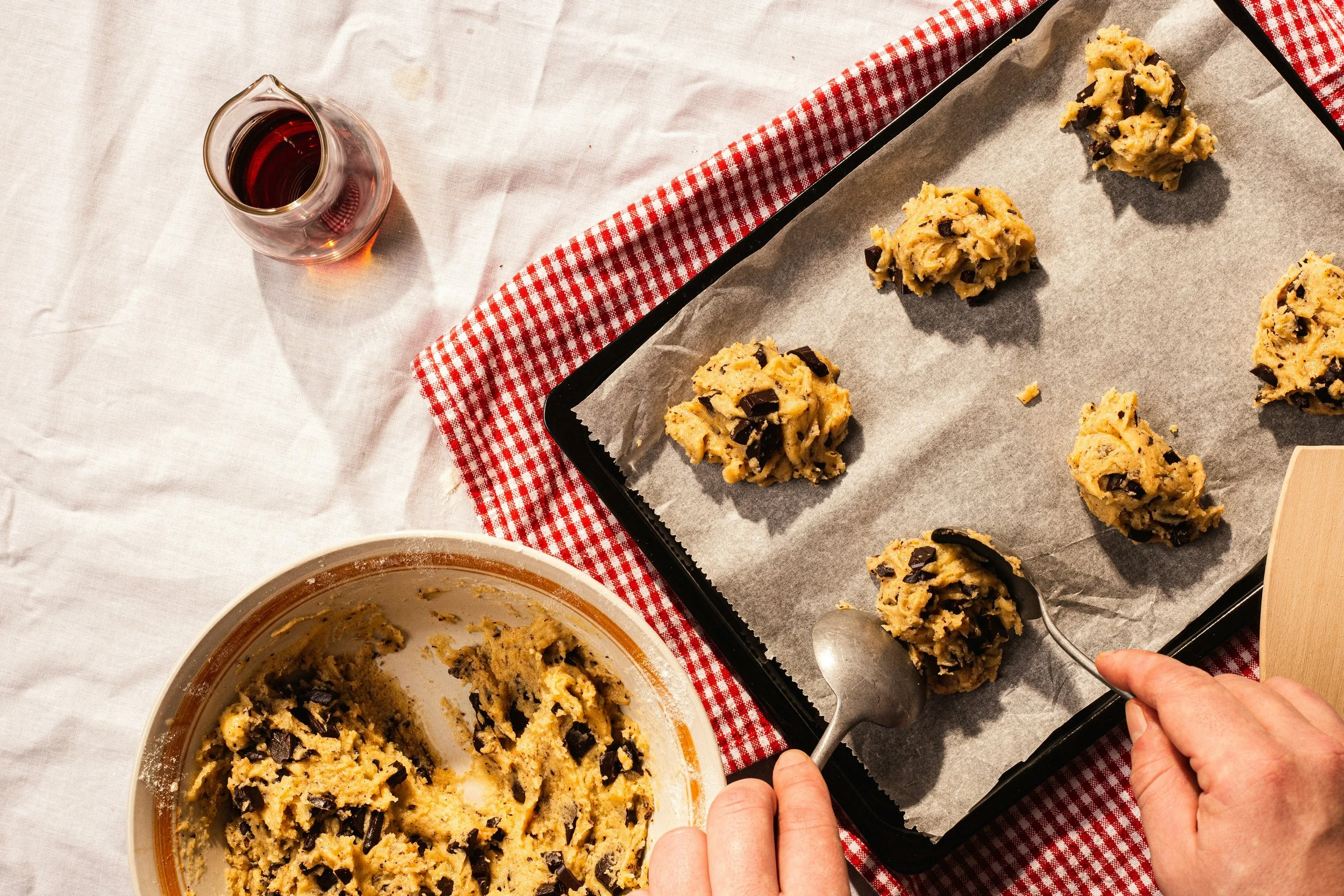
Deep Flavor is Born in the Dark.


Next Studio Case