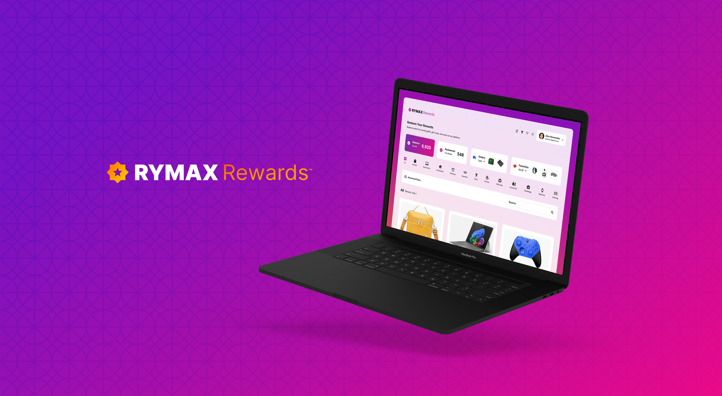

Rymax Rewards
Rymax, a leader in loyalty rewards solutions, needed a refreshed brand identity and streamlined checkout experience. The redesign modernized their visual system and improved usability for a more trusted, polished user experience.
Deliverables
▸ Elevated Brand Identity System
▸ User Interface Design
▸ Visual System
▸ Design Direction
Redesigned for Relevance.
Built to Convert.
A Modern Identity and Experience for a Loyalty Leader
Rymax’s original identity felt outdated and lacked the clarity today’s users expect. We created a bolder, more contemporary system that unifies brand and product—merging visual storytelling with a more intuitive checkout flow. The result is a refined experience that builds trust, improves usability, and positions Rymax Rewards as a premium player in the loyalty space.
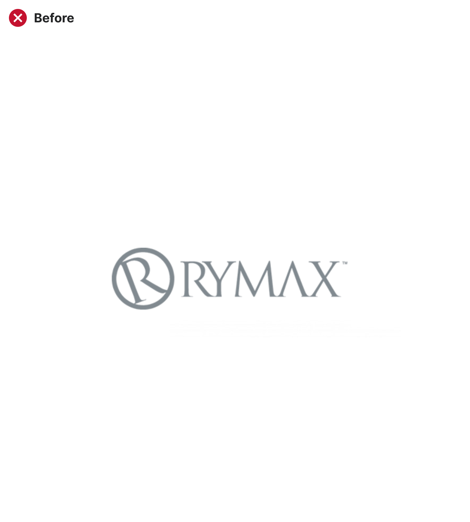
Old Identity
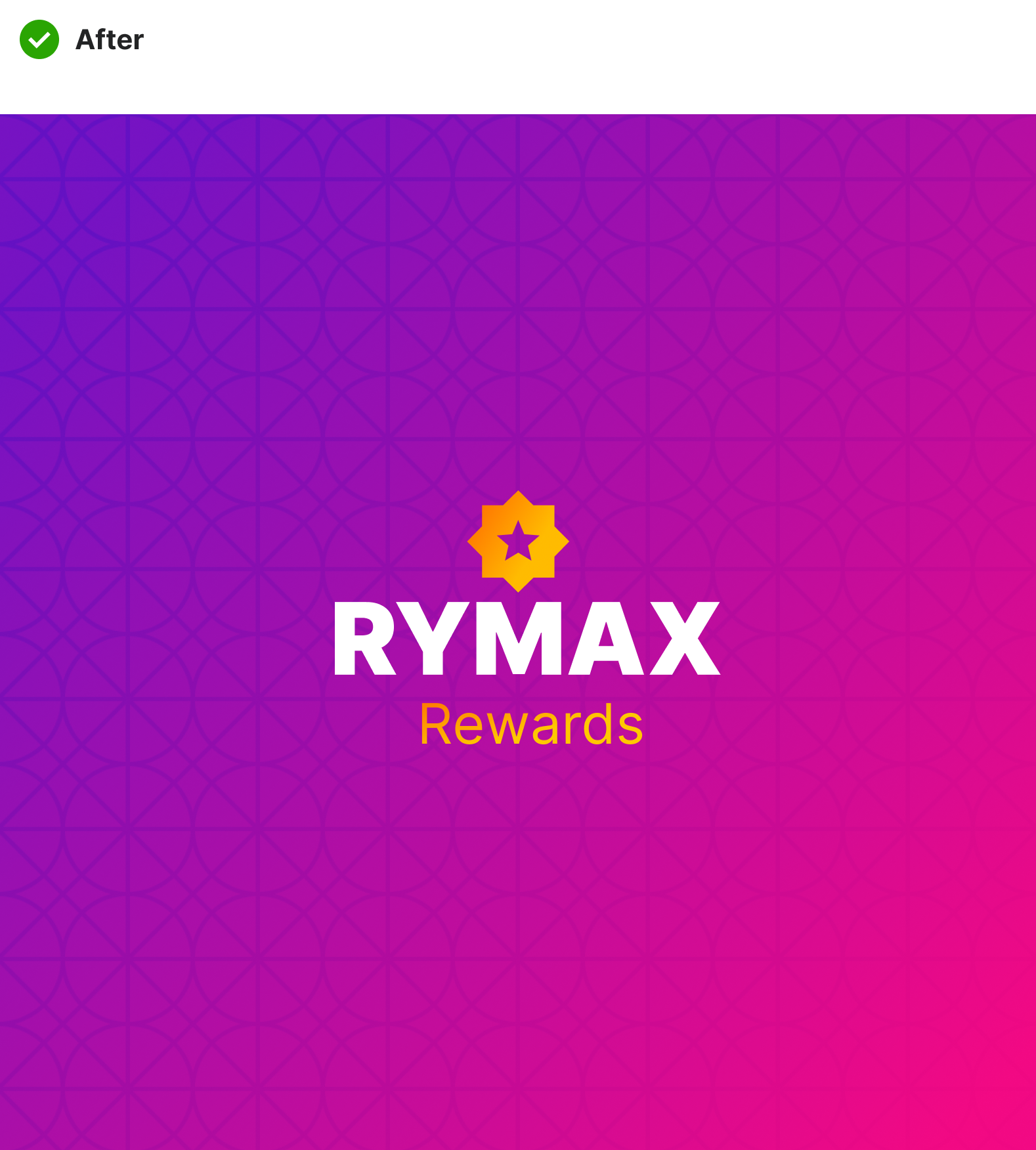
New Identity
See How We Got Here
↓


A Refreshed Identity and Streamlined User Experience
A modern brand system and simplified checkout flow for a leader in loyalty rewards. Built to strengthen trust, clarify the user journey, and elevate Rymax’s premium brand presence from the inside out.
01.
Discover
We reviewed Rymax’s existing rewards portal and conducted a competitive analysis to understand how similar platforms structure their flows. Insights from one key stakeholder helped guide priorities around trust, polish, and usability.
02.
Define
The goal was clear: explore a new direction that felt more modern, cohesive, and intuitive. The brand needed to elevate its digital presence while staying aligned with its premium, established reputation.
03.
Develop
We designed a refreshed identity and mapped out a simplified checkout flow. The visual and UX updates focused on reducing friction, building trust, and giving the platform a cleaner, more elevated feel.
04.
Deliver
The outcome was a flexible, forward-looking brand system paired with a more intuitive checkout concept—setting the stage for a stronger, more confident digital experience.
Inside the Work
↓

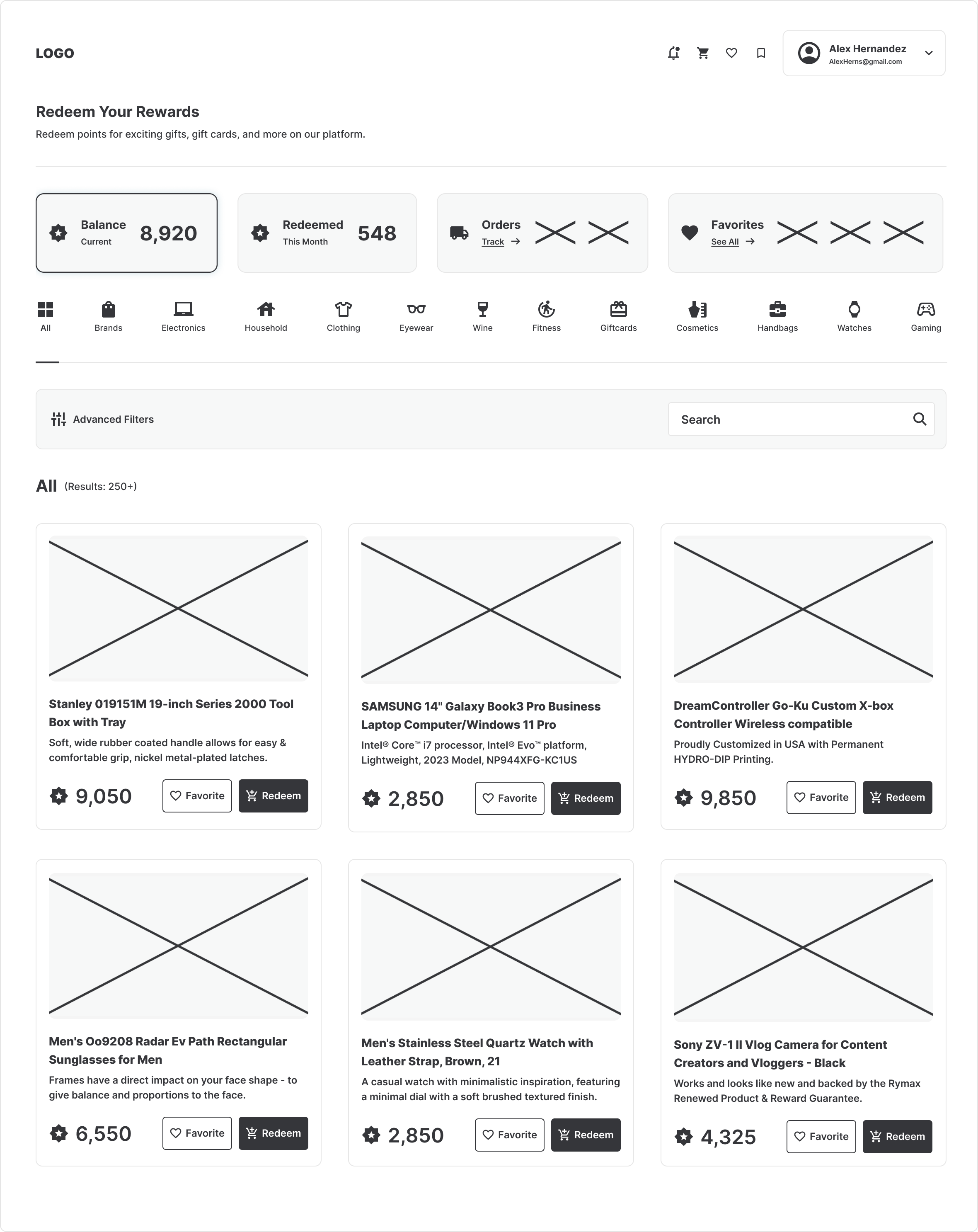
01 — Before the First Sketch
The Challenge
The outdated brand identity lacked clarity and polish - feeling more corporate than compelling. The checkout experience was cluttered, inconsistent, and not optimized for trust or usability. These issues hurt user confidence, slowed conversions, and weakened Rymax's credibility in a competitive digital market.
02 — Strategic Path
Strategic Approach
Rather than exploring endless logo sketches, I took a strategic path: starting with brand attributes, competitive analysis, and user expectations. From there, I selected typography and iconography that reflected modernity and sophistication. Every visual decision - from color to hierarchy - was crafted to elevate perception and strengthen credibility.
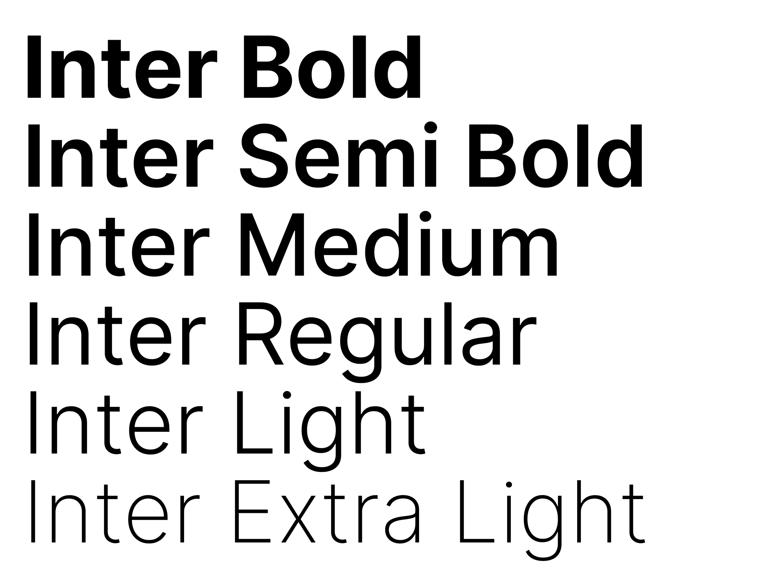
Typography
Inter was chosen for its modern, humanist design that balances clarity with warmth. Its versatile range of weights makes it highly adaptable—supporting bold headlines that command attention and lighter styles that keep longer copy approachable.
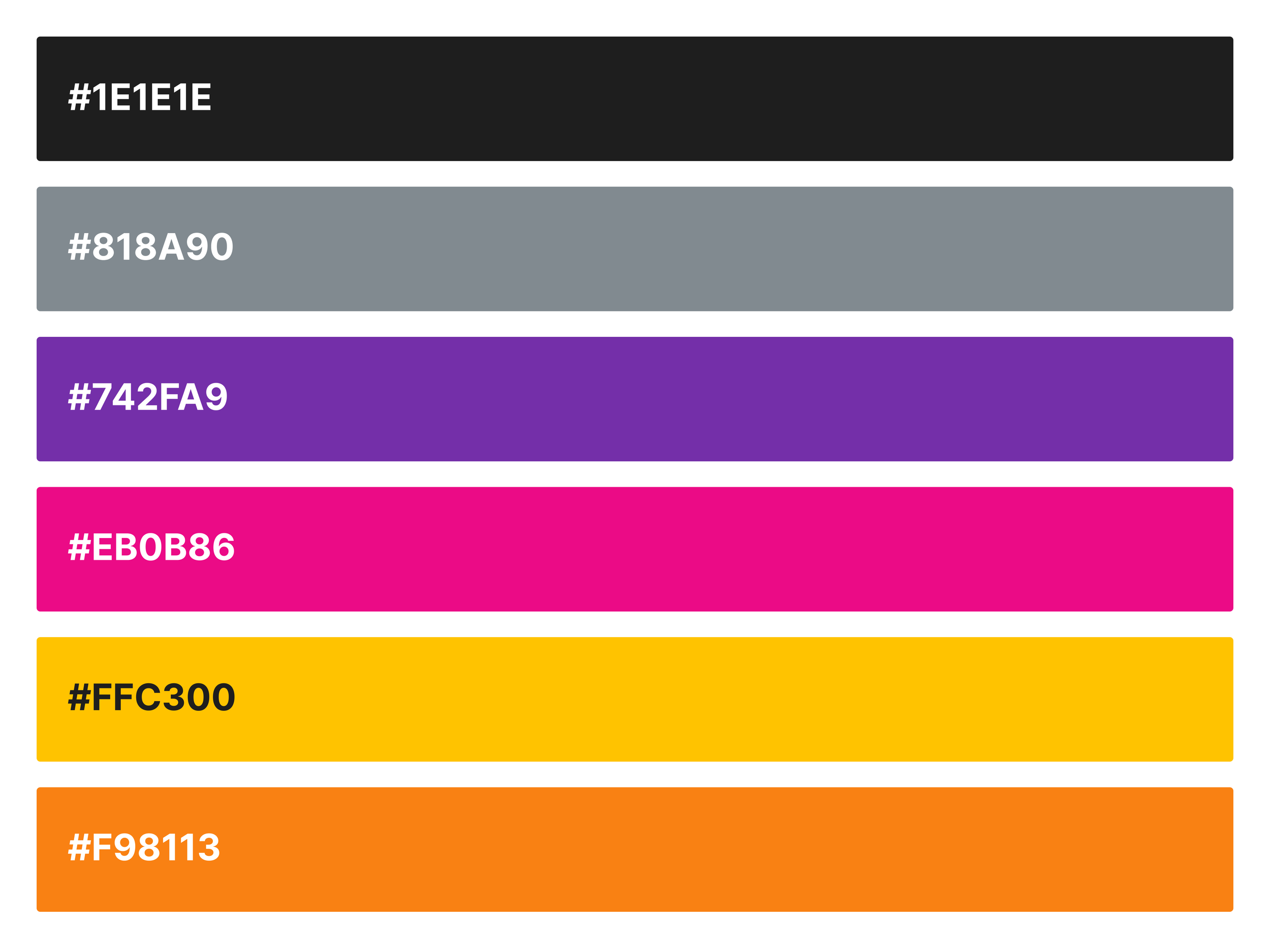
Color Palette
Rymax Rewards’ palette combines bold vibrancy with modern sophistication. Black and gray provide stability and professionalism, while purple and pink bring energy and excitement. Yellow and orange add warmth and optimism, creating a dynamic system that reflects the brand’s focus on engagement, empowerment, and rewarding experiences.

03 — Brand Identity
Rymax Identity Elevation
The previous Rymax identity felt overly corporate, visually outdated, and fragmented—lacking the consistency and clarity needed to support a modern user experience. The brand’s look hadn’t evolved alongside its services, resulting in a disconnect between its visual presence and its value proposition. The system also struggled to flex across digital platforms, which limited both usability and impact.
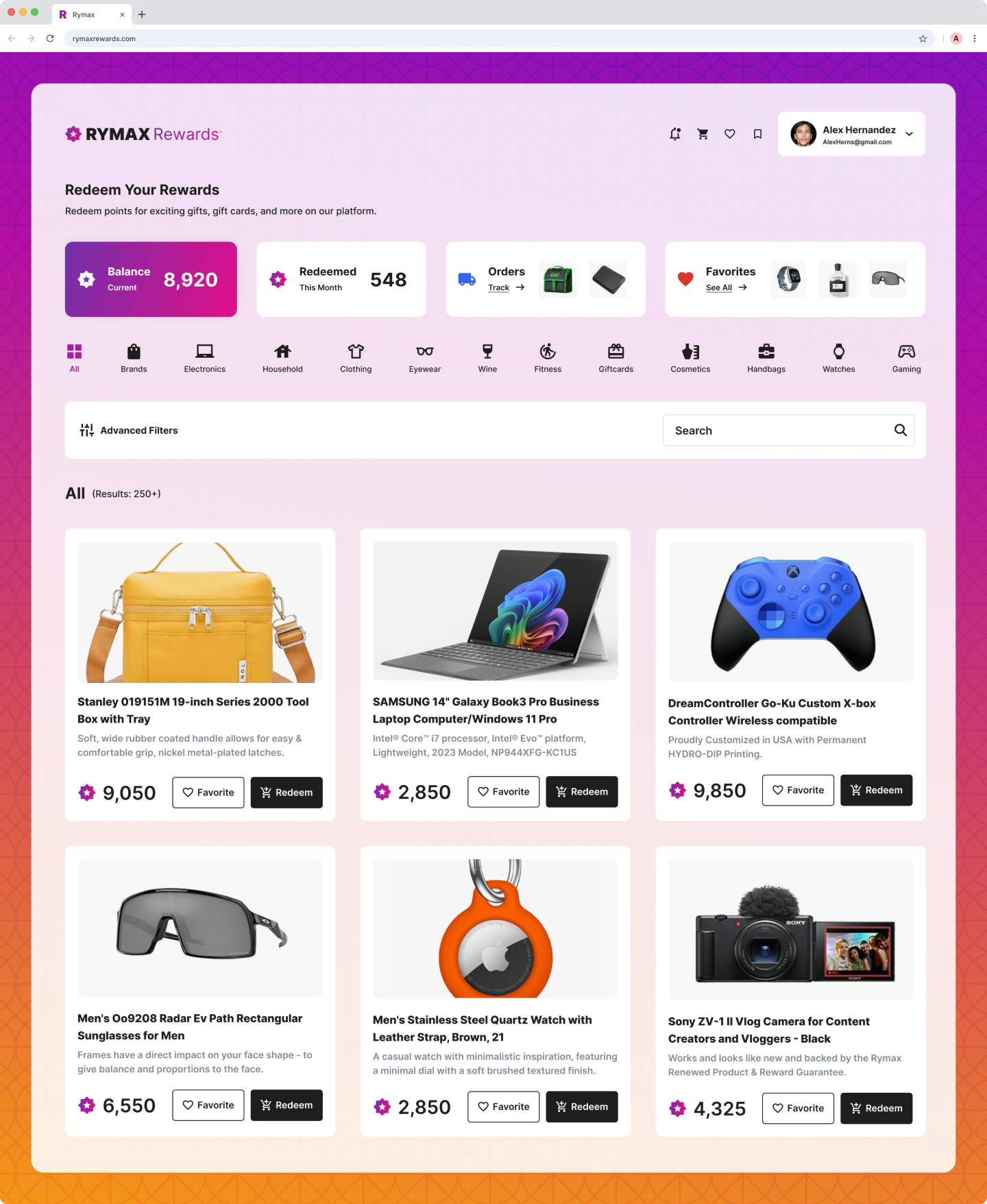
The refreshed identity introduced a confident, modern visual language that feels purposeful and polished. Clean typography, strategic color use, and a more cohesive visual system helped unify the brand across touchpoints. This redesign not only elevated Rymax’s professional presence but also reinforced its credibility and relevance—especially in digital spaces where user trust and clarity are critical.
Old Identity: Old identity was Overly corporate, visually dated, lacked cohesion.
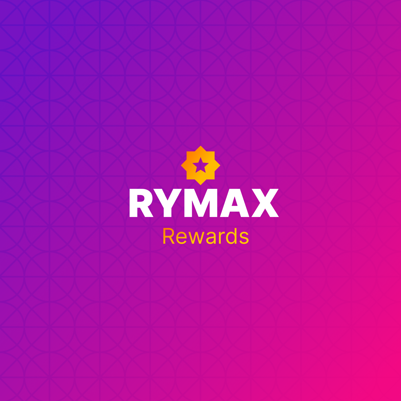
New Identity: Confident, clean, and strategically aligned
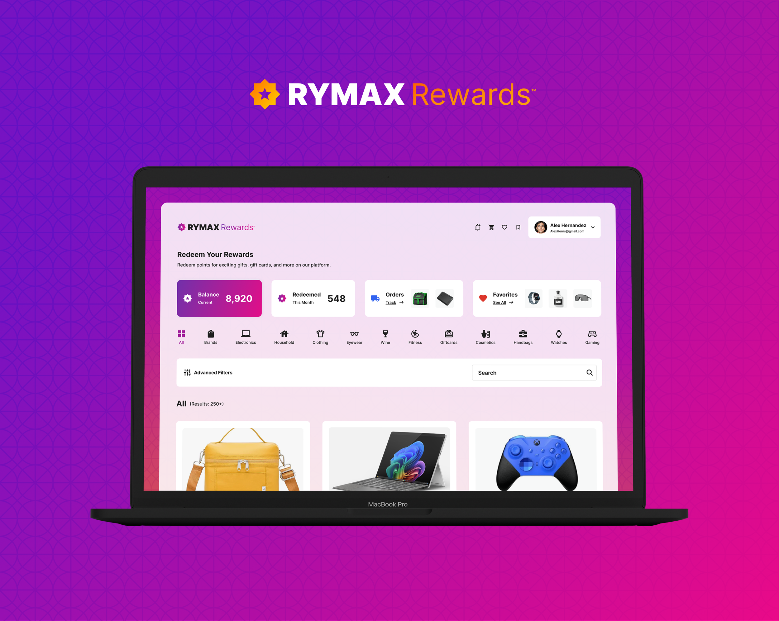
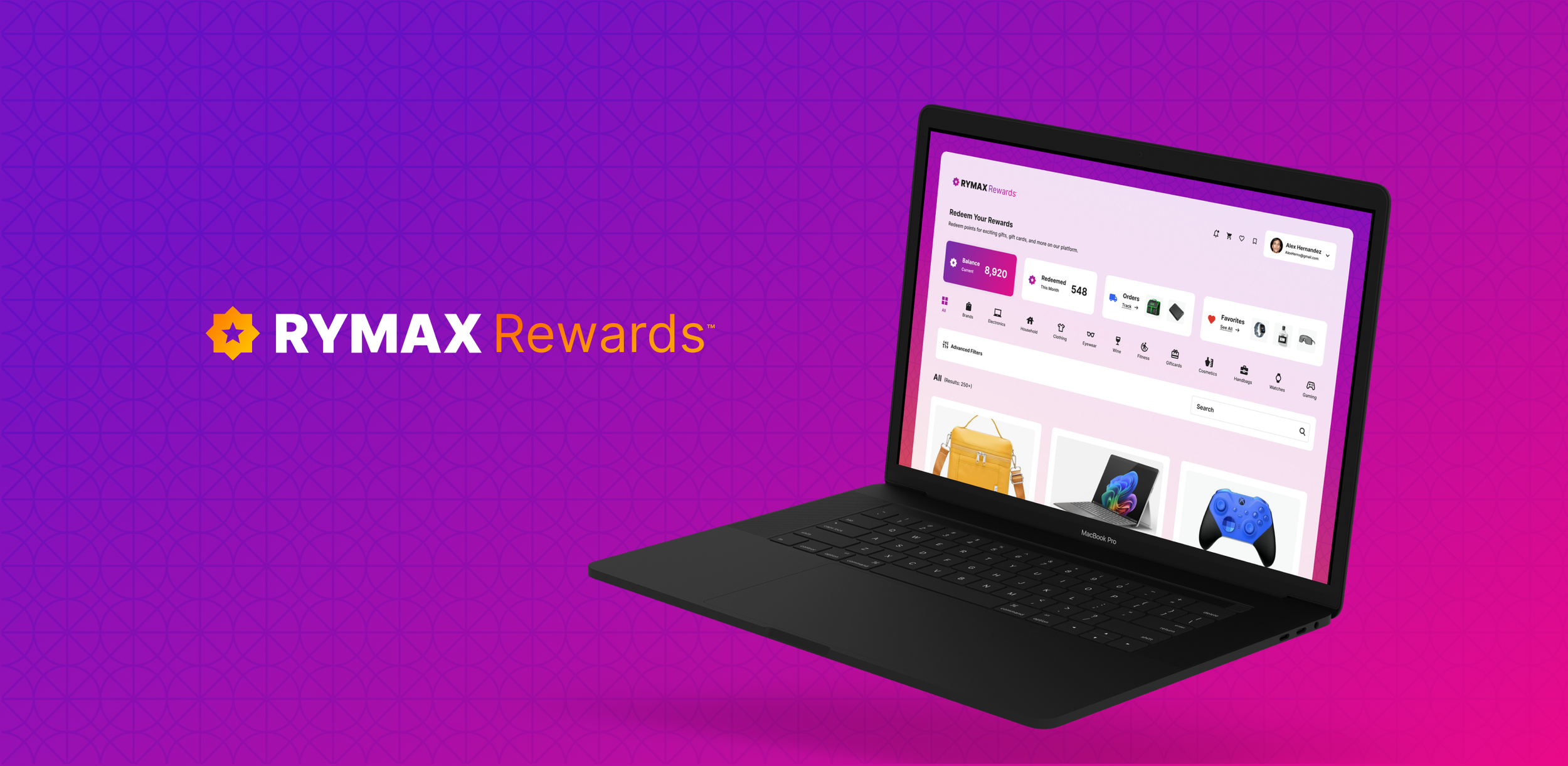
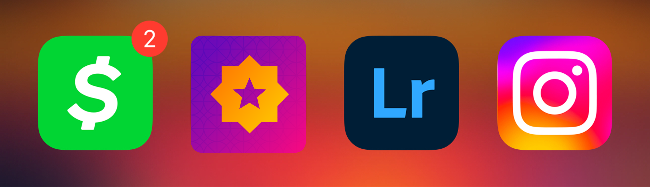
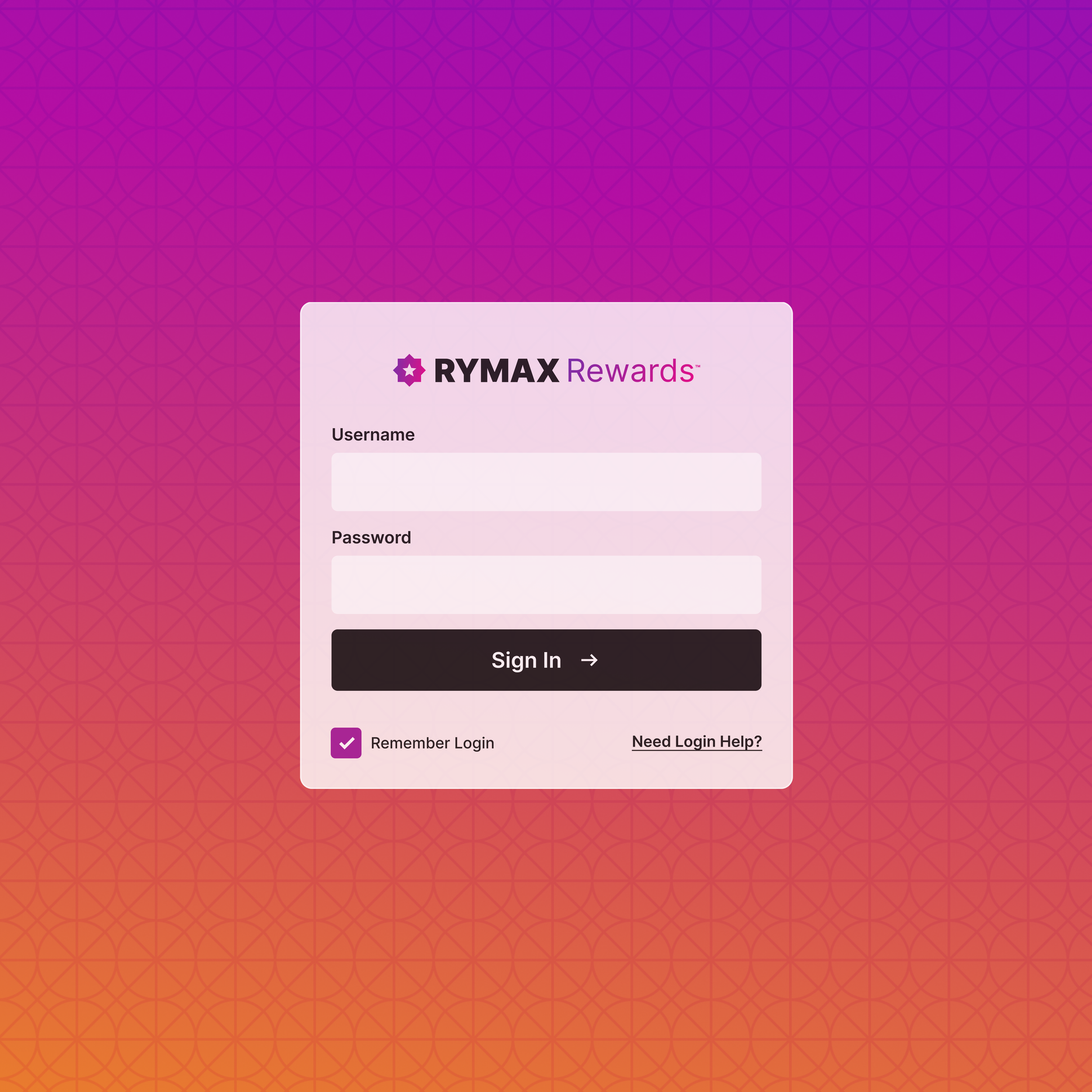
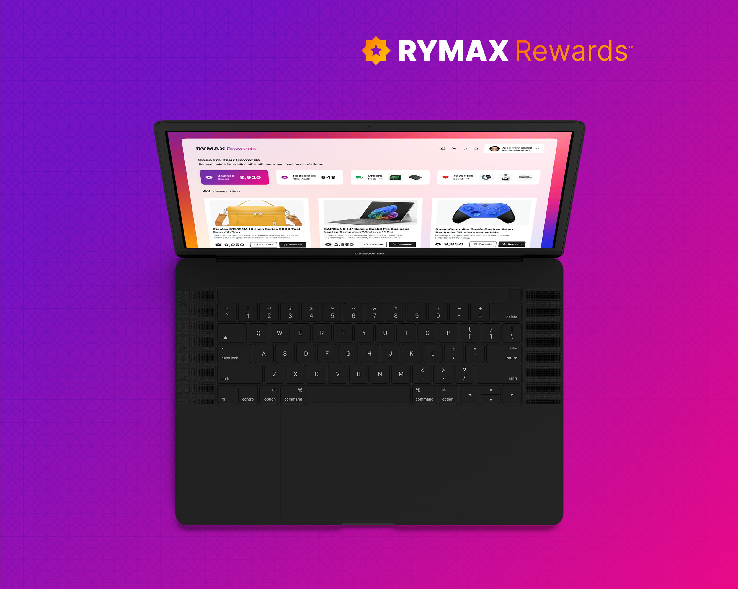
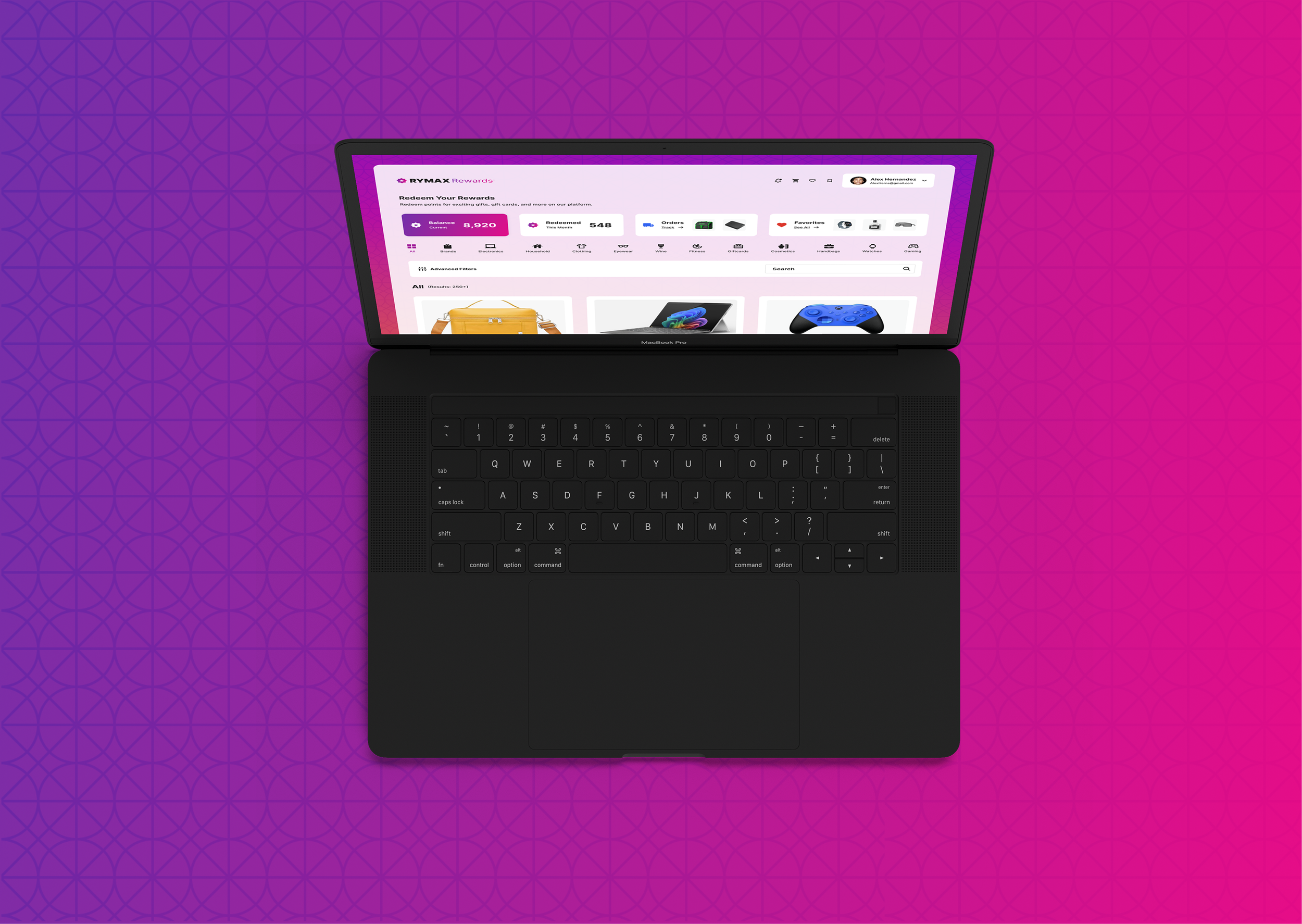
Designing The User Interface
04 — UI/UX
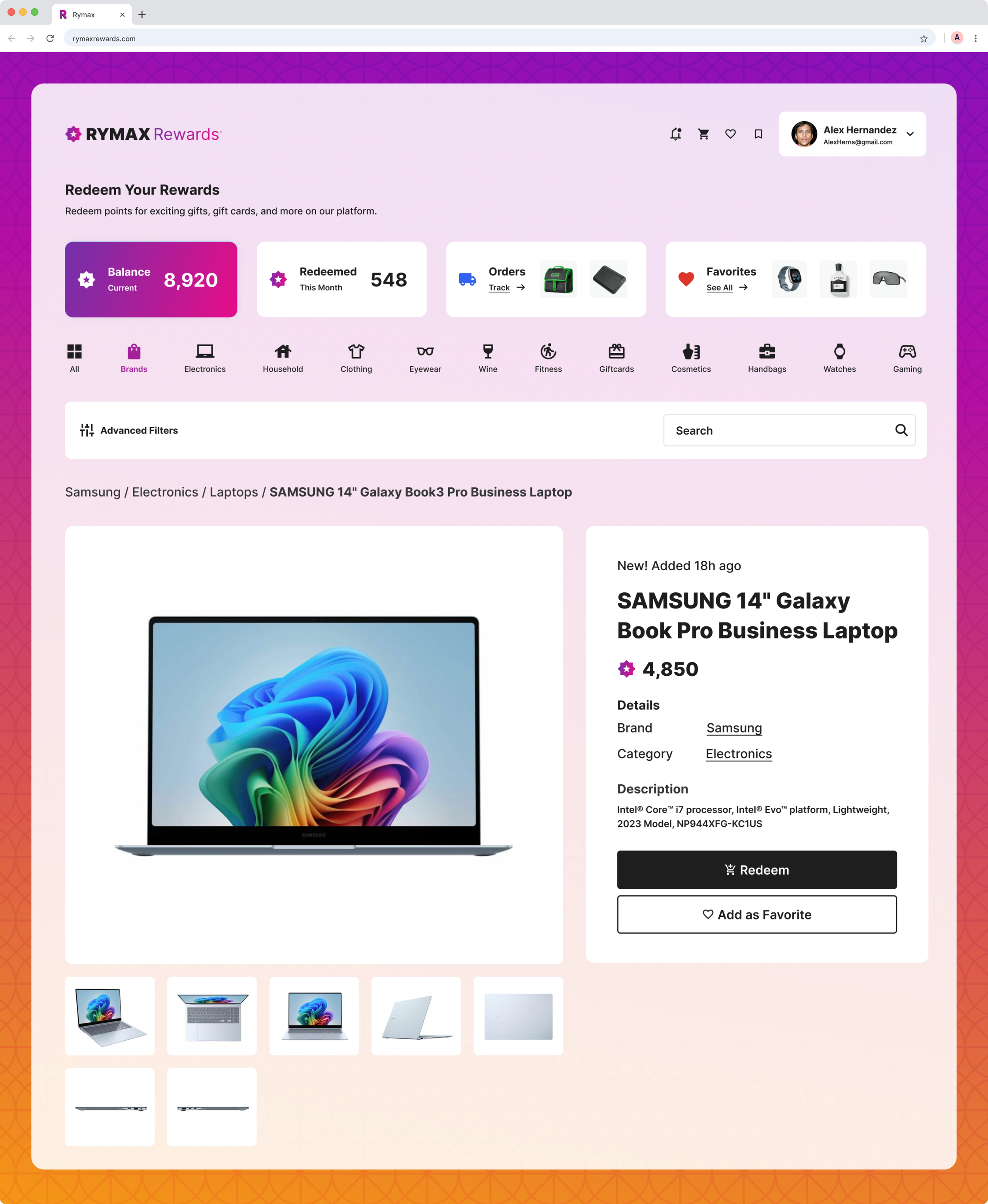
The interface was designed with clean layouts, bold hierarchy, and a color system that guides users naturally through each step. From selecting rewards to completing checkout, every screen was optimized for ease, trust, and satisfaction. The result: a seamless digital experience that makes earning and redeeming rewards feel effortless.
1. Task Flow - Reward & Checkout
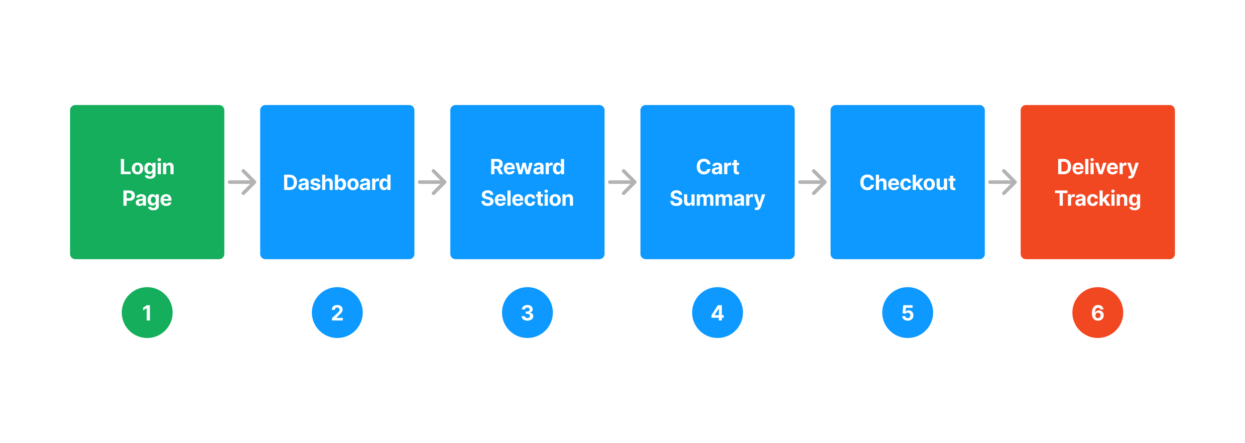
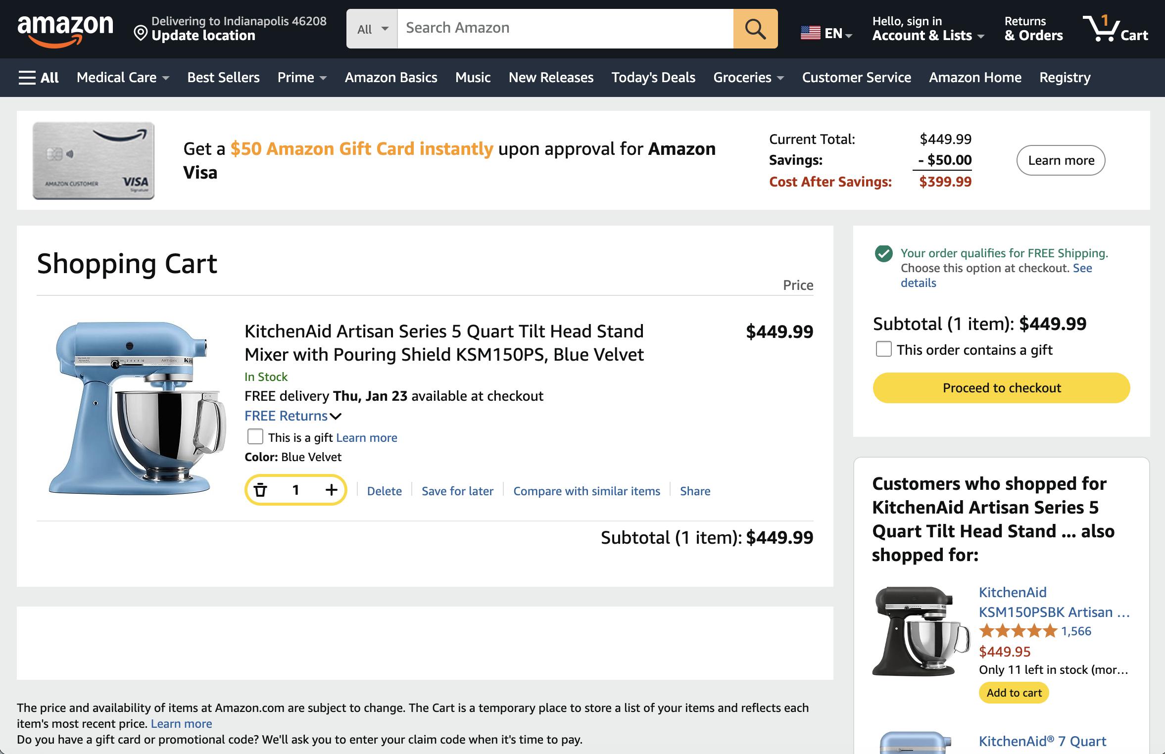
2. Research - Checkout Flow
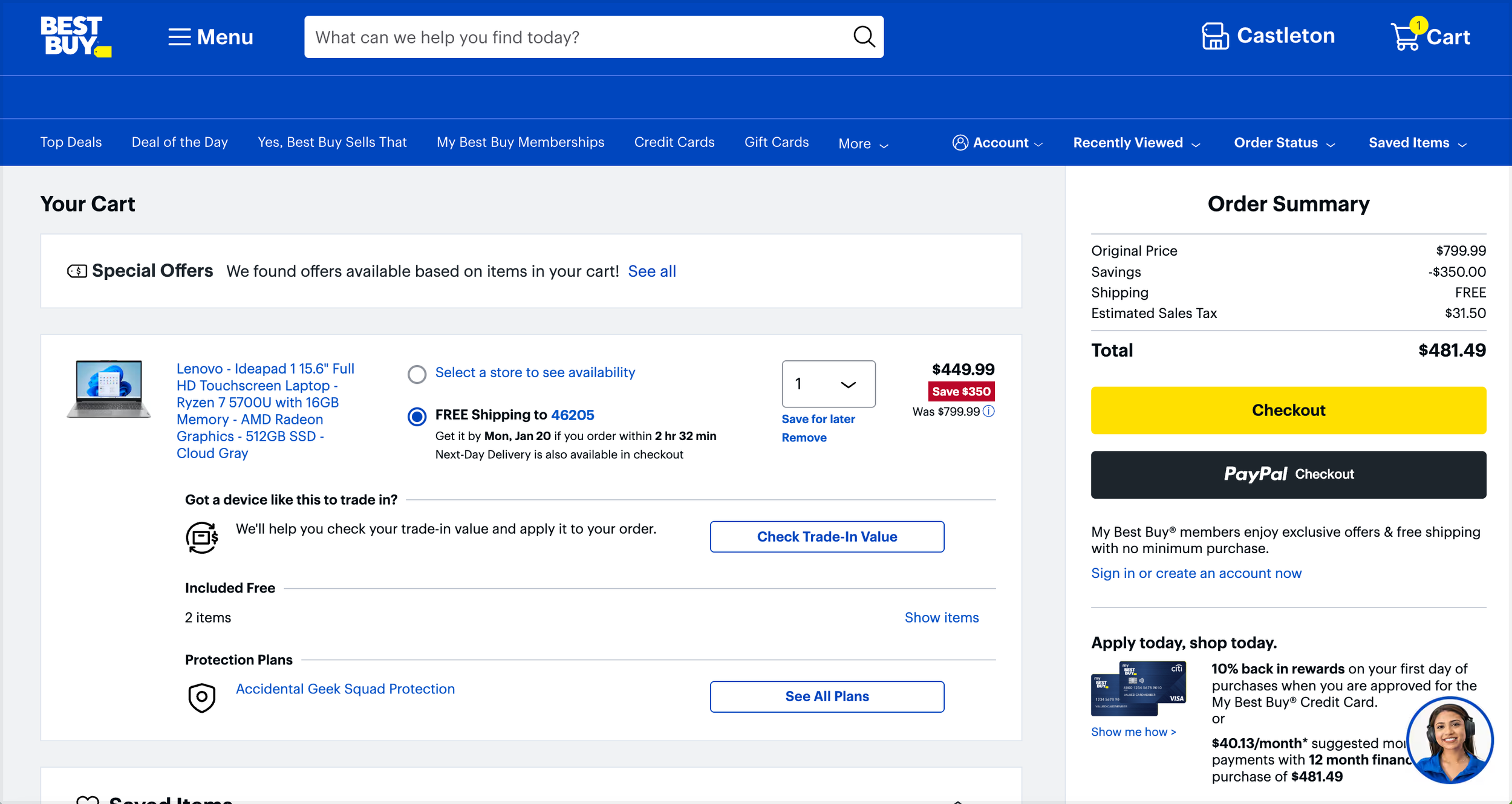
Best Buy Checkout Flow
Amazon Checkout Flow
3. Wireframes - High Fidelity
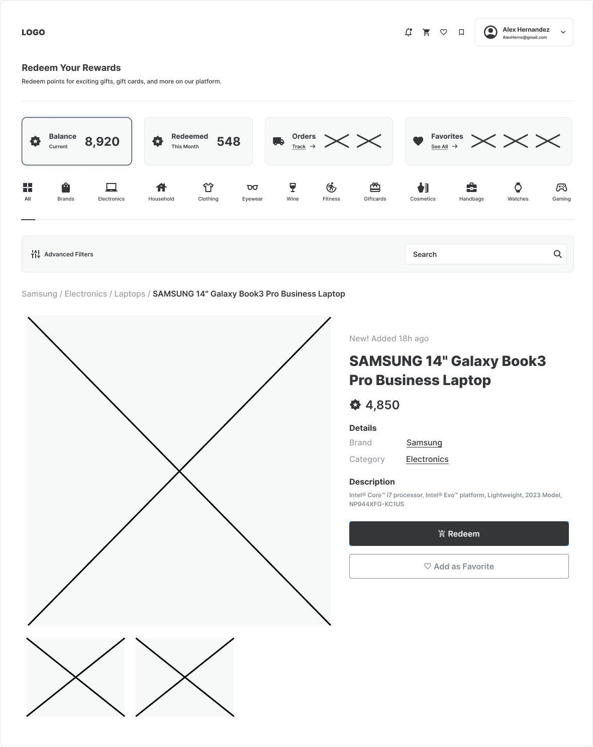
4. UI - Dashboard Mocks
05 — The Outcome
Results and Value
The new identity system brought clarity and cohesion. The redesigned checkout flow removed friction, and aligned the experience with Rymax's premium brand promise.
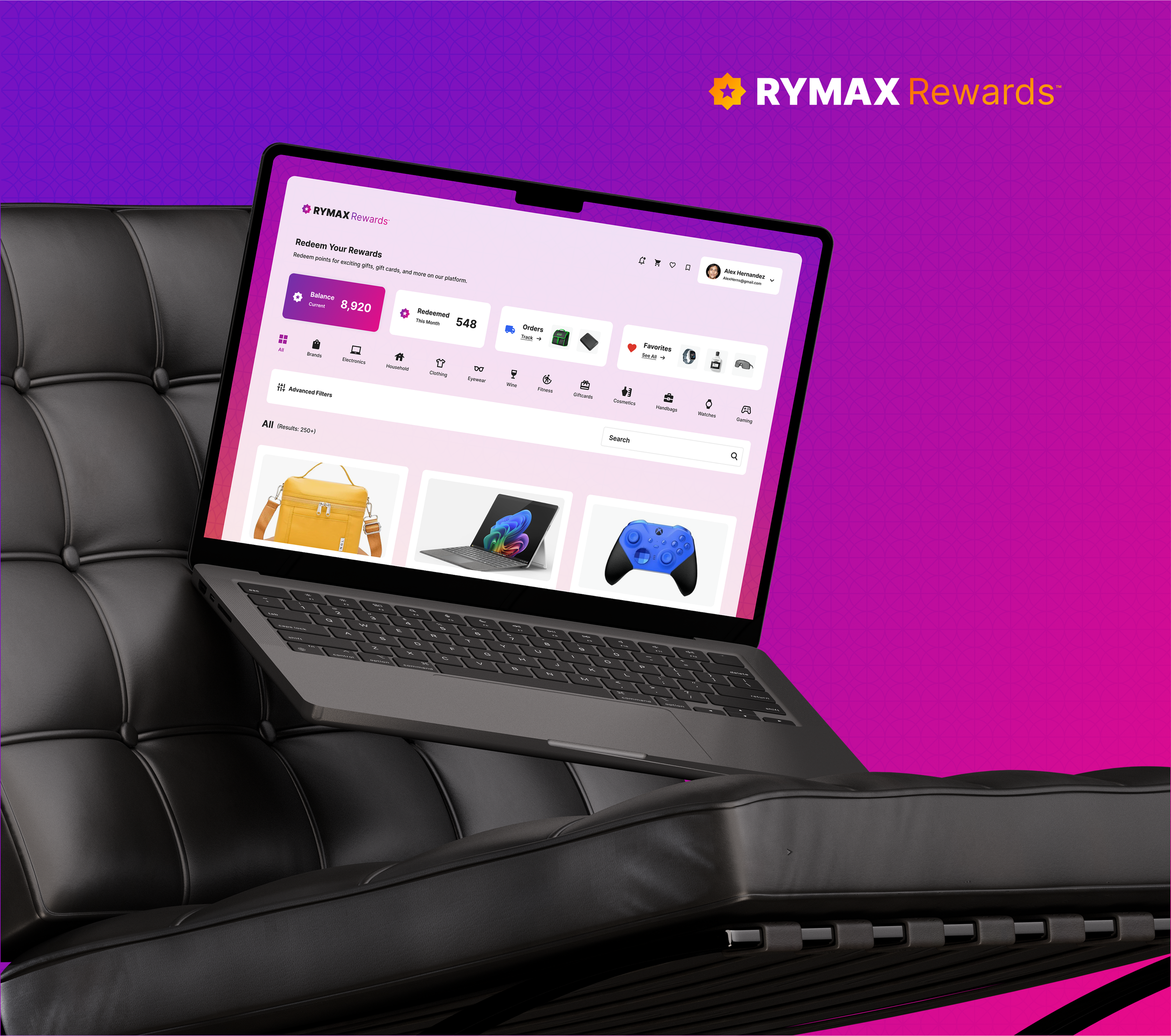
Identity Applied
↓


06 — Project Impacts
Brand Elevation Impact
The redesigned identity and platform experience elevated Rymax Rewards' digital presence, streamlined the user journey, and positioned the brand as a more modern, intuitive, and engaging rewards solution.
01
▸ Clear Brand Foundation
Created a refined brand identity that communicates professionalism and trust, aligning the look and feel of the rewards platform with Rymax's high-quality catalog and customer experience standards.
02
▸ Enhanced User Experience
Revamped the digital flow for browsing and redeeming rewards, making it faster and more intuitive for users to search, filter, and select items without unnecessary friction.
03
▸ Stronger Recognition
Introduced a cohesive design language, color palette, and interface elements that make the platform instantly recognizable while elevating the overall brand perception.
More Cases
↓

More Studio Cases